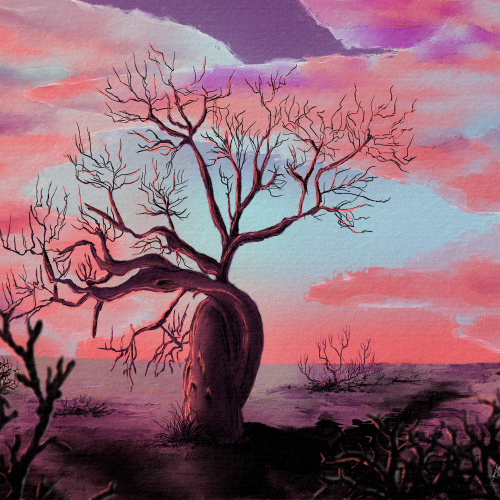
I gravitated towards the fony baobab, a real type of baobab. Sadly, all baobabs are in decline, which informed my composition. I used pastel earth tones and a lot of blacks. Digitally hand-drawn in Rebelle 6
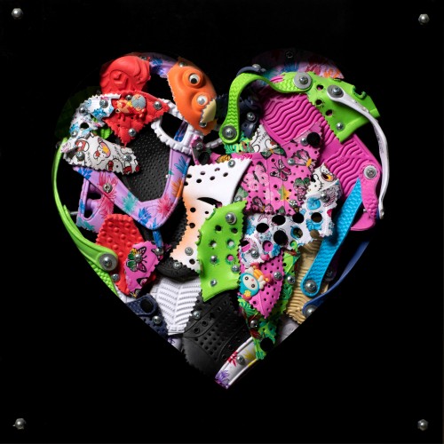
The materials that Meir uses in her works are not of the refined and so she is called an “arte povere” artist. At times she describes her work as someone dealing in alchemy - work develops as in a trial laboratory with different techniques and materials. She says, “ at times the artistic work process is a sort of puzzle demanding the filling in of all the empty squares “.
Some of her work focuses on women, and they incorporate criticism and cultural protest.
Meir has strong opinions about recycling and environmental protection that is represented in her works by use of materials and shapes. In her work she reacts to contemporary art that communicates with the eco system, waste, and she also searches for different worlds. Her works are made up of layers upon colorful layers that when we look at them it becomes clear that the mound of waste she chose is not coincidental. It actually becomes a colorful kaleidoscope of utopia.
Jaffa Meir is a multifaceted, autodidact artist working in painting, sculpture, photography, product design, carpets and furniture, painting on textile, and computer graphics.
The structural composition of some of the works is influenced also by her many years of working in the architects’ office.
Meir also worked in the developing of ideas within the field of ecosystems and recycling for factories such as Coca Cola, and during this process came up with ideas for designing parks and public game spaces using industrial waste products.
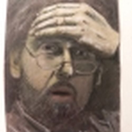
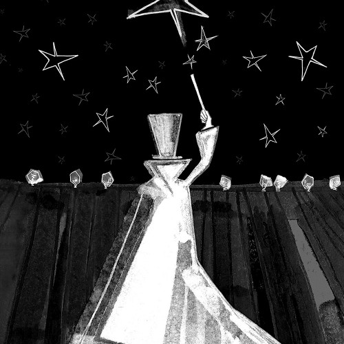
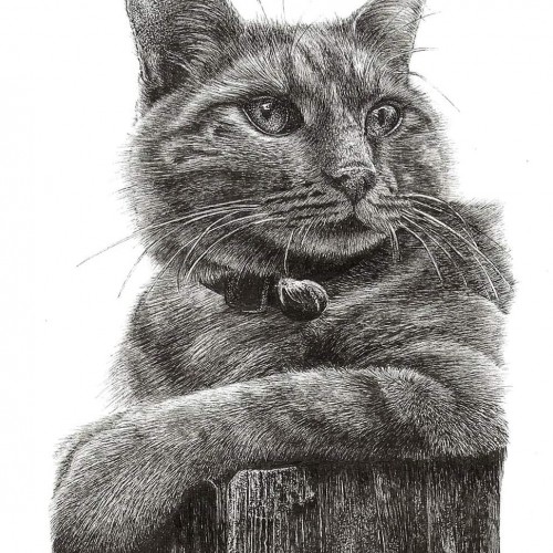
Teaching painting is a great task to ask of a person who doesn't paint. I do not paint. I teach the manipulation of media through experience. "Learn from doing!" I say. Monochromatic pastel exercises help my students to get a handle on the media. We explore value and composition and the handling of media. Sometimes happy accidents occur. This was my example to the teens on composition and value. It is a journey.
In July of 2022, Brianna Grier died falling out of a moving police car while having a mental health breakdown. Since Brianna passed, I have been heartbroken for her twins and family but also reflecting on my struggle with mental health. Mental health needs compassion and empathy, not police and punishment. The brunch strokes are purposeful, but I completed them with empathy in mind. I want to keep the composition simple but filled with meaning. The color theme represents vastness and loneliness, but also kinetic energy found in warm orange tones.
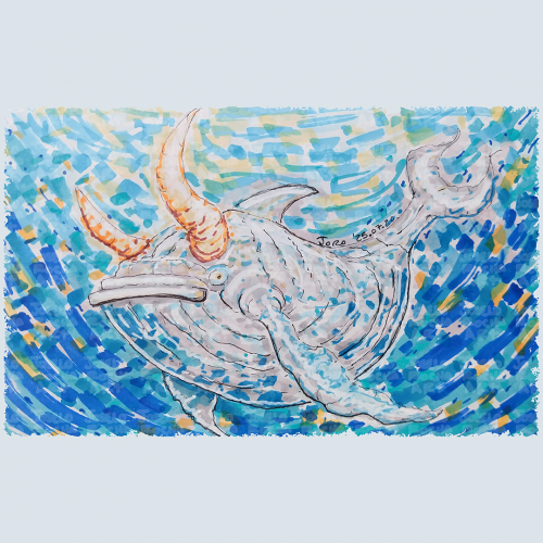
A fantastical bullwhale creature with a mix of whale and bull features glides through a vibrant, swirling, blue and orange hues body of water. The colors blend in a mosaic style, enhancing the creature's mythical presence with a composition that creates a sense of movement and depth, capturing an imaginative underwater scene.
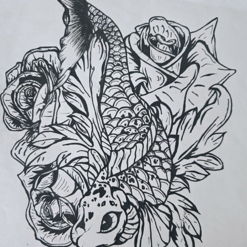
"Pisces Koi" is a bold and intricate black-and-white ink piece that blends symbolism with fluid motion. A koi fish, known for its resilience and transformation, weaves through a bed of blooming roses, creating a contrast between movement and stillness. The fine details in the scales and petals bring depth, making the composition feel alive.
The upward motion of the koi echoes the legend of perseverance—where a koi swimming upstream becomes a dragon—mirroring the Pisces spirit of adaptation and ambition. The roses introduce another layer, possibly symbolizing beauty, personal growth, or challenges that shape us.
This piece captures a sense of quiet strength and fluidity, speaking to those drawn to themes of transformation, water energy, and the balance between struggle and grace.
The form of Martial Arts introduced by Bruce Lee embraces `being formless’ as a central idea. Sharing this belief, my works do not start with an intention of what to make, but rather the process is to follow-through to what the works wish to become. In Jeet Kun To, the practice is to `be water’, to react and to blend. Instead of following the artist’s desire to direct the brush, I enhance, without an intention to change or render. The composition dropped from elsewhere as a message and is polished to shine.
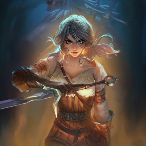
We have finished the second season of The Witcher and I was inspired to make a composition with Cirilla. I have decided to take the visuals from the game where Ciri is already a grown up and became very strong. Behind her is Geralt who looks after her. I hope you like the story as much as I do! https://www.youtube.com/watch?v=m6cfNkwJY6k
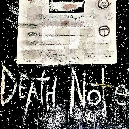
If you have any friends that ever watched the Anime / Manga Death Note .... Then , please, in the name and for the love of GOD , please prank them by placing one of these near them so they find it ! Oh.... I really need to do this , to like all my friends, IF I HAD THEM ! LOL .... Dudes, almost didn't upload today ,,, have a sweet Thanksgiving ya'll .
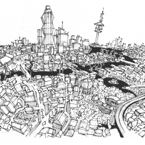
Another wobbly neighborhood. Focusing on color and composition and leaving behind perfect perfective and detail. Ultimately, putting fun first in my personal work moving forward.
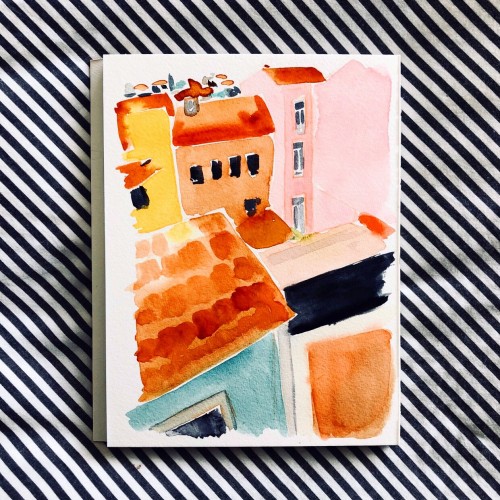
From Sketch to Final Water Coloring Stages, this is a spread from Tide Day! A lot goes into making a good composition, taking into account the center of the image where the binding is, and how to play with size and negative space. One of my favorite things to do is explore contrasting expressions between characters and highlight their emotions through physical stances and expressions. This was a tough challenge with the lack of limbs and the watery context, but Pearl's stubbornness and attitude shines through!
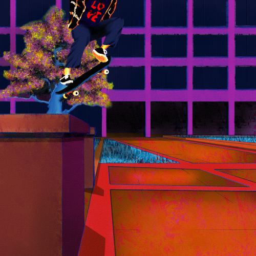
Yet another senseless lynching that has me here with a broken heart. Like my other paintings on this subject, I wanted to focus on life. Tyre was dynamic and energetic, so I wanted to paint him soring. I also wanted to paint him defiant in the face of his oppressors. He was a skater, and they are no strangers to defiance. Thankfully, I found some excellent references to help me with the composition. Aesthetically, I wanted the comp to be modern, colorful, and hopefully impactful. I went for a pop art, illustration, and false-color vibe and minimized blending and refining layer edges. I painted this in Rebelle 6 and Photoshop. Much respect.
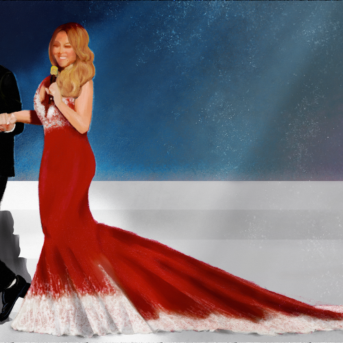
Shes served her best Christmas with an enormous train led by Brain Tanaka. I used charcoal and pastel brushes in Rebelle 6. I wanted a really simple composition so I could focus on her dress and their pose together. Happy Holidays everyone.
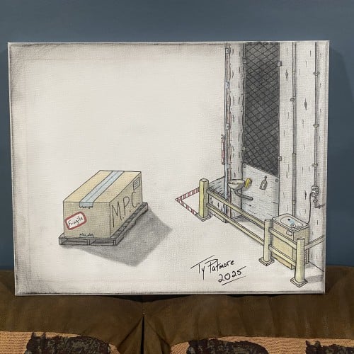
"Industrial Timeout" presents a meticulously rendered scene of solitude and tension within a utilitarian setting. The composition is split between a vast, empty white space and a tightly constrained, detailed industrial corner. In the foreground, a single, unassuming cardboard box sits on a pallet. It is labeled "FRAGILE" and "M.P.C." (possibly a reference to 'Minimum Package Content' or a similar industrial acronym), suggesting a precious, yet standardized, cargo awaiting movement.
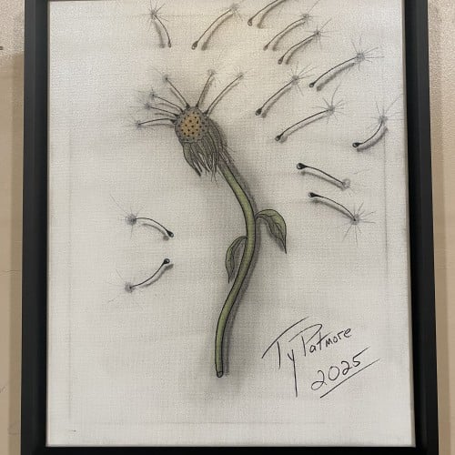
This captivating drawing by Ty Patmore (2025) beautifully illustrates the final stage of a dandelion's life cycle, transforming the common weed into a subject of elegant art. The central, spent head of the flower is rendered with intricate texture, while the detached seeds are given a light, airy quality as they float away. The subtle shading and focused color on the stem provide a grounding element to the otherwise ethereal composition, making it a perfect piece for anyone who cherishes the simple, magical moments in nature.
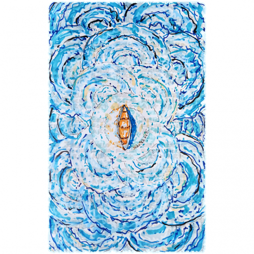
A boat floats at the center of swirling, vibrant blue waves, creating a sense of motion and energy. The contrast between the warm tones of the boat and the cool hues of the water highlights the image's dynamic composition.
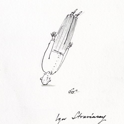
Igor Stravinsky (1882–1971)
“I get up at about eight, do physical exercises, then work without a break from nine till one,” Stravinsky told an interviewer in 1924. Generally, three hours of composition were the most he could manage in a day, although he would do less demanding tasks—writing letters, copying scores, practicing the piano—in the afternoon.
Unless he was touring, Stravinsky worked on his compositions daily, with or without inspiration, he said. He required solitude for the task, and always closed the windows of his studio before he began: “I have never been able to compose unless sure that no one could hear me.” If he felt blocked, the composer might execute a brief headstand, which, he said, “rests the head and clears the brain.”
- From Daily Rituals: How Artists Work by Mason Currey
Sometimes we see ourselves in a labirinth in which it's hard to make just one choice among many others and how it can affect our future. It's like going to the supermartket and seeing so many products of the same type and either you pick the same old or you just stare at them not knowing which one is the best and you waist your time reading the composition of each one to choose the one that suits you better.
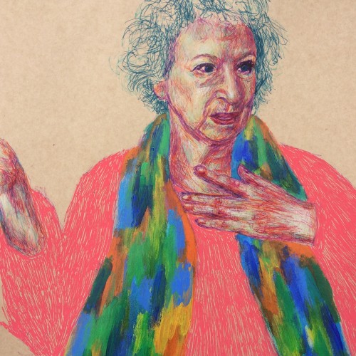
This is another way of working that I really like. Fine liners and chalk (colour) pencils were predominantly used, with a quick smothering of acrylics for her scarf and coarse posca pen marks for the jumper :). About the subject, Handmaid's Tale was one of those rare books that I read more than once growing up and it stayed with me, hence why I decided to draw Margaret Atwood (not seen the series yet though but I hear good things!). I accidentally had her hand cut out while penning the figure - still working on my scale and composition!
My project for a skillshare course I am taking. I am trying to work on developing more textures and drama to my paintings as well as improving on the composition. Any advice or tips that you can share would be appreciated. Thanks!
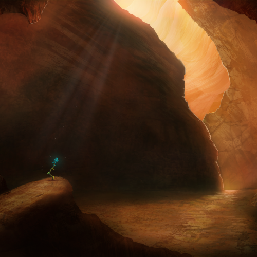
Painted as a project for Painting Environments class: skl.sh/32Khrti
Project parameters:
- Mysterious Cave
- Dark but with moody lighting
- Mostly warm colors but with single blue flower
- Flower is the focal point - use composition to lead eye to flower
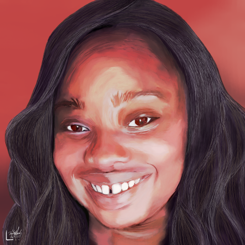
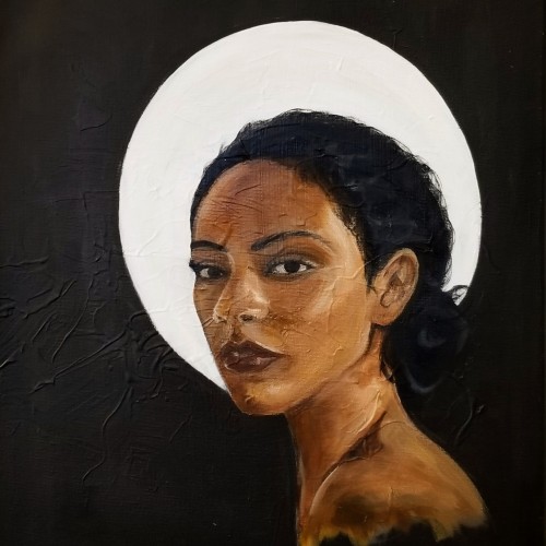
Eve is a continuation on my series of portraits. This piece represents my maturing technique and style as I begin to experiment with creamy consistencies. The painting displayed my ability to capture facial expressions.
My trip to Paris, France influenced my painting style. I was struck by the realism and drama depicted in various compositions, but also the lack of diversity. This piece is named "Eve" questioning whether the holy subjects depicted in European art were, in fact, part of a different race altogether.
This was a project I did and totally forgot about. It's a Notan style dragon I did for a 2d composition class. I kinda like out it turned out. This was my first major foray into illustrator. Time: 3 hours Medium: Illustrator on Mac