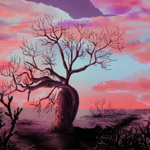
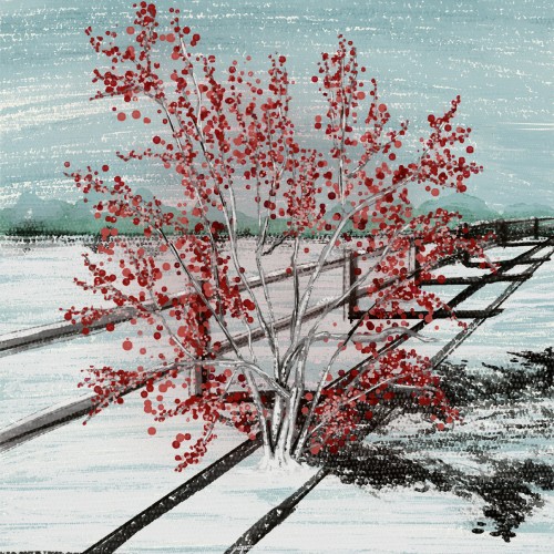
I gravitated towards the fony baobab, a real type of baobab. Sadly, all baobabs are in decline, which informed my composition. I used pastel earth tones and a lot of blacks. Digitally hand-drawn in Rebelle 6
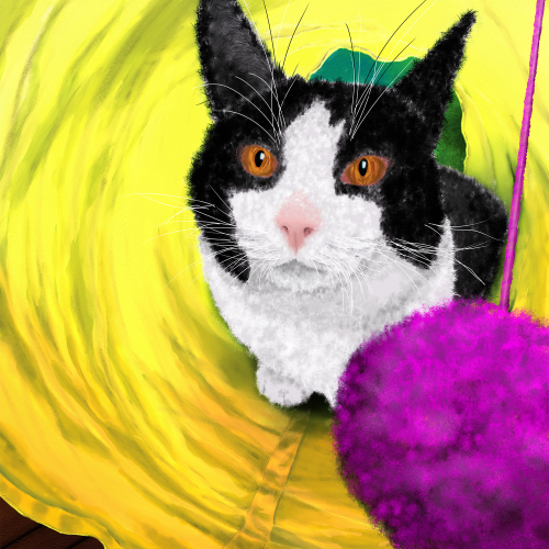
I painted one of my cats, Banana, in a cat tunnel. The coloring in the photo was muted, so I worked on color and fabric texture. I am thrilled with her facial expression, and the overall composition feels good. This is not AI nor is any element made from AI.
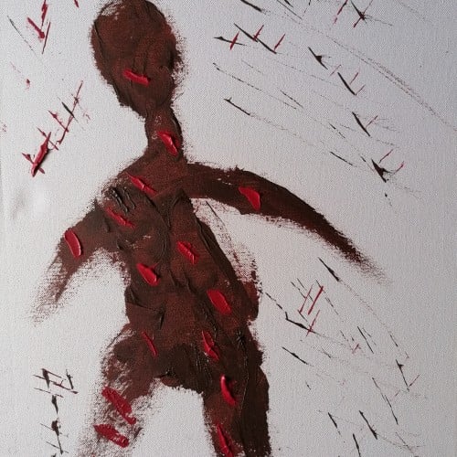
In July of 2022, Brianna Grier died falling out of a moving police car while having a mental health breakdown. Since Brianna passed, I have been heartbroken for her twins and family but also reflecting on my struggle with mental health. Mental health needs compassion and empathy, not police and punishment. The brunch strokes are purposeful, but I completed them with empathy in mind. I want to keep the composition simple but filled with meaning. The color theme represents vastness and loneliness, but also kinetic energy found in warm orange tones.
Teaching painting is a great task to ask of a person who doesn't paint. I do not paint. I teach the manipulation of media through experience. "Learn from doing!" I say. Monochromatic pastel exercises help my students to get a handle on the media. We explore value and composition and the handling of media. Sometimes happy accidents occur. This was my example to the teens on composition and value. It is a journey.
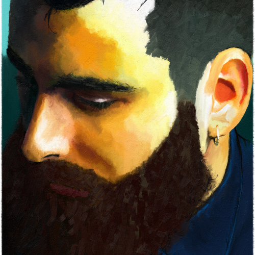
I want the composition to be thoughtful but on the sad side. My skill practice was brush strokes and blending (but not overdoing the blending) as I try to figure out how I stylize as an artist. Still working in the realm of realism and proportions as I am a newbie, but wanna flex into stylization a bit more. I did this through Rebelle 5, which is absolutely amazing, IMO.
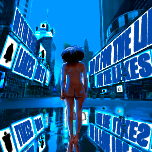
Take it how you want. You either give everything to social media, or it takes everything from you. In the end, you are left naked and hollow. I wanted to make this a simple composition at its core. The image is more about the message.
Times Square took forever to put together, I think the perspective is off just a bit. Overall, I think I did well with shading and depth. I am also improving on drawing/painting the human form. I wish I could trust in shapes and form and go a bit more abstract, but I think that will come with experience.
Digital is great -- for composition and color. But for line art? I don't think I can ever give up the fountain pen. This was drawn with a Sailor King of Pen (M) and Sailor 1911L (EF) fountain pens using Pilot Black ink. Yes, sacrilege. Pilot ink in a Sailor. But I have some Kiwa Guro arriving soon!
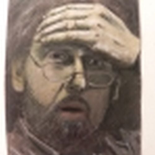
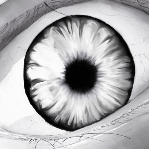
The monochromatic weekly challenge inspired me to do an eye study. I've been having a bit of a composition block and thinking about starting to sell at art fairs, so my thoughts are preoccupied. I wanted to keep practicing tho. Lemme know what you think. I used pencils, smudges, and liquify in Rebelle 6. This is not AI nor is any part of this AI.
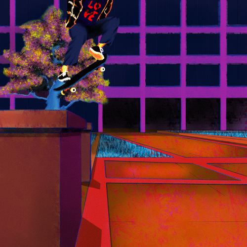
Yet another senseless lynching that has me here with a broken heart. Like my other paintings on this subject, I wanted to focus on life. Tyre was dynamic and energetic, so I wanted to paint him soring. I also wanted to paint him defiant in the face of his oppressors. He was a skater, and they are no strangers to defiance. Thankfully, I found some excellent references to help me with the composition. Aesthetically, I wanted the comp to be modern, colorful, and hopefully impactful. I went for a pop art, illustration, and false-color vibe and minimized blending and refining layer edges. I painted this in Rebelle 6 and Photoshop. Much respect.
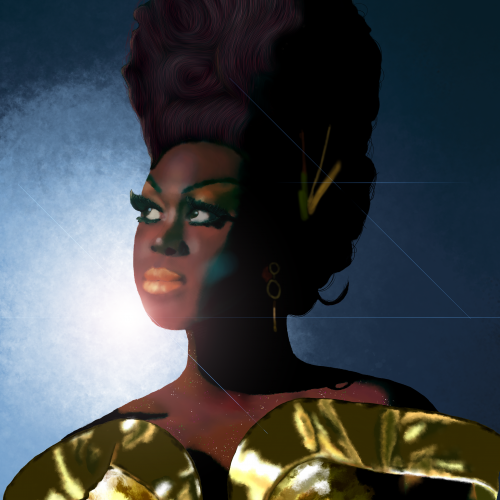
Bob the Drag Queen is a legendary performer and personality. She is one of my favorite people. I kept the composition simple to focus on shading and facial dimensions. I paid close attention to not lightening her skin tone and respecting her heritage but also contrasting the gold dress and blue background.
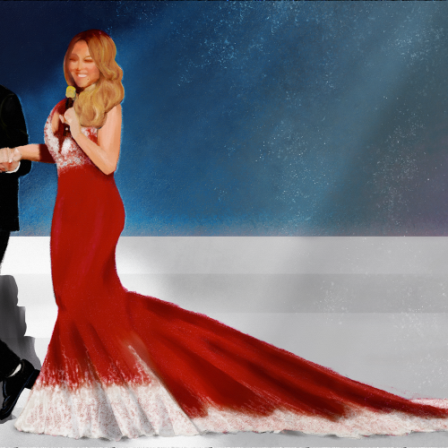
Shes served her best Christmas with an enormous train led by Brain Tanaka. I used charcoal and pastel brushes in Rebelle 6. I wanted a really simple composition so I could focus on her dress and their pose together. Happy Holidays everyone.
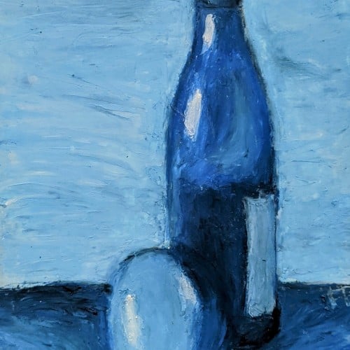
I tried to use my imagination for this, but I had to fall back on photo reference, to finish it. THe problem with the composition is I did not use a background colour. I did this about 3 years ago.
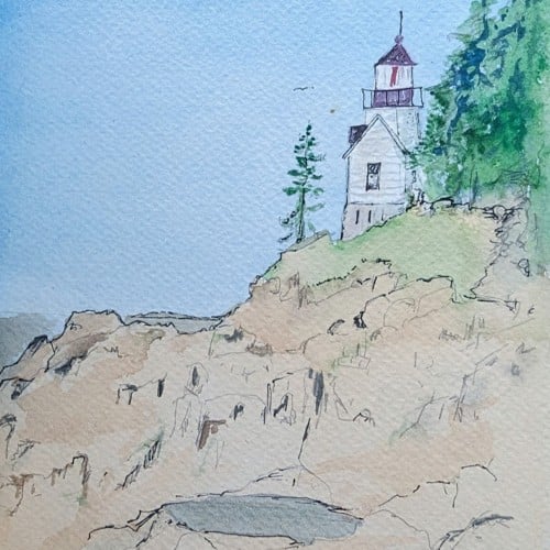
Their are mountains in the background.
A Bob Ross inspired painting, for the Digital Painting Studio challenge, I know composition is a bit off, but I'm still pretty satisfied with the end result, and sometimes, you just have to let go of the image and work on something else...
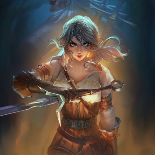
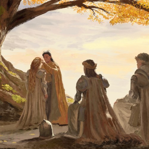
We have finished the second season of The Witcher and I was inspired to make a composition with Cirilla. I have decided to take the visuals from the game where Ciri is already a grown up and became very strong. Behind her is Geralt who looks after her. I hope you like the story as much as I do! https://www.youtube.com/watch?v=m6cfNkwJY6k
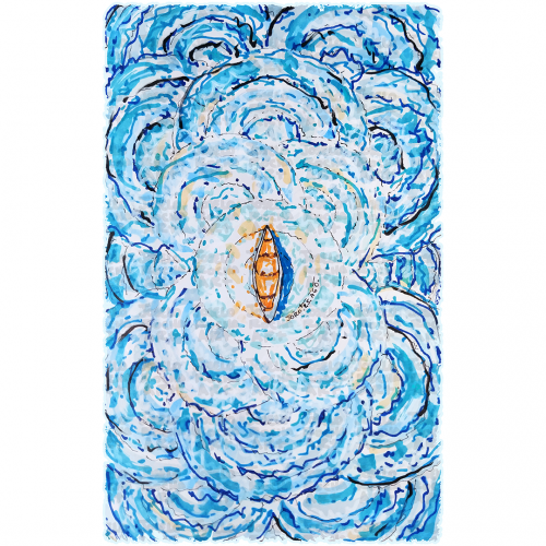
A boat floats at the center of swirling, vibrant blue waves, creating a sense of motion and energy. The contrast between the warm tones of the boat and the cool hues of the water highlights the image's dynamic composition.
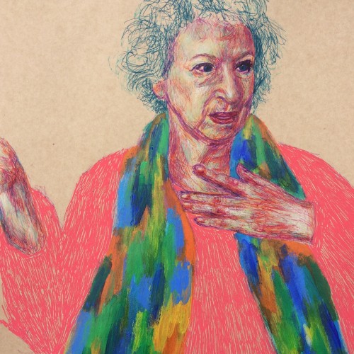
This is another way of working that I really like. Fine liners and chalk (colour) pencils were predominantly used, with a quick smothering of acrylics for her scarf and coarse posca pen marks for the jumper :). About the subject, Handmaid's Tale was one of those rare books that I read more than once growing up and it stayed with me, hence why I decided to draw Margaret Atwood (not seen the series yet though but I hear good things!). I accidentally had her hand cut out while penning the figure - still working on my scale and composition!
Dmitry Shostakovich (1906–1975)
Shostakovich’s contemporaries do not recall seeing him working, at least not in the traditional sense. The Russian composer was able to conceptualize a new work entirely in his head, and then write it down with extreme rapidity—if uninterrupted, he could average twenty or thirty pages of score a day, making virtually no corrections as he went.
But this feat was apparently preceded by hours or days of mental composition—during which he “appeared to be a man of great inner tensions,” the musicologist Alexei Ikonnikov observed, “with his continually moving, ‘speaking’ hands, which were never at rest.”
Shostakovich himself was afraid that perhaps he worked too fast. “I worry about the lightning speed with which I compose,” he confessed in a letter to a friend. Undoubtedly this is bad. One shouldn’t compose as quickly as I do. Composition is a serious process, and in the words of a ballerina friend of mine, “You can’t keep going at a gallop.” I compose with diabolical speed and can’t stop myself.… It is exhausting, rather unpleasant, and at the end of the day you lack any confidence in the result. But I can’t rid myself of the bad habit.
- From Daily Rituals: How Artists Work by Mason Currey
#dailyrituals #inktober #shostakovich @masoncurrey
My project for a skillshare course I am taking. I am trying to work on developing more textures and drama to my paintings as well as improving on the composition. Any advice or tips that you can share would be appreciated. Thanks!
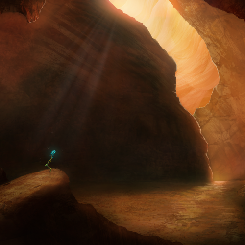
Painted as a project for Painting Environments class: skl.sh/32Khrti
Project parameters:
- Mysterious Cave
- Dark but with moody lighting
- Mostly warm colors but with single blue flower
- Flower is the focal point - use composition to lead eye to flower
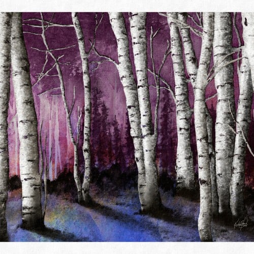
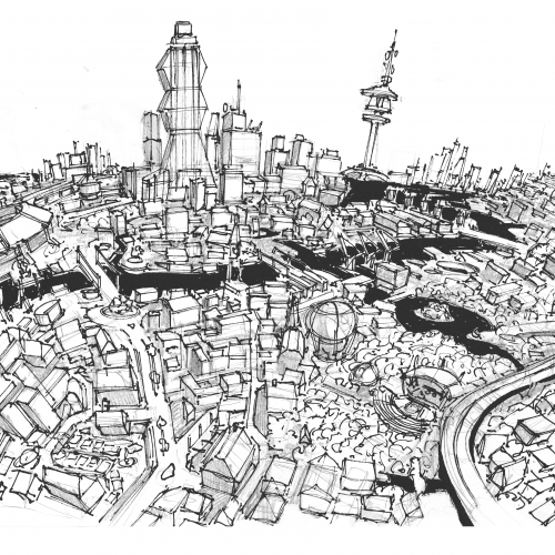
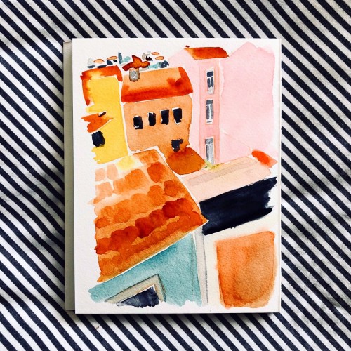
Another wobbly neighborhood. Focusing on color and composition and leaving behind perfect perfective and detail. Ultimately, putting fun first in my personal work moving forward.