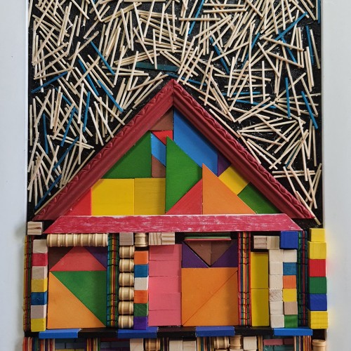
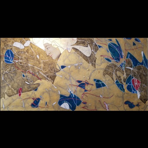
The materials that Meir uses in her works are not of the refined and so she is called an “arte povere” artist. At times she describes her work as someone dealing in alchemy - work develops as in a trial laboratory with different techniques and materials. She says, “ at times the artistic work process is a sort of puzzle demanding the filling in of all the empty squares “.
Some of her work focuses on women, and they incorporate criticism and cultural protest.
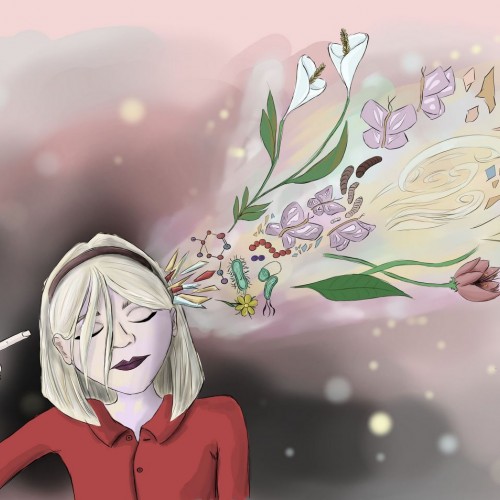
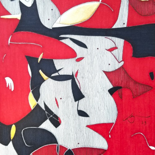
Meir has strong opinions about recycling and environmental protection that is represented in her works by use of materials and shapes. In her work she reacts to contemporary art that communicates with the eco system, waste, and she also searches for different worlds. Her works are made up of layers upon colorful layers that when we look at them it becomes clear that the mound of waste she chose is not coincidental. It actually becomes a colorful kaleidoscope of utopia.
Jaffa Meir is a multifaceted, autodidact artist working in painting, sculpture, photography, product design, carpets and furniture, painting on textile, and computer graphics.
The structural composition of some of the works is influenced also by her many years of working in the architects’ office.
Meir also worked in the developing of ideas within the field of ecosystems and recycling for factories such as Coca Cola, and during this process came up with ideas for designing parks and public game spaces using industrial waste products.
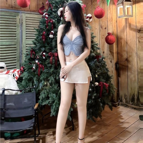
The photo captures a shimmering, festive Christmas moment with a beautiful young woman posing in front of a lavishly decorated Christmas tree. She is wearing a glamorous outfit consisting of a sparkling butterfly-shaped crop top and a short white skirt, paired with elegant high heels. The surrounding space exudes a warm, cozy atmosphere with wooden walls, vibrant red ornaments, and green-and-red pennant banners hanging above, creating a lively holiday scene. A black chair nearby, along with festive decorations like a fabric Santa Claus and candy canes, enhances the Christmas spirit. The woman in the image radiates a gentle yet captivating beauty, with her long, flowing black hair and a charming sideways gaze. The combination of modern fashion and a classic holiday setting creates a stunning composition, evoking a sense of warmth and romance.
This image is copyrighted and DMCA registered. I strictly prohibit all of you from posting this image on other online forums. If I discover it, you will receive some reports from me. Contact me via: thichminhbaovn@gmail.com
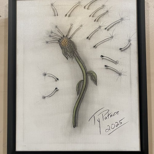
This captivating drawing by Ty Patmore (2025) beautifully illustrates the final stage of a dandelion's life cycle, transforming the common weed into a subject of elegant art. The central, spent head of the flower is rendered with intricate texture, while the detached seeds are given a light, airy quality as they float away. The subtle shading and focused color on the stem provide a grounding element to the otherwise ethereal composition, making it a perfect piece for anyone who cherishes the simple, magical moments in nature.
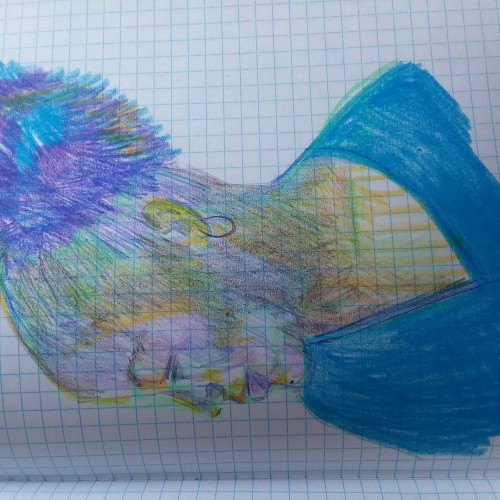
Chari is one of my favorite folks to draw! I have been drawing a lot more while out and about. Using the cheap graph composition notebook, non-expensive art supplies and going to a coffee shop to draw people. Sometimes I can get a likeness with my mind, eyes, hands and draftsmanship and other times it is the "many moods of my subject." :-) This is a place (in my book) where I can learn from my perceived fails. ****The images are sideways! I know this. I do not know how to make them portrait orientation. They started out as portrait-scaped orientation and now they are landscape. Well..... Okay then. The figurative landscape. Hahaahhha! Cry. I even tried the visa versa. Nope. They want to be on their sides.
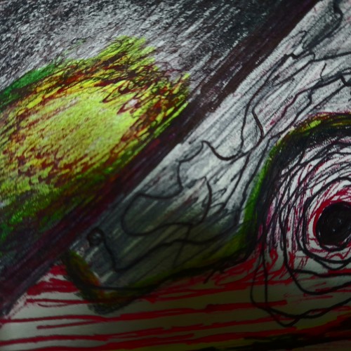
Some works were born to be prodigious. Once the preliminary lines were laid within the first minute, the quality of the shapes, the diagonal composition and the weight were balanced out.
With the black mass as the hood, a face, hidden underneath, is unveiled. With the addition of the black fingers and the white hand, the full figure surfaced naturally.
The black fingers are the minimal suggestions to add character. The title `Remorse’ came about because of the bowed head and the pose.
utube clip: https://youtu.be/mb48rCx-lYI
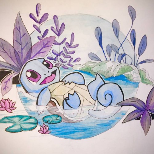
Squirtle: no more no less. Actually more about it, my lighting is bad, aka the yellow tint. Also color picking is really hard, and i might have to do a bit more outlining to the piece to make it look cohesive. But overall the composition is balanced i think, even if i slacked off with the execution a bit towards the end
This turned out to be a finished painting. It started with a full canvas of doodle lines (check my patreon log if you are interested in the raw file) This was executed just this March. Still, no lines were altered except the face area. Impossible you say?
Français : L’Appropriationnisme ou le « Remake » est un concept simple. En effet, il suffit de reprendre le travail d’un artiste et signer la nouvelle production de son nom. Il ne s’agit, en aucun cas, de copier l’œuvre comme pourrait le faire un faussaire. Il ne s’agit pas non plus de plagier l’œuvre.
En ce qui me concerne, j’utilise l’œuvre célèbre d’un artiste reconnu. En réutilisant une œuvre originale préexistante et célèbre, condition sine qua non, je propose de rendre un hommage. Il ne s’agit en aucun cas d’un manque d’inspiration surtout lorsque l’on sait maintenant que : « l’art naît de l’art et non de la nature » : Ernst Gombrich.
Dans cette série, j’ai voulu revisiter des œuvres célèbres en utilisant ma technique graphique de l’éloge de l’approximation mettant en évidence la problématique de la défaillance et de la mémoire vaporeuse.
English: Appropriationism or Remake is a simple concept. Indeed, it is enough to take again the work of an artist and to sign the new production of his name. It is not a question of copying the work as a forger could do. It is not a question of plagiarizing the work.
As far as I'm concerned, I use the famous work of a recognized artist. By reusing a pre-existing and famous original work, condition sine qua non, I propose to pay tribute. It is by no means a lack of inspiration especially when we now know that: "art is born of art and not of nature": Ernst Gombrich.
In this series, I wanted to revisit famous works using my graphic technique of praising the approximation highlighting the problem of failure and vaporous memory.
https://www.pierretomyleboucher.fr
The only line added consciously is the hand. It leads the eye to the eye and thereby showing the viewers that it is in fact a figure. The shape on the right feels kind of right to be there, it really does not matter what it is. Compositional-wise , it works.
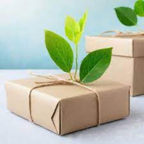
This artwork beautifully reflects the essence of Eco Friendly Packaging Eco Friendly Packaging by uniting nature and design. A simple kraft paper box, tied with organic twine, carries a sprouting green plant that symbolizes life, renewal, and sustainability. The composition turns ordinary packaging into a statement of environmental care, reminding us that every choice can support a greener future.
I changed the composition, types of silhouettes, and background texture a few times.
I didn't have any expectations about the finished work. It was a creative flow with many changes. I think the creative process looks like this.
Don't be afraid to try.
If you make your art digitally, it's simple. You can:
- create a new layer,
- use shortcut Ctrl+Z.
In traditional art, it depends on the art supplies you use. Sometimes you can try more times. Sometimes you need to start again.
But any attempt is better than giving up.
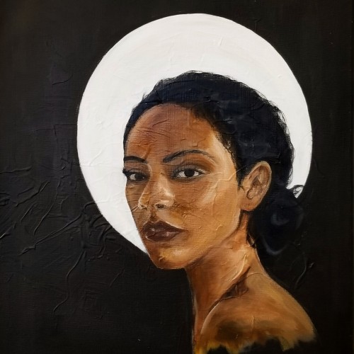
Eve is a continuation on my series of portraits. This piece represents my maturing technique and style as I begin to experiment with creamy consistencies. The painting displayed my ability to capture facial expressions.
My trip to Paris, France influenced my painting style. I was struck by the realism and drama depicted in various compositions, but also the lack of diversity. This piece is named "Eve" questioning whether the holy subjects depicted in European art were, in fact, part of a different race altogether.
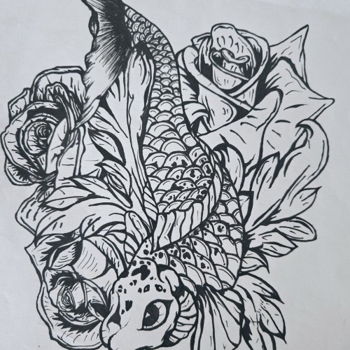
"Pisces Koi" is a bold and intricate black-and-white ink piece that blends symbolism with fluid motion. A koi fish, known for its resilience and transformation, weaves through a bed of blooming roses, creating a contrast between movement and stillness. The fine details in the scales and petals bring depth, making the composition feel alive.
The upward motion of the koi echoes the legend of perseverance—where a koi swimming upstream becomes a dragon—mirroring the Pisces spirit of adaptation and ambition. The roses introduce another layer, possibly symbolizing beauty, personal growth, or challenges that shape us.
This piece captures a sense of quiet strength and fluidity, speaking to those drawn to themes of transformation, water energy, and the balance between struggle and grace.
Sometimes we see ourselves in a labirinth in which it's hard to make just one choice among many others and how it can affect our future. It's like going to the supermartket and seeing so many products of the same type and either you pick the same old or you just stare at them not knowing which one is the best and you waist your time reading the composition of each one to choose the one that suits you better.
These figures found must cast some meanings from my subconscious. They simply came and as a whole composition! I uploaded a full description on youtube giving them individual names, mostly ghostly. This piece contains a spooky atmosphere stronger than the others and remains one of my favorites, probably because better works come effortless.
Since the dawn of l’automatisme, the floating shapes of Miro and Klee were praised as musical suggestions. Unlike the Masters, my groundwork of flowing lines speaks melody and rhythm from a musical score perspective. The flow of lines ties the art elements into a composition. It also reflects a concept from Chinese paintings, which says, ` as a line moves into the invisible, the idea continues.’
"Moon Lady" Acrylic on canvas 61 x 61 cm. Intuitive work. This painting wasn't planned. My art evolves as I work. I am obsessed with colour and composition. All shapes and colours are edited as I work.
This picture, among my many others, was created by following the doodle lines made in a minute. The figure and composition was FOUND from the loops in between... without alterations. https://youtu.be/xOa42BwxOx4
The form of Martial Arts introduced by Bruce Lee embraces `being formless’ as a central idea. Sharing this belief, my works do not start with an intention of what to make, but rather the process is to follow-through to what the works wish to become. In Jeet Kun To, the practice is to `be water’, to react and to blend. Instead of following the artist’s desire to direct the brush, I enhance, without an intention to change or render. The composition dropped from elsewhere as a message and is polished to shine.
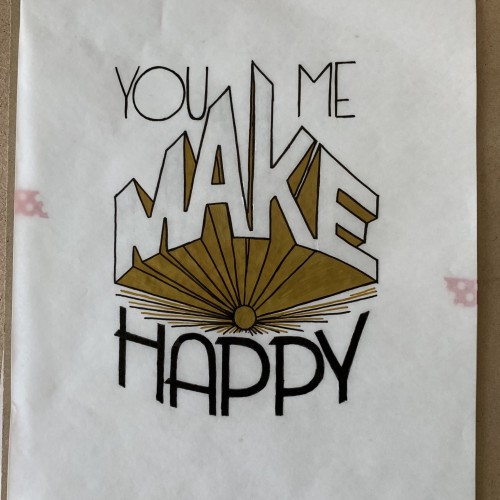
The complete first task of my lettering course. I thought maybe wait for the critique and refining it it before uploading here. Yet the suggested changes would make a whole different work.