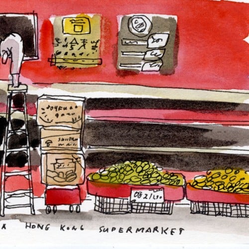
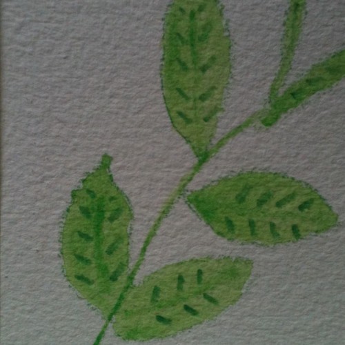
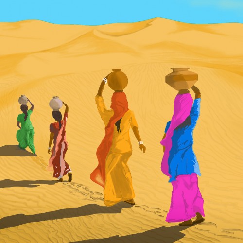
Now that I started to draw my photos, I noticed that I started taking different pictures. I am taking fewer "good" pictures - composition, color all went out the window. Instead, I am taking pictures of things that made me happy or just tickled my fancy.
A stack of blinis, made from my great-aunt's recipe. A book that I accidentally discovered that is so weird and funny. A secret compartment in the wall in a supermarket.
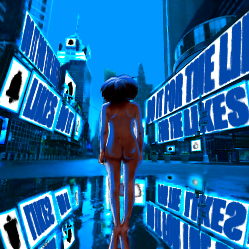
Take it how you want. You either give everything to social media, or it takes everything from you. In the end, you are left naked and hollow. I wanted to make this a simple composition at its core. The image is more about the message.
Times Square took forever to put together, I think the perspective is off just a bit. Overall, I think I did well with shading and depth. I am also improving on drawing/painting the human form. I wish I could trust in shapes and form and go a bit more abstract, but I think that will come with experience.
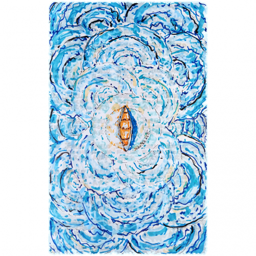
A boat floats at the center of swirling, vibrant blue waves, creating a sense of motion and energy. The contrast between the warm tones of the boat and the cool hues of the water highlights the image's dynamic composition.
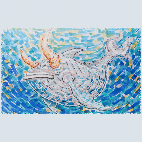
A fantastical bullwhale creature with a mix of whale and bull features glides through a vibrant, swirling, blue and orange hues body of water. The colors blend in a mosaic style, enhancing the creature's mythical presence with a composition that creates a sense of movement and depth, capturing an imaginative underwater scene.
A Bob Ross inspired painting, for the Digital Painting Studio challenge, I know composition is a bit off, but I'm still pretty satisfied with the end result, and sometimes, you just have to let go of the image and work on something else...
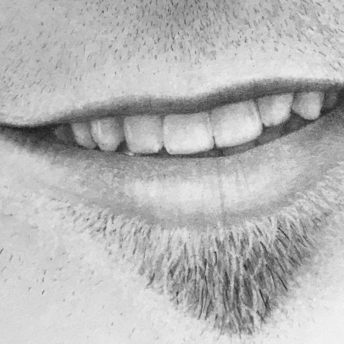
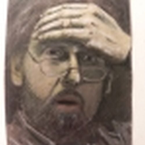
Really working on the composition of a face, trying to draw it as a whole face rather than as the separate parts of a face
Still need some practice but I'm not unhappy with the result
"She stopped to speak to him, altering her mind, and went on her way."
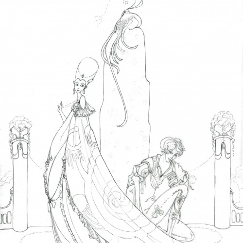
Trying to learn more about Kay Nielsen's style. He illustrated folk and fairy tales in the early 1900s for Grimm and Disney and others. I love his dark/moody style with everything so flowy, elongated, elegant, and tragic. And his amazing compositions.
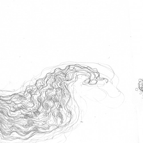
This was a project I did and totally forgot about. It's a Notan style dragon I did for a 2d composition class. I kinda like out it turned out. This was my first major foray into illustrator. Time: 3 hours Medium: Illustrator on Mac
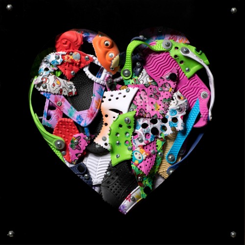
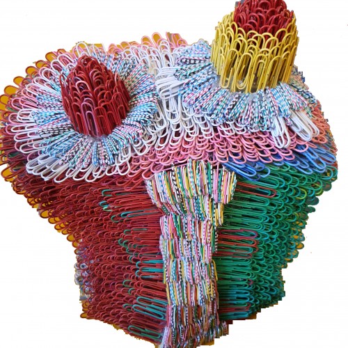
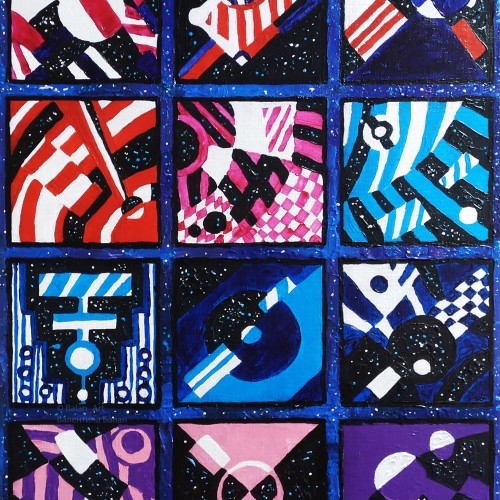
The materials that Meir uses in her works are not of the refined and so she is called an “arte povere” artist. At times she describes her work as someone dealing in alchemy - work develops as in a trial laboratory with different techniques and materials. She says, “ at times the artistic work process is a sort of puzzle demanding the filling in of all the empty squares “.
Some of her work focuses on women, and they incorporate criticism and cultural protest.
Meir has strong opinions about recycling and environmental protection that is represented in her works by use of materials and shapes. In her work she reacts to contemporary art that communicates with the eco system, waste, and she also searches for different worlds. Her works are made up of layers upon colorful layers that when we look at them it becomes clear that the mound of waste she chose is not coincidental. It actually becomes a colorful kaleidoscope of utopia.
Jaffa Meir is a multifaceted, autodidact artist working in painting, sculpture, photography, product design, carpets and furniture, painting on textile, and computer graphics.
The structural composition of some of the works is influenced also by her many years of working in the architects’ office.
Meir also worked in the developing of ideas within the field of ecosystems and recycling for factories such as Coca Cola, and during this process came up with ideas for designing parks and public game spaces using industrial waste products.
Teaching painting is a great task to ask of a person who doesn't paint. I do not paint. I teach the manipulation of media through experience. "Learn from doing!" I say. Monochromatic pastel exercises help my students to get a handle on the media. We explore value and composition and the handling of media. Sometimes happy accidents occur. This was my example to the teens on composition and value. It is a journey.
From Sketch to Final Water Coloring Stages, this is a spread from Tide Day! A lot goes into making a good composition, taking into account the center of the image where the binding is, and how to play with size and negative space. One of my favorite things to do is explore contrasting expressions between characters and highlight their emotions through physical stances and expressions. This was a tough challenge with the lack of limbs and the watery context, but Pearl's stubbornness and attitude shines through!
The materials that Meir uses in her works are not of the refined and so she is called an “arte povere” artist. At times she describes her work as someone dealing in alchemy - work develops as in a trial laboratory with different techniques and materials. She says, “ at times the artistic work process is a sort of puzzle demanding the filling in of all the empty squares “.
Some of her work focuses on women, and they incorporate criticism and cultural protest.
Meir has strong opinions about recycling and environmental protection that is represented in her works by use of materials and shapes. In her work she reacts to contemporary art that communicates with the eco system, waste, and she also searches for different worlds. Her works are made up of layers upon colorful layers that when we look at them it becomes clear that the mound of waste she chose is not coincidental. It actually becomes a colorful kaleidoscope of utopia.
Jaffa Meir is a multifaceted, autodidact artist working in painting, sculpture, photography, product design, carpets and furniture, painting on textile, and computer graphics.
The structural composition of some of the works is influenced also by her many years of working in the architects’ office.
Meir also worked in the developing of ideas within the field of ecosystems and recycling for factories such as Coca Cola, and during this process came up with ideas for designing parks and public game spaces using industrial waste products.
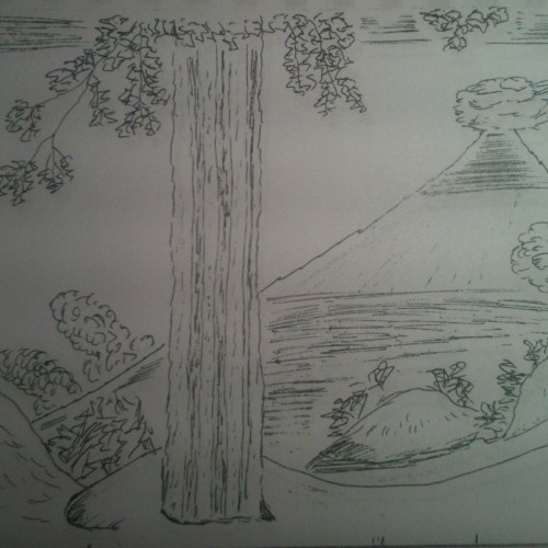
I tried to use my imagination for this, but I had to fall back on photo reference, to finish it. THe problem with the composition is I did not use a background colour. I did this about 3 years ago.
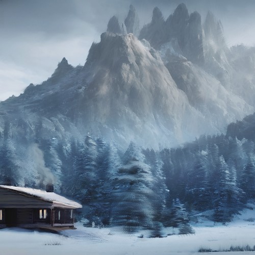
Their are mountains in the background.
My project for a skillshare course I am taking. I am trying to work on developing more textures and drama to my paintings as well as improving on the composition. Any advice or tips that you can share would be appreciated. Thanks!
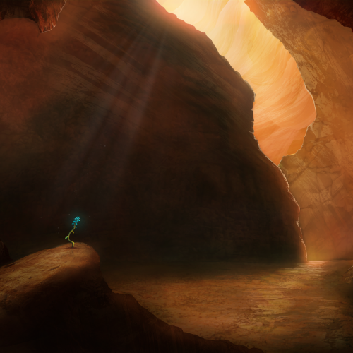
Painted as a project for Painting Environments class: skl.sh/32Khrti
Project parameters:
- Mysterious Cave
- Dark but with moody lighting
- Mostly warm colors but with single blue flower
- Flower is the focal point - use composition to lead eye to flower
The materials that Meir uses in her works are not of the refined and so she is called an “arte povere” artist. At times she describes her work as someone dealing in alchemy - work develops as in a trial laboratory with different techniques and materials. She says, “ at times the artistic work process is a sort of puzzle demanding the filling in of all the empty squares “.
Some of her work focuses on women, and they incorporate criticism and cultural protest.
Meir has strong opinions about recycling and environmental protection that is represented in her works by use of materials and shapes. In her work she reacts to contemporary art that communicates with the eco system, waste, and she also searches for different worlds. Her works are made up of layers upon colorful layers that when we look at them it becomes clear that the mound of waste she chose is not coincidental. It actually becomes a colorful kaleidoscope of utopia.
Jaffa Meir is a multifaceted, autodidact artist working in painting, sculpture, photography, product design, carpets and furniture, painting on textile, and computer graphics.
The structural composition of some of the works is influenced also by her many years of working in the architects’ office.
Meir also worked in the developing of ideas within the field of ecosystems and recycling for factories such as Coca Cola, and during this process came up with ideas for designing parks and public game spaces using industrial waste products.
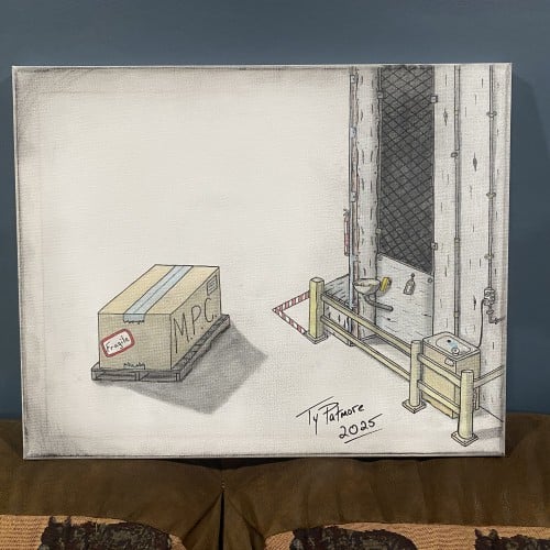
"Industrial Timeout" presents a meticulously rendered scene of solitude and tension within a utilitarian setting. The composition is split between a vast, empty white space and a tightly constrained, detailed industrial corner. In the foreground, a single, unassuming cardboard box sits on a pallet. It is labeled "FRAGILE" and "M.P.C." (possibly a reference to 'Minimum Package Content' or a similar industrial acronym), suggesting a precious, yet standardized, cargo awaiting movement.