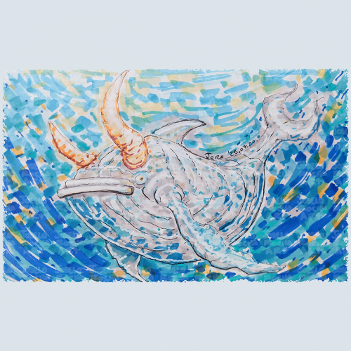
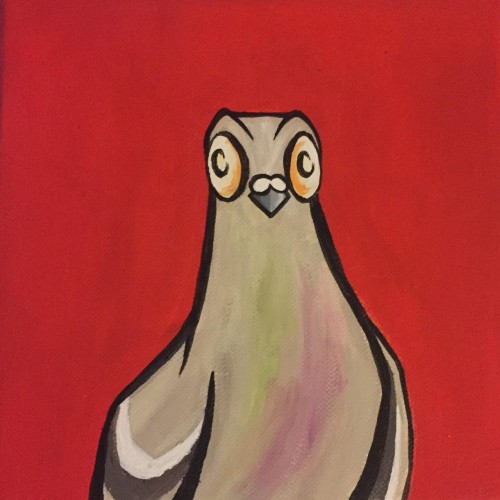
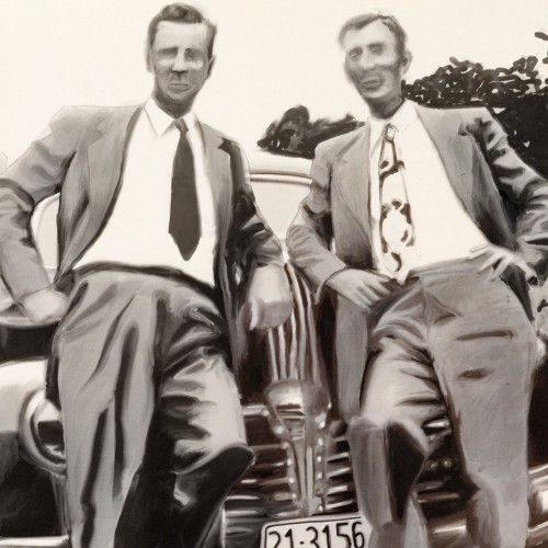
A fantastical bullwhale creature with a mix of whale and bull features glides through a vibrant, swirling, blue and orange hues body of water. The colors blend in a mosaic style, enhancing the creature's mythical presence with a composition that creates a sense of movement and depth, capturing an imaginative underwater scene.
"She stopped to speak to him, altering her mind, and went on her way."
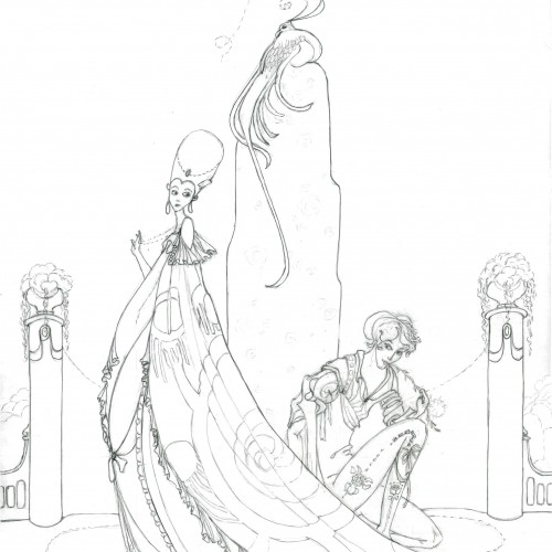
Trying to learn more about Kay Nielsen's style. He illustrated folk and fairy tales in the early 1900s for Grimm and Disney and others. I love his dark/moody style with everything so flowy, elongated, elegant, and tragic. And his amazing compositions.
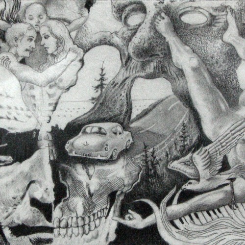
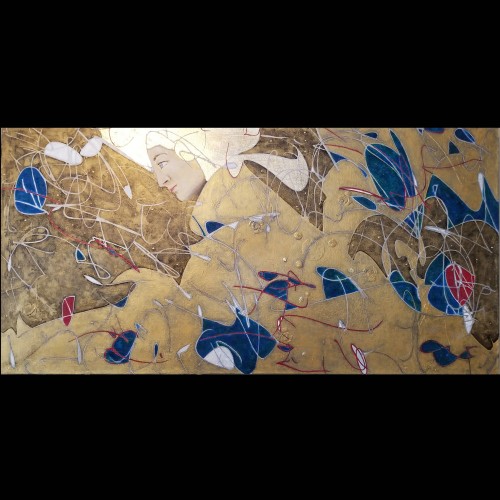
The materials that Meir uses in her works are not of the refined and so she is called an “arte povere” artist. At times she describes her work as someone dealing in alchemy - work develops as in a trial laboratory with different techniques and materials. She says, “ at times the artistic work process is a sort of puzzle demanding the filling in of all the empty squares “.
Some of her work focuses on women, and they incorporate criticism and cultural protest.
Meir has strong opinions about recycling and environmental protection that is represented in her works by use of materials and shapes. In her work she reacts to contemporary art that communicates with the eco system, waste, and she also searches for different worlds. Her works are made up of layers upon colorful layers that when we look at them it becomes clear that the mound of waste she chose is not coincidental. It actually becomes a colorful kaleidoscope of utopia.
Jaffa Meir is a multifaceted, autodidact artist working in painting, sculpture, photography, product design, carpets and furniture, painting on textile, and computer graphics.
The structural composition of some of the works is influenced also by her many years of working in the architects’ office.
Meir also worked in the developing of ideas within the field of ecosystems and recycling for factories such as Coca Cola, and during this process came up with ideas for designing parks and public game spaces using industrial waste products.
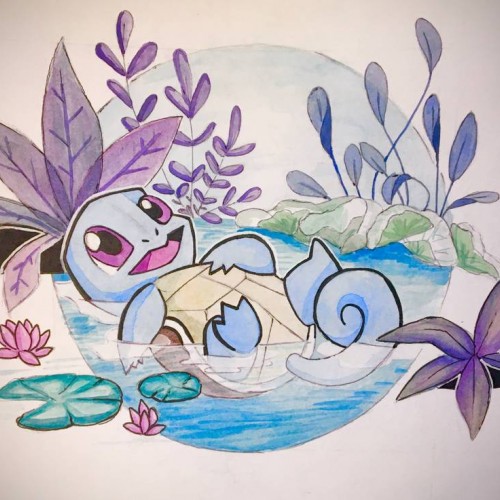
Squirtle: no more no less. Actually more about it, my lighting is bad, aka the yellow tint. Also color picking is really hard, and i might have to do a bit more outlining to the piece to make it look cohesive. But overall the composition is balanced i think, even if i slacked off with the execution a bit towards the end
This was a project I did and totally forgot about. It's a Notan style dragon I did for a 2d composition class. I kinda like out it turned out. This was my first major foray into illustrator. Time: 3 hours Medium: Illustrator on Mac
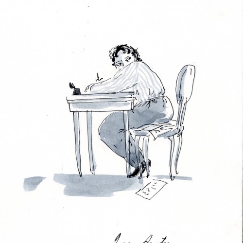
Jane Austen (1775–1817)
Austen never lived alone and had little expectation of solitude in her daily life. Her final home, a cottage in the village of Chawton, England, was no exception: she lived there with her mother, her sister, a close friend, and three servants, and there was a steady stream of visitors, often unannounced.
...
Austen wrote in the family sitting room, “subject to all kinds of casual interruptions,” her nephew recalled. She was careful that her occupation should not be suspected by servants, or visitors, or any persons beyond her own family party. She wrote upon small sheets of paper which could easily be put away, or covered with a piece of blotting paper. There was, between the front door and the offices, a swing door which creaked when it was opened; but she objected to having this little inconvenience remedied, because it gave her notice when anyone was coming.
“Composition seems to me impossible with a head full of joints of mutton & doses of rhubarb.”
From Daily rituals by Mason Currey
#dailyrituals #inktober #janeAusten @masoncurrey
Life is full of difficulties and hurdle. A mixed bag of happy and sad days. But when it comes to measuring them, we tend to weigh them towards the difficult ones more forgetting or avoiding the happy ones. This illustration is a composition to share how small or short life is to worry about tough times. Instead we can focus on being positive and happy and live every moment fully
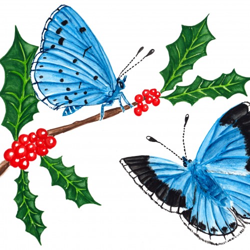
butterflies # ????? : two holly blues. This was a hard one and worthy of an art block
with top and bottom wings distinguishing the species, composition and pose was almost impossible. Cue two of the Holly Blues! :)
From Sketch to Final Water Coloring Stages, this is a spread from Tide Day! A lot goes into making a good composition, taking into account the center of the image where the binding is, and how to play with size and negative space. One of my favorite things to do is explore contrasting expressions between characters and highlight their emotions through physical stances and expressions. This was a tough challenge with the lack of limbs and the watery context, but Pearl's stubbornness and attitude shines through!
I changed the composition, types of silhouettes, and background texture a few times.
I didn't have any expectations about the finished work. It was a creative flow with many changes. I think the creative process looks like this.
Don't be afraid to try.
If you make your art digitally, it's simple. You can:
- create a new layer,
- use shortcut Ctrl+Z.
In traditional art, it depends on the art supplies you use. Sometimes you can try more times. Sometimes you need to start again.
But any attempt is better than giving up.
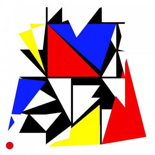
Sometimes we see ourselves in a labirinth in which it's hard to make just one choice among many others and how it can affect our future. It's like going to the supermartket and seeing so many products of the same type and either you pick the same old or you just stare at them not knowing which one is the best and you waist your time reading the composition of each one to choose the one that suits you better.
This turned out to be a finished painting. It started with a full canvas of doodle lines (check my patreon log if you are interested in the raw file) This was executed just this March. Still, no lines were altered except the face area. Impossible you say?
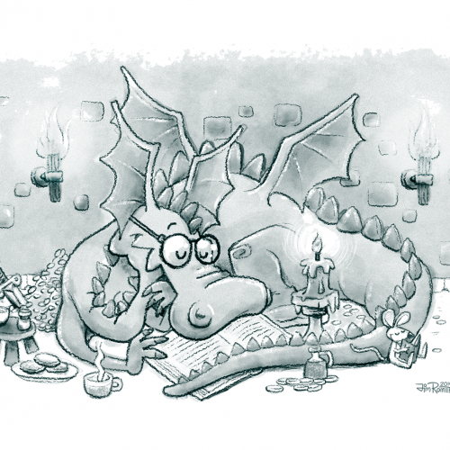
UPDATE: I was working on this illustration a while back, but I had no spare time and had to put it aside. The composition was too busy, but now I think it looks a little better. I made a few major changes, like:
• Made adjustments to light sources
• Created bolder outlines
• Got rid of the Knight reading over the dragon's shoulder
Français : L’Appropriationnisme ou le « Remake » est un concept simple. En effet, il suffit de reprendre le travail d’un artiste et signer la nouvelle production de son nom. Il ne s’agit, en aucun cas, de copier l’œuvre comme pourrait le faire un faussaire. Il ne s’agit pas non plus de plagier l’œuvre.
En ce qui me concerne, j’utilise l’œuvre célèbre d’un artiste reconnu. En réutilisant une œuvre originale préexistante et célèbre, condition sine qua non, je propose de rendre un hommage. Il ne s’agit en aucun cas d’un manque d’inspiration surtout lorsque l’on sait maintenant que : « l’art naît de l’art et non de la nature » : Ernst Gombrich.
Dans cette série, j’ai voulu revisiter des œuvres célèbres en utilisant ma technique graphique de l’éloge de l’approximation mettant en évidence la problématique de la défaillance et de la mémoire vaporeuse.
English: Appropriationism or Remake is a simple concept. Indeed, it is enough to take again the work of an artist and to sign the new production of his name. It is not a question of copying the work as a forger could do. It is not a question of plagiarizing the work.
As far as I'm concerned, I use the famous work of a recognized artist. By reusing a pre-existing and famous original work, condition sine qua non, I propose to pay tribute. It is by no means a lack of inspiration especially when we now know that: "art is born of art and not of nature": Ernst Gombrich.
In this series, I wanted to revisit famous works using my graphic technique of praising the approximation highlighting the problem of failure and vaporous memory.
https://www.pierretomyleboucher.fr
Chari is one of my favorite folks to draw! I have been drawing a lot more while out and about. Using the cheap graph composition notebook, non-expensive art supplies and going to a coffee shop to draw people. Sometimes I can get a likeness with my mind, eyes, hands and draftsmanship and other times it is the "many moods of my subject." :-) This is a place (in my book) where I can learn from my perceived fails. ****The images are sideways! I know this. I do not know how to make them portrait orientation. They started out as portrait-scaped orientation and now they are landscape. Well..... Okay then. The figurative landscape. Hahaahhha! Cry. I even tried the visa versa. Nope. They want to be on their sides.
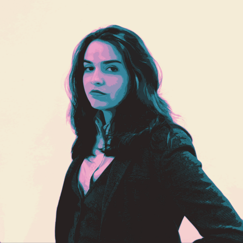
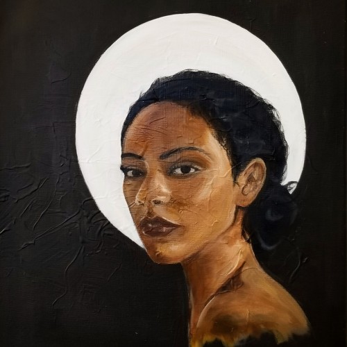
Eve is a continuation on my series of portraits. This piece represents my maturing technique and style as I begin to experiment with creamy consistencies. The painting displayed my ability to capture facial expressions.
My trip to Paris, France influenced my painting style. I was struck by the realism and drama depicted in various compositions, but also the lack of diversity. This piece is named "Eve" questioning whether the holy subjects depicted in European art were, in fact, part of a different race altogether.
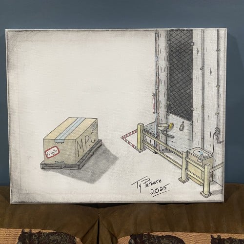
"Industrial Timeout" presents a meticulously rendered scene of solitude and tension within a utilitarian setting. The composition is split between a vast, empty white space and a tightly constrained, detailed industrial corner. In the foreground, a single, unassuming cardboard box sits on a pallet. It is labeled "FRAGILE" and "M.P.C." (possibly a reference to 'Minimum Package Content' or a similar industrial acronym), suggesting a precious, yet standardized, cargo awaiting movement.
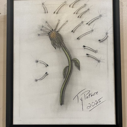
This captivating drawing by Ty Patmore (2025) beautifully illustrates the final stage of a dandelion's life cycle, transforming the common weed into a subject of elegant art. The central, spent head of the flower is rendered with intricate texture, while the detached seeds are given a light, airy quality as they float away. The subtle shading and focused color on the stem provide a grounding element to the otherwise ethereal composition, making it a perfect piece for anyone who cherishes the simple, magical moments in nature.
This artwork beautifully reflects the essence of Eco Friendly Packaging Eco Friendly Packaging by uniting nature and design. A simple kraft paper box, tied with organic twine, carries a sprouting green plant that symbolizes life, renewal, and sustainability. The composition turns ordinary packaging into a statement of environmental care, reminding us that every choice can support a greener future.