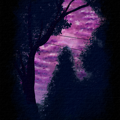
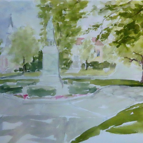
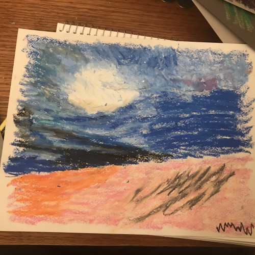
I was working on nighttime or dark themes and trying to get more contrast than the last piece I made. I wanted to also work on atmospheric perspective and depth with the clouds. Overall, I am pretty happy with the outcome. This is from a reference picture my husband took from our backyard. Painted with Rebelle 6 Pro.
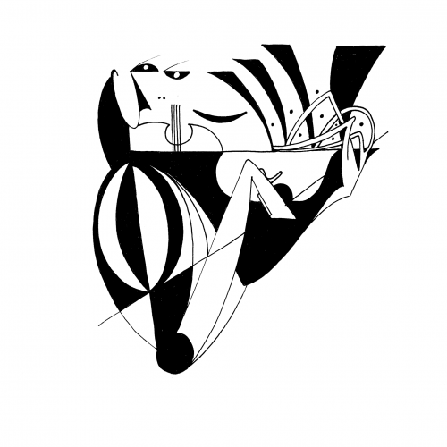
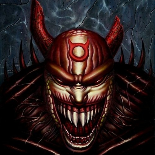
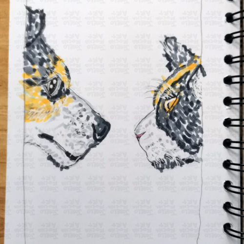
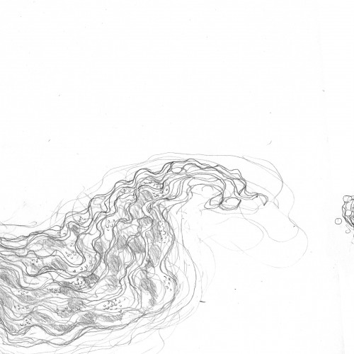
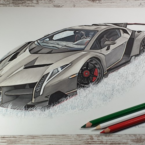
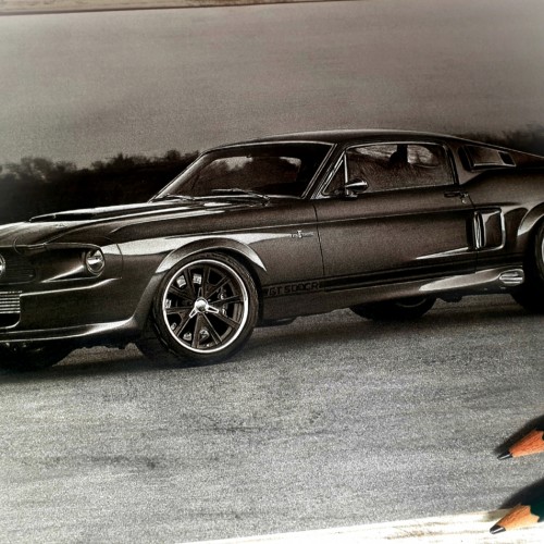
A little o' this, a little o' that. All on 8.5X11 heavy white card stock. Some colored pencil. Using photoshop only to render contrast, no other manipulation.
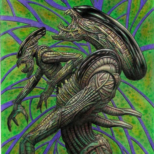
One day I was watching Aliens, Predator ,and AVP things and It just make me get so inspired. I love those franchise to start with ,but gosh getting exposed to those franchises again just pouring art juice on me to get me so inspired to create as you this art piece. I wanted to have minime alien coming out of adult aline chest instead of cliche baby alien coming to make it different than what people expect. I just wish I had Artist grade color pencils instead of student grade I used on my color pencil art pieces, but soon or later I want to get artists quality color pencils. I am dying to try Polychronos color pencils. It is oil based color pencils. I been using wax based,but polychronos are expensive even more so than Prismacolors. If i want to save money and i gotten this brand before . It is Staedler triangle coloe pencils. They sell this stadeler color pencils of 48 colors for $13 at walmart.com. I might get that one I dunno. I do wana get Polychronos if not prismacolor but anyways Here is the art work using shitty color pencils. It seems like this scan looks better than my originals cuz i scan it and bring it to Photo impression software that came with the scanner to boost a bit of contrast cuz if u did not know student grade color pencils have less pigementations and more white fillers so u cannot make dark really nice dark or hightlight really nice strong highlight like artist quality color pencils can bring. DONE 2022 WITH STUDENT GRADE COLOR PENCIL ON 11X17 BRISTOL ORIGINAL ART $160+S/H AND I AM OPEN FOR COMMISSION COLOR PENCIL OR LEAD PENCIL WORK. SIZE RANGE FROM 8.5X11, 9X12, 11X14, 11X17 COMMISSION RATE STARTS FROM $20 AND UP. LEAVE COMMENT OR JUNGMEISTER4@YAHOO.COM I AM SELLING MY ORIGINAL ART. I have my 2023 Wall calendar up for sale $19.95 with my artworks through Artwanted.com art community website. Click or copy&paste the link below and would be appreciated if you can support me on the calendar https://www.artwanted.com/artist.cfm?ArtID=115637&Tab=Calendar
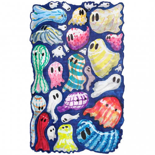
Howcome ghosts only wear white sheets? A group of whimsical, colorful ghosts fills the space, Each figure is unique, featuring different patterns and hues that provide a playful and vibrant contrast. The overall effect is lively and imaginative, evoking a sense of fun and mystery.
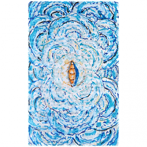
A boat floats at the center of swirling, vibrant blue waves, creating a sense of motion and energy. The contrast between the warm tones of the boat and the cool hues of the water highlights the image's dynamic composition.
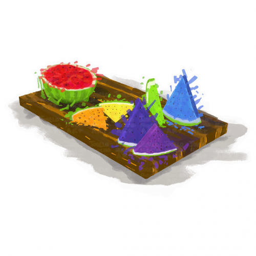
A vibrant assortment of rainbow watermelon slices is arranged on a wooden serving board, featuring colorful triangular and round shapes. The contrasting colors against the neutral background create a lively and appetizing display.
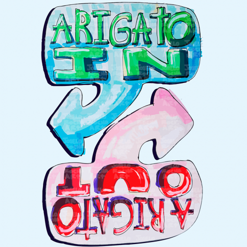
The image features colorful, hand-drawn text with arrows labeled 'Arigato In' and 'Arigato Out'. Inspired by Ken Honda and the philosophy of Happy Money.
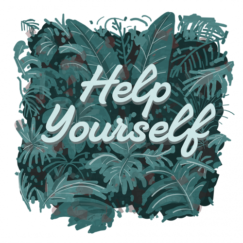
Lush green leaves form a vibrant background, setting a calming tone with the motivational phrase "Help Yourself" in the center. The contrast between the text and the foliage captures attention and invites reflection.
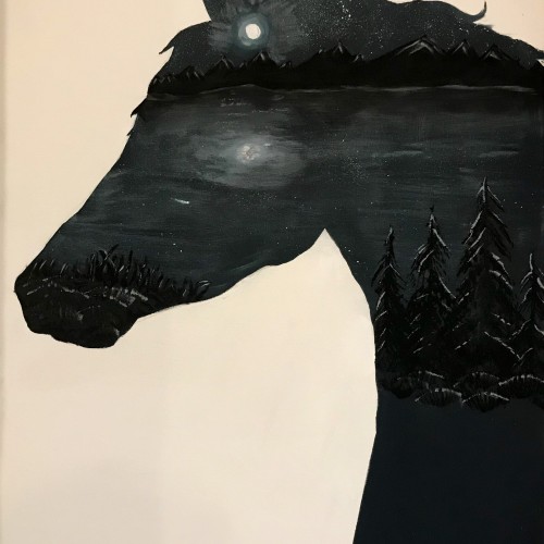
This is my most recent work, just finished. I really had a lot of fun with this one. It didn’t turn out as colorful as I hoped but the contrast is spot on. If you’d like to give me a suggesting, i’m still trying to decide if i should fill the lower right chest area of the horse. It doesn’t make sense to leave it blank but i’m afraid changing it might ruin what I have. Any opinion is welcome! :)
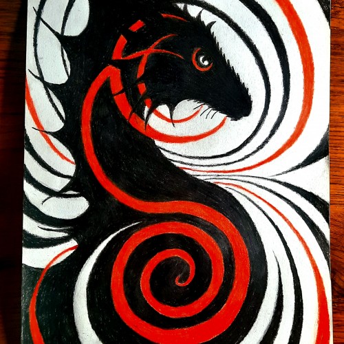
I honestly don't like using color tones like this. I actually really enjoy the black and white contrast. I have always loved black and white images, cartoons and movies. But I try.
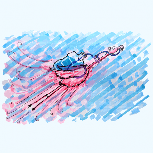
A vibrant pink flamingo bird is depicted soaring across a blue textured sky with a big water container in his back, its pink and blue hues create a striking contrast. The bold strokes and dynamic movement add a playful energy to the scene that reminds us to always stay hydrated.
Starting this past winter I began redoing some of my old artwork. This one was painted about 15 years ago--is quite pale. Soon I'll be brightening it, adding more value contrast. After each redo is done, I choose the next. Anyone else out there do redos? I'd love to hear about your experiences.
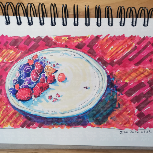
A vibrant fruit bowl filled with a variety of colorful mix of red fruits like strawberries, blueberries, and raspberries. The bright, bold colors create a striking contrast against the background.
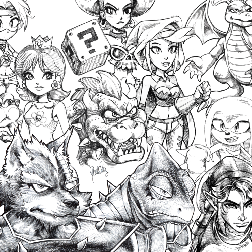
#28 - A collection of ballpoint pen sketches drawn on printer paper & scanned. This is what my lines look like when I'm not using a stabilizer in digital software to get the nicest clean lines. I tried to separate my scanned lines from the various shades of off-white that the scanner picked up. I adjusted the brightness and contrast levels in photoshop but I'm not very knowledgeable on how to achieve the best results.
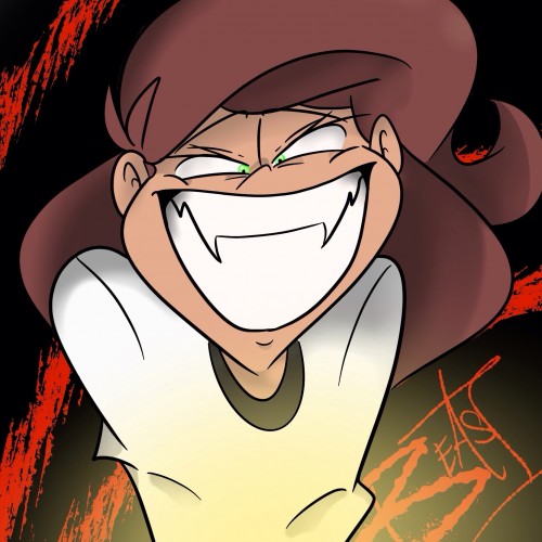
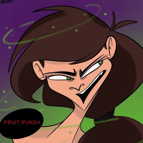
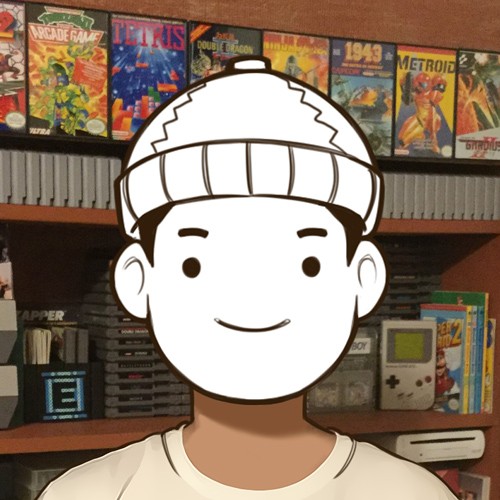
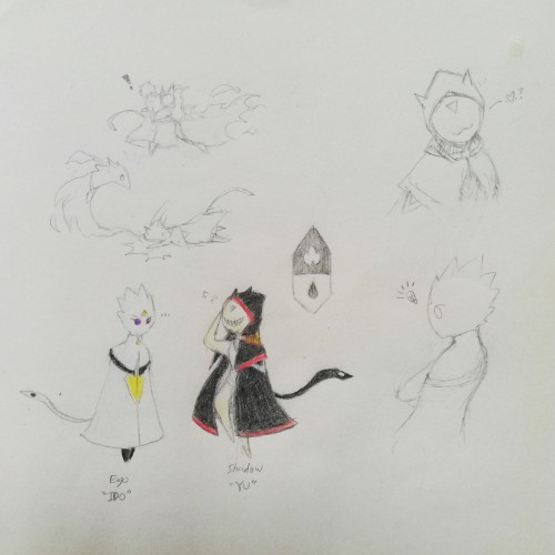
Been developing in a way to free myself from external reference-based OC concepts, which was where I started from in drawing. In a way, exploring how I view characters from my own eyes. Here, is an example of drawing myself in two contrasting counterparts. Personal preferences are actually pretty simplistic by appearance.
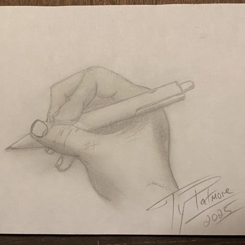
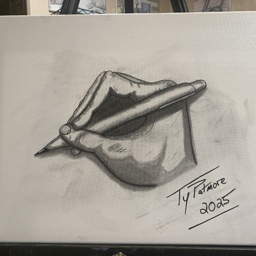
A striking, high-contrast graphite study of a hand in the act of writing. Created in a rapid 45-minute sitting through self-observation, this piece captures the intricate anatomy and focused tension of the artist's own hand as it holds the pen. The tip being pencil the top being pen and finger tips slightly smudged incorporate all aspects of the mediums used to create it.
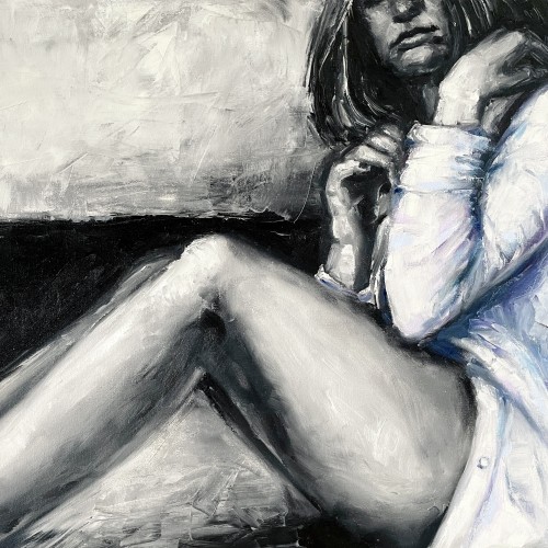
"The painting ""The Girl in a Shirt"" is one of the paintings series ""Her"".The artwork is painted in oil on canvas with wide textured strokes of a brush and a palette knife. In the work, we can see the opposition of a gentle female image and deliberately careless aggressive rough strokes of paint. The artist plays of black and white hard contrast against delicate pastel colors. The girl depicted in the painting feels
constrained by external conditions, which prevents this painting from having an erotic value. The girl nervously tries to unbutton her shirt in order to get more air and freedom. Her pose is not balanced, which shows even more uncertainty and indecision. That's why this artwork is considered rather dramatic."
From Sketch to Final Water Coloring Stages, this is a spread from Tide Day! A lot goes into making a good composition, taking into account the center of the image where the binding is, and how to play with size and negative space. One of my favorite things to do is explore contrasting expressions between characters and highlight their emotions through physical stances and expressions. This was a tough challenge with the lack of limbs and the watery context, but Pearl's stubbornness and attitude shines through!
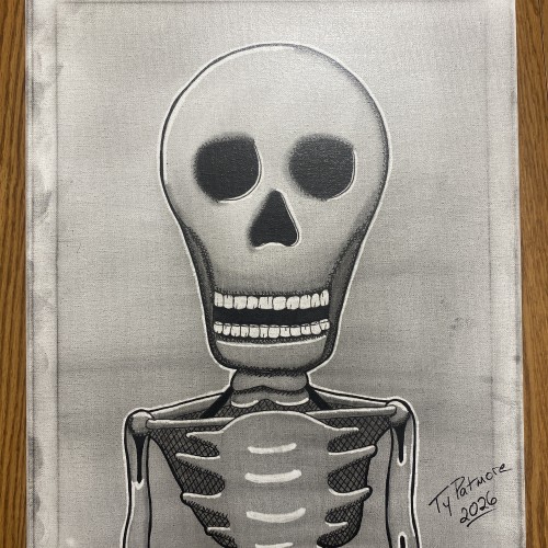
Stripped of skin, status, and story, what remains is the truth beneath it all. Bone Deep is a minimalist skeletal portrait rendered in graphite and ink on canvas, built through cross-hatching, stark contrast, and deliberate restraint. The exaggerated skull and hollow eyes confront the viewer directly — not with fear, but with inevitability.
A solitary rowboat drifts across a muted, restless surface, unanchored and unattended. Rendered in charcoal, ink, and subtle white highlights, the vessel exists in a quiet state of motion—moving, yet going nowhere. The surrounding water is suggested through loose, rhythmic lines, emphasizing atmosphere and isolation over realism.
The boat is sharply defined against the hazy background, its dark contours and interior shadows contrasting with the soft, unsettled environment. Oars rest unevenly, implying recent human presence while reinforcing absence. The name Perditas—Latin for “lost”—is affixed to the hull, anchoring the emotional weight of the piece without explanation.
This work explores themes of solitude, uncertainty, and endurance. With no shoreline or destination in sight, Perditas becomes a reflection on drifting—physically, mentally, and emotionally—inviting the viewer to confront their own sense of direction within an undefined space.