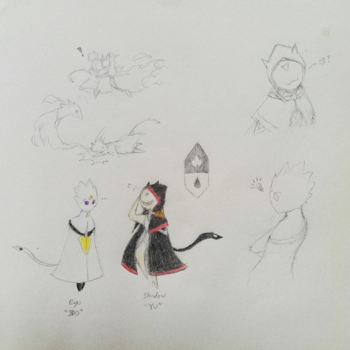
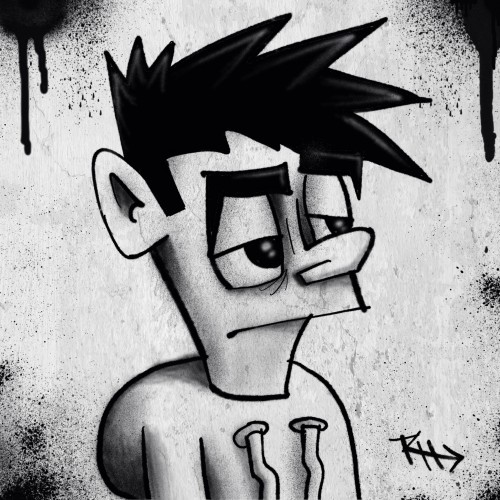
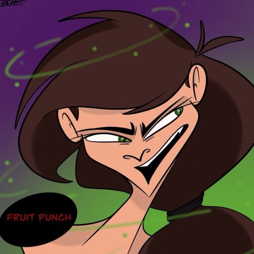
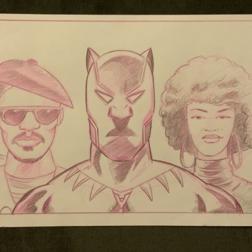
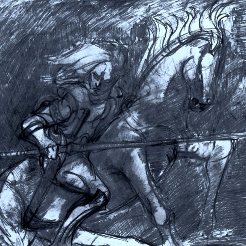
Been developing in a way to free myself from external reference-based OC concepts, which was where I started from in drawing. In a way, exploring how I view characters from my own eyes. Here, is an example of drawing myself in two contrasting counterparts. Personal preferences are actually pretty simplistic by appearance.
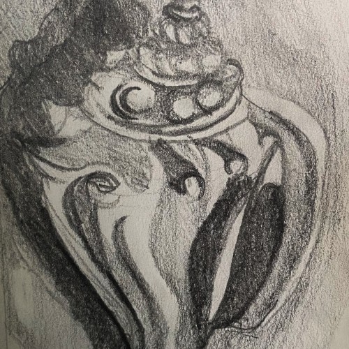
This is a graphite pencil drawing of a conch shell I found on the beach in Florida. I used this sketch as a base for a intaglio print I made. The sketch features the cool textures and forms of the shell in a harsh contrasting light.
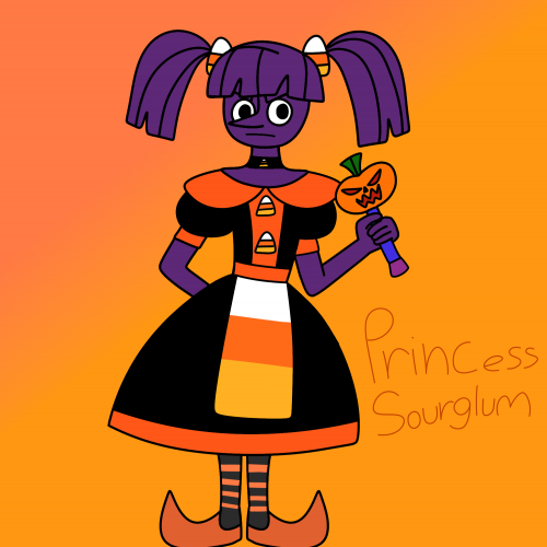
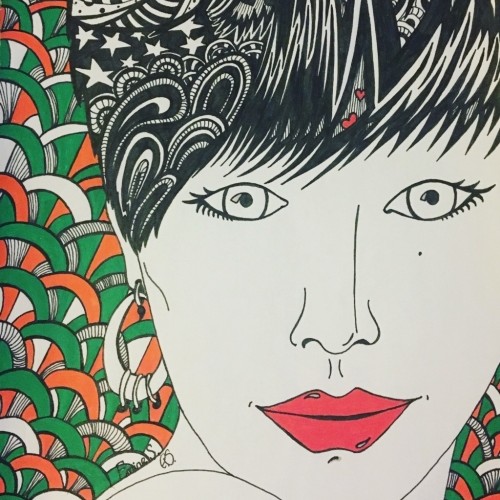
Like her name,she's sour but she's more angry than glum,I really don't like how her dress turned out but I really couldn't try anything else since I'm drawing with my finger again.. hopefully I'll redesign the dress soon and use less orange.Duchess RavenWaves is my inspiration for her.She is a purple licorice princess albeit evil (you know how a lot of people hate licorice?) Instead of having simple sweet candy decorations on her dress she has candy corn decorations (no one likes candy corn) she is really bitter,evil, selfish and ruthless often enslaving many candy people with her father who works as her advisor.her wand isn't alive like Sweetnette's wand it still has powerful magic like Sweetnette,she has to dance and sing to transform, there's a jester form and a military leader form.she is taller and thin,and has a circular face in contrast to Sweetnette's square face.she often uses demonic magic,which sometimes backfires.
I honestly don't like using color tones like this. I actually really enjoy the black and white contrast. I have always loved black and white images, cartoons and movies. But I try.
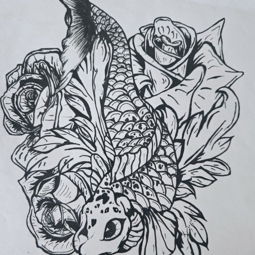
"Pisces Koi" is a bold and intricate black-and-white ink piece that blends symbolism with fluid motion. A koi fish, known for its resilience and transformation, weaves through a bed of blooming roses, creating a contrast between movement and stillness. The fine details in the scales and petals bring depth, making the composition feel alive.
The upward motion of the koi echoes the legend of perseverance—where a koi swimming upstream becomes a dragon—mirroring the Pisces spirit of adaptation and ambition. The roses introduce another layer, possibly symbolizing beauty, personal growth, or challenges that shape us.
This piece captures a sense of quiet strength and fluidity, speaking to those drawn to themes of transformation, water energy, and the balance between struggle and grace.
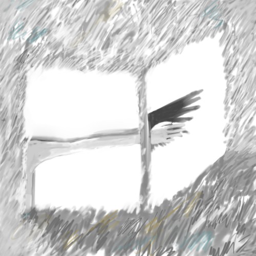
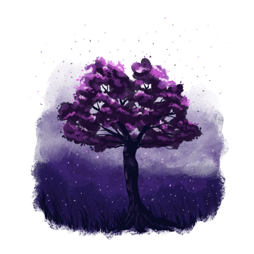
Somehow the tree trunk looks like a female figure to me.
I'm not sure if I really like this illustration, but my imagination plays here a lot.
I could draw a bit lighter background to make more contrast for the tree trunk. What do you think?
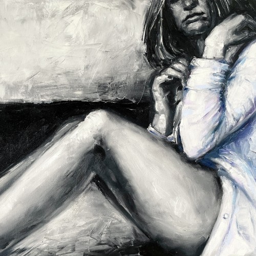
"The painting ""The Girl in a Shirt"" is one of the paintings series ""Her"".The artwork is painted in oil on canvas with wide textured strokes of a brush and a palette knife. In the work, we can see the opposition of a gentle female image and deliberately careless aggressive rough strokes of paint. The artist plays of black and white hard contrast against delicate pastel colors. The girl depicted in the painting feels
constrained by external conditions, which prevents this painting from having an erotic value. The girl nervously tries to unbutton her shirt in order to get more air and freedom. Her pose is not balanced, which shows even more uncertainty and indecision. That's why this artwork is considered rather dramatic."
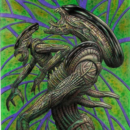
One day I was watching Aliens, Predator ,and AVP things and It just make me get so inspired. I love those franchise to start with ,but gosh getting exposed to those franchises again just pouring art juice on me to get me so inspired to create as you this art piece. I wanted to have minime alien coming out of adult aline chest instead of cliche baby alien coming to make it different than what people expect. I just wish I had Artist grade color pencils instead of student grade I used on my color pencil art pieces, but soon or later I want to get artists quality color pencils. I am dying to try Polychronos color pencils. It is oil based color pencils. I been using wax based,but polychronos are expensive even more so than Prismacolors. If i want to save money and i gotten this brand before . It is Staedler triangle coloe pencils. They sell this stadeler color pencils of 48 colors for $13 at walmart.com. I might get that one I dunno. I do wana get Polychronos if not prismacolor but anyways Here is the art work using shitty color pencils. It seems like this scan looks better than my originals cuz i scan it and bring it to Photo impression software that came with the scanner to boost a bit of contrast cuz if u did not know student grade color pencils have less pigementations and more white fillers so u cannot make dark really nice dark or hightlight really nice strong highlight like artist quality color pencils can bring. DONE 2022 WITH STUDENT GRADE COLOR PENCIL ON 11X17 BRISTOL ORIGINAL ART $160+S/H AND I AM OPEN FOR COMMISSION COLOR PENCIL OR LEAD PENCIL WORK. SIZE RANGE FROM 8.5X11, 9X12, 11X14, 11X17 COMMISSION RATE STARTS FROM $20 AND UP. LEAVE COMMENT OR JUNGMEISTER4@YAHOO.COM I AM SELLING MY ORIGINAL ART. I have my 2023 Wall calendar up for sale $19.95 with my artworks through Artwanted.com art community website. Click or copy&paste the link below and would be appreciated if you can support me on the calendar https://www.artwanted.com/artist.cfm?ArtID=115637&Tab=Calendar
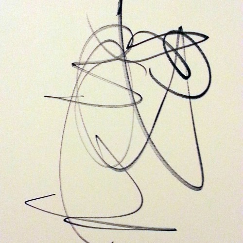
Like smoke, the line finishes as soon as it began. There is no room for any colour shapes, or anything else to be done to it; any additions would disturb the coherent of the flow. Contrast, balance and flow all met there. Art simply surfaced at that very moment and left a trace. This very line represents 3 decades of work!
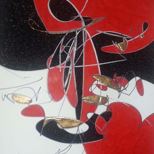
Another transitional one from 2017 in the size of 18" x 24". Looking back, this work starts showing me some glimpses. Abstracts do have an impersonal quality to it. Since it is not grounded with our everyday familiar objects or people, not knowing the visual language would be hard to understand the merits. I guess that is why I fell back to semi figurative.