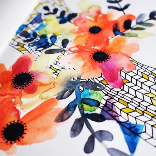
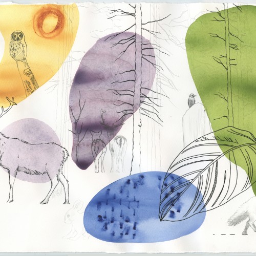
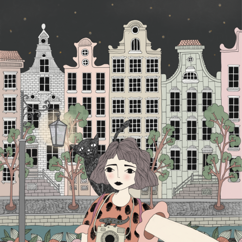
I've started a new mixed media sketchbook. Which is often times unexplainably daunting. To get over it I just dive in with lots of color. Then the fun begins.
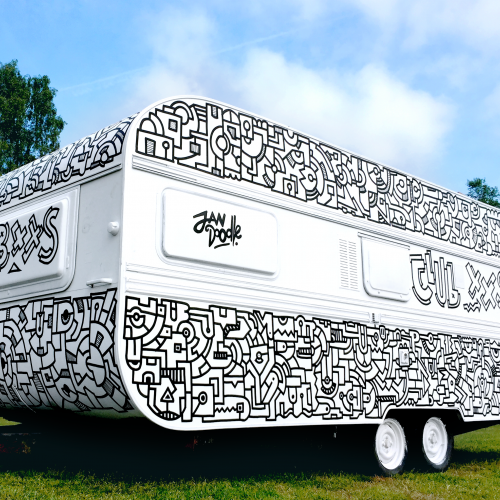
Club XXS was exposed at a music festival in the netherlands and used as a mini club, with dj booth inside and a line-up! :) It's my biggest doodle till now and it was amazing fun to do! my focus was allready on trying bigger stuff, so then a chance came by to do this huge caravan. Awesome.
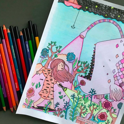
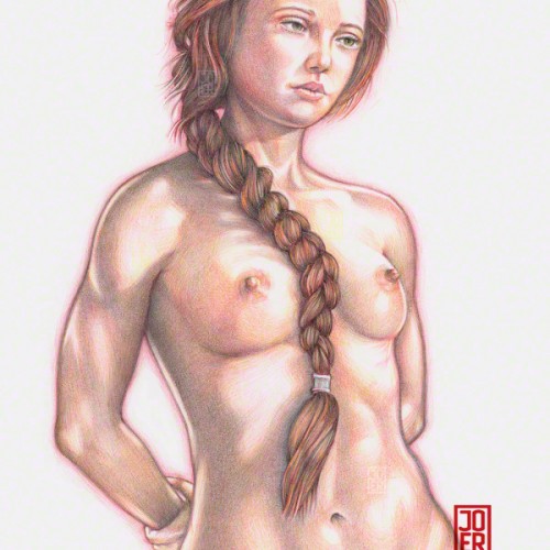
My first venture into artist grade colouring pencils - and I'm smitten! I never thought I could achieve such boldness and blendability with them! I'm still getting used to them and will think about choosing smoother paper with less tooth next time. The texture and weight was more for the water-based gouache along with alcohol inks (which are very unforgiving to even primed heavy paper!). Apologies for the unevenness of lighting between the 2 sides of paper; will correct that when I'm making proper image files.
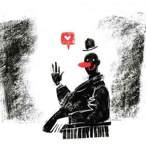
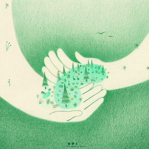
When we help someone there is always something that blooms and grows beyond us. It is an increasingly necessary action in a world that unfortunately is increasingly divided.
@givingtuesdaypt challenged me to illustrate its movement inspired by this year's motto "Together we change the world"!
This day is celebrated on the first tuesday after BlackFriday, calling on anyone to choose a cause that ressonates with them and give back to them however you can. Thus, a wave of massive generosity is created, which can (and should) extend beyond today! Are there any organizations you want to support?
: .
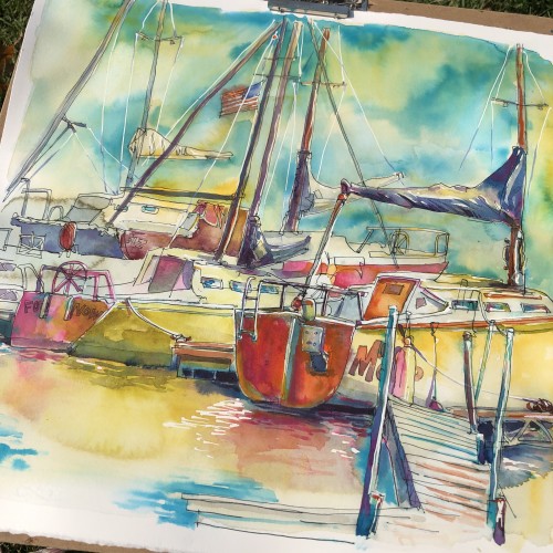
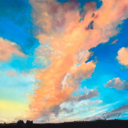
Had a wonderful morning at Perry Lake painting this scene from the harbor. The soothing harbor sounds and a flock of pelicans taking a rest on their way to Texas were my companions. Swipe for a few detail shots. Also... a bonus fly for your nature enjoyment.
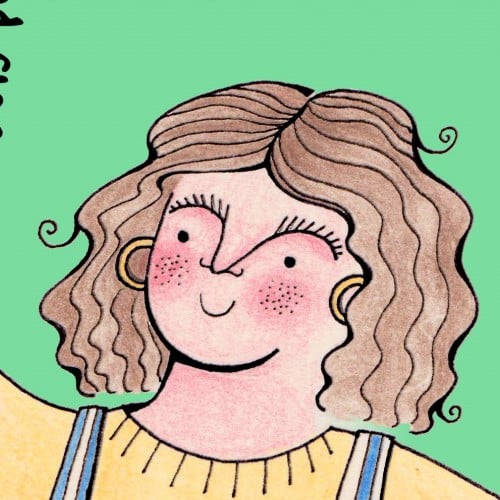
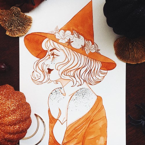
Congrats to anyone else who took part in inktober this year! I focused on combining witches inspired by different types of teas and I had so much fun! I’m conquering my irrational fear of side profiles and I think it’s working, I’ve been really liking side profiles lately and finding them easier to do. I experimented on this piece with adding freckles (they’re a feature in all of my inktober sketches but I haven’t liked how freckles have looked when I’ve dotted them in with a pen or brush) and uh, I guess it was kind of a success? Next time I’ll use my lighter shading colour for them, as I used the ink I use for my lines and it turned out really dark and concentrated, but I think they’re cute! (and I have ink sprays everywhere)
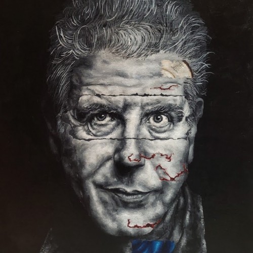
"Parts Unknown," Acrylic on Canvas, 18x24 Some actions we will never know the reason behind, and, quite honestly, we don't always need to know the answer. Anthony Bourdain committed suicide on June 8th, 2018, news that was shocking for most to hear. People continue to speculate what could have caused him to commit suicide, some feel he had more to do, to say before he died. Personally, I find there's some feeling of closure or completeness to his death. I don't know what the feeling is exactly, but it's there. It feels like he left on his own terms, decided it was time. I wouldn't consider his death as him waving a white flag to addiction and depression. He said his shows were intended to tell other's stories, tell them frankly and truthfully. It's interesting how blunt and honest he could seem to be about himself, though he kept so many layers held within. Although we'd love to have a clear cut answer, explanation, reason, what would knowing that information change?
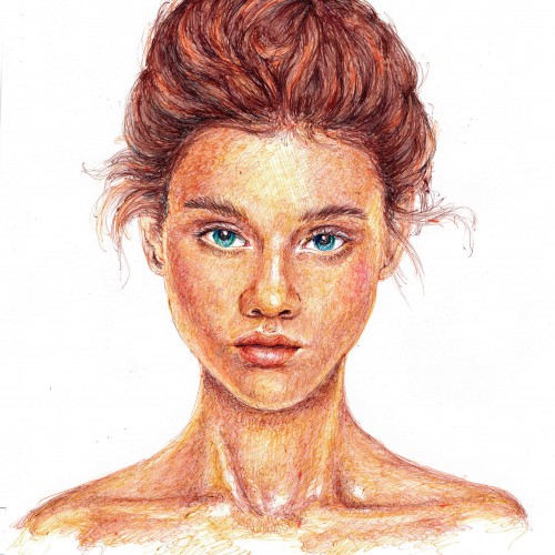
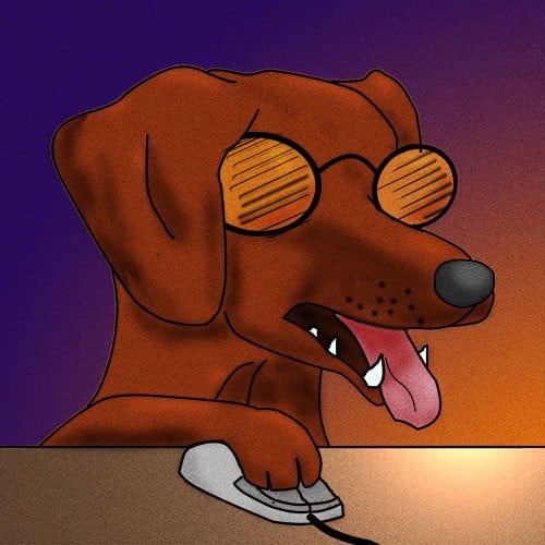
My first ballpoint pen person. This was a lot more time consuming than I expected, but I'm glad I hung in there and finally finished it. The reference for the drawing was a Getty Image.
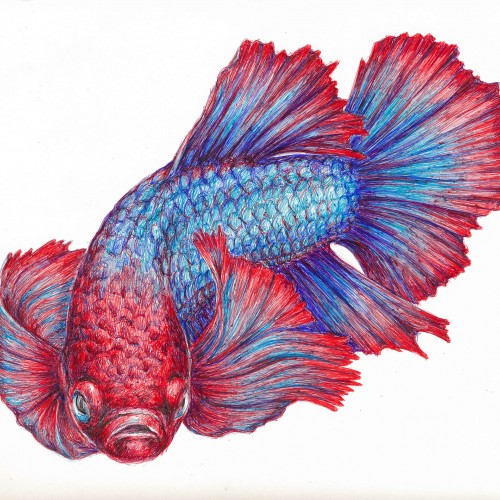
I've been so impressed with the ball point pen art that I have seen on this site, that I decided to give it a try. This is a Betta fish (Siamese fighting fish) done in red, blue, and purple ball point pens. Obviously, I have much to learn....but it was great fun and I have ordered some more colors since I plan on experimenting more. I've enclosed a photo of the work in progress and the various reference photos I used. The colors are more true to the final scan than in the flash photo of my drawing table.
More ballpoint pen experiments. This was trying to "blend" colors, using ball point pens in a similar way to colored pencils. I found Layering evenly to be pretty difficult, esp with the pens blotching and very very limited burnishing. The interesting thing is that the paper doesn't seem to get "tired" the way it does with pencils. This is just cheap printer card stock.
Étude chromatique colorée à l'aquarelle dans le cadre du cours de dessin à la deuxième session.
The final result of a color study exercise made in class. This piece got sold not long ago.
Really enjoying experimenting with soft pastels. This piece was the first time I used Pastelmat. It's an amazing surface to use with pastels as it takes loads of pastel, the colour stays vibrant, and there's minimal dust
Bic4 Ballpoint Pen, Sanrio Novelty 10 Colour Ballpoint Pen on Archival 8.5" x 11" paper.
A breakdown of the Bic4 pen and No-name 10 colour pen layering that I’ve used.
Drawing in a single direction instead of using back-and-forth movement alleviates some of the blotching that happens when using ballpoint pens. The back-and-forth method usually deposits the gunk that builds up on the tip of the ballpoint, smearing them in unexpected and unfortunate places on the drawing. When using the back-and-forth method, I usually have a napkin handy in order to clean the tip of the pen. Model: Meadhbh (Maeve)
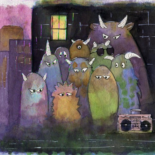
Ink on watercolor paper. I am experimenting with different color combinations. I think the distribution of different sized monsters is acceptable, but i am not quite happy with the colors of them. Suggestions are appreciated!