I have quite a bit of traveling planned this Summer...from NYC to Copenhagen to Venice to Berlin and a few more spots. Very much looking forward to all the different colors, cities, and cultures in the coming weeks.
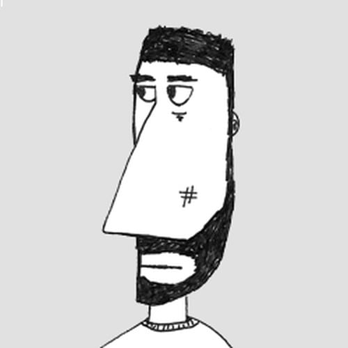
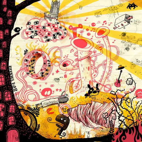
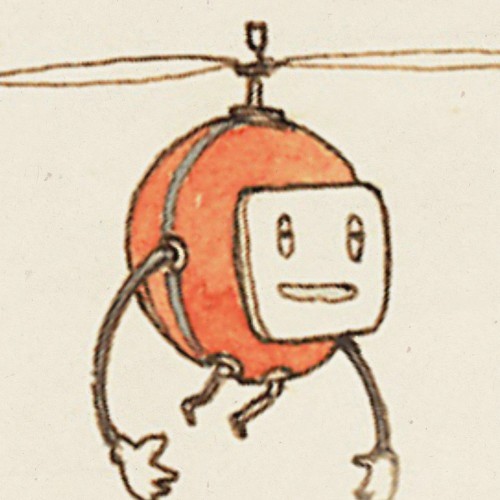
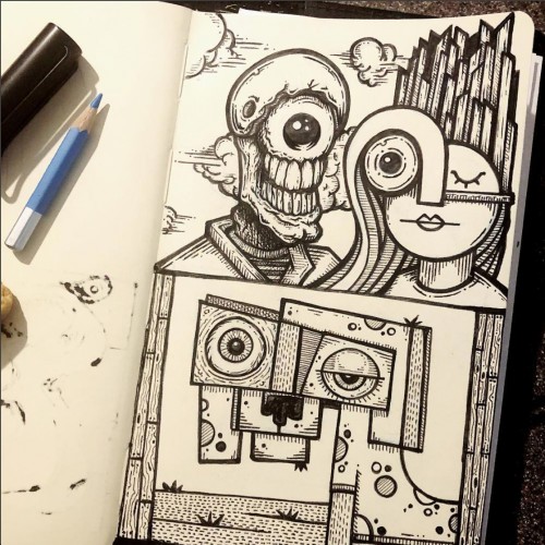
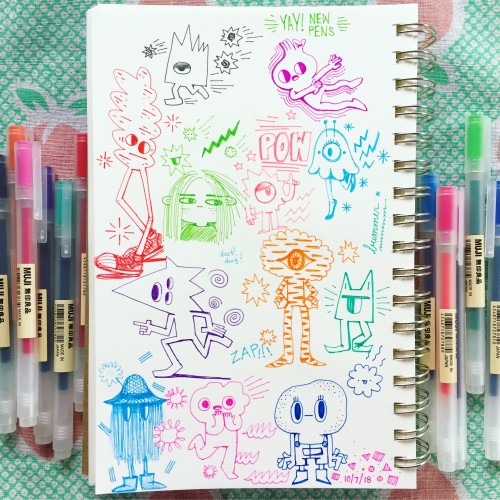
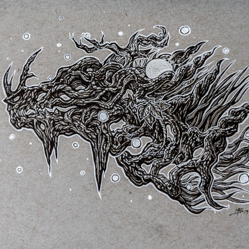
What happens when Jimmy is reading Ezekiel in the morning then discovering @themarcuskingband and @billystrings and doodling on the same day? There is no logical reason to throw all this randomness together in one drawing. This stream of consciousness improv drawing can get weird at times. All I can say is if you were in my head 24/7 it would all make perfect sense. I have become comfortably weird.
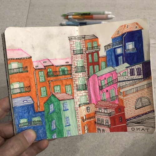
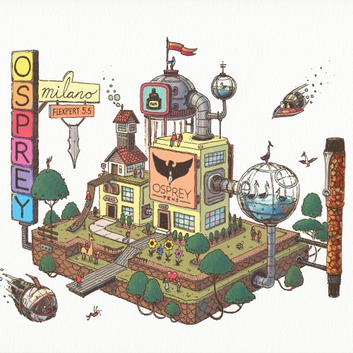
Here's the final color illustration created for Osprey Pens featuring the Osprey Pen Factory. It was drawn with the same fountain pen there on the right... An Osprey Milano 5.5 Flexpert Hourglass nib. Great pen! Colored in Photoshop.
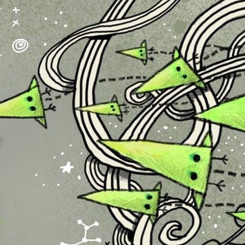
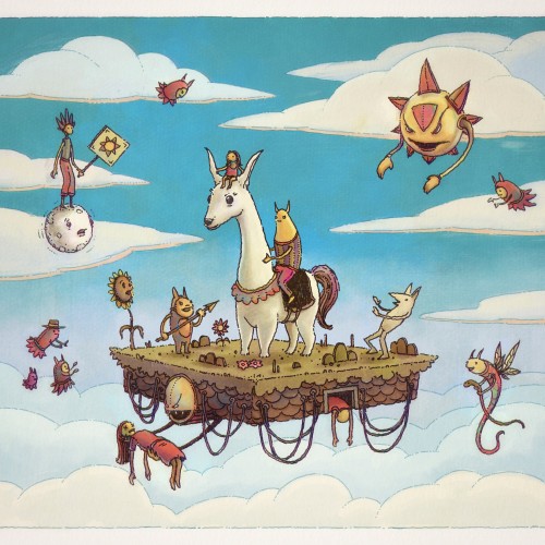
"Flying in the sky with a lady in its arms,
The Platform's heading fast out to the farm.
She was harmed unknowingly and now she will become a seed,
From which the platforms now will feed until they breed." -- Drawn with fountain pens, colored with my iPad using Procreate.
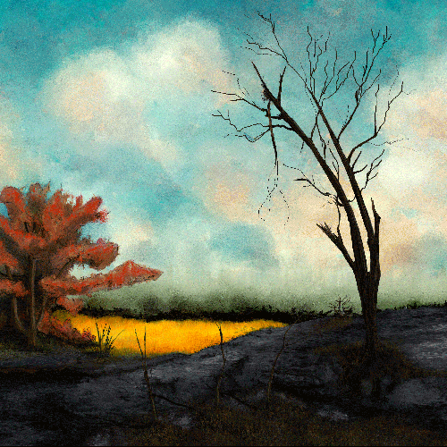
A foggy morning opens up to a burnt landscape. I wanted to paint a couple of different environments in one painting but still aim to be refined. I used fall colors and smaller lines.
I was tired of carrying around a bunch of Microns. I want one or two refillable pens so I started with buying a new Lamy AL-Star Fountain Pen. I love it. I got the medium nib and am able to get a nice range of line width from it. This and maybe a fine nib and I'll be all set for a travel kit. This is the first page I drew with it.
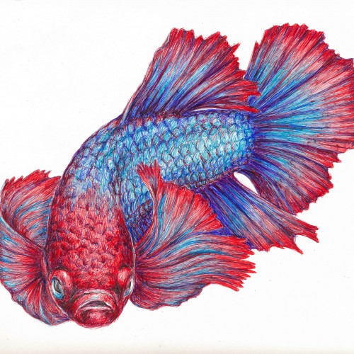
I've been so impressed with the ball point pen art that I have seen on this site, that I decided to give it a try. This is a Betta fish (Siamese fighting fish) done in red, blue, and purple ball point pens. Obviously, I have much to learn....but it was great fun and I have ordered some more colors since I plan on experimenting more. I've enclosed a photo of the work in progress and the various reference photos I used. The colors are more true to the final scan than in the flash photo of my drawing table.
More ballpoint pen experiments. This was trying to "blend" colors, using ball point pens in a similar way to colored pencils. I found Layering evenly to be pretty difficult, esp with the pens blotching and very very limited burnishing. The interesting thing is that the paper doesn't seem to get "tired" the way it does with pencils. This is just cheap printer card stock.
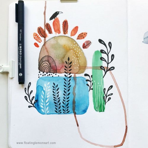
I was on the fence of whether or not I was going to make a piece for the prompt, but I'm glad I did. I tested out some watercolor pens I had recently gotten (I definitely have to practice with them a bit more). I didn't really have a plan for this, and it was a bit fun to do something so spontaneously.
Bic4 Ballpoint Pen, Sanrio Novelty 10 Colour Ballpoint Pen on Archival 8.5" x 11" paper.
A breakdown of the Bic4 pen and No-name 10 colour pen layering that I’ve used.
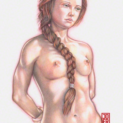
Drawing in a single direction instead of using back-and-forth movement alleviates some of the blotching that happens when using ballpoint pens. The back-and-forth method usually deposits the gunk that builds up on the tip of the ballpoint, smearing them in unexpected and unfortunate places on the drawing. When using the back-and-forth method, I usually have a napkin handy in order to clean the tip of the pen. Model: Meadhbh (Maeve)
Inktober 2020, day 11: "Disgusting". A license not to do the dishes thanks to art! :D
Although I got too carried away trying to capture the reflections to really capture the effect I was after. Also, even though I try to do a line drawing and ink it, my painterly sensibilities keep coming through. When I get a brush pen, I use it like a brush...
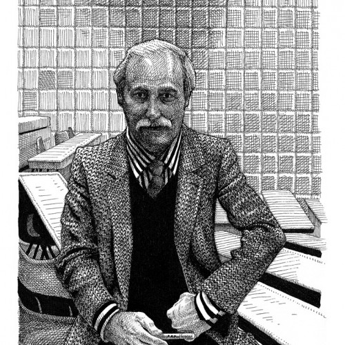
Zoomed in shot of "I'll Sleep When I'm Dead". Created in 2012. Size: 22” x 30” / Micron Pens on Archival Paper. This piece was all drawn freehand - no rulers or measuring tools were used to create this artwork. 2019 kinda looked like this. It had a lot going on. Lots of changes. A close friend of mine predicted 2019 would be "The year of change", and she was right… at least up in my neck of the woods. Anyway, it has been full of good, fun and challenging things – all worth while. Excited to dive into 2020.
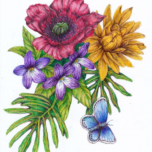
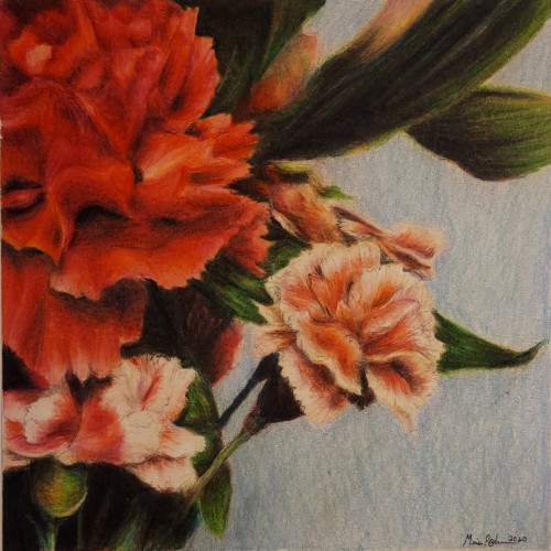
A "longer" colored pencil drawing, took about 4 days, 6.25" x 6.25". What originated from a moment of frustration turned into me staring at some flowers in our house, and then into the drawing I now present. The piece's original purpose has shifted, and hey, that happens. I'm not sure what I'll do with it now, but I'll figure something out...
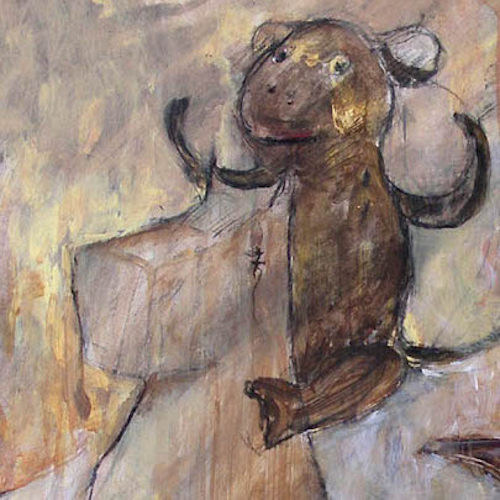
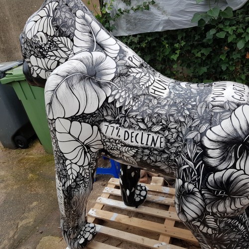
I was lucky enough to get to illustrate a beautiful Gorilla sculpture for Paignton Zoo. He took me 18 months to complete as he was under a purpose built awning at my house. Too hot and the pens dried up, too cold and my fingers froze! He now sits at the zoo and I miss him terribly! He Was decorated using acrylic markers on a white gloss base then varnished with car varnish.
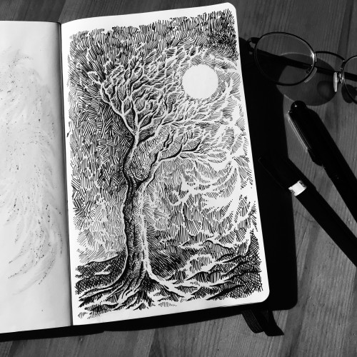
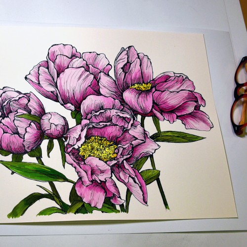
This started as a line drawing based on a photo of peonies in the garden. It’s drawn with three different pens: Micron 005, Micron 03 and Faber Castell Pitt superfine (0.3) on 11x14 Strathmore Bristol Vellum. The paper isn’t terribly tolerant of wet media, so I played around with tinting it in Photoshop because I wasn't sure how it would go. But I liked it in color enough to chance painting the drawing with the nice and bright Dr Ph Martin Hydrus watercolors. It's photographed it on my drafting table with my glasses for scale. The lamp has a daylight bulb, so I think the color (at least where the light is more prominent) is fairly true.
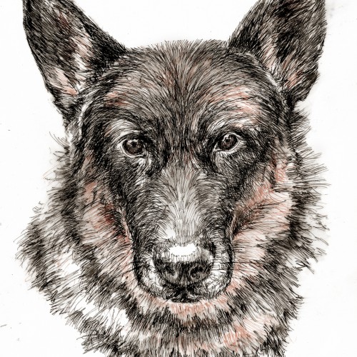
Maia, one of two current German Shepherds was born here at our house ten years ago. She is a grand old lady with a big ears, a big ruff and a sweet personality. This drawing was done from a photo reference AND her sleeping at my feet. I used Pigma Micron Pens in black and brown with a little graphite smudging to add a bit of shadow.
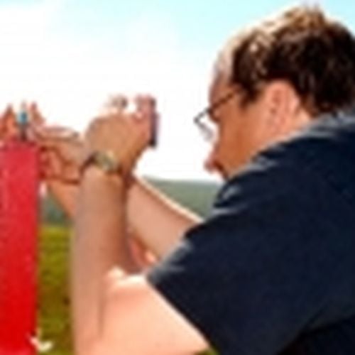
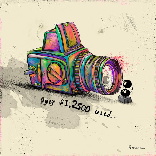
The new Hasselblads are so dang out of my range! I can't even swing a used one. This is the first time using the oil brush in @procreate on a final illustration. I have to admit i didn’t want it to end.