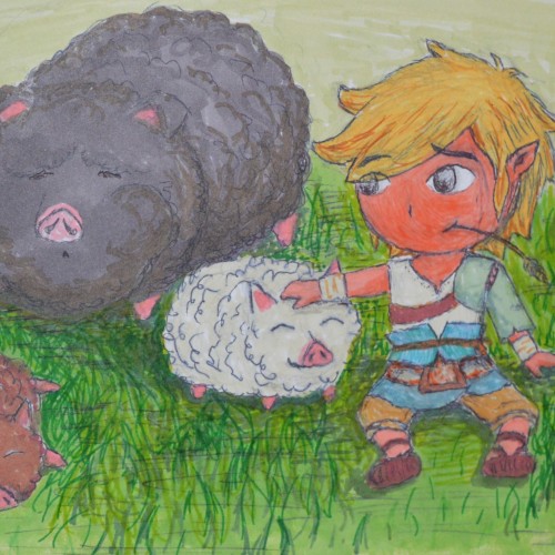
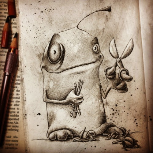
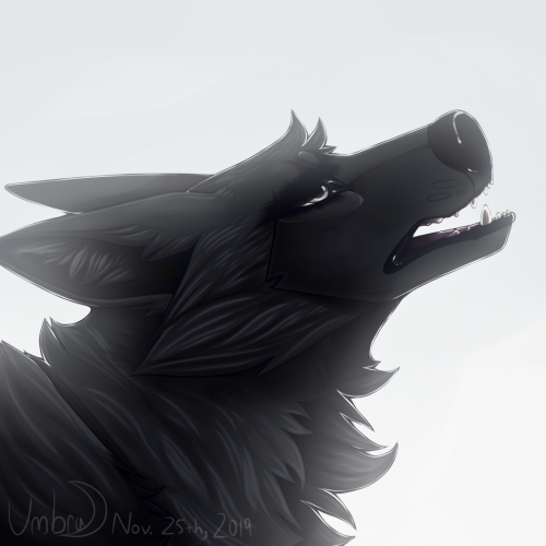
I like Pigs! ^_^ Didn't you know? They make me laugh, lol. In high school I asked my friends and others to draw me pigs so I could make a pig book. I got at least 30 I think. lol. I've always liked the pigs in Windwaker but recently I found out about a rare type of pig called the Mangalista pig! It's furry! As you can see, lol (google search to see what they really look like because I did a cartoon version obviously lol). They kinda are like a Sheep Pig. So yeah, this is ToonLink if he were a Shepard boy or something, kind of like a Rancher (that's why he's wearing the Rancher outfit Link wore in Twilight princess.) He got a tan too (i didn't have a non-rose skin color marker lighter then that, haha). :) If your up for it take the Draw a Pig challenge! :P
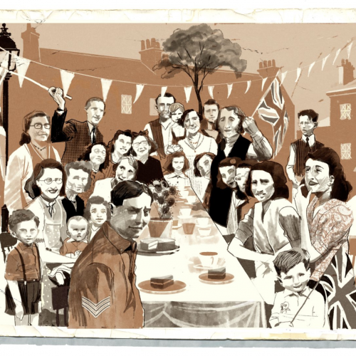
Although this is my commercial work, it's more in keeping with my sketchbook drawings so I'm posting it here. It's for Waitrose My week magazine on old photos of V.E day and what we can lean from them in our current international emergency.
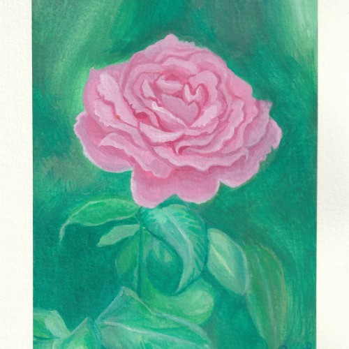
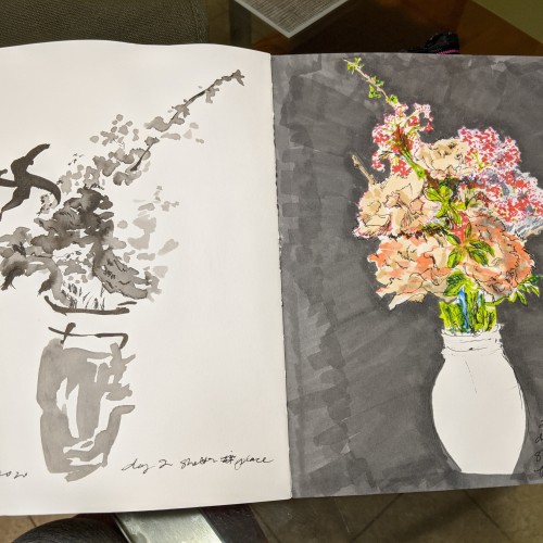
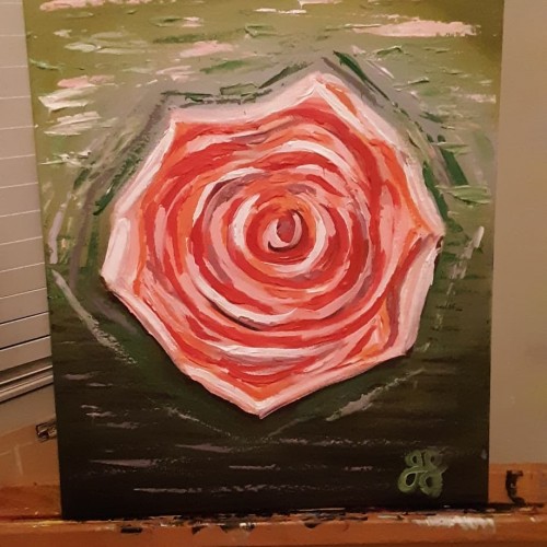
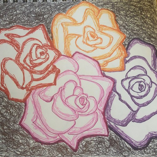
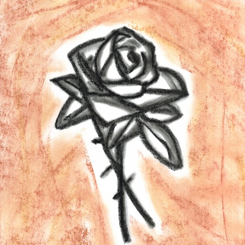
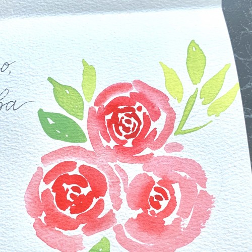
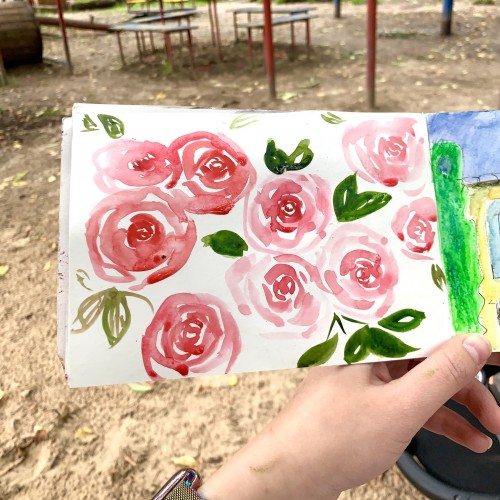
3/17/2020 San Francisco. The art studio is closed because of social distancing for the Coronavirus. My teacher sent out a note with a sketch she did and suggested we do a drawing a day during this isolation, to stay calm and creative and maintain our community. A neighbor put out a bucket with free bouquets, and it inspired me to pause while I was getting dinner started and do this instead. Definitely rusty after not being in the studio for two weeks!
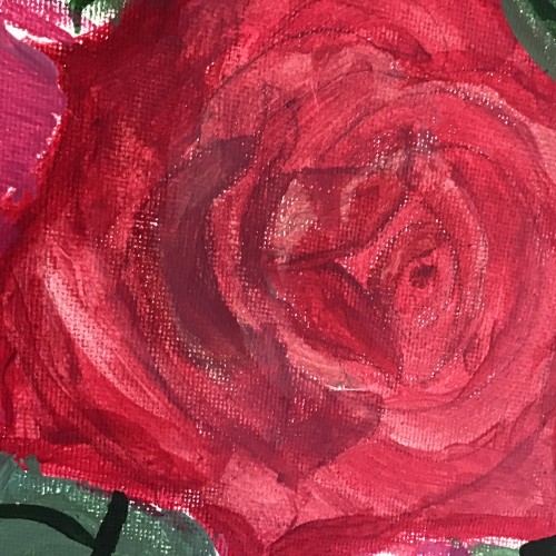
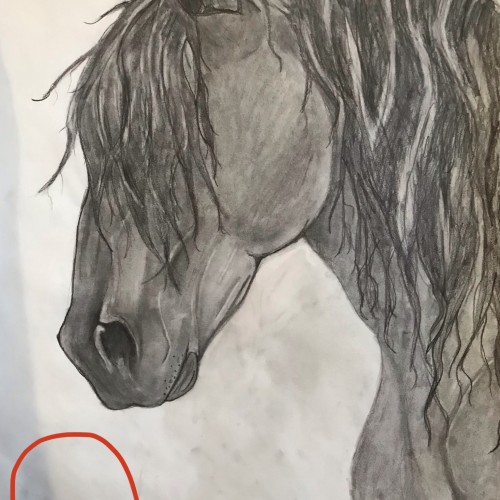
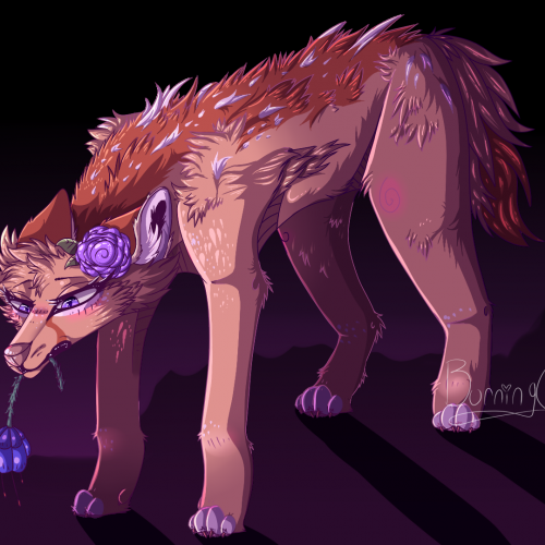
I would like to place a red rose somewhere in the vicinity of the red circle. Should I make the background darker than the Friesian, lighter (grey-ish) than the Friesian, or keep it how it is? Any opinions/comments would be very helpful.
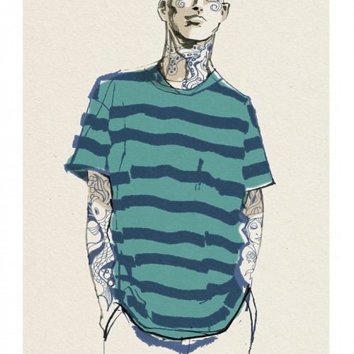
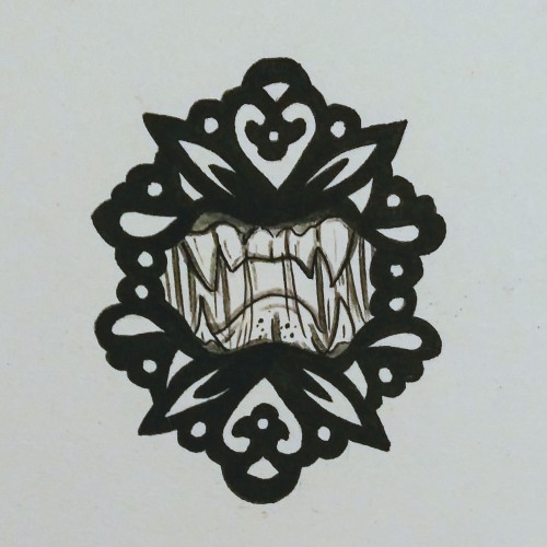
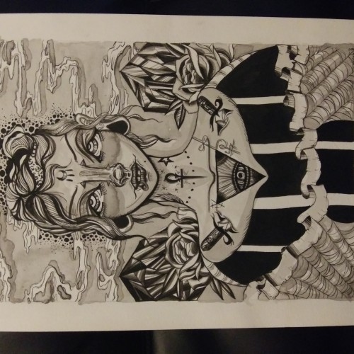
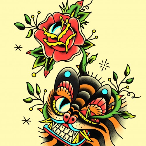
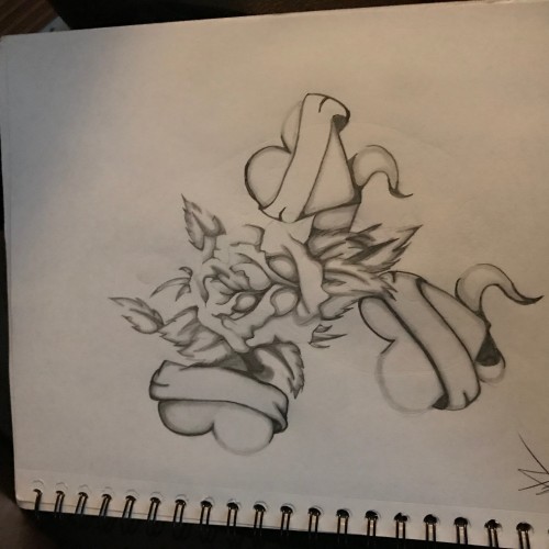
Something a little different than my normal work. I just started a tattoo apprenticeship so I am learning to draw in traditional tattoo flash style. My old style of illustration work will not go anywhere. I am continuing that but just growing artistically and learning something new.
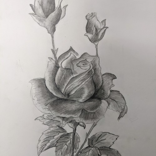
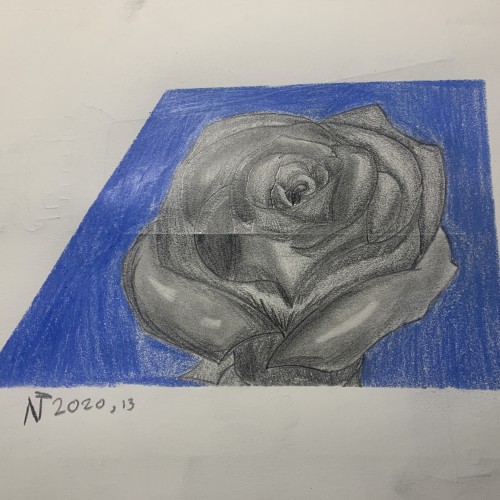
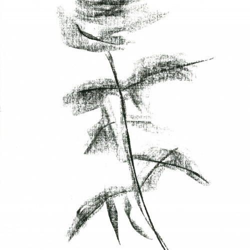
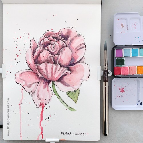
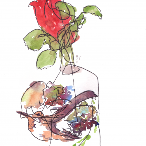
This was intended to be the first layer of a multi-colored rose. The ghostly starkness of the black on white was so appealing to me I decided to leave it alone and call it finished.