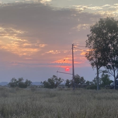
Warm and cool winds mixing and blowing over sand ridges. A memory from living on the edge of a desert in Western Australia. Sometimes, walking the early morning the air is still cool in the shade of the trees, but the moment you step out into the sun, it is already hot.
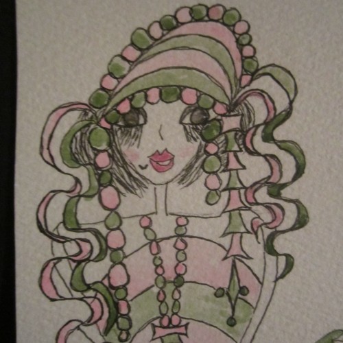
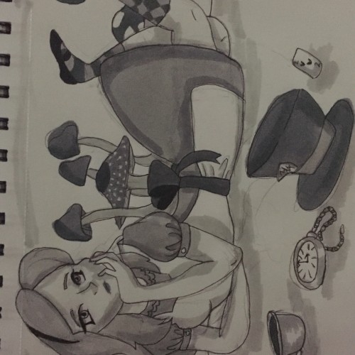
A value study I did with my friend for practice. Based on a D&D picture we found online. First time using different shades of markers, so it isn't the cleanest piece when looking at it up close.
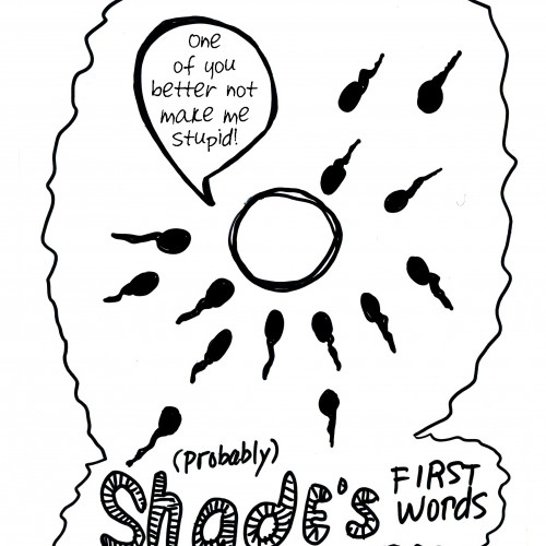
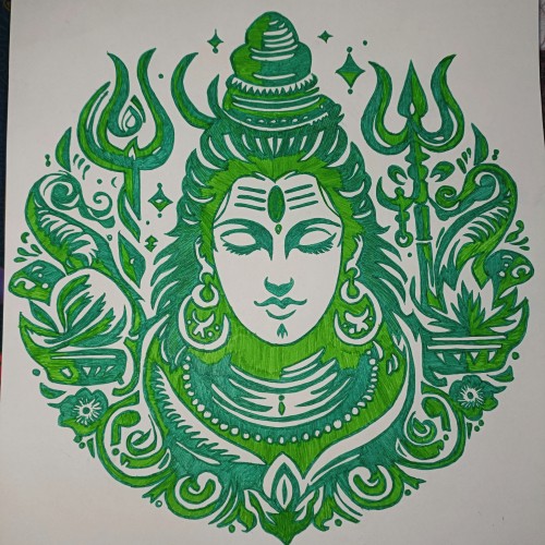
I’m addicted to shading, I chase the shine, I’m addicted, and sometimes you find things along the way like these teeth that make me believe there’s a shade I gotta still hit just for that perfect shine that never falls flat. Ride that shade like a wave…
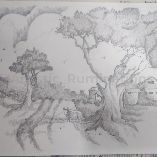
In this captivating cross-hatched pencil shading, a tranquil village scene comes to life. The intricate strokes create a harmonious blend of light and shadow, showcasing the serene beauty of rural life. Thatched roofs, winding pathways, and towering trees are meticulously detailed, inviting viewers to step into the peaceful simplicity of village existence. The gentle interplay of shades and textures evokes a sense of nostalgia and calm, capturing the essence of a timeless village story.
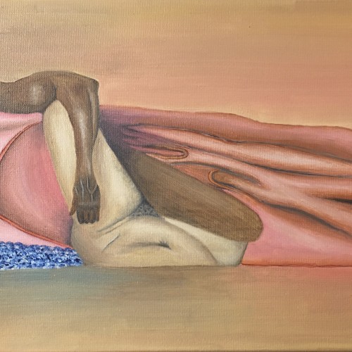
This is an oil painting of an African American couple. They’re sharing an intimate moment with each other. Some maybe would say that they’re the epitome of “Black Love”. His skin is dark tones as compared to her lighter shade. The two skin tones wrapped together in sheets gives life to what I call “The Happy Couple”.
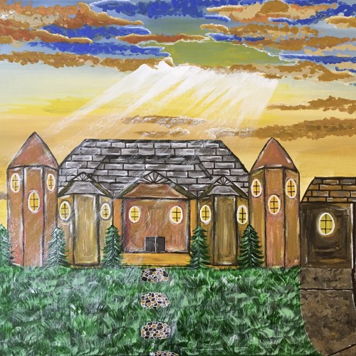
The idea was to create a nice scene of the sun shining down on a house. The skies are showing off shades of blue, and brown, and yellow. I love the rustic style and I feel like I accomplished that look in this painting.
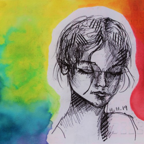
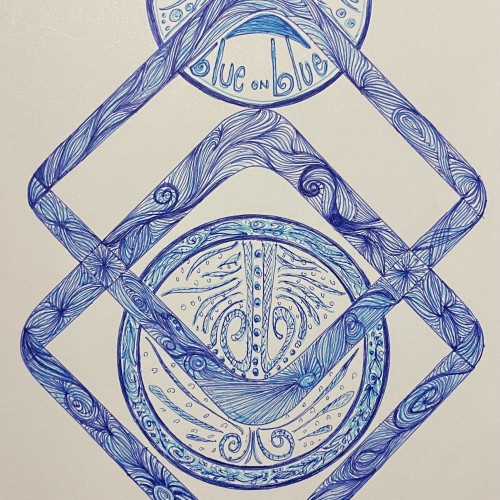
This is a colorful mixed media artwork using a black ballpoint pen complemented with a rainbow gradient painted with watercolor paints. I created this artwork on November 11, which is why it's titled "Angel Numbers."
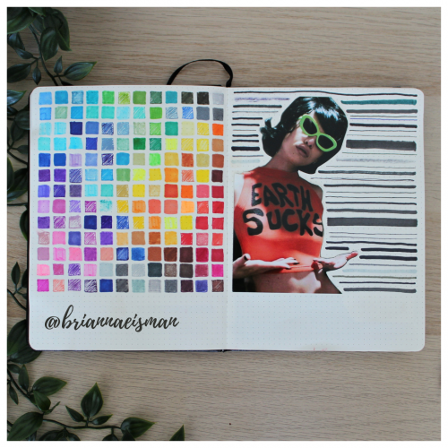
About once a year I set aside a page in my sketchbook, or bullet journal, to do a marker test. I go through every pen I own including Sharpies, highlighters, Bic Permanent Markers, Crayola markers, Stabilo pens, Expo dry erase markers and everything in between. I document the quality and determine whether to keep or toss the utensil. I find it’s easy to collect art materials, especially when you’re like me and switch mediums regularly. It’s important to know that when I reach for a certain pen or marker, it’s going to work the way I want it to. I do keep a page at the back of my sketchbook open for testing mediums, but it’s an important part of the process of creating art to go with the flow and just draw.
I wanted to try a drawing that uses a monochromatic color palette. I found the process to be very enjoyable. It can feel limiting at times, working with only one color of varying shades. Specifically when choosing the amount of shades you're working with. It's also a nice alternative when I can't think of a color scheme that uses different colors.
Embark on a journey through the mesmerizing world of our colorful rainbow artwork doodle drawing. This captivating creation is a vibrant symphony of hues that come together in harmonious chaos.
Every stroke of the pen is a burst of energy, every line a dance of colors that evoke emotions and spark imagination. From the rich reds that symbolize passion to the serene blues that whisper tranquility, each shade tells a story.
This artwork is a celebration of diversity, a reminder that beauty thrives in differences. It's a reminder of the positivity that radiates when we embrace the spectrum of life. The meticulous detailing and intricate patterns invite you to explore every nook and cranny, discovering hidden gems with each gaze.
Hang this masterpiece in your space, infuse your surroundings with its dynamic spirit. Let the vivid colors breathe life into your world, a testament to the joyful, vibrant, and kaleidoscopic nature of existence.
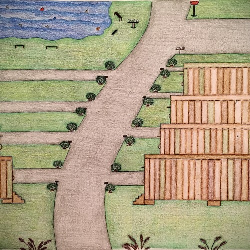
I designed these multicolored trailers using different shades of color only in a different pattern for each trailer. I felt like this color scheme would give the trailers a uniform look yet their own distinct look. The roads look freshly paved with small shrubbery on the corners of the entry ways of the driveways. There are some pretty brown steps that leads to a door on each trailers. Also, as you can see the trailers have been topped off with the same flat style roof only with a different solid color which is one of the colors used on the sides of the trailers. There’s a fishing area with plenty of fish in it as well as places to sit. There’s even a place to use the restroom close by the fishing area so you can continue to enjoy your day catching fish with minimal interruption. This trailer park has a fresh look to it. It has a warm, inviting feel to it and is perfect for living a more simple lifestyle.