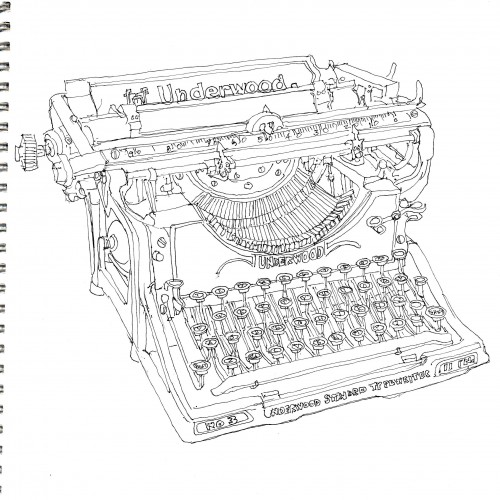
I have dragged this typewriter around for more than 50 years. I found it in an antique store when I was in college. It's still fully useable, except that it's REALLY hard to find ribbons. Basically, it's just another object to dust. But it is a beautifully made object. The basic shapes and perspective were blocked in with a 2H pencil, then I used a Sakura 005 micron pen to do the contour drawing.
Once again playing with shapes, colours, marks, and loads of squiggly, smudgy ink lines. No pressure. Just trying to get back into splashing around with paint and seeing what emerges.
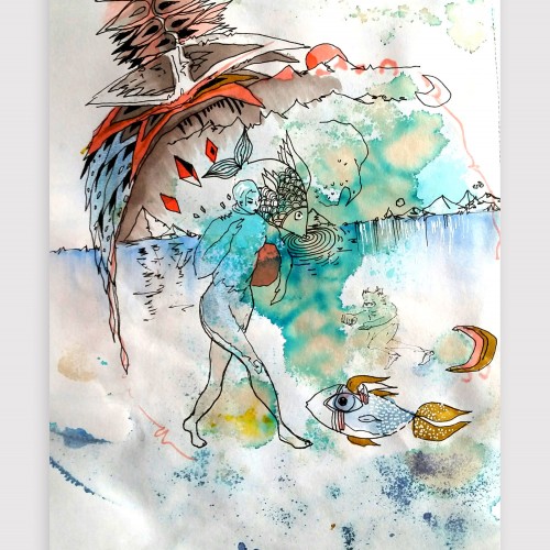
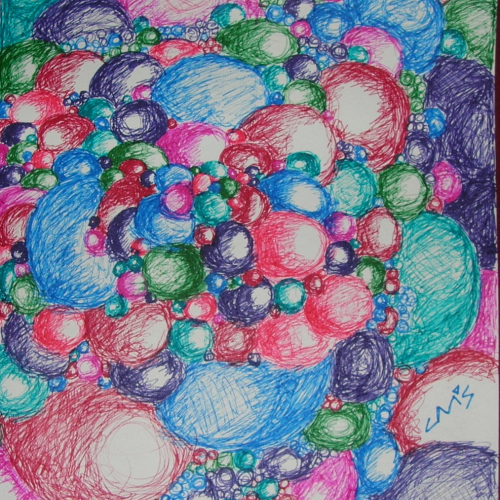
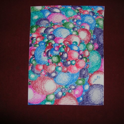
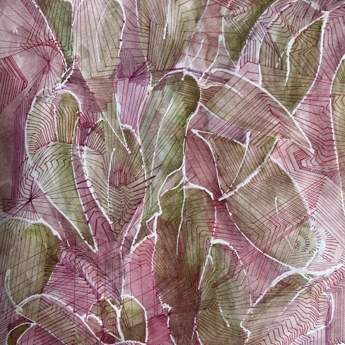
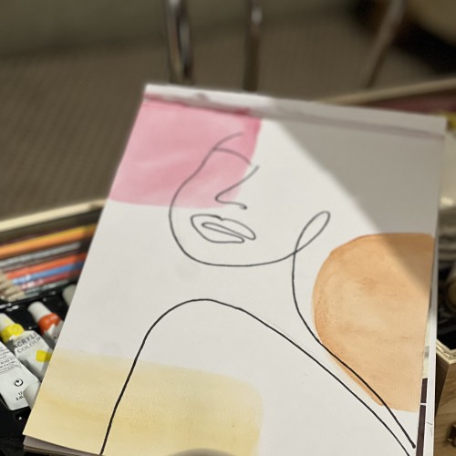
Artwork on "the other side" - playing with the bleed-through from the watercolor and intuitiviely allowing the shapes to arise. Created using watercolor, coffee, ink, graphic pens and unipen
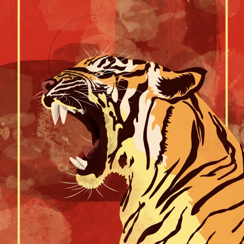
In celebration of Year of the Tiger, I illustrated this Tiger with vector shapes and then shades the shapes with a variety of pixel brushes. Then I doodled some abstract brush strokes as the background with a red and gold color theme.
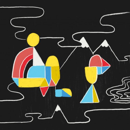
An automatic drawing, everything is out of my head with only the briefest idea of a story line. I played around with shapes and lines and shading to see what affect would result. It was fun, but time consuming.
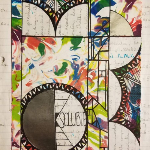
Temperature, polarity, pressure, molecule size, and stirring all increase solubility. Yup. The background is stained from food coloring swirled in shaving cream, some AP Chem practice problem notes, and some shapes for spice. Also, I submitted 3 college apps yesterday, so here's to that.
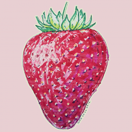
A vibrant, hand-rendered standing strawberry illustration featuring rich textures and expressive marker strokes. This piece captures the organic beauty of summer fruit through a modern, illustrative lens.
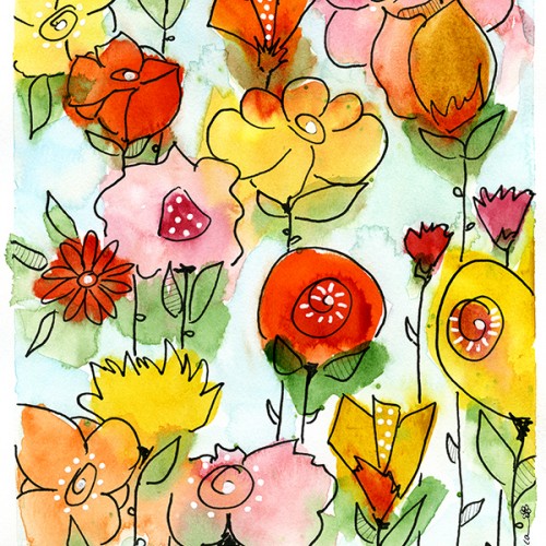
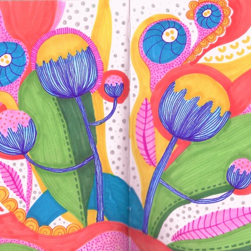
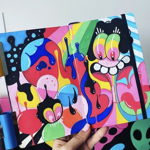
This sketchbook spread features a stylized pattern of colorful poppy flowers. The garden of flowers includes leaves of green, yellow and peach. The flowers are yellow with blue stems. The drawing as a whole has a whimsical and playful feel with a bright color scheme, polka dots and organic squiggle shapes, and blobs of seemingly random colors. Please check out my website ArtsyDrawings.com for more by me, Brianna Eisman. Thank you!
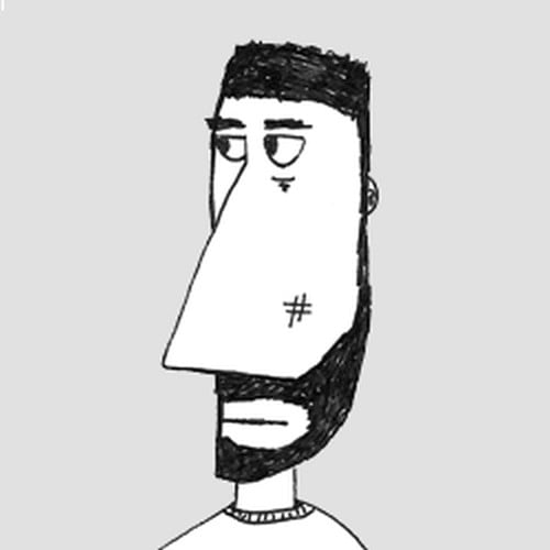
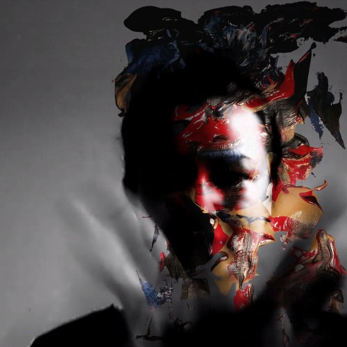
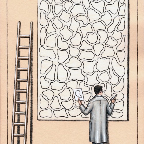
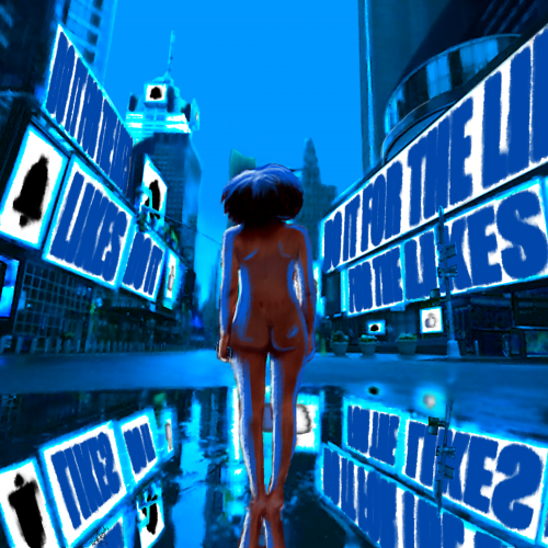
Take it how you want. You either give everything to social media, or it takes everything from you. In the end, you are left naked and hollow. I wanted to make this a simple composition at its core. The image is more about the message.
Times Square took forever to put together, I think the perspective is off just a bit. Overall, I think I did well with shading and depth. I am also improving on drawing/painting the human form. I wish I could trust in shapes and form and go a bit more abstract, but I think that will come with experience.