Started this doodle with several 3, 4, 5, and 6 sided shapes and kept mucking about until it got to this point. Decided to leave a bit of blankspace this time instead of filling the whole thing in
Metatron’s cube is made up of 13 circles connected by straight lines. It contains all 5 Platonic solids and if you stare at it long enough, letting your eyes focus in and out, you start seeing lots of different shapes and patterns. When I draw this shape I generally leave out some of the connector lines to see how it changes the pattern
Title: Heart and Soul Medium: illustration pens on sketch book paper Style: surreal Category: illustration Created: Dec-Jan 2024-2024 Artist: Stephen J. Vattimo Heart and Soul This is preliminary drawing for a painting I am about to begin. The concept for this illustration started as a design for a pumpkin carving contest. I feel the message of the design is so important for people to hear, I decided to make it into a painting. 
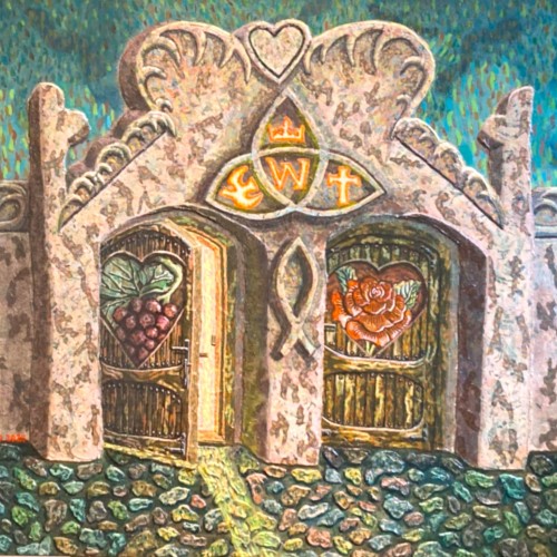
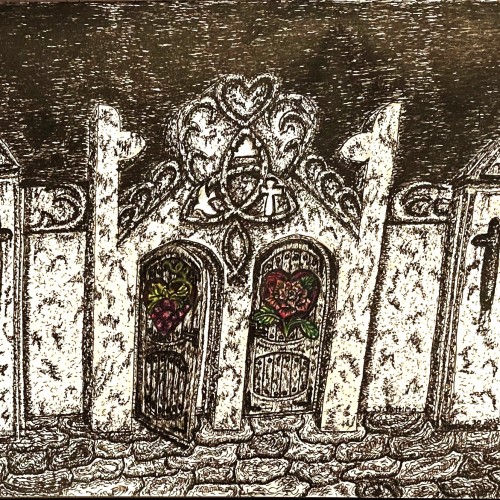
The original design, done in pen and ink. The design only shows the two doors of the entrance to a fortress. It was designed for a live pumpkin carving event in mind. At this type of event, the carver must create their piece of art live on site with spectators watching and asking questions, and there is a time limit. The evolution of the design? I added a wall on each side of the entrance, with matching pillars. Explaining the design of the pillars The triangle top: the triune God. Representing three persons of God: Father, Son, Holy Spirit. The cross shape opening in the pillars: The cross is the only path to God, to have the debt of sin satisfied. To reconcile humankind back to himself. To be released from being a slave to the Devil. To be a new creation empowered by God Spirit. Explaining the design of the entrance way(gate) The top of the entrance is in the shape of a heart, represents the seat of human passion, ambition, and allegiance. The cultic three petal flower is used to represent God in three persons united. The symbol inside the flower: God’s ministry toward humankind. Crown: Highest authority Cross: God’s loving salvation and restoration plan. The dove: Spiritualty made alive, fellowship with God, empowerment to weather the storm of life, and equip for service to God. Change in the design of the door. In the original design, one door had roses carved on it. The pattern took up the whole door. The other door had a grape vine carved on it. The pattern took up the whole door. I modified the emblem on the doors by making them smaller and simplified, so I could place them inside heart shapes, so the new images would more clearly communicate what they are meant to represent. I also added color to the emblems(color pencil) to make them clear of what they are, because of their size and the ink medium ,they were hard to interpret. Understanding the symbol of the two doors. The door with the rose inside the heart emblem represents a heart whose passions, ambitiousness, allegiance are focused on the cares, worries, and abstaining riches of the world. Only giving God lip service. I chose the rose to represent the heart of spiritual allegiance to the world, because roses are pretty, but you can’t eat them to nourish your body. They also have thorns that can cause injury to the body. So, the parallel point is, just as flower fade and turn to dust, so will the person who chases the thing of the world and has no time for God. For life is very short, we know not which will be our last breath on this side of eternity. But if a person leaves this earth without excepting the gift God offered them which is salvation from penalty of sin and given enteral life through the work that was done on the cross by God’s son. Then that soul will appear before Jesus, and just as they did not know him in their life on earth, He will tell them he knows them not. Into the lake of fire, they will spend eternity. The door with the grape vine in the heart emblem represents a heart whose passions, ambitiousness, allegiance are for God. To know Him intimately, to obey His teachings, to serve his will. I chose the grapevine to represent the heart of spiritual allegiance to God, because grapes are nourishing to the body. Jesus also used a grape vine in one of his parables. He paralleled the spiritual relationship he had with his disciples and the grapevine. He told them just as branches of a vine must depend on the base of the vine to live and bare fruit, so they must abide him to have abundant life. Abiding in Christ is not a religious act. It is outside of religion. It is an intimate relationship. Example: you can belong to a fan club of Paul McCartney and know a lot of things you have heard about him, but he doesn’t even know you exist. Where, if Paul is your father, and you have a good parent to child relationship, then you know him intimately. So, abiding in God, we commune with him through read his word and living by its teachings. It is spending time in prayer. Sharing our hearts with God and spending time listing to him. Trusting in him as our provider and giving thanks for his provision. Living our lives, with the purpose of pleasing him with the work of our hand and loving our neighbors in the workplace as well as in the community. Just as a healthy grapevine continues to grow and produce much fruit. Having an imitate relationship with God should be more and more evident in the way we live our lives. So, when the angel of death pays you an unexpected visit, he escorts you to Jesus’s throne, you know for certain he going to welcome you with loving arms and said welcome home my faithful servant. Now to which door I chose for my life? It’s the one that is open. This bible verse one of a couple that inspired me to design this illustration. 1 Corinthians 3:12-13 King James Version 12 Now if any man builds upon this foundation gold, silver, precious stones, wood, hay, stubble. 13 Every man's work shall be made manifest: for the day shall declare it, because it shall be revealed by fire; and the fire shall try every man's work of what sort it is. This verse is not referring to the rebellious people who have rejected God, this is referring to people who are children of God, who failed to serve God faithful. Written by Stephen J. Vattimo. 3 Jan 2024 .
I am trying different techniques, also digitally. In this case, I aimed to "build" the illustration only using shapes. So, it's beyond fine drawing, but I'm curious what you think. Thanks for the prompt.
With our words in sentences With our ideas in motion With our social customs in our lives With our practices and habits We force things upon ourselves and others Within each of these realms Instead of developing understanding Instead of searching for meaning Instead of exploring their functions And discovering the shapes that fit.
This sketchbook spread features a stylized pattern of colorful poppy flowers. The garden of flowers includes leaves of green, yellow and peach. The flowers are yellow with blue stems. The drawing as a whole has a whimsical and playful feel with a bright color scheme, polka dots and organic squiggle shapes, and blobs of seemingly random colors. Please check out my website ArtsyDrawings.com for more by me, Brianna Eisman. Thank you!
9 x 12 graphite pencil on Bristol Smooth paper. For the background, I managed to get a nice deep black by using 9B graphite powder which I made myself by sanding down a 9B Faber Castell Graphite stick. I then mixed the graphite with linseed oil to make a paste which I applied to the paper using cotton. For the smoke, I used a kneaded eraser to lift off the graphite making shapes and direction of the smoke. I then use a mono zero eraser to add detail and more highlights in the smoke, because I use a light pressure and build up my tones by layering my graphite, I don’t damage the tooth of the paper and am able to easily lift the graphite.
Practicing making different shapes and textures and trying to bring out the contrast with a black background.
Since the dawn of l’automatisme, the floating shapes of Miro and Klee were praised as musical suggestions. Unlike the Masters, my groundwork of flowing lines speaks melody and rhythm from a musical score perspective. The flow of lines ties the art elements into a composition. It also reflects a concept from Chinese paintings, which says, ` as a line moves into the invisible, the idea continues.’
A fun little challenge from instagram that really allows you to wake up your childhood imagination.
Some works were born to be prodigious. Once the preliminary lines were laid within the first minute, the quality of the shapes, the diagonal composition and the weight were balanced out. With the black mass as the hood, a face, hidden underneath, is unveiled. With the addition of the black fingers and the white hand, the full figure surfaced naturally. The black fingers are the minimal suggestions to add character. The title `Remorse’ came about because of the bowed head and the pose. utube clip: https://youtu.be/mb48rCx-lYI
This drawing is titled "Greyscale Doodle" and was created by Brianna Eisman, Artsy Drawings. The pen and ink drawing is a fun doodle of organic blobby shapes with circles and floral patterns and lines. It's drawn in greyscale using grey, black, and white ink tones. The doodled image features an abstracted floral mandala type pattern. For more like this, please visit my website at ArtsyDrawings.com
The materials that Meir uses in her works are not of the refined and so she is called an “arte povere” artist. At times she describes her work as someone dealing in alchemy - work develops as in a trial laboratory with different techniques and materials. She says, “ at times the artistic work process is a sort of puzzle demanding the filling in of all the empty squares “. Some of her work focuses on women, and they incorporate criticism and cultural protest. Meir has strong opinions about recycling and environmental protection that is represented in her works by use of materials and shapes. In her work she reacts to contemporary art that communicates with the eco system, waste, and she also searches for different worlds. Her works are made up of layers upon colorful layers that when we look at them it becomes clear that the mound of waste she chose is not coincidental. It actually becomes a colorful kaleidoscope of utopia. Jaffa Meir is a multifaceted, autodidact artist working in painting, sculpture, photography, product design, carpets and furniture, painting on textile, and computer graphics. The structural composition of some of the works is influenced also by her many years of working in the architects’ office. Meir also worked in the developing of ideas within the field of ecosystems and recycling for factories such as Coca Cola, and during this process came up with ideas for designing parks and public game spaces using industrial waste products.