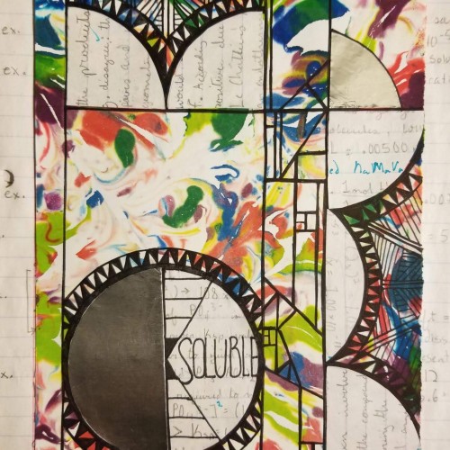
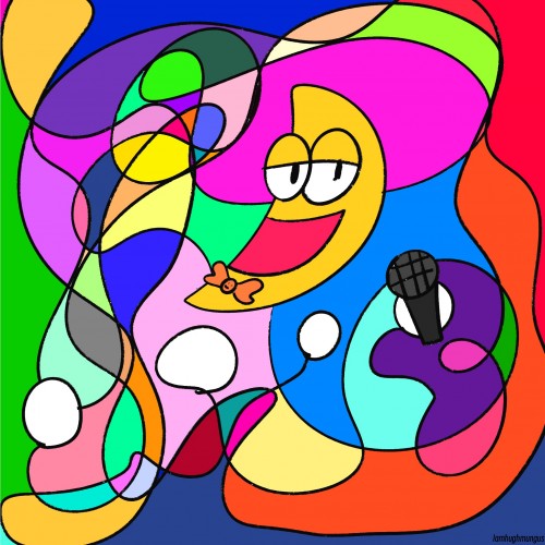
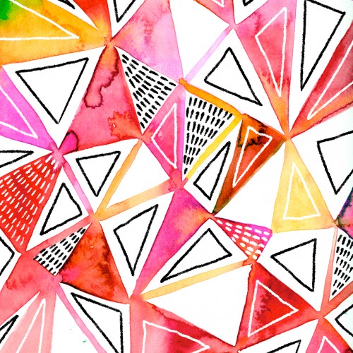
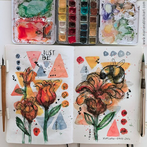
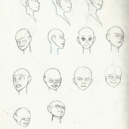
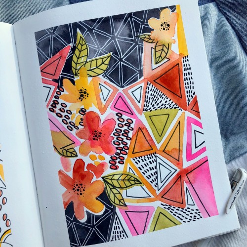
Temperature, polarity, pressure, molecule size, and stirring all increase solubility. Yup. The background is stained from food coloring swirled in shaving cream, some AP Chem practice problem notes, and some shapes for spice. Also, I submitted 3 college apps yesterday, so here's to that.
The materials that Meir uses in her works are not of the refined and so she is called an “arte povere” artist. At times she describes her work as someone dealing in alchemy - work develops as in a trial laboratory with different techniques and materials. She says, “ at times the artistic work process is a sort of puzzle demanding the filling in of all the empty squares “.
Some of her work focuses on women, and they incorporate criticism and cultural protest.
Meir has strong opinions about recycling and environmental protection that is represented in her works by use of materials and shapes. In her work she reacts to contemporary art that communicates with the eco system, waste, and she also searches for different worlds. Her works are made up of layers upon colorful layers that when we look at them it becomes clear that the mound of waste she chose is not coincidental. It actually becomes a colorful kaleidoscope of utopia.
Jaffa Meir is a multifaceted, autodidact artist working in painting, sculpture, photography, product design, carpets and furniture, painting on textile, and computer graphics.
The structural composition of some of the works is influenced also by her many years of working in the architects’ office.
Meir also worked in the developing of ideas within the field of ecosystems and recycling for factories such as Coca Cola, and during this process came up with ideas for designing parks and public game spaces using industrial waste products.
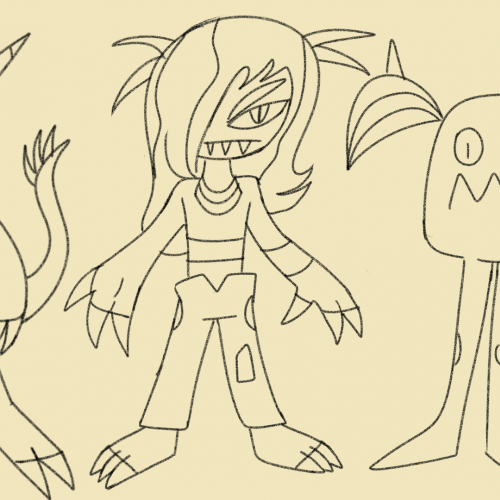
Conjoined imp oc I haven't drawn in years,both of them were originally pink.both of them are very mischievous but deadly.they can stretch their body,warp reality,shapeshift,become big or small and control their "hair" making them powerful foes like no other imps.
In my worldbuilding imps are silly monsters who love having fun,they are the weakest demons to live despite having super super strength.imps come in all shapes,colors and sizes.an imp can have 2 legs or 4 legs,3 eyes or 5 eyes,horns or hornless wings or no wings.imps rarely kill and if they do then it's for self defense, most end up being killed by stronger demons.imps live in groups like a family and are rarely alone.when imps go to the mortal world,they torment and trick people,imps love to be around children since they are playful.imps torture people and find torture to be amusing and better than killing (imps never kill people)if an imp kills an person they are shunned and regarded to be too dangerous to be around other imps
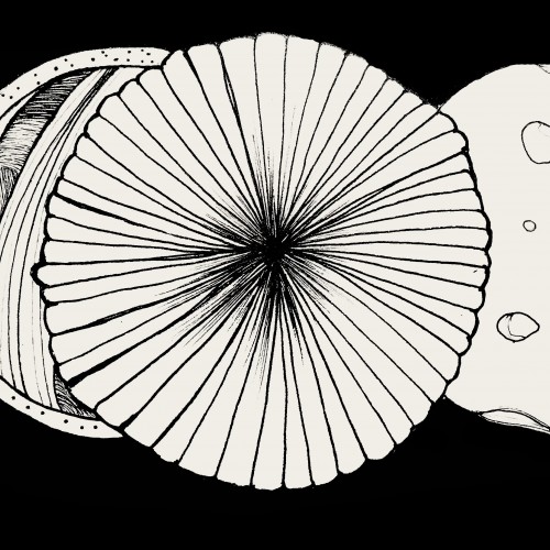
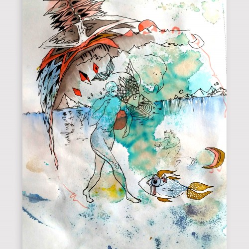
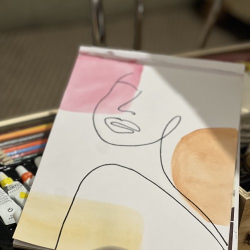
Artwork on "the other side" - playing with the bleed-through from the watercolor and intuitiviely allowing the shapes to arise. Created using watercolor, coffee, ink, graphic pens and unipen
I have dragged this typewriter around for more than 50 years. I found it in an antique store when I was in college. It's still fully useable, except that it's REALLY hard to find ribbons. Basically, it's just another object to dust. But it is a beautifully made object. The basic shapes and perspective were blocked in with a 2H pencil, then I used a Sakura 005 micron pen to do the contour drawing.
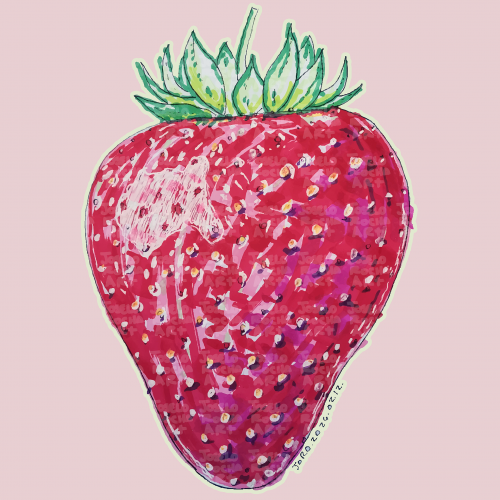
A vibrant, hand-rendered standing strawberry illustration featuring rich textures and expressive marker strokes. This piece captures the organic beauty of summer fruit through a modern, illustrative lens.
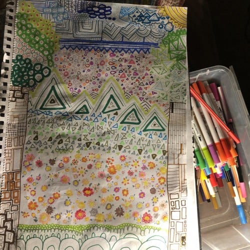
Once again playing with shapes, colours, marks, and loads of squiggly, smudgy ink lines. No pressure. Just trying to get back into splashing around with paint and seeing what emerges.
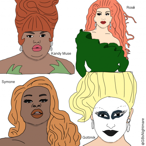
So if any of y’all have watched RuPaul sorry if I am spoiling it for you. It’s really great. I was told to make Appa from Avatar. Working on it @rayedrgn ! Okay so here it is! I traced just to get shapes then I colored it. Um I guess that’s it?
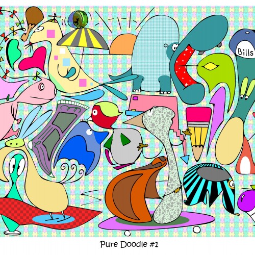
Normally i start w an idea or whim & doodle away trying to capture my thots. On this one i simply scribbled onto a page & then looked hard for shapes, animals, faces & any other unorthodox item. Then i simply added some color. I plan to do more of these mostly as a gr8 exercise for fresh runaway doodles hot off the press!
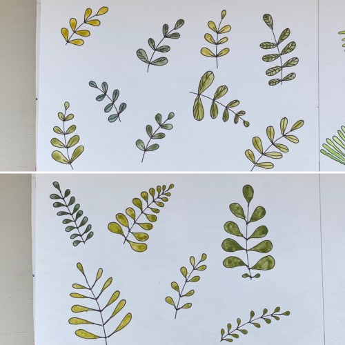
For some reason I tried some floral drawings, of different shapes, and I also used mixtures of different colors to produce hues of green. The first page - it’s a mix of the cobalt blue (PB 28) and cadmium yellow medium (PY 35). On the second one there is ultramarine (PB 29) for the blue color and the same yellow paint. To me, it seems the difference is very little but I’ve got the color closest to the ‘normal’ green using Cobalt rather than ultramarines. The latter gave either to yellowish to olive hues or too blueysh
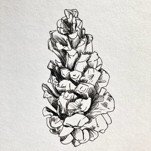
The nearby pine tree has dropped quite a few pine cones, all in different states of decay. I enjoy looking at the different shapes, sizes and colours of each cone, each with its unknown story.
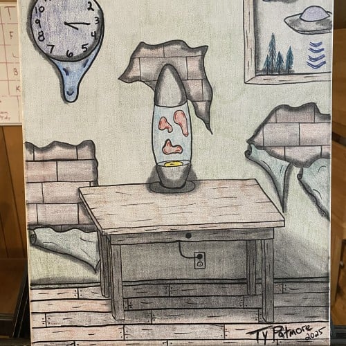
In “I Love Lamp,” Ty Patmore blends nostalgia, humor, and subtle unease into a surreal domestic scene where time, space, and memory feel slightly off-center. A lava lamp—softly glowing with drifting shapes—sits on a worn wooden table, acting as the sole beacon of warmth inside a room that is quietly falling apart. The wallpaper peels back to reveal fractured brick beneath, as if the structure itself is shedding its old skin.
A melting wall clock drips down the surface like time losing its grip, while a framed picture of a UFO drifting over pine trees hints that even the outside world may not be quite right. Every object bends reality just enough to make the viewer question whether this room is comforting… or unsettling.