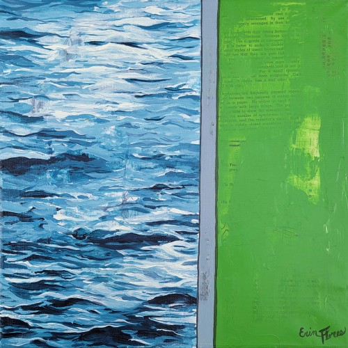
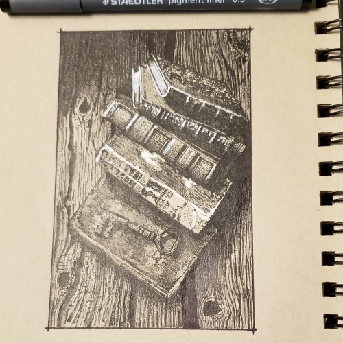
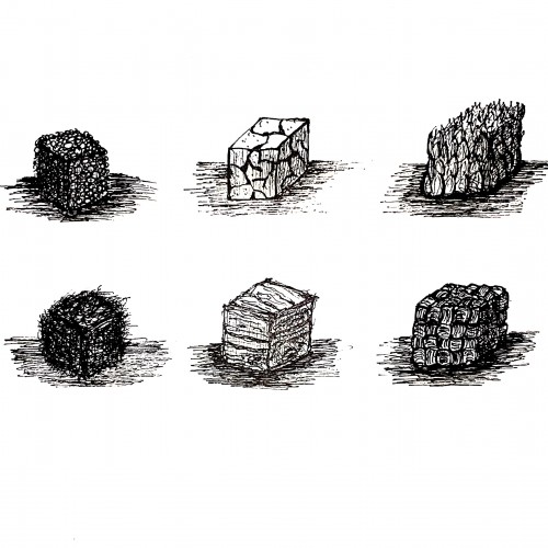
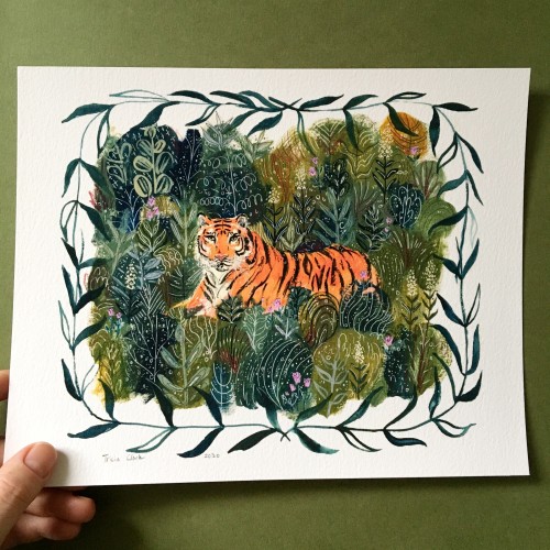
Inspired by a photo I took of a walled off area of a lake. It was grass on one side and water on the other. I love using textures from old book paper and the juxtaposition of realism and flat color.
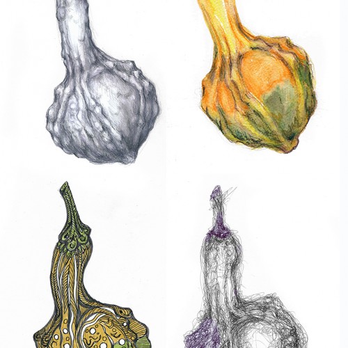
I modified the challenge a wee bit. I didn't use the same paper for the various drawings since I was using (top row, left to right) hard graphite pencils (3H to HB), watercolor pencils, (bottom row, left to right) brush pens and ballpoint pen. These media work best on very different paper textures and moisture absorbing qualities. The second picture shows the object of my study --- and the apparatus I use to hold botanical subjects. "Third hand" tools are very useful and cheap. This one was under $10 and serves my purposes well. Just FYI. (Each drawing/painting was scanned and composited in Photoshop.)
This was my first try using paint pens. Played around with shapes to get used to the texture of the paint and how it feels to use the pens. Done in a watercolour sketchbook.
Combination of traditional and digital art. I actually hand painted this on some very textured paper with oil pastels a while back, so to 'tidy and clean' it I had to employ digital means. The background was done with alcohol inks, the 'flow' of it I was particularly proud of :).
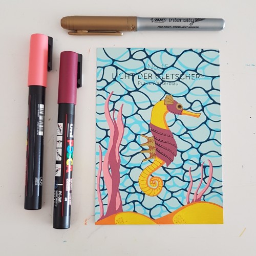
I did the water texture according to a tutorial by James Chapman, found on Instagram. The steampunk seahorse was an idea from a lady I am following on Instagram as well (look for @carrieisartsy) This piece is done on a paint chip card with poscapens, a gold marker and fineliners.
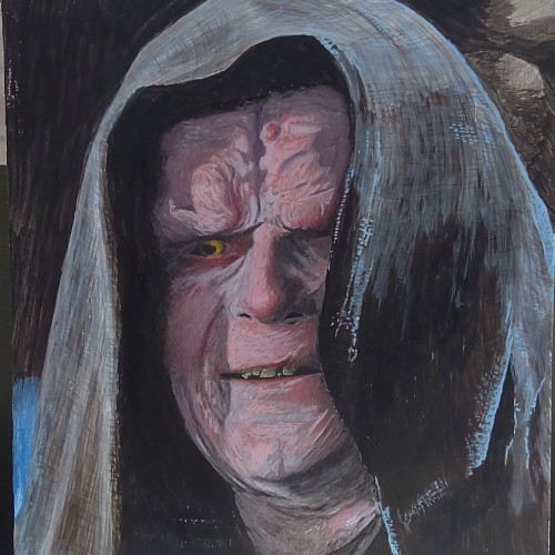
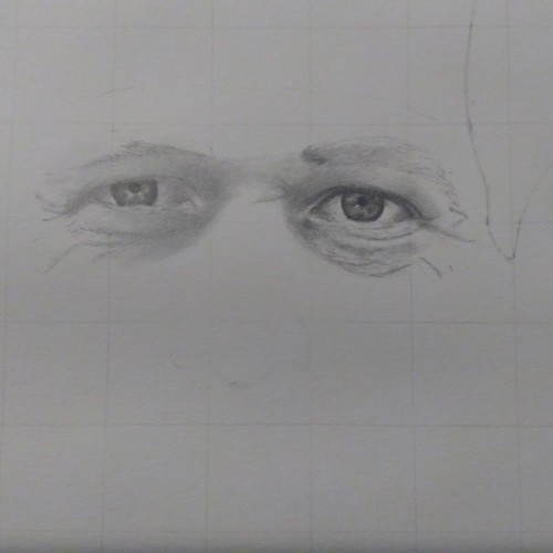
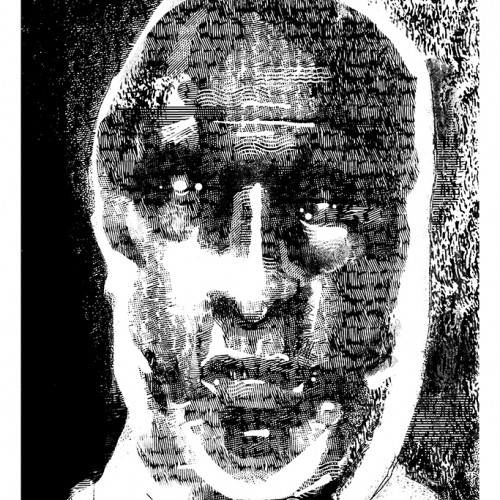
It has been a while. I have been working on a project that can't be posted. I decided to try re-doing pictures that I have already posted. This is a re-do of Paul Newman. I wanted to see if I have improved. Drawing consistently now since late November/early December 2020.
Spent some time last week trying to work through a new digital painting/colouring technique . It needs some more work and I haven't decided if I like It yet or not. One of the images turned out blander but the original skin tone was very orange I did like the brush textures a lot better on the orange skin but the lighting feels better on the purple-toned image.
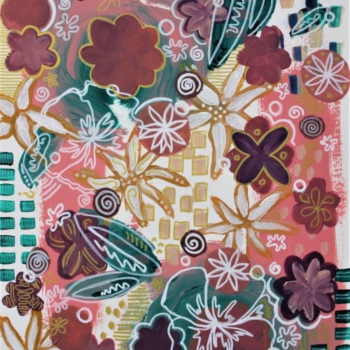
This is an acrylic painting on pre-stretched canvas. It features a pop art style of pink and teal and purple shapes in a sort of abstracted floral pattern, but wait, that's a flower there too. Huh that's pretty cool. Yeah so there's also gold and white flowers too. It's a pretty pretty painting and I should know, I'm the artist. Love, Brianna Eisman
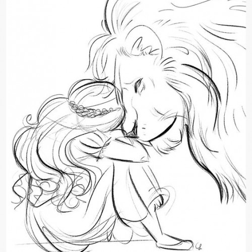
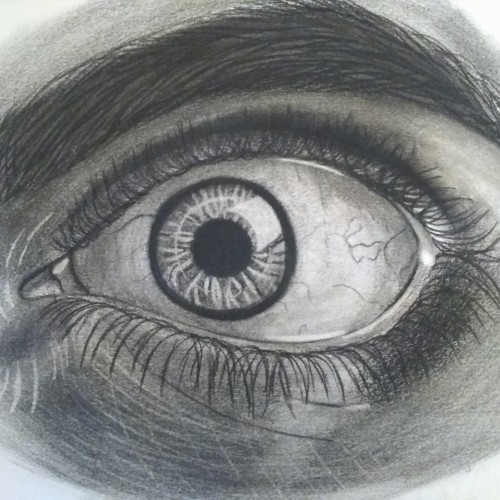
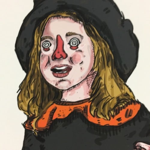
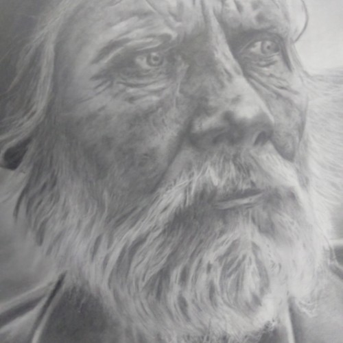
I really enjoyed drawing this. This is where I really explored using my kneadable eraser to create texture in the skin. I still learning how to draw hair.
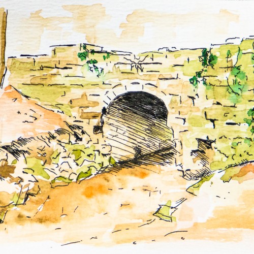
I started messing about with line and wash. I really enjoyed the speed and looseness of working on this piece. In hindsight, I'm wondering if it would be worth working on a larger, more considered version as there is quite a lot of nice texture that is missing here. Pen & watercolour on watercolour paper (4x6").
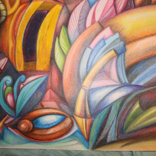
My first venture into artist grade colouring pencils - and I'm smitten! I never thought I could achieve such boldness and blendability with them! I'm still getting used to them and will think about choosing smoother paper with less tooth next time. The texture and weight was more for the water-based gouache along with alcohol inks (which are very unforgiving to even primed heavy paper!). Apologies for the unevenness of lighting between the 2 sides of paper; will correct that when I'm making proper image files.
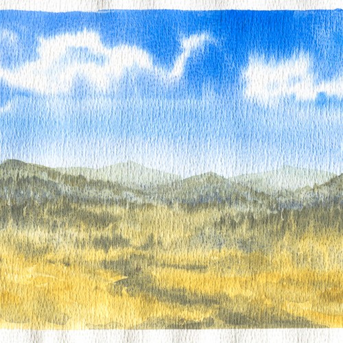
I got a pack of loose watercolour paper from eBay in 2018. The side this was painted on had a really strange pitted texture on it. I thought it might be interesting but I didn't like the way the paint gathered in the pits. I just use it for sketching and testing colours these days.
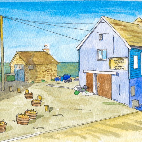
New Quay is a quaint little seaside town on the Ceredigion coast. This was my second attempt at pen and wash in 2018 and it totally bombed. I'm not sure there's anything I like about this - the colours, the linework, the lack of texture. Nah! Definitely worth trying again at some point.
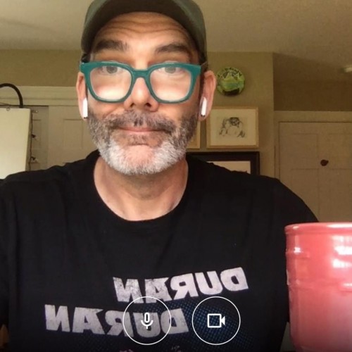
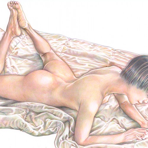
Nat checking her email. The polar fleece blanket colour and texture didn't turn out the way I wanted it to.
Bic4 Ballpoint Pen, Sanrio Novelty 10 Colour Ballpoint Pen on Archival 8.5" x 11" paper