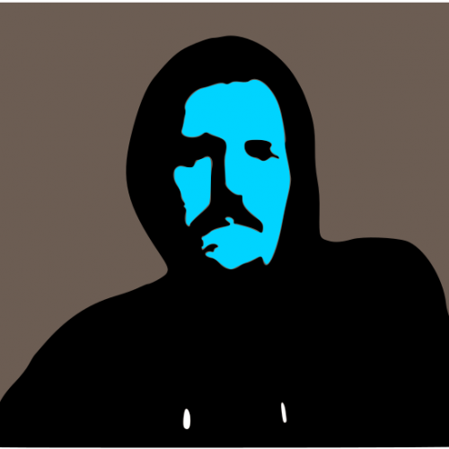
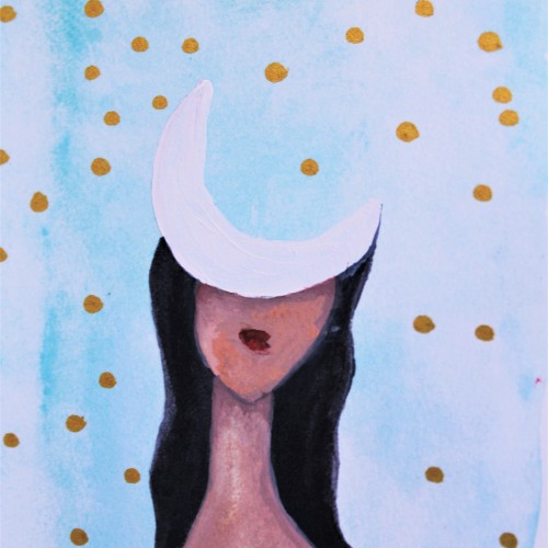
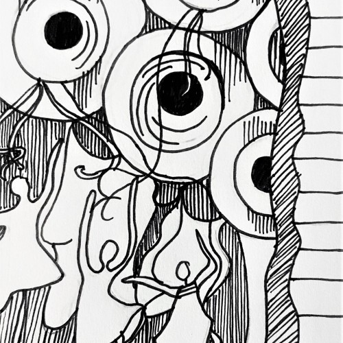
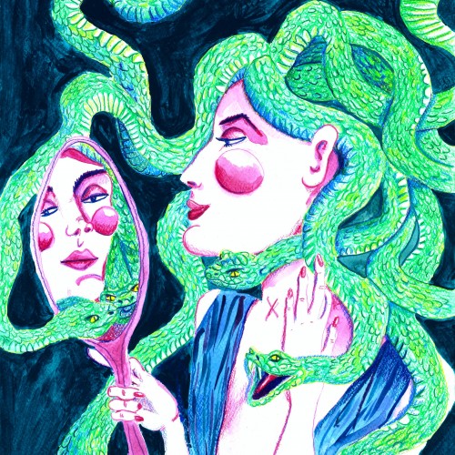
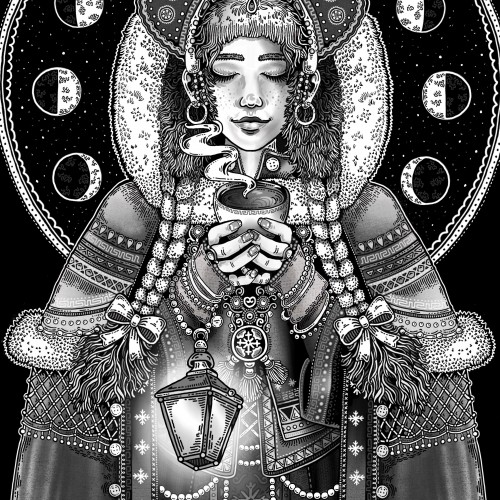
Daughter of the Moon: An Artsy Drawing by Brianna Eisman is an ink drawing with painting overlay of a woman with the face of a moon. This surreal portrait has an ethereal feeling of loneliness and mystery.
Created using pen and ink, this drawing mimics a fine art painting I saw in a museum. I loved the figures and their fluid movements, so I doodled it down in my sketchbook and later inked it in for a refined black and white artwork. Check out more on my website ArtsyDrawings.com!
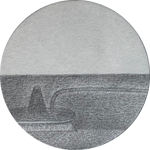
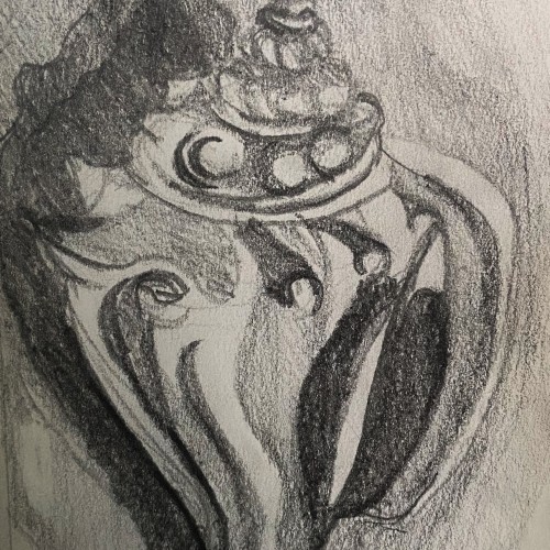
This is a graphite pencil drawing of a conch shell I found on the beach in Florida. I used this sketch as a base for a intaglio print I made. The sketch features the cool textures and forms of the shell in a harsh contrasting light.
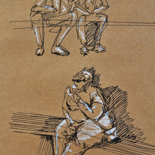
These are some gesture drawing sketches I did in ink with white pen highlights on brown paper. I was in Europe and sitting around a fountain watching people go about their lives. This was a really fun figure study and I think people make for great works of art.
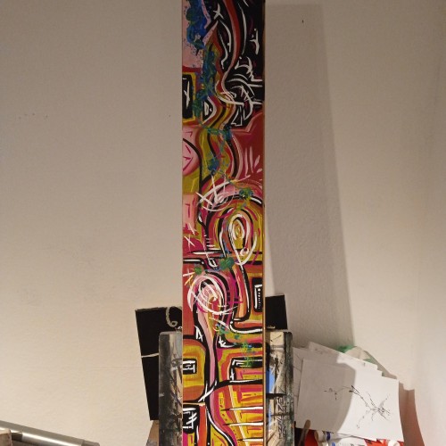
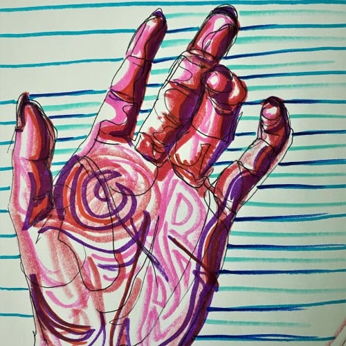
Pop art ink drawing in red, pink, and violet hues. The subject is the palm of a hand and curled fingers. The background has blue, green, and turquoise stripes contrasting the colors of the hand. This artistic drawing style uses non local color to create form in the palm hand drawing.
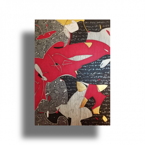
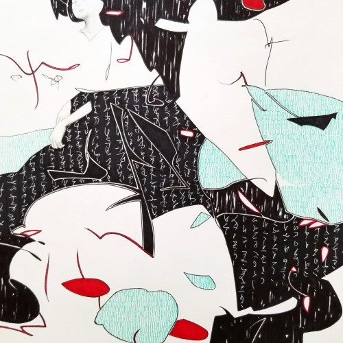
The idea is to show a figure crossing over two ` scripts’ with a bilingual suggestion. By standing in between worlds, we see opposing viewpoints.
Many artists have incorporated typography as symbols in their paintings since the 60s, but no one has attempted to approach lines in this `written’ manner. How different it is are the two writing styles of the East and the West; one with angular lines while the other in a smooth flow! This work juxtaposes the symbolism of cultures – script. At the same time, it questions the need to grasp the full meaning of the script to appreciate the aesthetic flow of calligraphic lines.
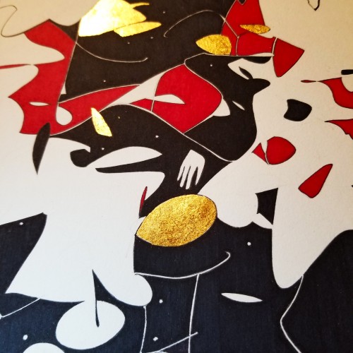
Since the dawn of l’automatisme, the floating shapes of Miro and Klee were praised as musical suggestions. Unlike the Masters, my groundwork of flowing lines speaks melody and rhythm from a musical score perspective. The flow of lines ties the art elements into a composition. It also reflects a concept from Chinese paintings, which says, ` as a line moves into the invisible, the idea continues.’
Whether the script in the background is an actual sutra is not the concern, even if it is, would it be readable to most? I question the use of lines in Calligraphy. Without the recognition of the exact words or meaning, can we still appreciate the quality and skills involved? Armed with a Chinese writing foundation, I adapted the use of the eight strokes (the basis of construction to Chinese character). The `writings’ resembles Chinese/Japanese writings but in fact, they are not. I needed a texture. With language as a symbol of culture, by visually adapting these kind of lines endears us to the image.