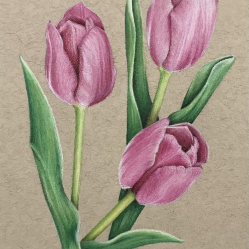
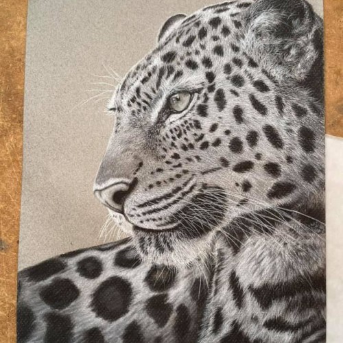
Pink tulips on toned tan sketch paper. This was my first time burnishing. I used the toned tan paper so that I could better see the effects of burnishing with a white pencil. I used Prismacolor soft core pencils.
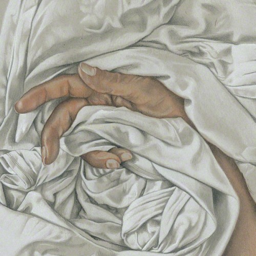
Hand and drapery sketchbook drawing. This combo never gets old for me. Faber-Castell PITT pastel pencils, charcoal pencils on 9” x 12” Strathmore Toned Grey sketchbook paper.
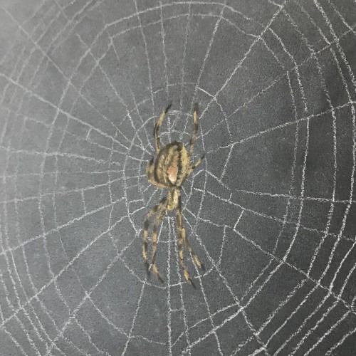
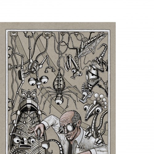
30 minute sketch in tinted charcoal on toned black paper. This spider lives outside my window and I have the perfect view of her catching wasps all day.
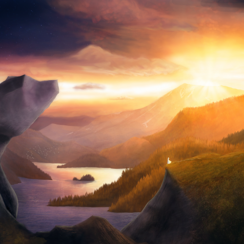
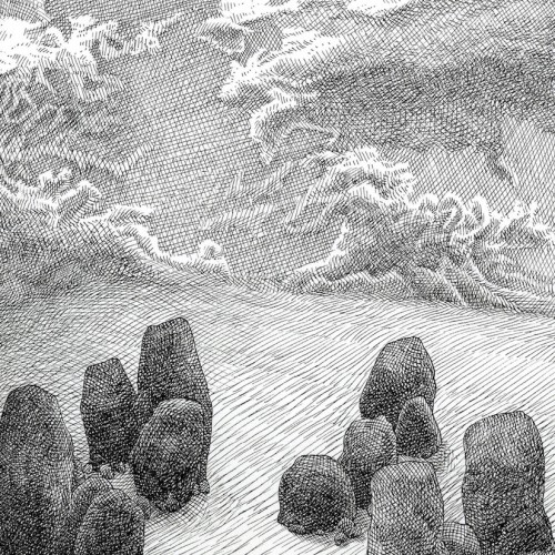
Painted as a project for My Painting Environments class: https://skl.sh/32Khrti
I am studying and working on my environment paintings, focusing on building textures and painting with light. This was submitted as my project for a Painting Environments course. If you have any advise, tips or comments on this painting I would love to hear from you. Thanks!
Epic Valley Project parameters:
- Hugh, expansive valley with mix of grassy and rocky terrain
- Haunting, dramatic sky with rays of light beaming
- Stone formations
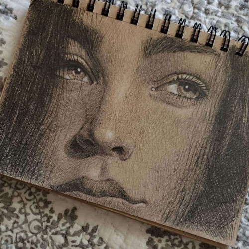
From a snap of me sitting in the waiting room. Pencil, Charcoal Pencil, Pastel Pencils and white Prismacolor pencil on 9” x 12” Strathmore Toned Grey sketchbook paper.
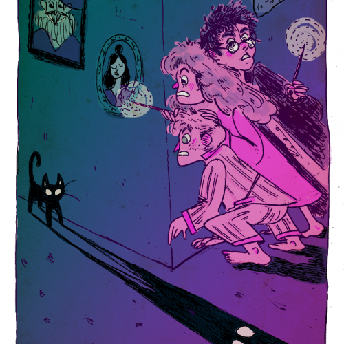
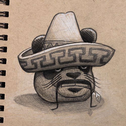
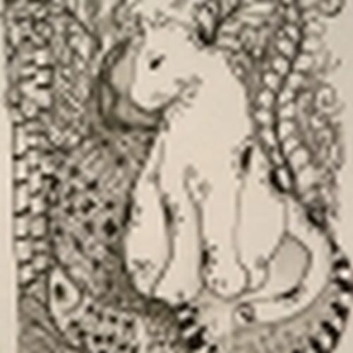
I've been re-reading the Harry Potter Series, and now am on a quest to do a small illustration for each of the books. This one is from "The Sorcerer's Stone" and features Mrs. Norris, my favorite evil cat.
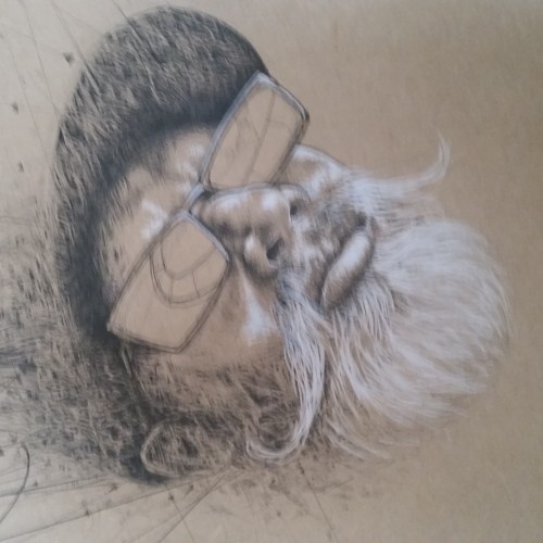
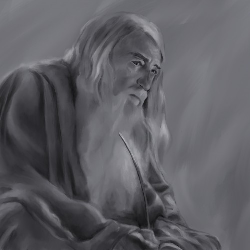
I love working with black, white and all sorts of grey tones. This is a digital drawing created using standard brushes on procreate. Gandalf is a favourite character of mine. One of those characters that whenever they are around you know its all going to be okay.
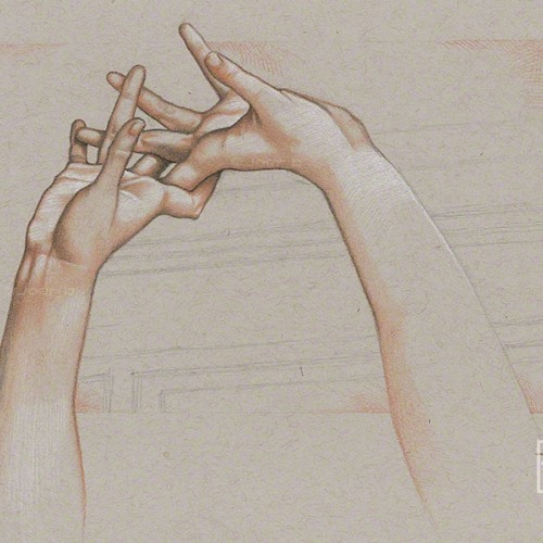
Pastel pencil study of the intertwined hands of the Ambrogio Borghi sculpture, Chioma di Berenice. Faber Castell pastel pencils, Black and White Generals charcoal pencils on 9” x 12” Strathmore Toned Grey sketchbook paper.
Chromatography is used in chemistry to dissolve a mixture and place it into a "mobile phase," which allows the solvent to carry it and its components up the paper. It shows the layers, exposing deeper, hidden tones and colors, something only seen when a solvent of the same polarity is used. It's odd. Life feels a bit like that, and I'm seeing the colors separate for the first time. It's all there, everything that's been hidden in the inky mess for the past however many years. And now it's smeared. Bold. Clear. But blurry. What's on me and what's on you? Where do we go from here?
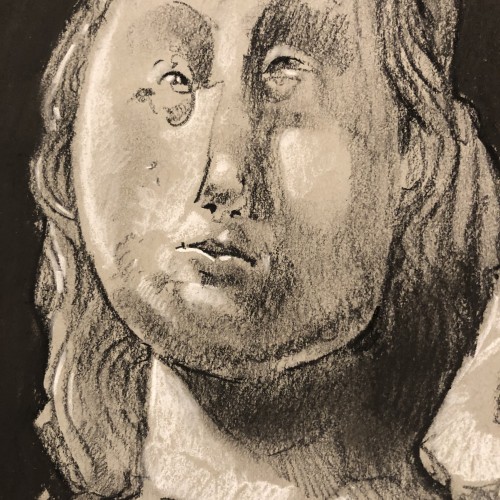
I took my Cultural Safari sketchbook class to the Nelson Atkins Museum of Art today. My sketch of The Virgin and Child, ca. 1350, France, Limestone Sculpture.
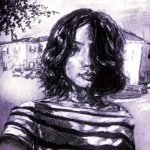
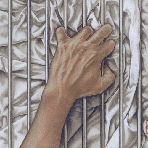
Some LGBTQ+ members of the community can’t openly love who they want to love, so the bars represent that barrier. The fabric, with all its complex folds and creases represents sensuality, desire and love. Love, in all its forms is a complex thing of beauty.-------------
The companion piece to my previous post ‘Ecstasy.’ Agony and Ecstasy were always meant to be a diptych. The issue for me is that there is a two-year gap between the completion of the two - there is a noticeable difference in the the way both were drawn.
Faber Castell pastel pencils, Black and White Generals charcoal pencils on 9” x 12” Strathmore Toned Grey sketchbook paper.
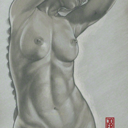
Classical lighting setup. Finished piece derived from an initial sketch. Model: Meadhbh (Maeve).
H, 4B pencils and white Prismacolor pencil on 9” x 12” Strathmore Toned Grey sketchbook paper.