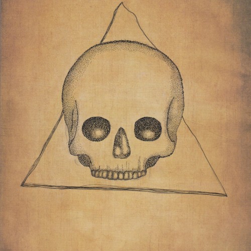
This is was more of an experiment as I wanted to see what black ink would like on paper with an "aged" like background. I think it came out quite nicely but I also think that the black ink might seem a bit too bold. I'm not really sure.
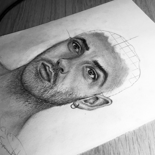
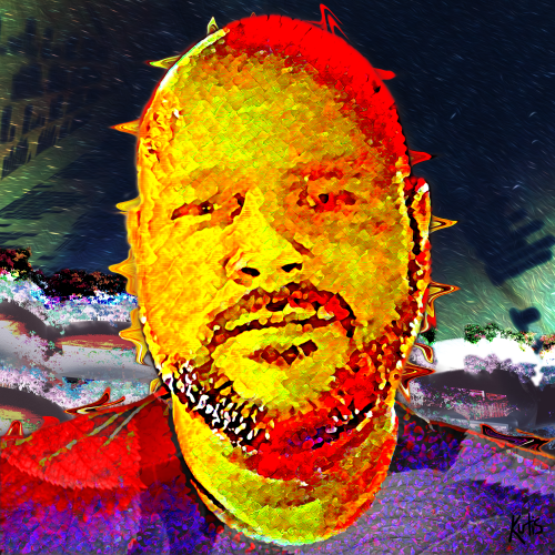
It has been a while. I have been working on a project that can't be posted. I decided to try re-doing pictures that I have already posted. This is a re-do of Paul Newman. I wanted to see if I have improved. Drawing consistently now since late November/early December 2020.
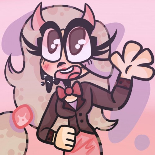
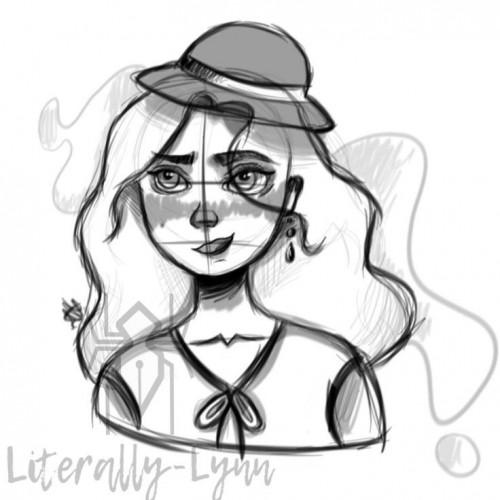
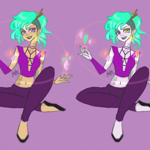
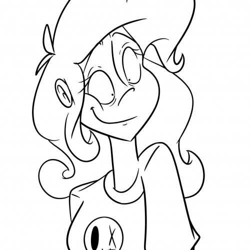
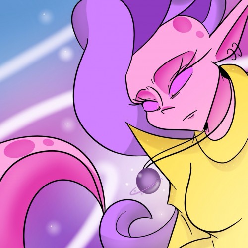
Some friends and I are working on a Bendy and the ink machine [sorta an AU] animatic. I wanted to doodle my character alive/ human before I made her an ink creature :)) Hope you like it!
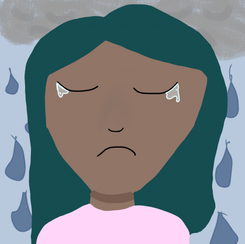
I was doing this while listening to M83, specifically “My Tears Are Becoming A Sea”. I wanted to do art inspired by that song. This is a very quick random drawing that’s actually really bad but I just was doodling for like 10 minutes and decided to post it.
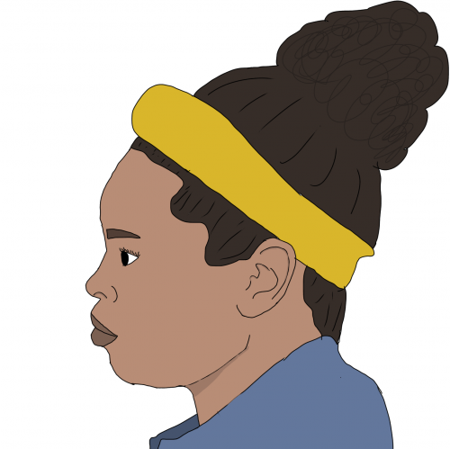
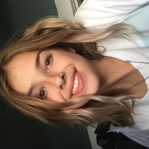
I wanted to draw someone who is actually in my life. My moms friend Chanda was around and I just secretly took a photo of her, and traced her face outline because I am sucky at outlines.
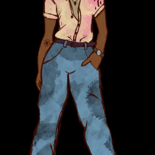
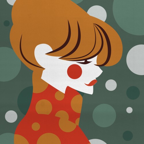
I drew this simple sketch because I wanted to have that outfit, but I didn't have the pieces for it in my closet, so I drew it instead! Close enough, I guess. :)
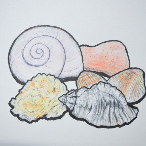
I haven't done a still life since highschool! I was finally motivated to make one after finding this black conch shell on the beach of Rimini. In the past I found one but it was broken, i feel like i've been on a healing journey and was delighted to find a complete full shell. In a way I took it as a sign of the healing graces God is pouring out on me. I also found the coral thing floating on the waves of the shore. I felt the presence of the divine through His creation that day. I picked up the other scallop shells and the red rock there too. The big snail shell I found outside the monastery, there are some big snails here! So yeah, I wasn't trying to be too precise in this still life but I wanted to jot down the idea and my thoughts from that day. Peace be with you all
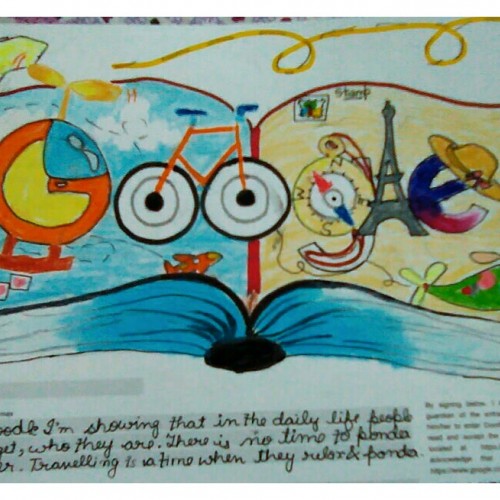
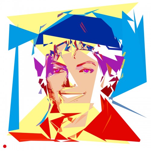
This was a Doodle for Google which I made on 2018's theme and I wanted to upload it & show you people how it looks or get your opinions ¯\_(ツ)_/¯.. I liked it a lot and thought to share my idea with you all..... Please do tell me how's it....as I'm damn excited to get ur opinions (^O^)↝
Wanted to further push how realistic I can achieve with water colour. I don’t think my skill is there yet, so I just let the water colour did it’s thing. And tried to control it less, moved away from adding even more detail.
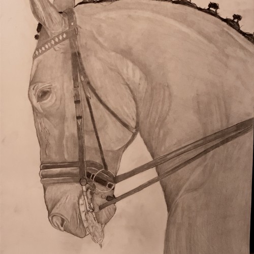
I decided to do this piece because one of my friends argued that bits aren’t invasive and horses enjoy the clear commands. I ride in a bit so if you are a rider and you use bits I’m in no way attacking you. I merely wanted to express that bits are painful and invasive to horses and how important it is to keep light hands and only pull on the reins when necessary.
Français : L’Appropriationnisme ou le « Remake » est un concept simple. En effet, il suffit de reprendre le travail d’un artiste et signer la nouvelle production de son nom. Il ne s’agit, en aucun cas, de copier l’œuvre comme pourrait le faire un faussaire. Il ne s’agit pas non plus de plagier l’œuvre.
En ce qui me concerne, j’utilise l’œuvre célèbre d’un artiste reconnu. En réutilisant une œuvre originale préexistante et célèbre, condition sine qua non, je propose de rendre un hommage. Il ne s’agit en aucun cas d’un manque d’inspiration surtout lorsque l’on sait maintenant que : « l’art naît de l’art et non de la nature » : Ernst Gombrich.
Dans cette série, j’ai voulu revisiter des œuvres célèbres en utilisant ma technique graphique de l’éloge de l’approximation mettant en évidence la problématique de la défaillance et de la mémoire vaporeuse.
English: Appropriationism or Remake is a simple concept. Indeed, it is enough to take again the work of an artist and to sign the new production of his name. It is not a question of copying the work as a forger could do. It is not a question of plagiarizing the work.
As far as I'm concerned, I use the famous work of a recognized artist. By reusing a pre-existing and famous original work, condition sine qua non, I propose to pay tribute. It is by no means a lack of inspiration especially when we now know that: "art is born of art and not of nature": Ernst Gombrich.
In this series, I wanted to revisit famous works using my graphic technique of praising the approximation highlighting the problem of failure and vaporous memory.
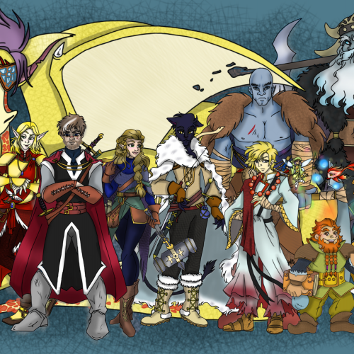
A recent commission from a patron of mine. They have weekly game #DungeonsAndDragons game nights and wanted all of their original thought up characters in a group shot. I was happy to oblige -- this was both a challenge and so much fun! A total of 13 characters was done, in about 2 1/2 weeks time!
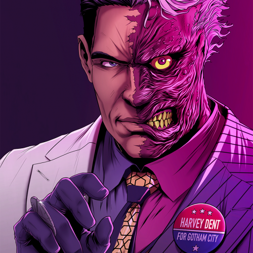
I'm not completely happy with the coloring on this, so I might redo it later. I really wanted to take my hand at the more colorful old comic style for Two Face, but I'm terrible at working with pinks.
Sooo, I was trying to draw Sam Smith... it didn’t work out how I wanted but that doesn’t matter. Just forget the Sam Smith idea and see another drawing
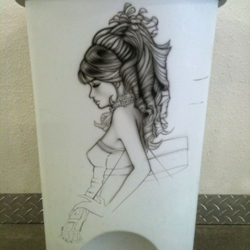
Garbage can: I wanted to try out my 'Secret Shoppers' doodle on a soft surface before I tried it on canvas, and I found a garbage can in our garage that worked okay
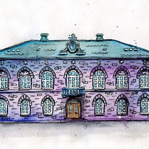
This is the the Icelandic parliament house in Reykjavik Iceland.
Usually I don´t draw houses, I am more into faces, but have always wanted to draw houses though and enjoy watching them. This house has always been one of my favourite.
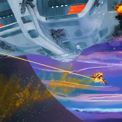
A big fan of the Star Trek universe and was especially impressed with the final run of Picard. This is the new Enterprise in action, heavily damaged but winning a battle against a Klingon Bird of Prey. I wanted a unique angle and decided to flip the starship upside down. It's space; why not. Digitally painted in Rebelle 6 with watercolors, pen, and oil brushes, and meant to have a classic/watercolor feel. This is not AI nor is any part of this AI.
Before I got into digital painting, I was putting together digital collages. I love digital collages, but most of them are a bit too literal/pop art for me. No diss on pop art; I create a lot in that style. But, I wanted to make a smoother, more blended collage for my profile pic.
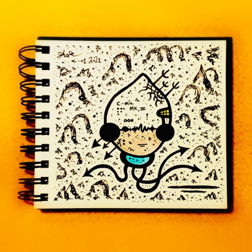
Was itching to play along with the “Draw Me A Robot” challenge for a while now!
Not much I can say about this, pretty spontaneous to say the least...
Definitely wanted to add some sort of low fidelity edge to things though.
I was going through some of my old work from a few years ago and I wanted to see the difference. I uploaded the original sketch. I like my art and my style. I see the growth. I. Am. Happy!
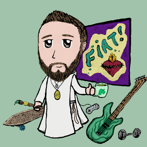
This piece critiques the modern tendency to hide identity behind brands and consumerism.
* Visual Focus: The mask is partially obscured by a fitted baseball cap, with the bill pulled down to cover one eye. The cap itself is a symbol of brand identity and fast-fashion culture. The uncovered eye retains an unsettling, almost mechanical gaze.
* Symbolism:
* The Cap: Represents the societal practice of hiding behind brands and allowing consumerism to dictate self-worth and block out unwanted truths. The act of seeing is deliberately curtailed.
* The Mask: Emphasizes that the consumer identity is often a façade-a manufactured mask that prevents others from truly
"seeing" the individual, while simultaneously restricting the individual's full sight of the world.