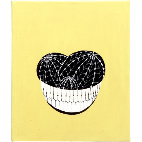
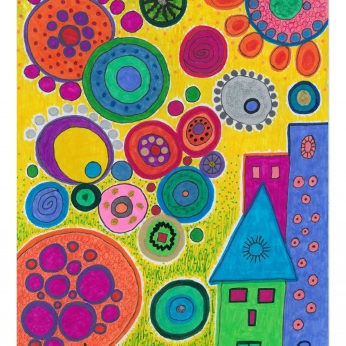
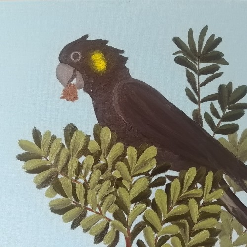
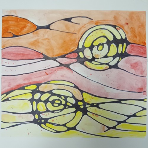
Canvas mounted on wooden frame. Size: 25 x 30 cm Materials: acrylic, Chinese ink, brush, pen and marker. Is sold the original piece. For this reason, there may be slight differences from one piece to another.
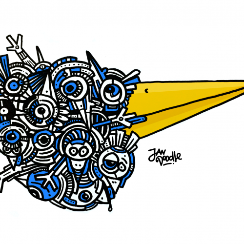
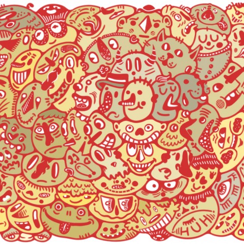
Against a vibrant yellow sky, the boldly colored, circular shapes suggest a multitude of orbs, each with its own unique style and design, floating across the vast universe.
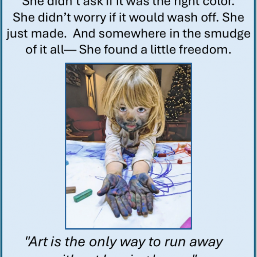
The tables were covered in white paper. Crayons, pastels, and smooth sticks waited quietly. Then came Lucy’s glittery purse—her 8-year-old hands had filled it with stones to pass along, one by one, to the strangers around the table.
We traced them. Pushed them. Held them.
Then we let the colors lead:
-Red for emotion.
-Yellow for curiosity.
-Blue for memory.
Each color came with music, with story, with space.
At the Museum of Wisconsin Art, we made marks not for meaning but for presence.
Thank you to Ann Marie and MOWA for the invitation and trust. And thank you to the participants—some new friends, some old students—for showing up and making lines that listened before they spoke.
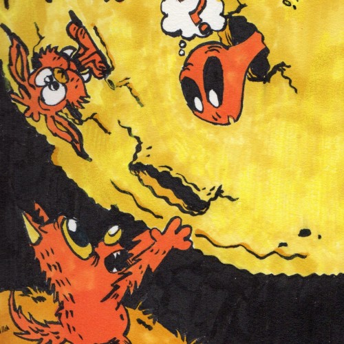
Much like "Orange", I used my orange and yellow Ohuhu markers to create this spooky,hilarious drawing of a wolf (not a werewolf) getting up close and personal with the moon, and it's inhabitants.
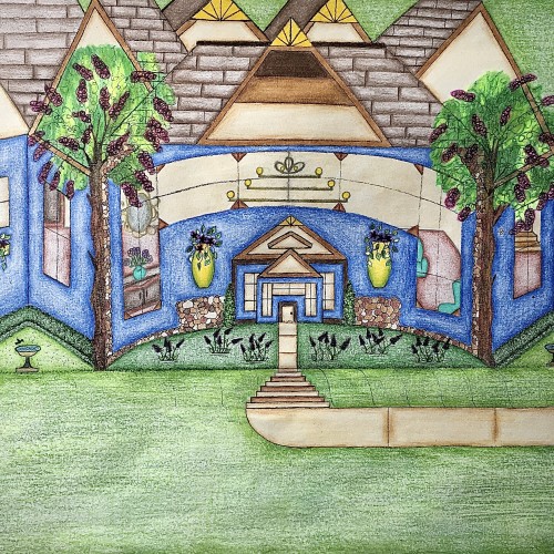
I designed this house. It has a really pretty blue exterior, and it has a slight curve to it that gives it a more warm and inviting feel. I like how the walkway kind of curves into the stairs and transitions back into the walkway before arriving at the front door. I like that there’s plenty of yard space with some really nice landscaping. The birds can even come and get a birdbath. I thought that was really cute. I used the multicolored stones to add detail for a more distinguished look. The hedges are neatly cut in a square and follows along side of the house. Looking through those gorgeous windows you can see the house is fully furnished. There are some really pretty chandeliers in there that adds character. There’s a stairway that leads to another level of the house as well. I love how there’s a touch of yellow that highlights the points on the rooftop. Furthermore, the swing in the backyard adds an inviting feel to the scenery. Also, it’s a nice place to sit and enjoy the view.
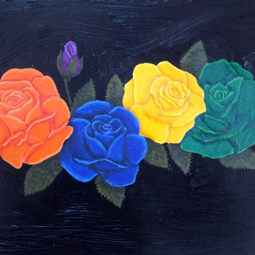
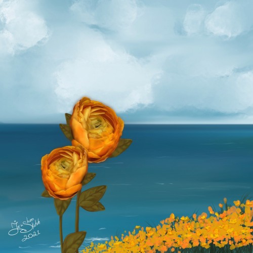
Each rose represents each member of the bridal party on the Bride's side. Orange is the Bride herself, ultramarine is me (sister), yellow is the Bride's best friend and emerald is the Bride's sister in law
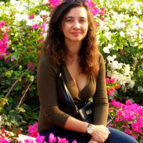
My name is Jenny Lebedev.
I am a multidisciplinary artist and illustrator, Making painting on canvas and digital platform, video, photography, drawing. Graduate of the Department of Multidisciplinary Art at Shenkar.
I recently finished illustrating the second children's book. I also accept commission projects and work with the client in close communication. I make digital art work for postcards, prints, incl. producing prints.
In the field of art I deal with conceptual art on the topics of "nothingness" and the existing emptiness, awareness of the air.
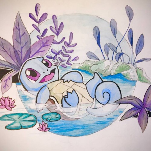
Squirtle: no more no less. Actually more about it, my lighting is bad, aka the yellow tint. Also color picking is really hard, and i might have to do a bit more outlining to the piece to make it look cohesive. But overall the composition is balanced i think, even if i slacked off with the execution a bit towards the end
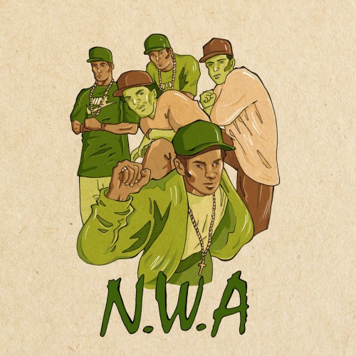
"You'd rather see, me in the pen,
Than me and Lorenzo rollin' in a Benz-o.
Beat a police out of shape
And when I'm finished, bring the yellow tape".
First playing card for a musical game of fours.
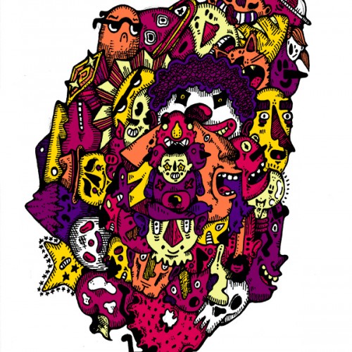
This doodle is totally rad!...or at least I think it is. Drawn traditionally with pencil and ink and colored digitally with purples, yellows, and pinks.
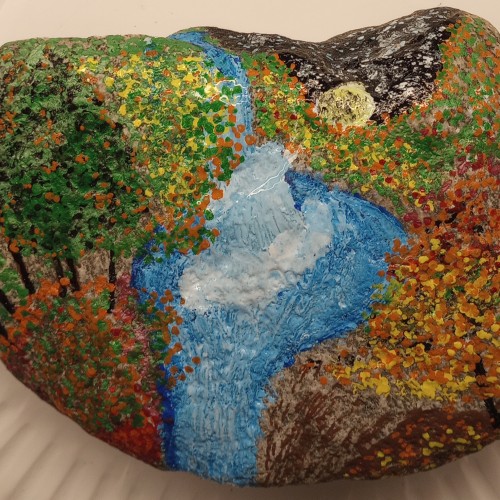
I painted this with Oil on a non tumbled Rock I found from my local Mountains. An evening Autumn Scene and a slight yellow moon peeking out over the horizon.