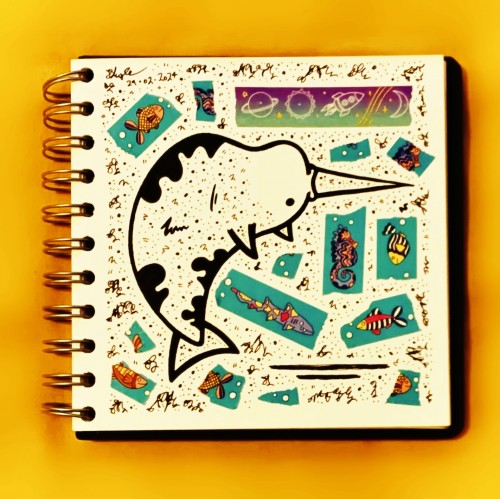
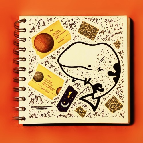
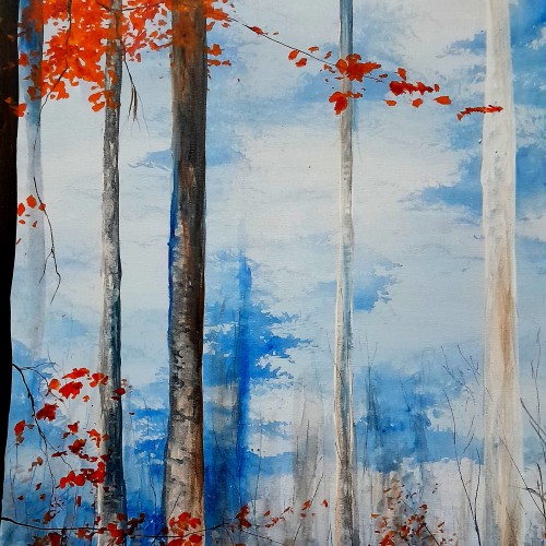
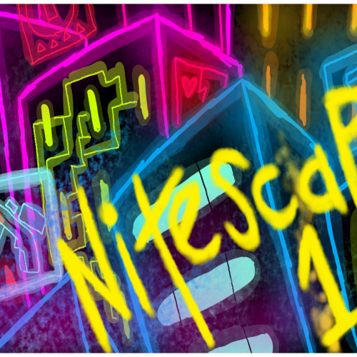
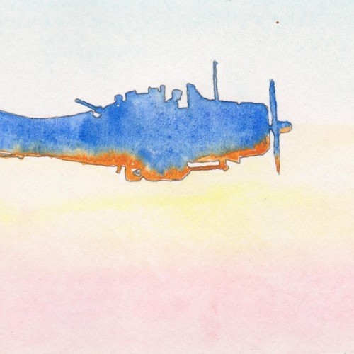
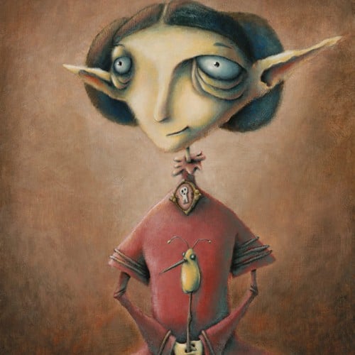
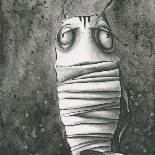
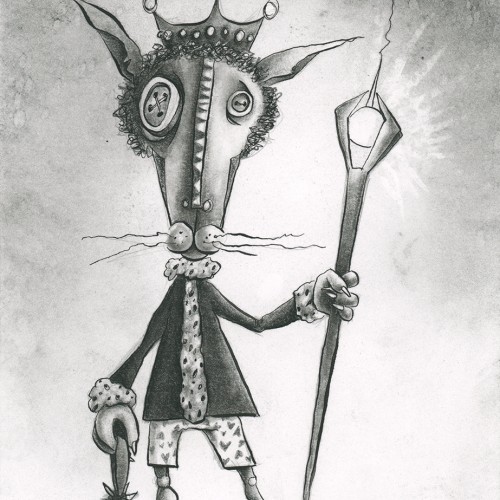
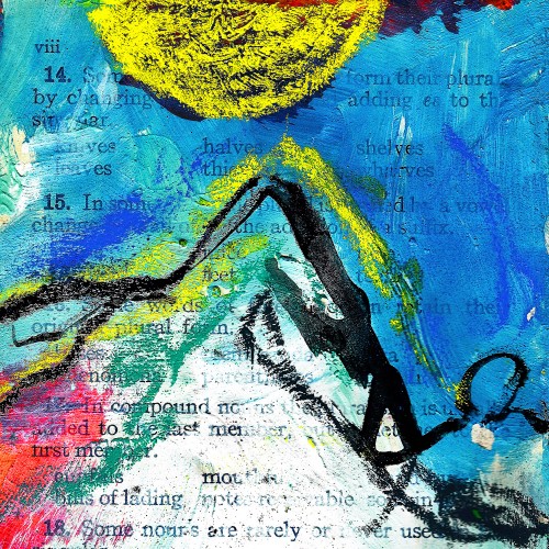
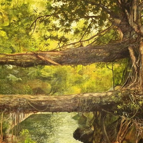
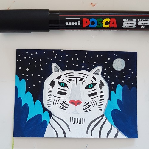
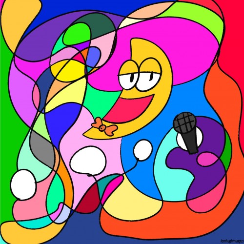
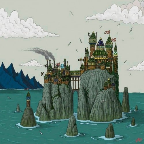
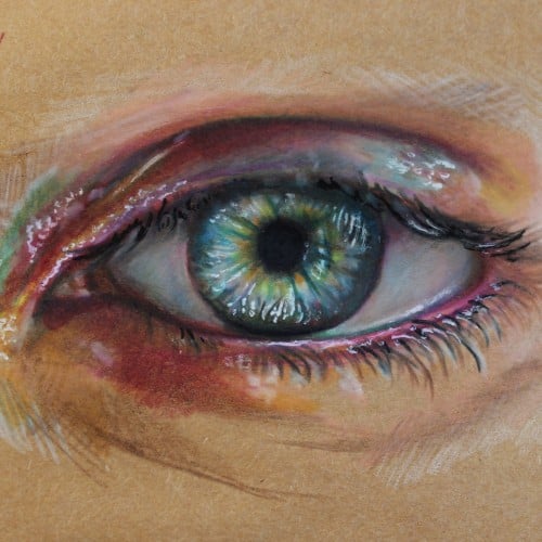
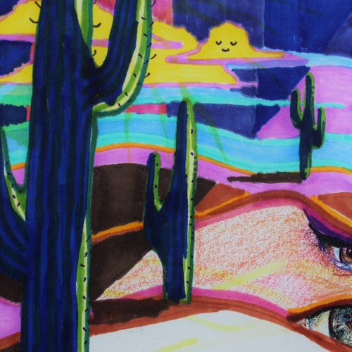
Nitescape. The mysterious going city across the great ocean, far away from Nornwan and far forgotten, but they have not forgotten. They still have hints of the old world in their dome of cyber charged pessimism. Older painting, for a Nitescape cyberpunk project, the following link is to my friend's bizarre video adventure that takes place sometime in the dark and dreary city of Nitescape!
https://www.youtube.com/watch?v=AnfgqkhL_yE
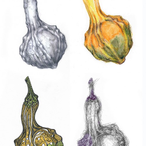
I modified the challenge a wee bit. I didn't use the same paper for the various drawings since I was using (top row, left to right) hard graphite pencils (3H to HB), watercolor pencils, (bottom row, left to right) brush pens and ballpoint pen. These media work best on very different paper textures and moisture absorbing qualities. The second picture shows the object of my study --- and the apparatus I use to hold botanical subjects. "Third hand" tools are very useful and cheap. This one was under $10 and serves my purposes well. Just FYI. (Each drawing/painting was scanned and composited in Photoshop.)
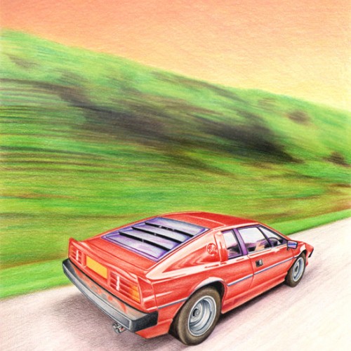
A colour pencil drawing using Derwent Artists pencils on thick cartridge paper. I wanted to show the car speeding down the highway, and so tried to make the tress appear as though they are a blur - Many thanks for looking !
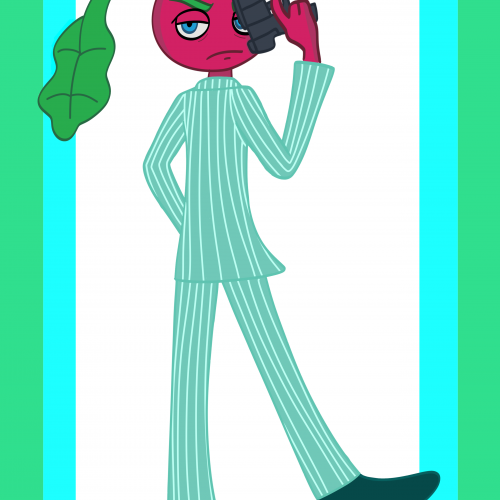
I can't draw guns lol,Ruthleen is a 30 year old crime lord who is in charge of exporting illegal firearms throughout various cities,she also launders lots of money along with her partner in crime Parslip longstem who's a parsnip vegetable.Both bring in millions of dollars in illegal activity.they are wanted for their crimes,Ruthleen and Parslip have a mutual relationship with Taffeliers who is a moody drug lord.Ruthleen came from a poor,dangerous neighboorhood and was raised by a single mother which shaped most of her personality,cold and restrained.
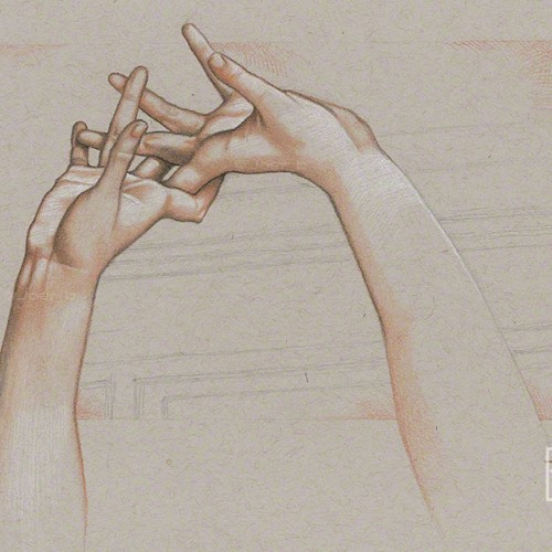
Pastel pencil study of the intertwined hands of the Ambrogio Borghi sculpture, Chioma di Berenice. Faber Castell pastel pencils, Black and White Generals charcoal pencils on 9” x 12” Strathmore Toned Grey sketchbook paper.
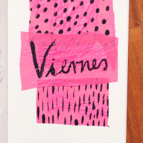
India ink on tissue paper. I had never used ink on this kind of paper before; I really liked the results! There are some folds and wrinkles on the paper that give the pattern some interesting details. The paper is also super absorbing, which plays nicely with the quantities of ink. Since it's very thin, there can easily be overlays between textures. And finally, when trying to use less ink (so that it wouldn't seep through and cause a big dot - the absorbing quality is nice, but it was also somewhat of a challenge!) I used very little ink on the lettering, causing a scratchy, dry look.