It's a mess, right? Not particularly beautiful or impressive. That is what self-hatred is like. Easy to achieve. Not great to look at. Very common. And very, very hard. To all of the people that struggle with self-hate, it's all in your head don't worry. You are the only one that sees you the way you see yourself.
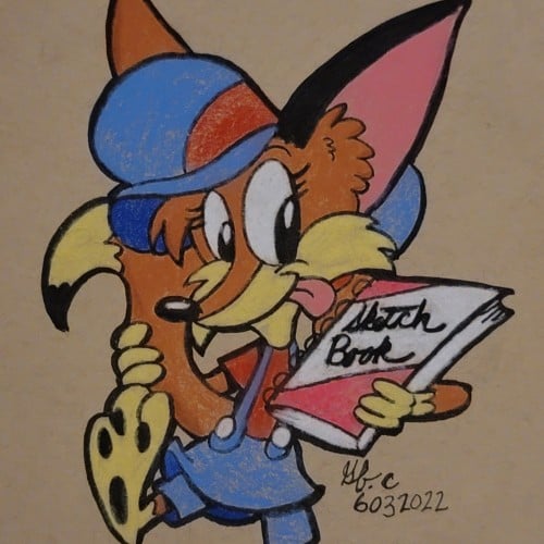
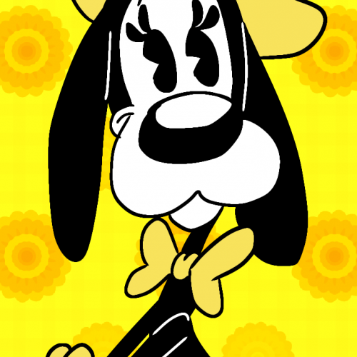
Twizzy loves all things yellow. Cause it feel like the sun and is always bright. Speaking of which , she also likes flowers. Her faves are sunflowers, marigolds, buttercups, tulips, etc.
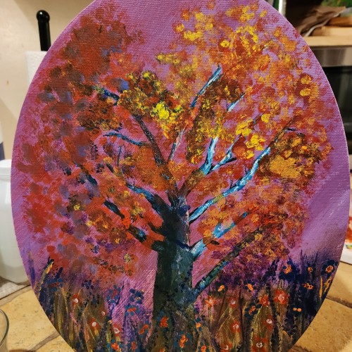
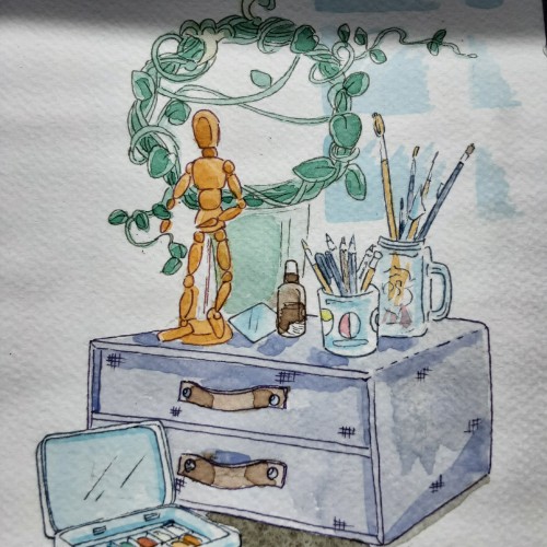
This is my first attempt at traditional egg tempera painting. The panel is a Masonite board from Michaels, but I need to use true gesso because the egg tempera will not adhere to acrylic gesso. Some of my favorite artists used egg tempera. Andrew Wyeth, Robert Vickrey, and Colin Fraser are all masters of this ancient and archival medium. I have been self studying this technique for months and I was very excited to start experiencing the medium. Egg tempera is like layering stained glass on top of stained glass. the painter can expect a luminous glow to take shape as the colors blend visually through the layers of paint - assisted by the chalk of the true gesso. Egg tempera has been described as the closest painting technique to drawing, hence my draw to this medium.
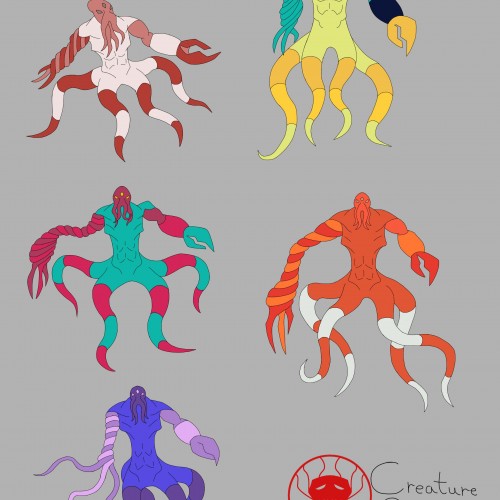
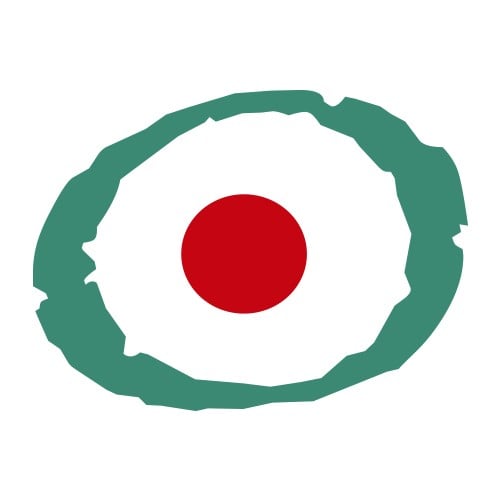
I was trying out different color palettes to see which one I preferred. The top palettes are based off the mimic octopus and the blue-ringed octopus, respectively. The rest aren't inspired by anything, I just thought the colors looked nice.
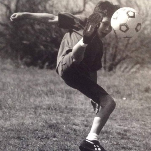
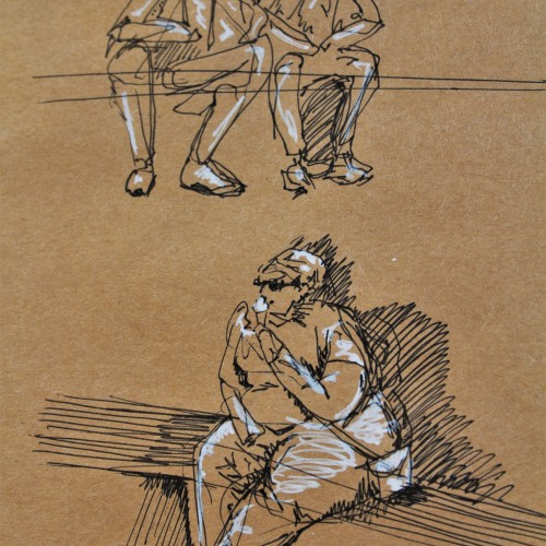
These are some gesture drawing sketches I did in ink with white pen highlights on brown paper. I was in Europe and sitting around a fountain watching people go about their lives. This was a really fun figure study and I think people make for great works of art.
One of my Swirly Designs, illustrated with different tools such as Graphite, Aquarelle, Ink Pens and Ai & Tablet. Sometimes sheer Vectorillustration/design.
.
Urh.-Nr:1811955
.
Copyright by Carolina Matthes
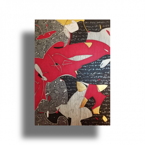
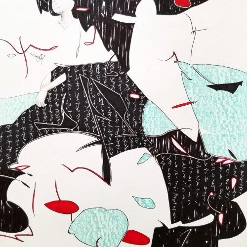
The idea is to show a figure crossing over two ` scripts’ with a bilingual suggestion. By standing in between worlds, we see opposing viewpoints.
Many artists have incorporated typography as symbols in their paintings since the 60s, but no one has attempted to approach lines in this `written’ manner. How different it is are the two writing styles of the East and the West; one with angular lines while the other in a smooth flow! This work juxtaposes the symbolism of cultures – script. At the same time, it questions the need to grasp the full meaning of the script to appreciate the aesthetic flow of calligraphic lines.
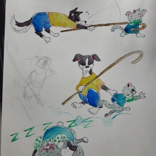
Having younger siblings is 50% about having spoiled rotten playmates and 50% about making sure those little morons dont accidentaly kill themselves. Border collies are so hard to draw antropomorph! Ever noticed how they most of the time keep their head lover than the bum?
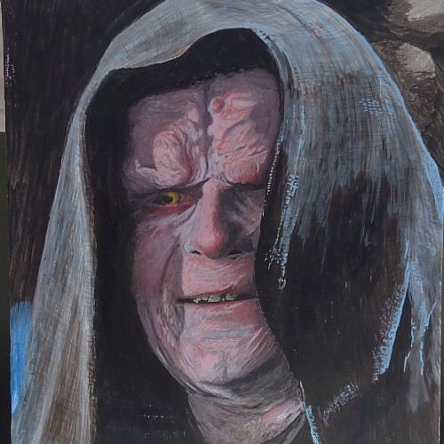
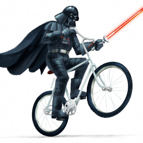
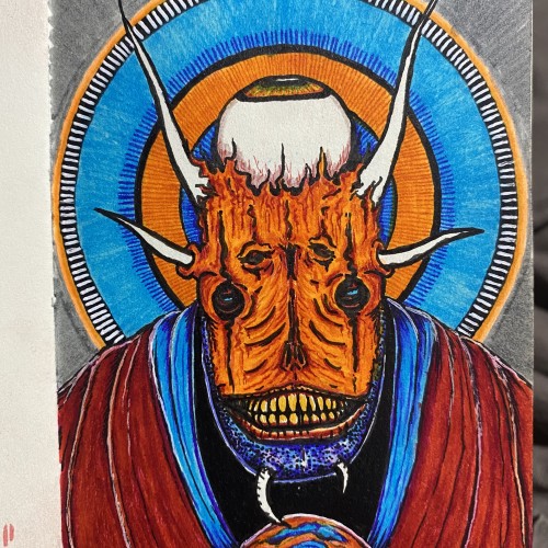
Another Star Wars fan art piece of my all time fav character from Star Wars. Which is telling how impactful his performance was considering he had very little screen time. we are talking just minutes in each film.
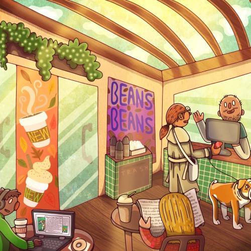
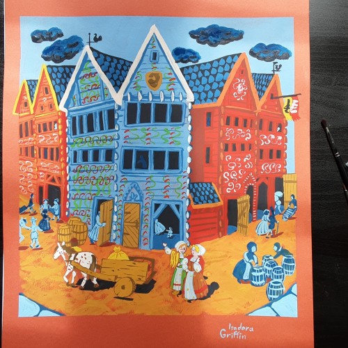
This looks simple, but i spent days researching to get the buildings and clothing right. There was also a lot more layers than i planned for. This buildings are still in use, there are different shops in them now. Sadly they no longer have those colorful decorations,
Whether the script in the background is an actual sutra is not the concern, even if it is, would it be readable to most? I question the use of lines in Calligraphy. Without the recognition of the exact words or meaning, can we still appreciate the quality and skills involved? Armed with a Chinese writing foundation, I adapted the use of the eight strokes (the basis of construction to Chinese character). The `writings’ resembles Chinese/Japanese writings but in fact, they are not. I needed a texture. With language as a symbol of culture, by visually adapting these kind of lines endears us to the image.
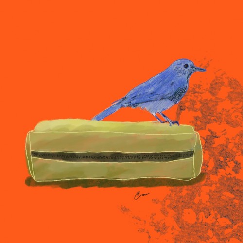
The little bluebird, restless artist,
Flew over the orange horizon without restraint.
With his box full of colored pencils,
He thought he could paint the sky in an instant, of course!
But too many pencils and too few wings,
Unbalanced the poor little bird.
So many colors, no coordination,
His creative disaster fell to the ground!
Orange, yellow and red pencils shattered,
While the little blue bird fell in tears.
His celestial dream turned into a nightmare...
Until he saw - a rainbow formed!
From sadness, joy overflowed,
In that magical moment he understood:
It doesn't matter the skill or the tools,
Art comes from the heart, even if messy!
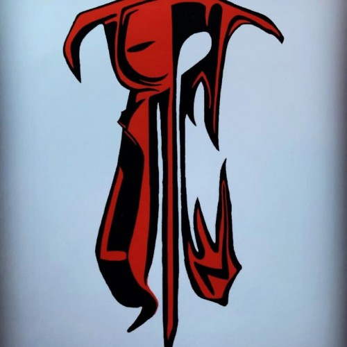
Some works were born to be prodigious. Once the preliminary lines were laid within the first minute, the quality of the shapes, the diagonal composition and the weight were balanced out.
With the black mass as the hood, a face, hidden underneath, is unveiled. With the addition of the black fingers and the white hand, the full figure surfaced naturally.
The black fingers are the minimal suggestions to add character. The title `Remorse’ came about because of the bowed head and the pose.
utube clip: https://youtu.be/mb48rCx-lYI