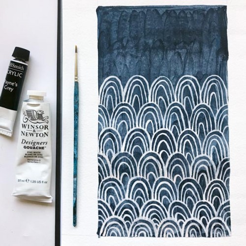
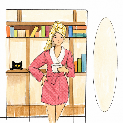
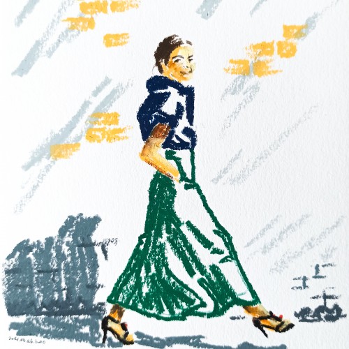
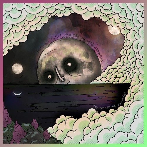
Following the daily painting challenge with Lisa Congdon over at CreativeBug though I haven't quite managed to keep up daily. Still, it's wonderful picking the brush up again and splashing around with paint!
The materials that Meir uses in her works are not of the refined and so she is called an “arte povere” artist. At times she describes her work as someone dealing in alchemy - work develops as in a trial laboratory with different techniques and materials. She says, “ at times the artistic work process is a sort of puzzle demanding the filling in of all the empty squares “.
Some of her work focuses on women, and they incorporate criticism and cultural protest.
Meir has strong opinions about recycling and environmental protection that is represented in her works by use of materials and shapes. In her work she reacts to contemporary art that communicates with the eco system, waste, and she also searches for different worlds. Her works are made up of layers upon colorful layers that when we look at them it becomes clear that the mound of waste she chose is not coincidental. It actually becomes a colorful kaleidoscope of utopia.
Jaffa Meir is a multifaceted, autodidact artist working in painting, sculpture, photography, product design, carpets and furniture, painting on textile, and computer graphics.
The structural composition of some of the works is influenced also by her many years of working in the architects’ office.
Meir also worked in the developing of ideas within the field of ecosystems and recycling for factories such as Coca Cola, and during this process came up with ideas for designing parks and public game spaces using industrial waste products.
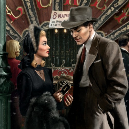
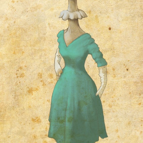
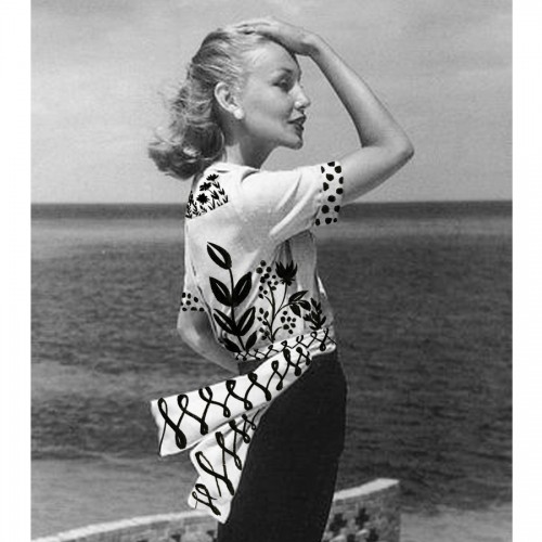
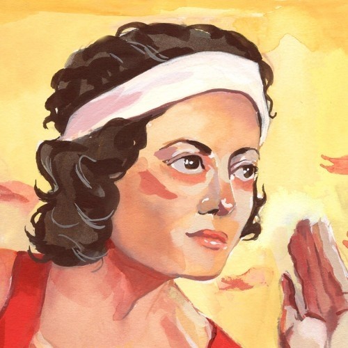
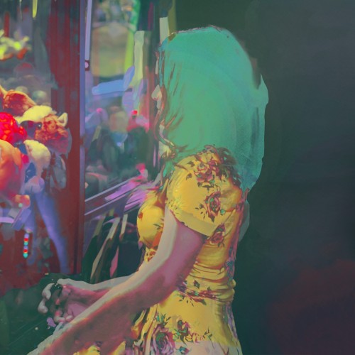
Trying to meld the moody tones of pulp noir with the playful romanticism of 1950s lifestyle illustration. Inspired by the fairground scene from the 1942 Veronica Lake classic, This Gun for Hire.
If red is for hardiness and valor, may we show courage and resilience. If white is for purity and innocence, may we help protect the young, disadvantaged and helpless. If blue stands for vigilance, perseverance and justice, may we put a mirror to ourselves and learn persistently.
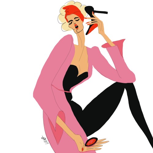
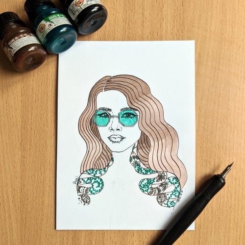
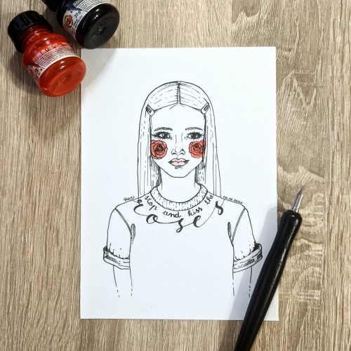
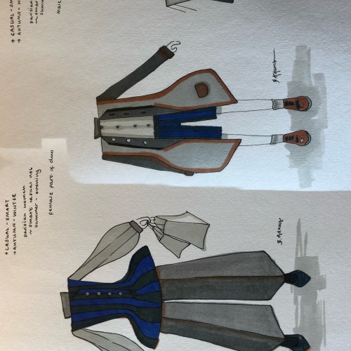
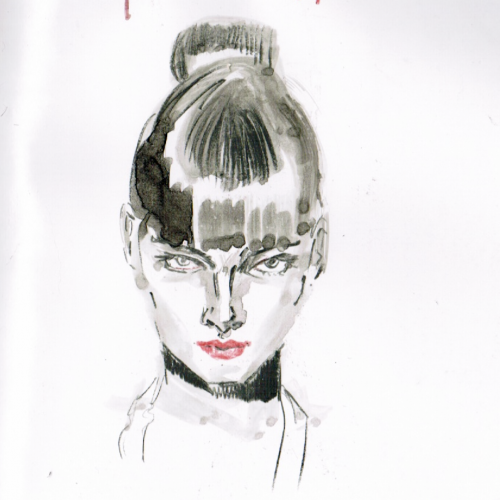
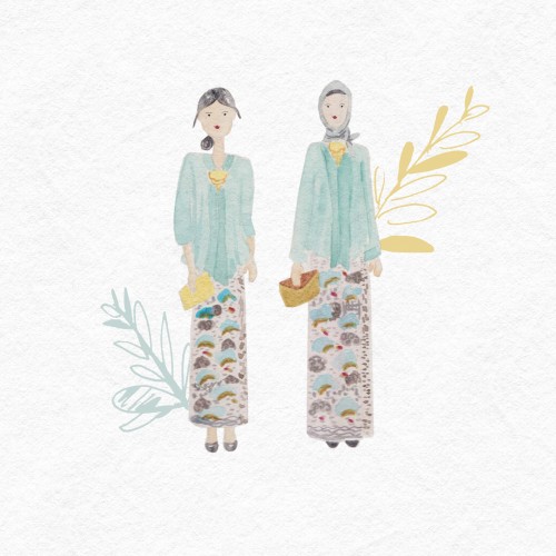
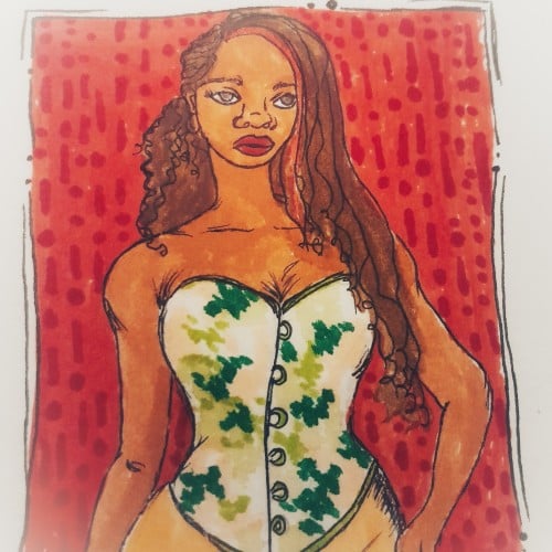
Some fashion Sketches today - they go as a pair together, so that’s why they’re are edited into the same pic ( cos i don’t have doodleaddicts pro lmaoo). If you are interested, I used winter and newton Promarkers, and a waterproof permanent 0.5 black pen to outline! leave a comment to let me know if you like it!!
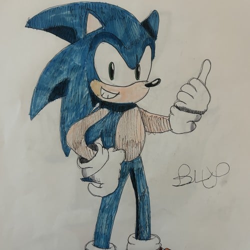
This is day 1 of drawing Sonic characters and it’s the man himself. Sonic is very fast who lives in green hill zone, loves eating chili dogs, and bashing Dr, Eggman and his machines. No matter where he goes, he will always keep on running. Sonic belongs to Sega
(Ps its my 21th / 22th time drawing my oc Junior in my Sneezy art and doodle addict era and thrid time in my counter social era but not my first time drawing my sml trans woman Jewish 6'2 woman oc exp I drew her during her now being 8-9 months pregnant btw still.
(PS 8th junior drawing on sneezy art and forth time on doodle addict btw.)
*PS photo 1 is better
Finished ver then photo 2 is inked ver.*
*Ps: it's not my best work yet! But its one my most inspiringwirks so far! But it's bit if an improvement of last time an few days ago even I took 3 - 4 days aka almost an week to draw this I started it on September 20th and finished it on September 23th and I liked better than last junior I made last time and better then the
inked ver btw!*.
(Ps jeffoween 2025 is coming soon like next month or 2 weeks later
Elias Rosenshaw 8/29/2025
Mixed media on toned tan paper.
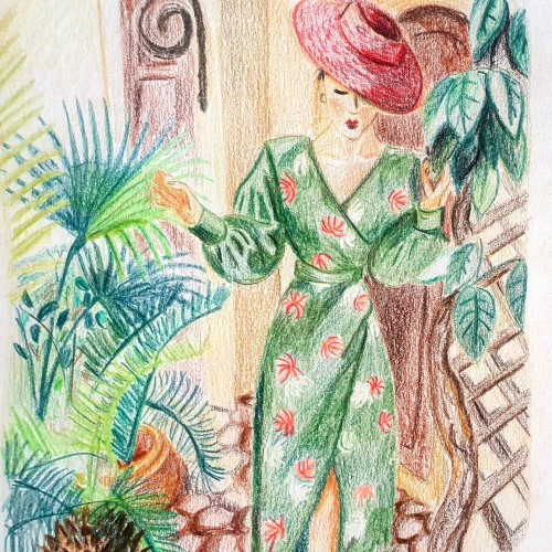
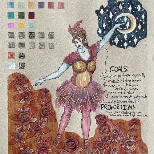
Starting next week, I'm going back to college. I'm very excited for my courses, especially art & writing. It will be a great opportunity to explore my curiosities, improve my art skills, and grow as a person. I will share my art assignments if my instructors allow it. I would also like to write a little about each piece, which may be required for my assignments anyway.
Lately, I've been inspired by fantasy & fairytale artwork. I think fantasy & horror will make good focuses for my pre-BFA portfolio. This was a little experiment with a fairytale aesthetic. One of my goals is to use limited art supply sets & swap out colours as they run out. I feel the first colours I picked out fit with aesthetic well.
I'm proud of this drawing, especially the dress & the night sky. However, I can see some areas that I should've done differently. I'm not happy with the proportions & foreshortening of the limbs. Also, I shouldn't have used a background colour for the flowers. I added the colour to cover up a smear from the watercolour. I should avoid making large areas of solid colour, especially with my coloured pencils. I am learning & improving.