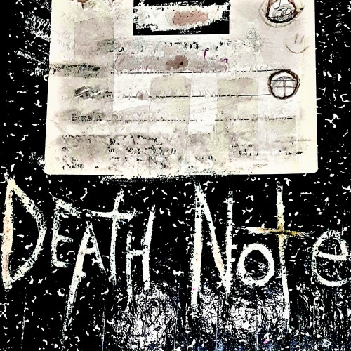
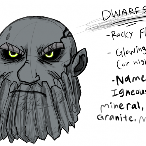
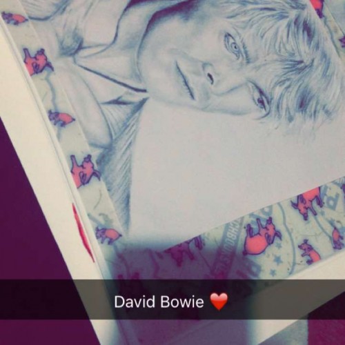
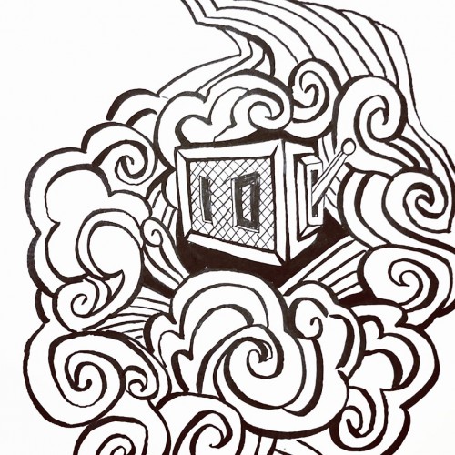
If you have any friends that ever watched the Anime / Manga Death Note .... Then , please, in the name and for the love of GOD , please prank them by placing one of these near them so they find it ! Oh.... I really need to do this , to like all my friends, IF I HAD THEM ! LOL .... Dudes, almost didn't upload today ,,, have a sweet Thanksgiving ya'll .
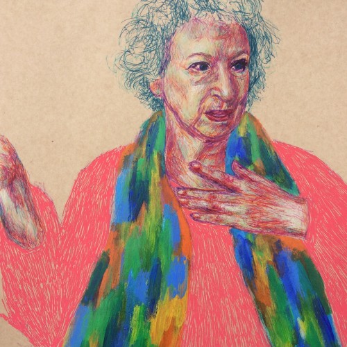
This is another way of working that I really like. Fine liners and chalk (colour) pencils were predominantly used, with a quick smothering of acrylics for her scarf and coarse posca pen marks for the jumper :). About the subject, Handmaid's Tale was one of those rare books that I read more than once growing up and it stayed with me, hence why I decided to draw Margaret Atwood (not seen the series yet though but I hear good things!). I accidentally had her hand cut out while penning the figure - still working on my scale and composition!
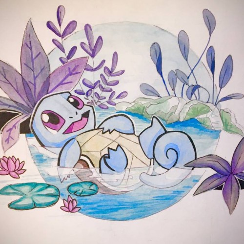
Squirtle: no more no less. Actually more about it, my lighting is bad, aka the yellow tint. Also color picking is really hard, and i might have to do a bit more outlining to the piece to make it look cohesive. But overall the composition is balanced i think, even if i slacked off with the execution a bit towards the end
This turned out to be a finished painting. It started with a full canvas of doodle lines (check my patreon log if you are interested in the raw file) This was executed just this March. Still, no lines were altered except the face area. Impossible you say?
I have been wanting to explore the concept of creating a Vitruvian Women. Also felt like I struggled with the composition of the Reflect piece (which I am working on developing a series). Hence trying to learn from the best - in a scientific way:)
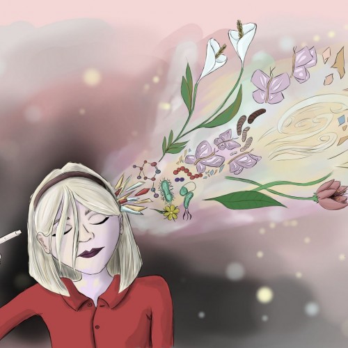
UPDATE: I was working on this illustration a while back, but I had no spare time and had to put it aside. The composition was too busy, but now I think it looks a little better. I made a few major changes, like:
• Made adjustments to light sources
• Created bolder outlines
• Got rid of the Knight reading over the dragon's shoulder
My project for a skillshare course I am taking. I am trying to work on developing more textures and drama to my paintings as well as improving on the composition. Any advice or tips that you can share would be appreciated. Thanks!
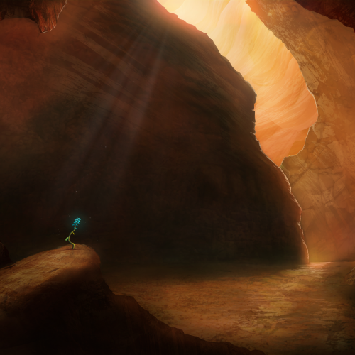
Painted as a project for Painting Environments class: skl.sh/32Khrti
Project parameters:
- Mysterious Cave
- Dark but with moody lighting
- Mostly warm colors but with single blue flower
- Flower is the focal point - use composition to lead eye to flower
Français : L’Appropriationnisme ou le « Remake » est un concept simple. En effet, il suffit de reprendre le travail d’un artiste et signer la nouvelle production de son nom. Il ne s’agit, en aucun cas, de copier l’œuvre comme pourrait le faire un faussaire. Il ne s’agit pas non plus de plagier l’œuvre.
En ce qui me concerne, j’utilise l’œuvre célèbre d’un artiste reconnu. En réutilisant une œuvre originale préexistante et célèbre, condition sine qua non, je propose de rendre un hommage. Il ne s’agit en aucun cas d’un manque d’inspiration surtout lorsque l’on sait maintenant que : « l’art naît de l’art et non de la nature » : Ernst Gombrich.
Dans cette série, j’ai voulu revisiter des œuvres célèbres en utilisant ma technique graphique de l’éloge de l’approximation mettant en évidence la problématique de la défaillance et de la mémoire vaporeuse.
English: Appropriationism or Remake is a simple concept. Indeed, it is enough to take again the work of an artist and to sign the new production of his name. It is not a question of copying the work as a forger could do. It is not a question of plagiarizing the work.
As far as I'm concerned, I use the famous work of a recognized artist. By reusing a pre-existing and famous original work, condition sine qua non, I propose to pay tribute. It is by no means a lack of inspiration especially when we now know that: "art is born of art and not of nature": Ernst Gombrich.
In this series, I wanted to revisit famous works using my graphic technique of praising the approximation highlighting the problem of failure and vaporous memory.
https://www.pierretomyleboucher.fr
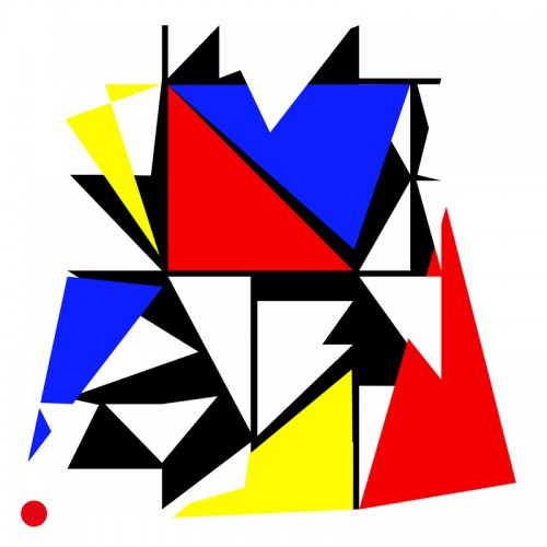
Another wobbly neighborhood. Focusing on color and composition and leaving behind perfect perfective and detail. Ultimately, putting fun first in my personal work moving forward.
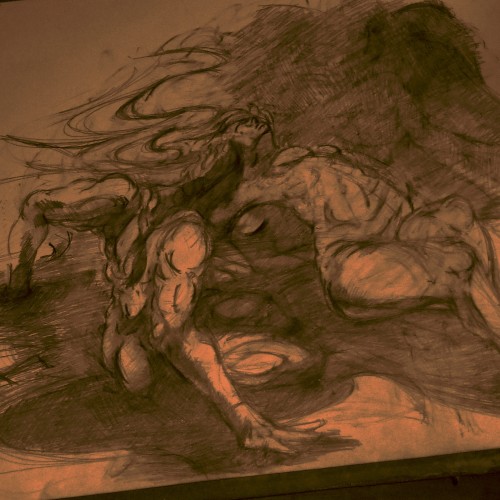
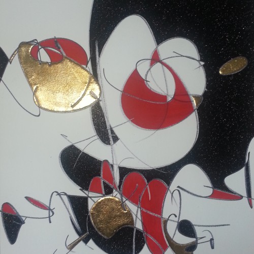
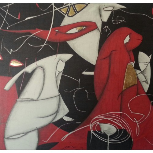
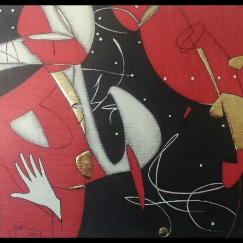
This was a transitional piece as I enlarged/zoomed out the 'mass' of the doodle towards the edge of the paper. This was one of the last pieces of abstracts before my figures surfaced from the compositions.
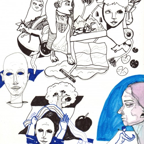
These figures found must cast some meanings from my subconscious. They simply came and as a whole composition! I uploaded a full description on youtube giving them individual names, mostly ghostly. This piece contains a spooky atmosphere stronger than the others and remains one of my favorites, probably because better works come effortless.
The only line added consciously is the hand. It leads the eye to the eye and thereby showing the viewers that it is in fact a figure. The shape on the right feels kind of right to be there, it really does not matter what it is. Compositional-wise , it works.
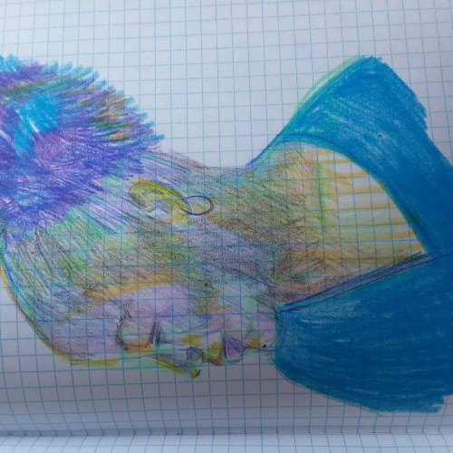
Chari is one of my favorite folks to draw! I have been drawing a lot more while out and about. Using the cheap graph composition notebook, non-expensive art supplies and going to a coffee shop to draw people. Sometimes I can get a likeness with my mind, eyes, hands and draftsmanship and other times it is the "many moods of my subject." :-) This is a place (in my book) where I can learn from my perceived fails. ****The images are sideways! I know this. I do not know how to make them portrait orientation. They started out as portrait-scaped orientation and now they are landscape. Well..... Okay then. The figurative landscape. Hahaahhha! Cry. I even tried the visa versa. Nope. They want to be on their sides.
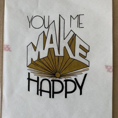
The complete first task of my lettering course. I thought maybe wait for the critique and refining it it before uploading here. Yet the suggested changes would make a whole different work.
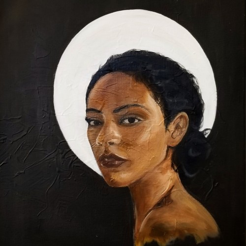
Eve is a continuation on my series of portraits. This piece represents my maturing technique and style as I begin to experiment with creamy consistencies. The painting displayed my ability to capture facial expressions.
My trip to Paris, France influenced my painting style. I was struck by the realism and drama depicted in various compositions, but also the lack of diversity. This piece is named "Eve" questioning whether the holy subjects depicted in European art were, in fact, part of a different race altogether.
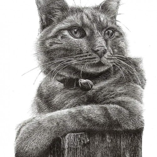
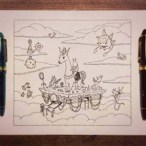
Digital is great -- for composition and color. But for line art? I don't think I can ever give up the fountain pen. This was drawn with a Sailor King of Pen (M) and Sailor 1911L (EF) fountain pens using Pilot Black ink. Yes, sacrilege. Pilot ink in a Sailor. But I have some Kiwa Guro arriving soon!
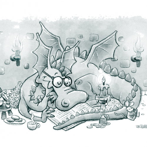
This was a project I did and totally forgot about. It's a Notan style dragon I did for a 2d composition class. I kinda like out it turned out. This was my first major foray into illustrator. Time: 3 hours Medium: Illustrator on Mac