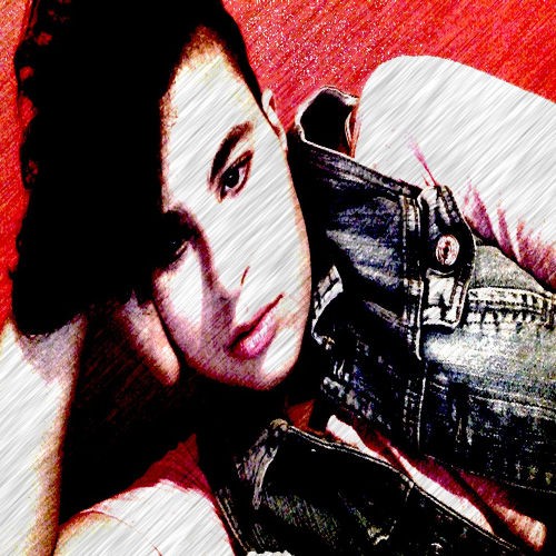
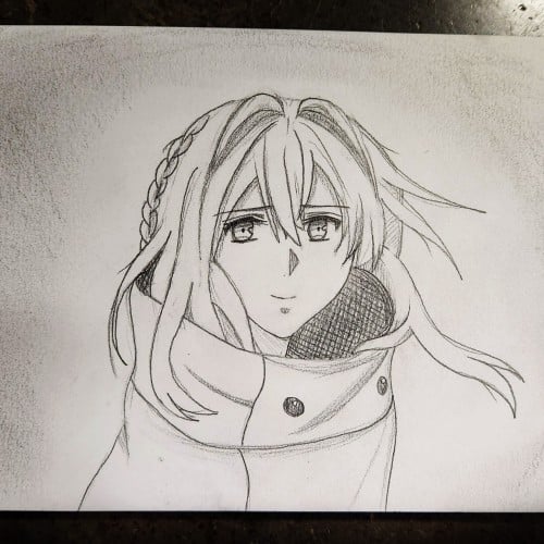
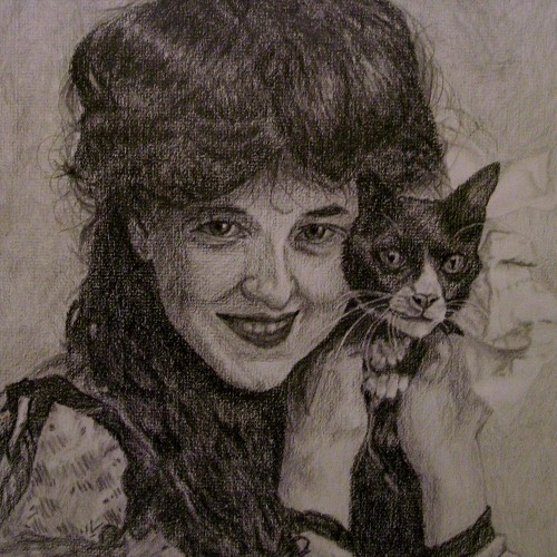
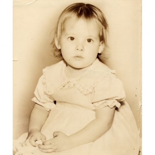
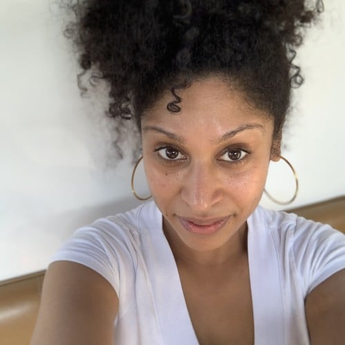
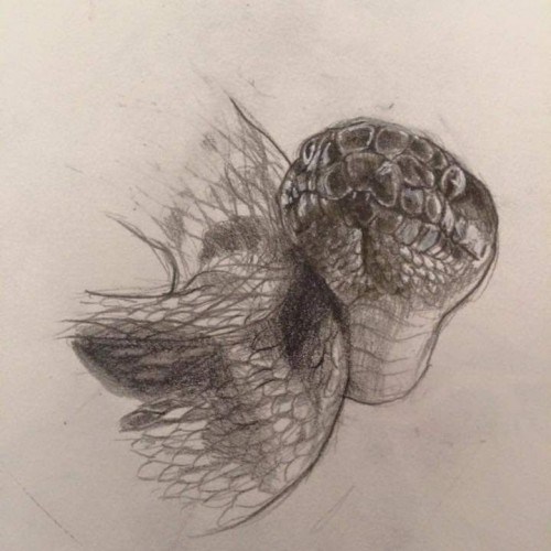
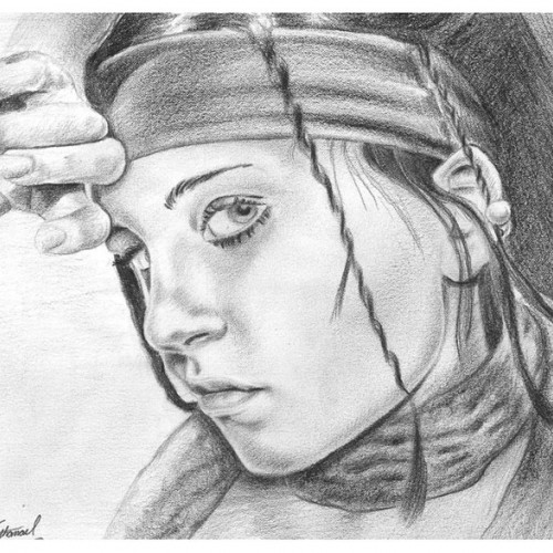
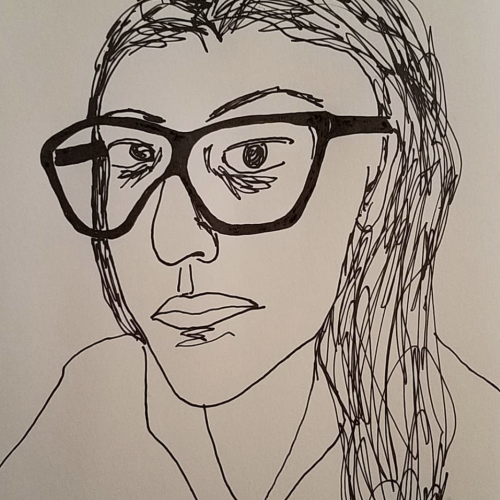
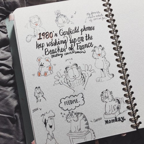
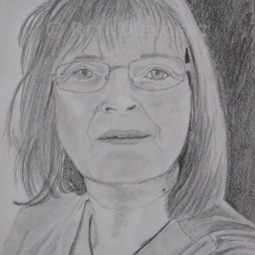
While waiting in line at a convention to meet Erika Harlacher-Stone (the voice of Violet Evergarden), I sketched this from a reference. Pretty cool moment to see her reaction when I handed it to her, and I'm happy to report that she is indeed a lovely person.
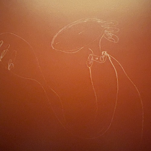
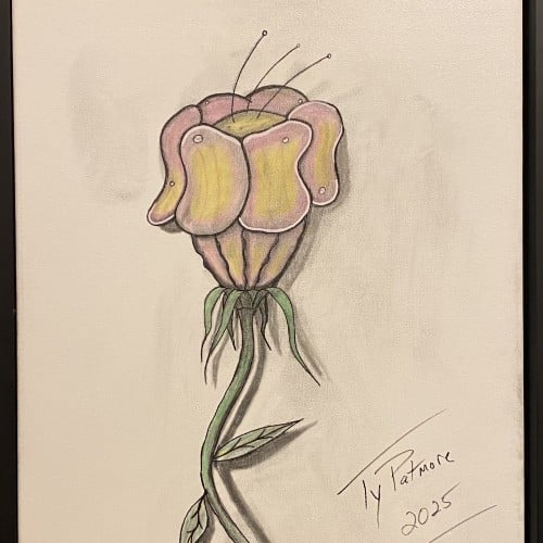
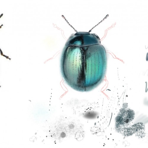
A captivating exploration of form, this work features an imaginative flower with a distinctive, almost sculptural head. The smooth, folded petals suggest a soft resilience, like a fleshy, protective helmet, while delicate antennae reach tentatively toward the light. The long, winding stem and minimal leaves anchor the drawing, creating a strong vertical movement. Rendered in a mix of colored pencil and graphite, the piece uses subtle shading to give the subject a remarkable three-dimensional quality, making it pop against the neutral background.
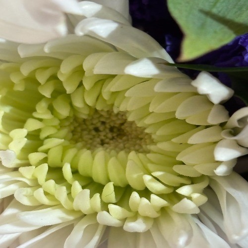
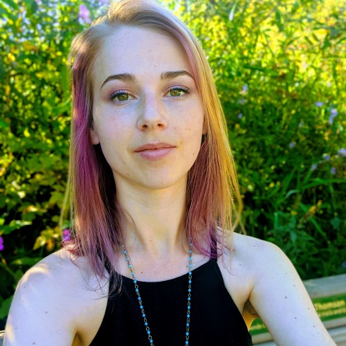
Hi! I just now created this page because I have a problem!! I love the idea of drawing (digital, graphite, markers, microns you name it), BUT I never actually get anything finished. It's a curse that has haunted me my entire life. Any good advice on how to stay consistent and follow through with your drawings? This one I've been doodling with Sketchable, using the photo to the left as reference just to eyeball off. I worked on it for a few days and was super inspired and now a year has passed from that (!!!) and It's still in this stage of almost done but I'm struggling with getting back into it..
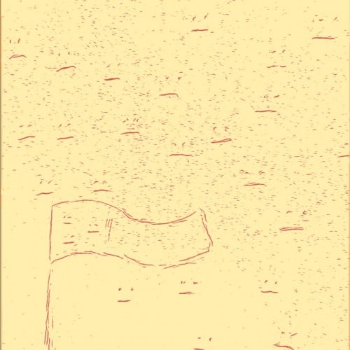
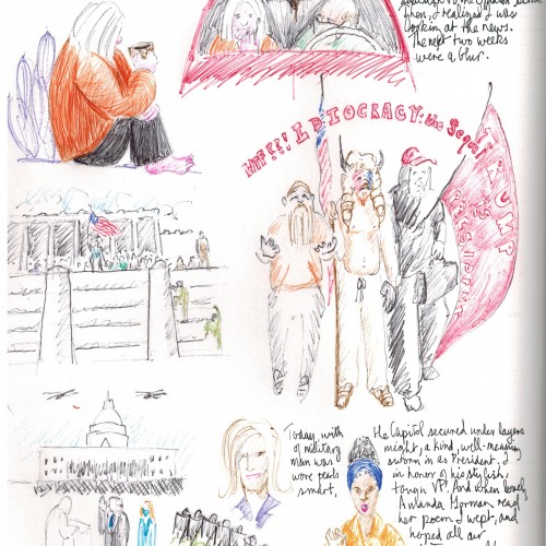
Sketch of a flag surrounded by sadness. Featured in ART GALLERY GERMANY by Mark Fischer, WORLD OF ART & PHOTOGRAPHY and ART GALLERY CHINA by Mark Fischer.
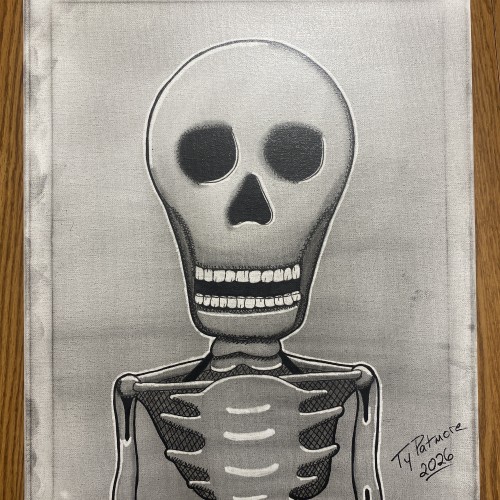
Stripped of skin, status, and story, what remains is the truth beneath it all. Bone Deep is a minimalist skeletal portrait rendered in graphite and ink on canvas, built through cross-hatching, stark contrast, and deliberate restraint. The exaggerated skull and hollow eyes confront the viewer directly — not with fear, but with inevitability.
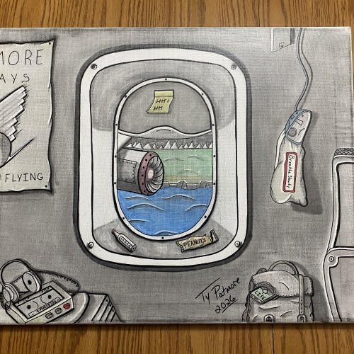
A quiet study of restraint at altitude. Framed through an aircraft window, the world below drifts by while the interior remains still—objects worn, familiar, and waiting. Subtle distortions in perspective and muted tones emphasize the tension between motion and pause, progress and endurance. This piece captures the discipline of waiting while suspended between departure and arrival, where patience is not passive, but practiced under pressure.
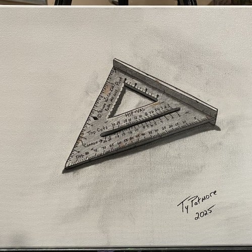
This piece continues my ongoing tool series, focusing on objects shaped by use, precision, and repetition. The speed square—an essential instrument of measurement and accuracy—is rendered with attention to wear, markings, and subtle imperfections left by time and handling.
Isolated against a minimal background, the tool becomes both subject and symbol: a quiet reflection on structure, angles, and the human need to measure and make sense of the physical world. Like the others in this series, it honors everyday labor and the overlooked beauty found in functional objects.
The materials that Meir uses in her works are not of the refined and so she is called an “arte povere” artist. At times she describes her work as someone dealing in alchemy - work develops as in a trial laboratory with different techniques and materials. She says, “ at times the artistic work process is a sort of puzzle demanding the filling in of all the empty squares “.
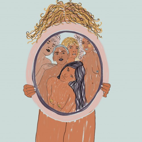
Some of her work focuses on women, and they incorporate criticism and cultural protest.
Meir has strong opinions about recycling and environmental protection that is represented in her works by use of materials and shapes. In her work she reacts to contemporary art that communicates with the eco system, waste, and she also searches for different worlds. Her works are made up of layers upon colorful layers that when we look at them it becomes clear that the mound of waste she chose is not coincidental. It actually becomes a colorful kaleidoscope of utopia.
Jaffa Meir is a multifaceted, autodidact artist working in painting, sculpture, photography, product design, carpets and furniture, painting on textile, and computer graphics.
The structural composition of some of the works is influenced also by her many years of working in the architects’ office.
Meir also worked in the developing of ideas within the field of ecosystems and recycling for factories such as Coca Cola, and during this process came up with ideas for designing parks and public game spaces using industrial waste products.
The logo is for a medical supplies company. I hope you like it. The name of the company is written in English and Arabic at the same time. You can read it from left to right in English, and from right to left in Arabic. I will leave it to you to guess the name of the company. Besides, I also hope that you can find the word in Arabic. I am so excited to see your comments.