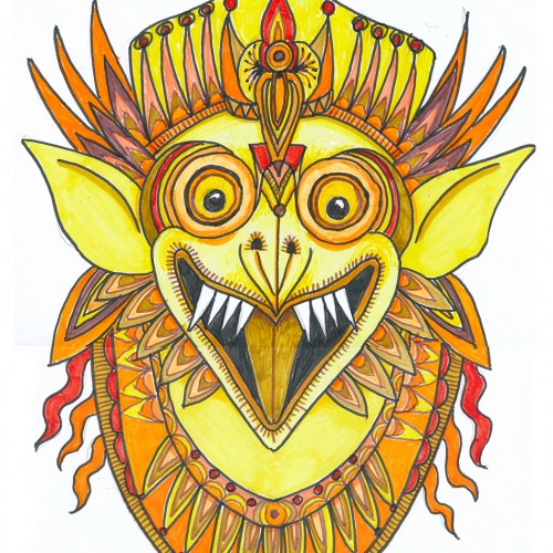
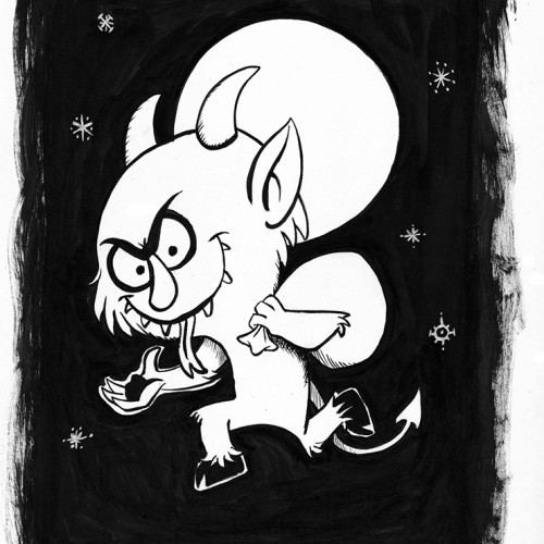
Oh boy, markers (NOT a go-to), least favorite color, and a subject that isn’t on my radar. This was a hard one what with 3 negatives going for it. But, hey, it’s a challenge, right?
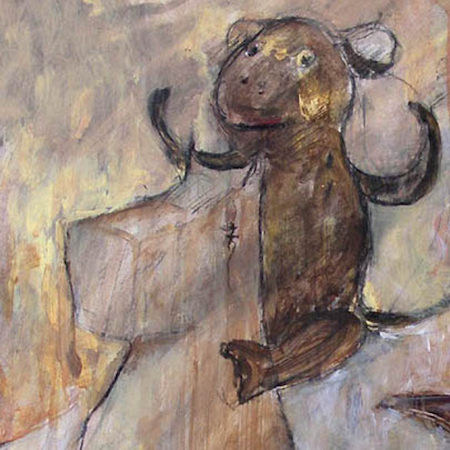
Choosing a subject came first….we have a house full of Indonesian masks and sculptures. (My husband studied gamelon music in Indonesia.) Garuda, the “mount” of Vishnu and popular with Balinese artists seemed a good choice, esp. since he can be green, red, yellow or orange.
I rarely choose yellow/orange for anything---artwork, décor, clothing...though I do have a soft spot for sunflowers.
First I drew a bunch of images based on one of our wooden Garuda sculptures and then made a simplified marking pen outline and colored it with markers.
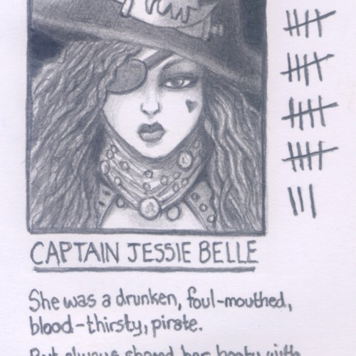
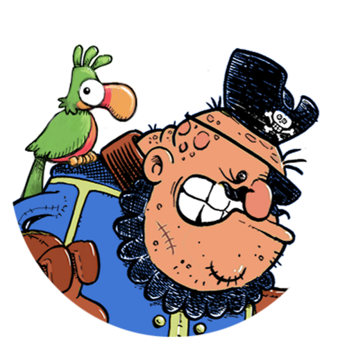
(2B pencil on an A7 page) This is one of eight images I used in a small booklet I made about "The Little Black Book" and the contacts and comments people would write in such address books. This one is of a pirate. Others include a superhero, an alien, a witch, an angel, and a cat. The full set can be seen here on my art blog: https://www.skavart.co.uk/2020/06/the-little-black-book-vidi-vici-veni.html
I learned about Christoph Niemann Sunday Drawings and decided to d my own. I recommend you check them out. Here's a link to some of them: https://www.bing.com/images/search?q=Christoph+Niemann+Sunday+Drawings&form=HDRSC2&adlt=strict&first=1&scenario=ImageBasicHover
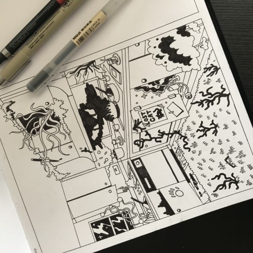
I started a project of hunt illustrations, where things in the image need to be found. In this, the objects were: Lost iPhone, murder weapon, portal to another world, glass half empty and banana. (This is the pre-digital illustration which I don’t usually share but felt like a change!)
Digital illustration of a retro drive-in theater, complete with 3D glasses. Image has been featured on consumer items at Boom Boom Prints & coming soon to Spoonflower. #DriveInMovieDay
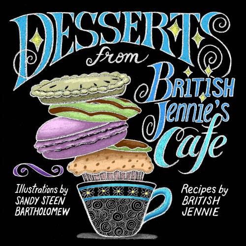
I wanted it to look like the chalkboard menus in quirky cafes. I drew the image with a Blackwing pencil, scanned it into Photoshop, inverted, then applied the colors.
Sorry I haven’t been around to post much. I’m always really busy during the summer months. I decided to buy a set of oil paints and experiment with them. When my set arrived, it was missing a blue paint so i had to improvise on this one. The painting is still wet so there is some glare in the image. I feel like it looks good, but I am definitely lacking the skill and technique in oil paints. That is why this painting is super simple and easy subject matter. Hopefully, I can start to get a feel for the oils :)
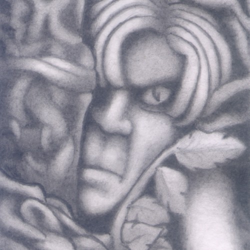
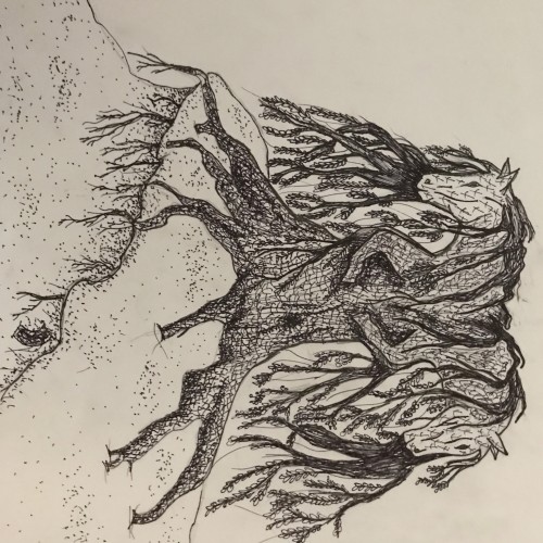
(HB pencil on 74mm x 106mm paper) A dreamscape (automatic drawing) image. A weird one showing a somewhat annoyed elf hiding amongst the trees and shrubs. The face itself was one of the first things to take form and I liked the way the dream construct became the texture of the tree branches.
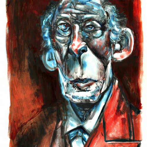
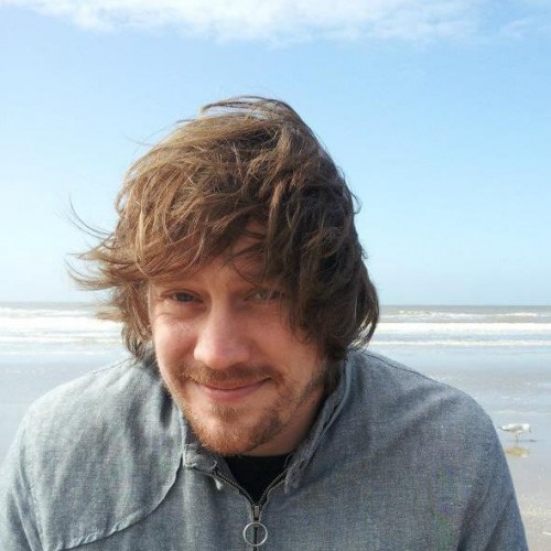
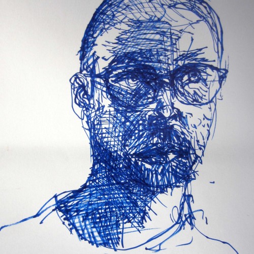
Four quick self-portraits, also show-casing my quarantine haircut. I did them yesterday as a part of Leith of School of Art’s Wake up and Draw challenge. The instructions were to do Van Gogh style drawings using the short very lively lines he is renowned for. The main image was 15 minutes on A3, the other three 5 mins each on A4. The images are in ascending order, so the first one should be at the bottom and the last one as the featured image.
Brush with black ink and white acrylic paint on 9” X 12” acid free Strathmore Bristol smooth surface paper. The Image dimensions are about 5 1/2” X 8 ½. Signed and dated.
(The black ink was used for the character as well as for the background. The acrylic painting was used only for the small shapes in the background)
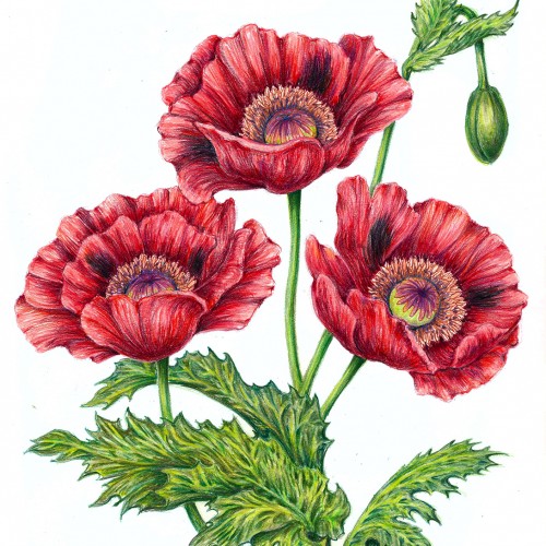
Poppies are among my favorite flowers---vibrant AND delicate. Great swaths of "bread poppies" garnish our garden. We harvest seeds for lemon-seed cake and poppy-seed rolls. (No, we don't harvest that other stuff.) They reseed generously and we have beautiful crops of red and purple flowers each year. I've been working on this colored pencil drawing for the past week. Enclosed are some images of the progress over that time.
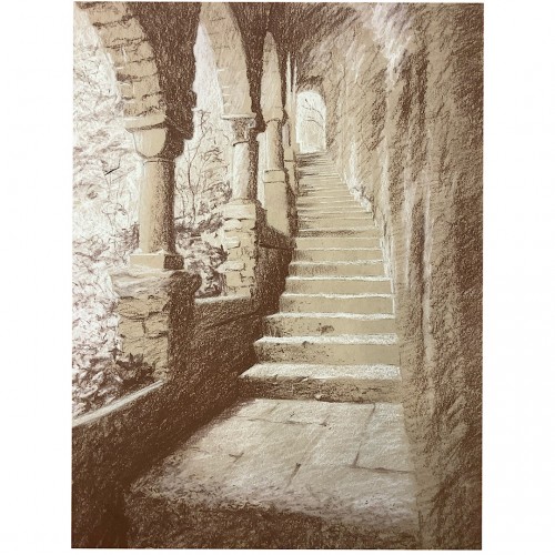
White and sanguine conte pencils on toned paper. These ruins captured my drawing itch with the quality of the light filtering brilliantly through the tangled growth outside, and the open shade within. At a metaphorical level, the image is about the sense of having a laborious path set in stone for me by custom, convention, and culture, while way is wide open to the chaotic fertility of nature, should I choose to follow my own feet and heart.
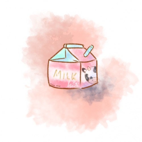
Life gives us too much work sometimes. Here's a minimalistic and simple splash of milk to brighten your day. Pastel colours that softens the image and allows you to feel relaxed. I hope this little artwork can refresh your spirit just like how drinking a small carton of milk will let us feel refreshed.
. . . . . . . . . . . . . Go to my profile, click Website to jump to: https://www.etsy.com/sg-en/shop/IERYArt
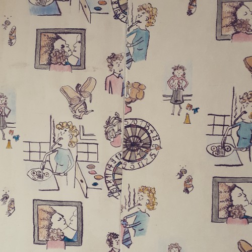
Hand drawn repeat pattern design, I used ink and then pencil crayon on top. The idea was to create a realistic scene of what life was like for me in the 80's - as opposed to cutesy images of children playing with puppies etc.
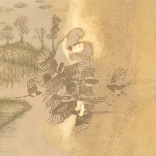
This image illustrates a Chinese fairy-tale from the 6th Century. Girl Weaver neglects her heavenly duties to spend her life on earth with the Goat Herd, this invokes the wrath of her family who force them to live apart. They are brought together for one day a year when a flock of tender-hearted magpies form a bridge to reunite them. This legend is still celebrated in China on the 7th night of the 7th month with a summer festival full of symbolism for newly-wed couples.