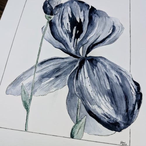
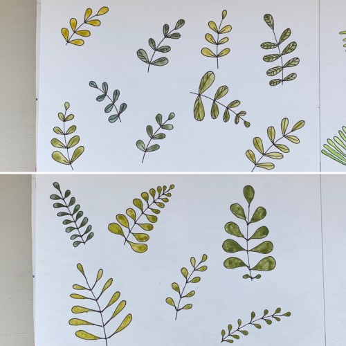
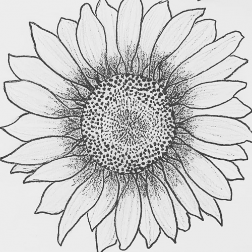
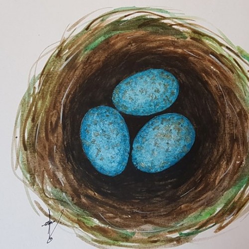
For some reason I tried some floral drawings, of different shapes, and I also used mixtures of different colors to produce hues of green. The first page - it’s a mix of the cobalt blue (PB 28) and cadmium yellow medium (PY 35). On the second one there is ultramarine (PB 29) for the blue color and the same yellow paint. To me, it seems the difference is very little but I’ve got the color closest to the ‘normal’ green using Cobalt rather than ultramarines. The latter gave either to yellowish to olive hues or too blueysh
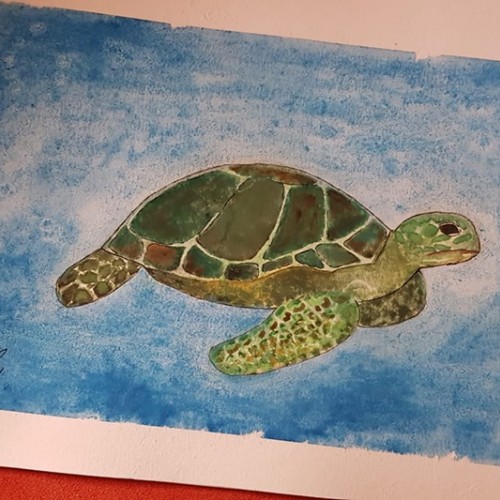
I wax specific areas (paint with wax) and light from the back...in the end it will be in a glass frame to hang in a window....tben the waxed areas will glow!!!
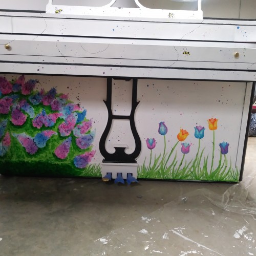
I was selected to be one of the local artists to paint a piano that the nonprofit organization city sounds will put on public display in one of several spots in the city.
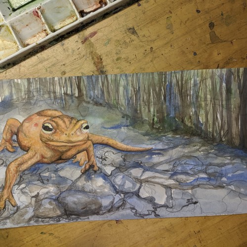
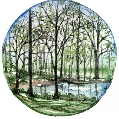
Another piece from my vernal pools/treescapes studies I have been working on in correlation to my interest in local creature found in our woodlands.
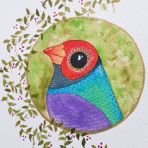
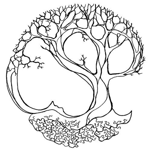
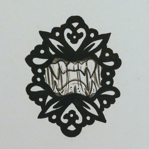
I adopted the use of a circle one night, wanting to frame out an idea/sketch and a wine glass happened to be close by. Since then I have used it often, loving the circle aspect.
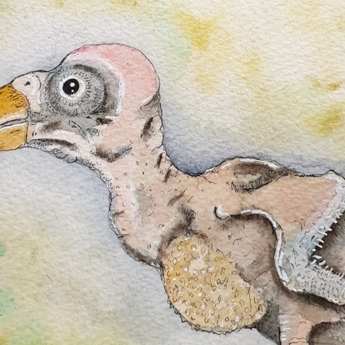
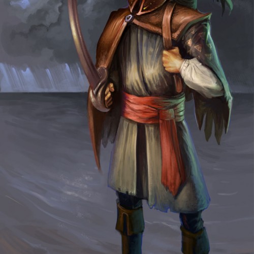
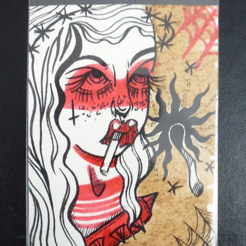
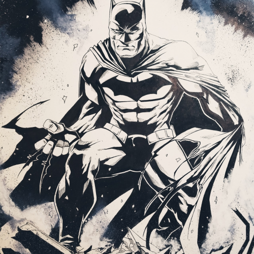
We were having a thunder storm, so I figured I’d do a sketch waiting for my markers to get here. I ended up getting carried away and inking it right away. I put a few layers of fixatif on it, and I'm hoping that'll stop the paint/ink from bleeding too much when I apply the markers.