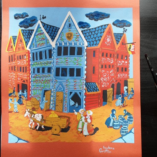
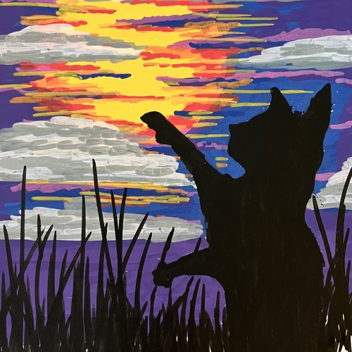
This looks simple, but i spent days researching to get the buildings and clothing right. There was also a lot more layers than i planned for. This buildings are still in use, there are different shops in them now. Sadly they no longer have those colorful decorations,
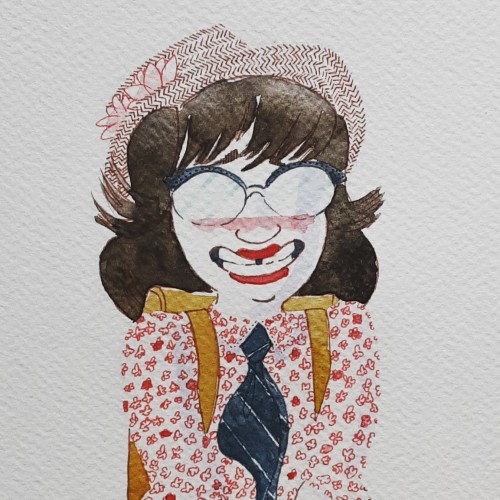
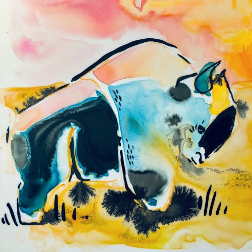
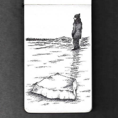
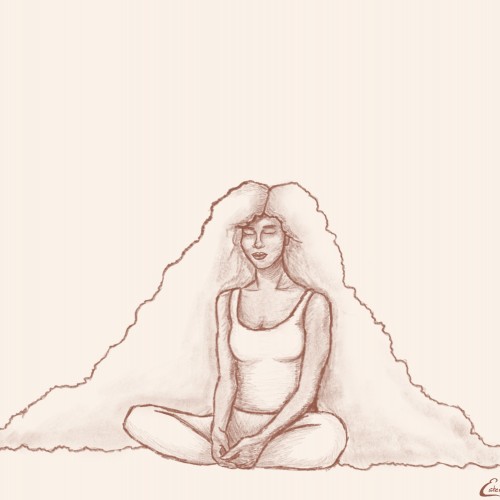
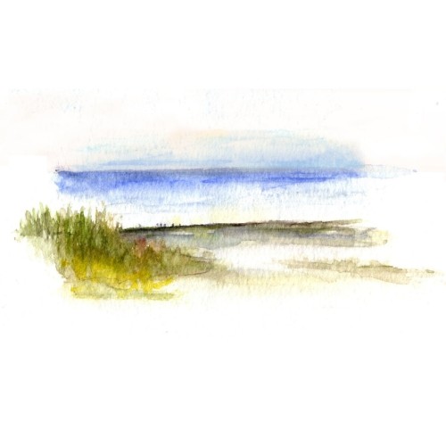
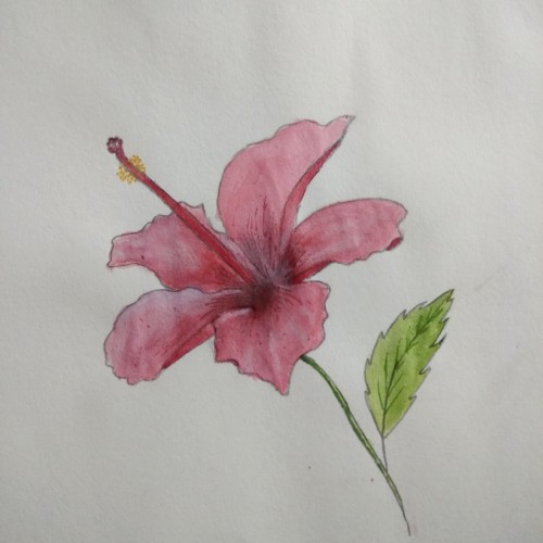
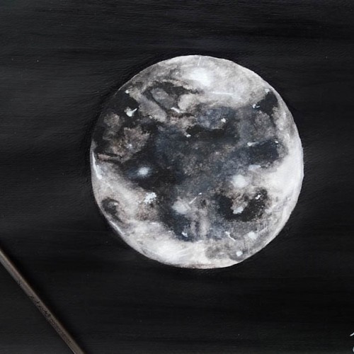
A silly watercolor sketch, I know, but there's a lot tied to this little thing. There are so many bittersweet feelings lately. I tend to avoid putting a numerical value to time, I don't like the count-down aspect to things, especially knowing how obsessive I can be with that. It allows me to live in some semblance of ignorance (they say ignorance is pure bliss). There's a lot of tip-toeing around what I want to say and what I'm afraid to say, or even what I'd love to explore and embrace and simply afraid to. It's something I'm not used to. It's taken me quite a while to finally sit with certain things, or even acknowledge them, and it feels like there's so much more I'm now realizing. It's odd to be so frank to some and worried that others may find out. There's a lot of shifting again, goodbyes coming soon, complicated feelings and situations.
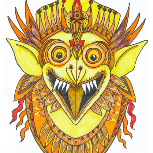
Oh boy, markers (NOT a go-to), least favorite color, and a subject that isn’t on my radar. This was a hard one what with 3 negatives going for it. But, hey, it’s a challenge, right?
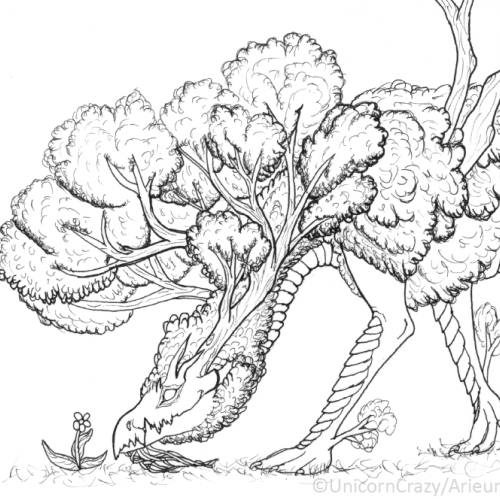
Choosing a subject came first….we have a house full of Indonesian masks and sculptures. (My husband studied gamelon music in Indonesia.) Garuda, the “mount” of Vishnu and popular with Balinese artists seemed a good choice, esp. since he can be green, red, yellow or orange.
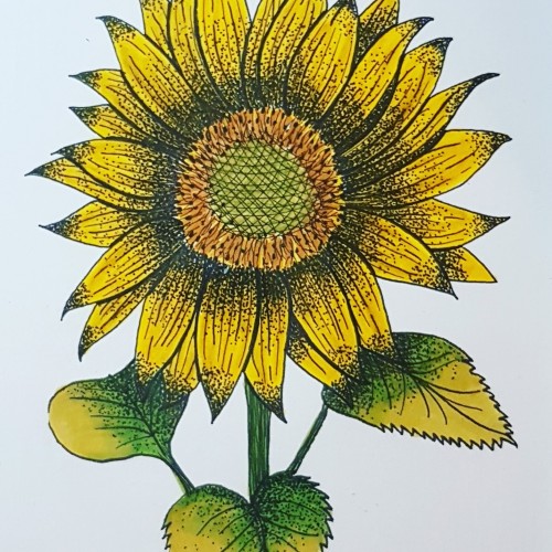
I rarely choose yellow/orange for anything---artwork, décor, clothing...though I do have a soft spot for sunflowers.
First I drew a bunch of images based on one of our wooden Garuda sculptures and then made a simplified marking pen outline and colored it with markers.
Watercolor and India Ink on Yupo paper. If there is any single way to let go of detail and think simply, it is by using watercolor on Yupo paper. You basically have to surrender control and just see what happens.
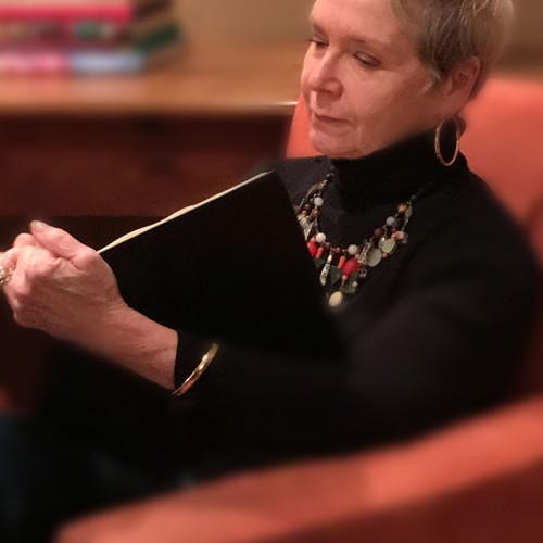
Here is a pencil drawing of actress Charlize Theron. I used Cold Greys and black from the Faber Castell Polychroms range of color pencils on Strathmore Bristol Smooth (series 300) paper. Many thanks for looking
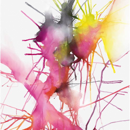
Title: Never Forget. A quick piece I made today. I wanted to go abstract so the viewer can put their own meaning into the piece, but each paint stroke I made I had September 11th in mind. Digitally painted with watercolor in Rebelle 5 on a simple white canvas and sent over to PS.
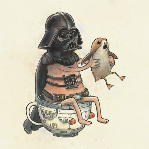
He sits up in his teacup with his hands wrapped 'round a porg,
Thinking up new ways to join forces with the Borg.
To eradicate the Rebels by infecting them with spores,
And assimilate the hive mind to become one with the Force.
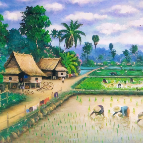
- Oil painting of a countryside of Vietnam. When observing, it is easy to see an image erected when people are working in the field, along with the early morning time, so it has created a beautiful picture. Each object in the picture has its own highlight, full of attractive looks. Although it is a picture of a simple landscape about people in the countryside, every little detail is meticulously painted by the author. This painting is owned by the author "Uilliam Potter". This picture was drawn and uploaded to show everyone the inherent beauty of a rural village, if you have the opportunity, come and feel it. Get the beauty here in the most realistic way.
- Please contact me via Email: williampotterowners@yahoo.com
This was a bit difficult prompt. I dont want to draw just brick of wall or similar. So i choose to use photo where my wife is with ”brick” of ice as reference
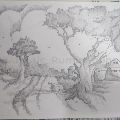
In this captivating cross-hatched pencil shading, a tranquil village scene comes to life. The intricate strokes create a harmonious blend of light and shadow, showcasing the serene beauty of rural life. Thatched roofs, winding pathways, and towering trees are meticulously detailed, inviting viewers to step into the peaceful simplicity of village existence. The gentle interplay of shades and textures evokes a sense of nostalgia and calm, capturing the essence of a timeless village story.
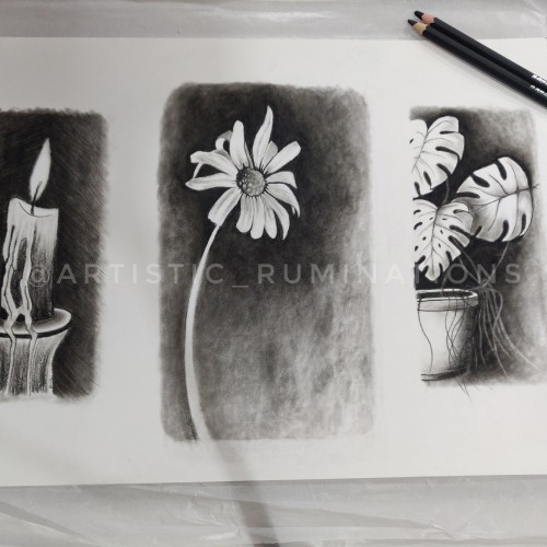
"Monochrome Serenity: Candles, Blooms, and Foliage" is an exquisite black and white charcoal artwork that captures the tranquil essence of its subjects. The subtle interplay of shadows and highlights accentuates the delicate beauty of flickering candles, graceful flowers, and lush plant life. This piece evokes a sense of calm and harmony, allowing the viewer to find peace in its serene simplicity.
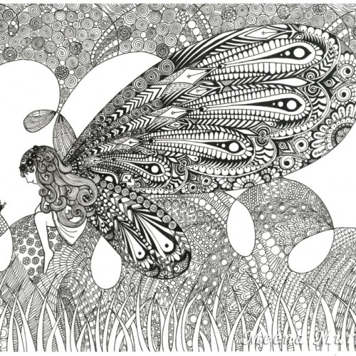
I never understood the power of dots and lines until I did this art! A simple change in the line from straight to curved shows projection of a hand. What a beauty!
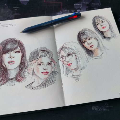
Sketchbook #11.
Since the 100heads challenge was real tiresome for me, I devised myself another challenge - "50 heads". Basically it's a "100 heads challenge", but for lazy people) The rules are simple: I had to draw 10 two-page spreads of 5 heads, no time limit, no nothing. And I decided to use different materials for each spread.
Spread #1 - ballpoint pen (+ a little bit of watercolour) - NEMOPHILA.
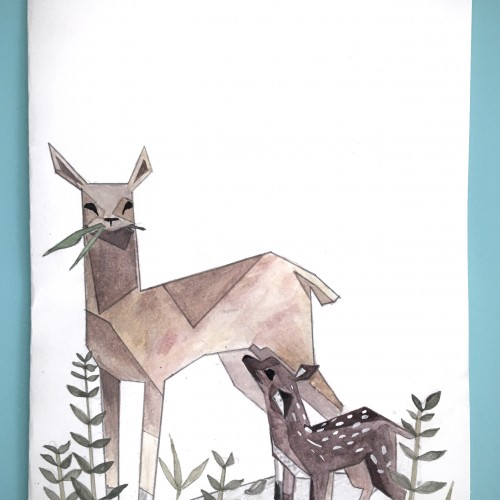
A geometrically stylized Doe and fawn illustration intended for the purposes of a greeting card. Materials used: Water soluble colored pencil, graphite pencil
Mostly wet on wet technique and then wet on dry for the white paint. I used a Mont Marte Round 2 brush and Reeves watercolor paint tubes.
Also concocted my very own magic watercolor paint that made the black background somewhat similar to gouache.
I learned this painting from one of the best artists named Maria Raczynska.