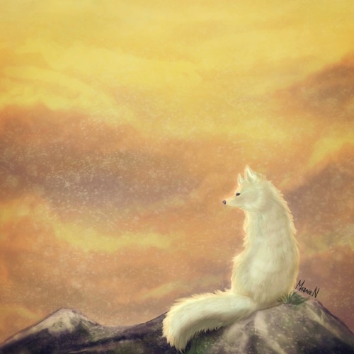
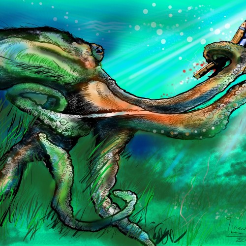
Older picture I've done. At that time I wasn't used to using references, but instead I did everything from my head, as I imagined them. And this time I wanted to create a lonely arctic fox with a warmer atmosphere surrounding the animal.
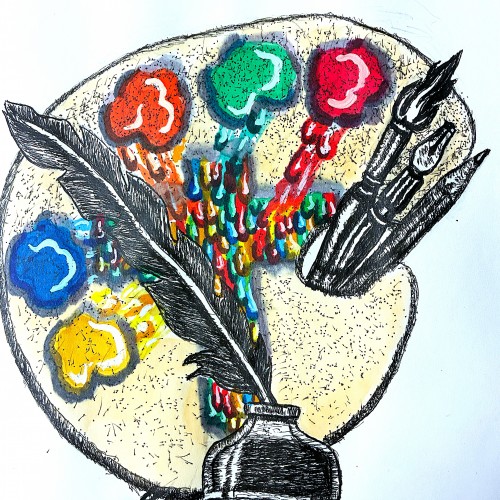
Well friends just got done creating my new logo to represent my ministry. The design incorporates symbols that represent both writing poetry, commentaries, short humorous stories. This is represented by the quill pen. My fine art, commercial art represented by the painter's palette, and illustrative tools.
The colors running to the center of the palette to from the cross, represent my Christian ministry. Going to FedExs to have business cards made. Planning to use this logo for my art fair booth
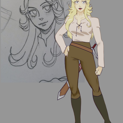
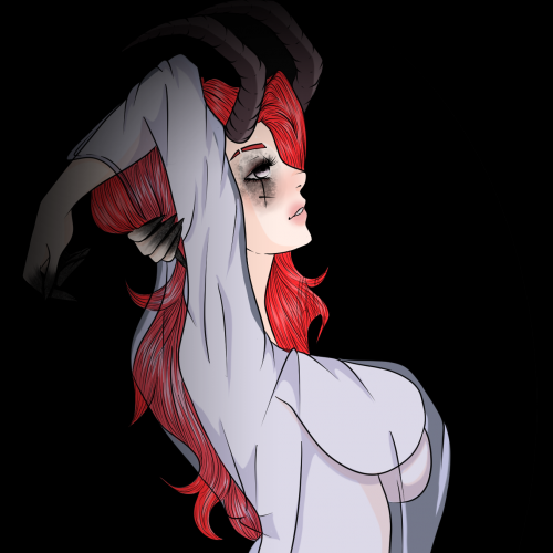
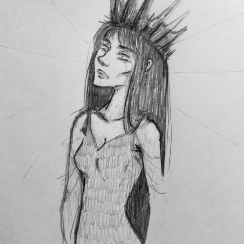
It has been a while since I last felt that I had a good day. Got myself together to draw, and the first thing that came into mind was to continue this character design project.
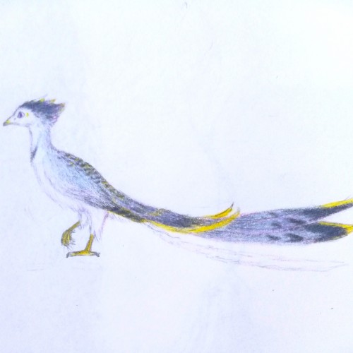
Tried a mix between shades of grey, pale blue, with a tint of purple. Overall, the practice in drawing bird anatomy is slowly getting there. But yea... This is not a Blue Jay... I might have went a little too blue.
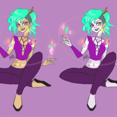
I forgot to post it here. I got better at drawing her. I tried a more '80s anime style recently but will keep at this style since that's how I draw. I love her even though she's not intended to be a main character
I got sick, it's hard to draw...
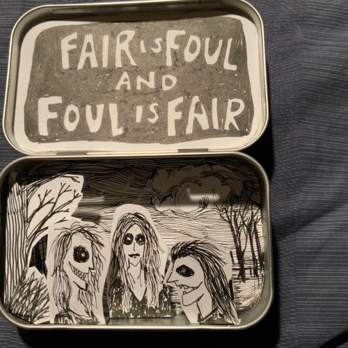
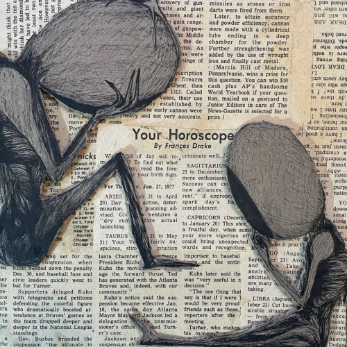
there are no ideas, so only Too-tiсky (i still love moomins brbrbrbr)
Honestly, the art is pretty weak for my bar.. I kind of like which way my painting is moving, but my recent works has been distinguished by attention to the background or inscriptions... A simple filll somehow already seems to me flawed in MY work.. At the same time, in other people's drawings i even love it... As we say in my country, everything brilliant is simple...
I don't know why I'm messing around in vain... Well, let's put it down to the fact that I'm especially physically unwell today
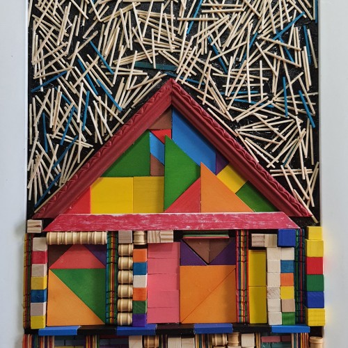
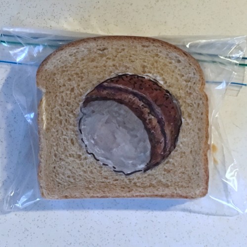
I am trying different techniques, also digitally. In this case, I aimed to "build" the illustration only using shapes. So, it's beyond fine drawing, but I'm curious what you think. Thanks for the prompt.
The materials that Meir uses in her works are not of the refined and so she is called an “arte povere” artist. At times she describes her work as someone dealing in alchemy - work develops as in a trial laboratory with different techniques and materials. She says, “ at times the artistic work process is a sort of puzzle demanding the filling in of all the empty squares “.
Some of her work focuses on women, and they incorporate criticism and cultural protest.
Meir has strong opinions about recycling and environmental protection that is represented in her works by use of materials and shapes. In her work she reacts to contemporary art that communicates with the eco system, waste, and she also searches for different worlds. Her works are made up of layers upon colorful layers that when we look at them it becomes clear that the mound of waste she chose is not coincidental. It actually becomes a colorful kaleidoscope of utopia.
Jaffa Meir is a multifaceted, autodidact artist working in painting, sculpture, photography, product design, carpets and furniture, painting on textile, and computer graphics.
The structural composition of some of the works is influenced also by her many years of working in the architects’ office.
Meir also worked in the developing of ideas within the field of ecosystems and recycling for factories such as Coca Cola, and during this process came up with ideas for designing parks and public game spaces using industrial waste products.
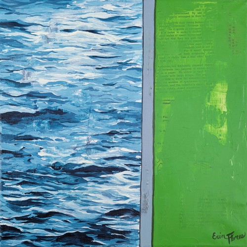
Inspired by a photo I took of a walled off area of a lake. It was grass on one side and water on the other. I love using textures from old book paper and the juxtaposition of realism and flat color.
Hey guys! My commissions are open! If you'd like to place an order, head on over to my Twitter (https://twitter.com/_MariAnna_cx) and shoot me a dm! I would love to meet and work with you! You may also make a small donation to my Ko-Fi if you'd simply like to support me, if you don't want any artwork (https://ko-fi.com/manikmariart) but it's not required If you have any questions regarding my pricing, feel free to ask!
Ever since COVID19 time has moved at a different pace. It has made me introspective. My value and appreciation for life has given me a unique perspective. If it has taught me anything , life is not to waste and time is too precious to take for granted.
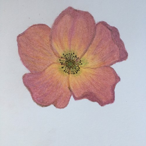
In an ambiguous relationship, people's minds are always guessing. Pull a rose petal. Yes, he likes me. Pull another petal. Oh no, he doesn't like me. Even after tearing a bunch of flowers, the answer remains unclear.
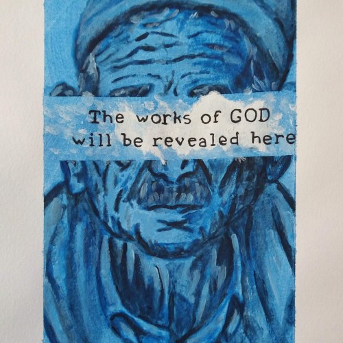
I painted this as a commentary on Christ's response to disability in John 9. He states that the blind man was not born blind because he sinned, but so that the works of God would be revealed in him. This was so cathartic to paint.
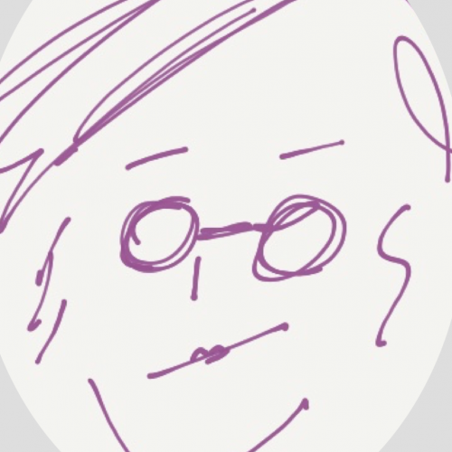
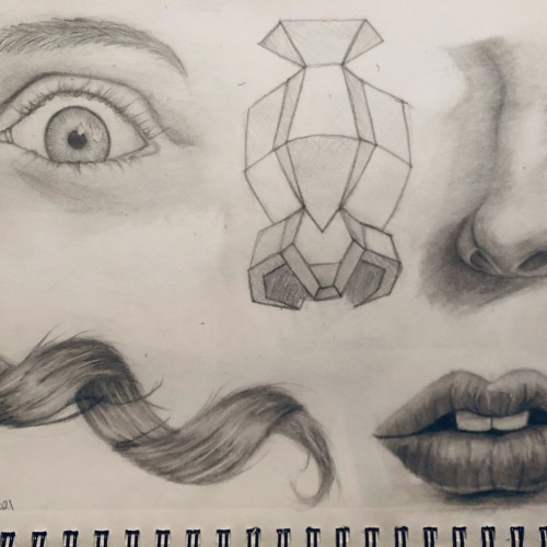
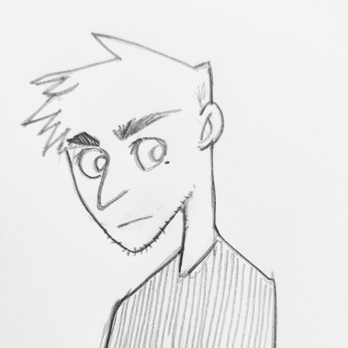
After a year of really focusing on the fundamentals I decided to try my hand at some simple studies regarding facial features and attempted hair. Any thoughts or suggestions would be appreciated, as I’m wanting to continue to learn and improve!
Thanks for missing me, Doodle Addict app. Pastels - as in pastel colors?
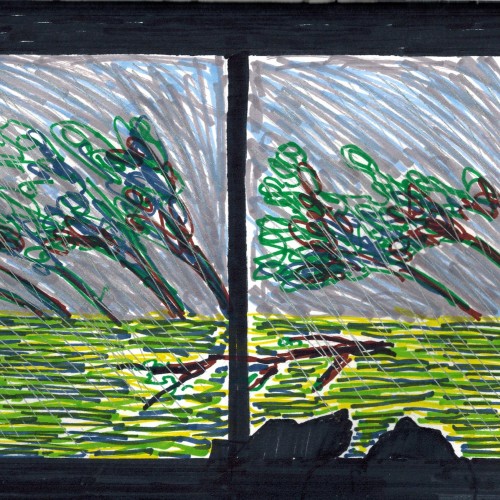
Well...depends on how far we can bend that. Inspired by the hurricane that passed through this evening. The wind bent the largest trees to the ground. I'm happy to still have my roof.
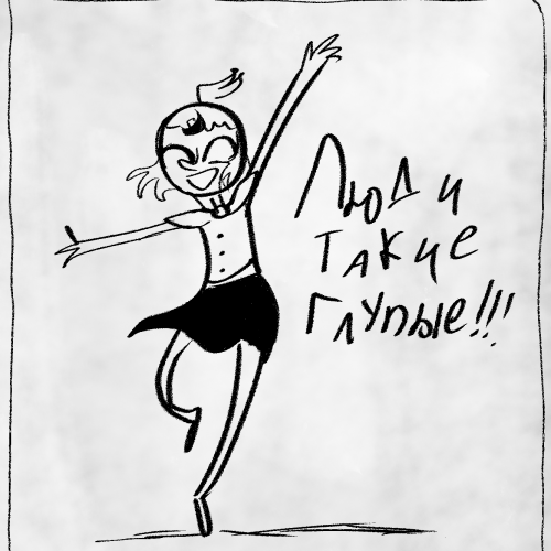
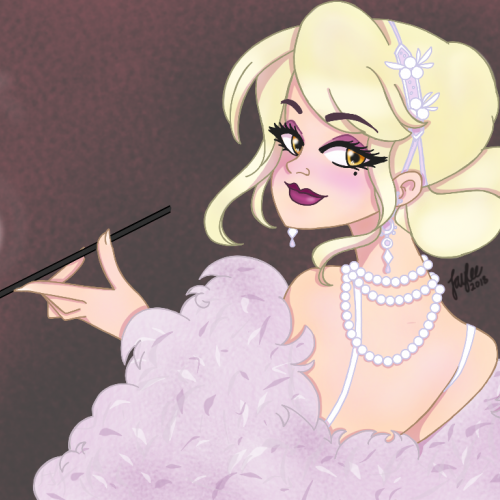
My take on #Japicasso 's #DrawThisInYourStyle challenge of her beautiful roaring 20's girl. Totally inspired and happy to keep practicing my digital art skills.