This is a little collage (did you know Maxfield Parrish invented collage, not Picasso?) of a characters from one of my children's books. I wondered if this would inspire a book. Not yet.
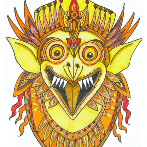
Oh boy, markers (NOT a go-to), least favorite color, and a subject that isn’t on my radar. This was a hard one what with 3 negatives going for it. But, hey, it’s a challenge, right?
Choosing a subject came first….we have a house full of Indonesian masks and sculptures. (My husband studied gamelon music in Indonesia.) Garuda, the “mount” of Vishnu and popular with Balinese artists seemed a good choice, esp. since he can be green, red, yellow or orange.
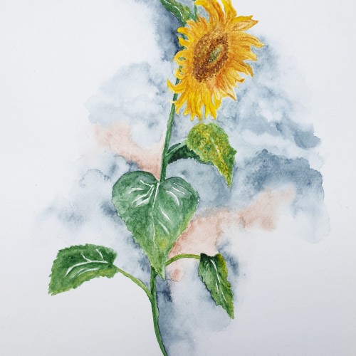
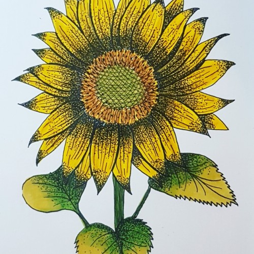
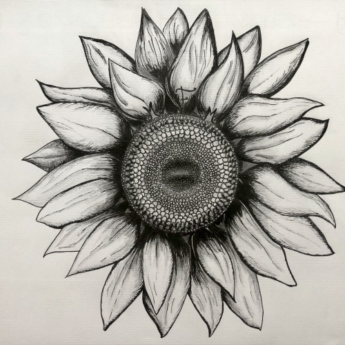
I rarely choose yellow/orange for anything---artwork, décor, clothing...though I do have a soft spot for sunflowers.
First I drew a bunch of images based on one of our wooden Garuda sculptures and then made a simplified marking pen outline and colored it with markers.
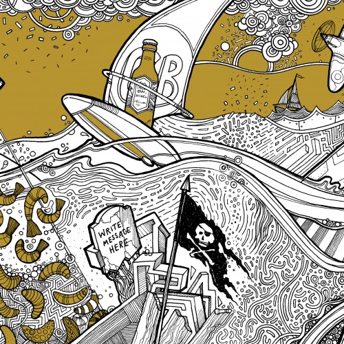
Beer Label design incorporating lots of local facts/things to do with the area it's brewed in. Sailing, windsurfing, big lake, spitfire plane, invading shrimps, highland cattle, sunken church, snakes, beer swilling octopus (ok I made that one up).
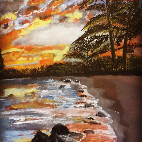
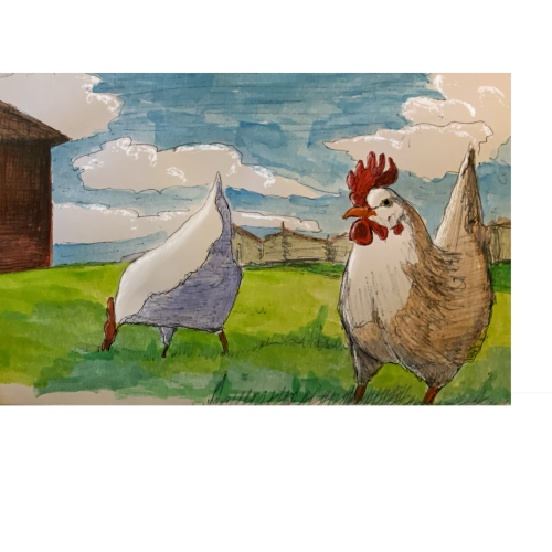
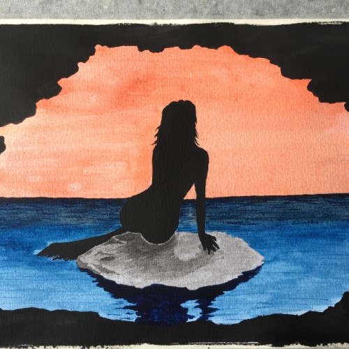
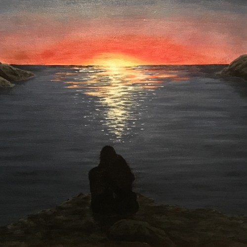
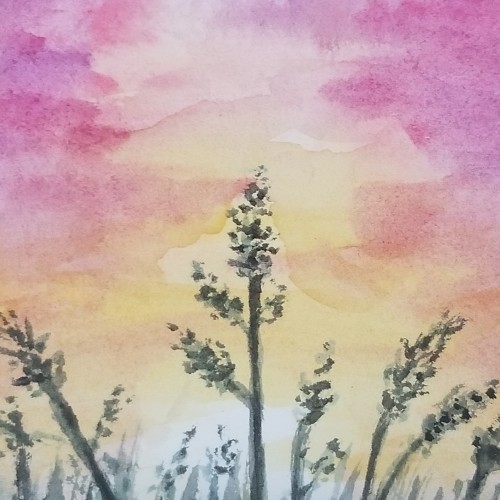
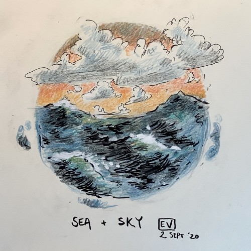
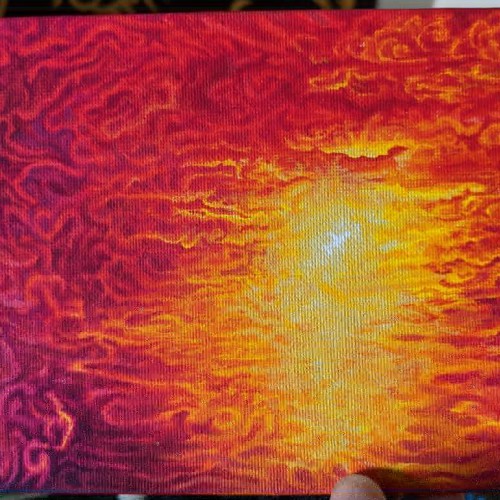
A little sketch, 3” by 5”, made better with a bit of cheap watercolour paint. I don’t know why, but I like this little scene. It isn’t a terribly brilliant sketch and I didnt paint it with great care, but still, i like it. And in the end, it really doesn’t matter what anyone else thinks. If you finish a little piece of art snd can say you like it even weeks and months later, then it is a winner for you.
私のパトレオンで利用可能な印刷可能で着色デザイン | Printable and coloring design available on my Patreon | Diseño imprimible y para colorear disponible en mi Patreón: https://www.patreon.com/posts/chu-yin-kitei-134803356
check out my instagram if you like it, I started painting less than a year ago and im self taught so im just sharing my progression to everyone along the way.
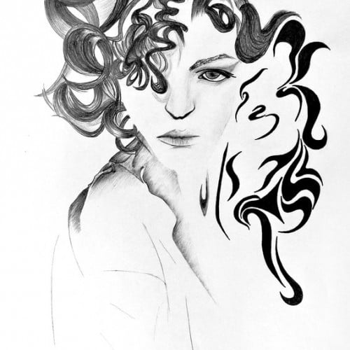
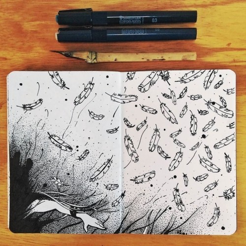
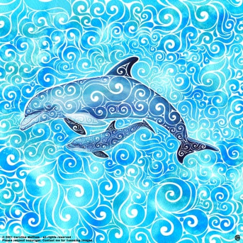
One of my Swirly Designs, illustrated with different tools such as Graphite, Aquarelle, Ink Pens and Ai & Tablet. Sometimes sheer Vectorillustration/design.
.
Urh.-Nr:1811955
.
Copyright by Carolina Matthes
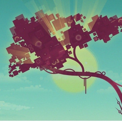
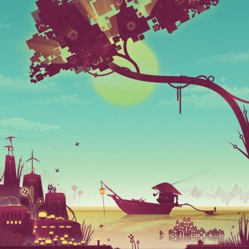
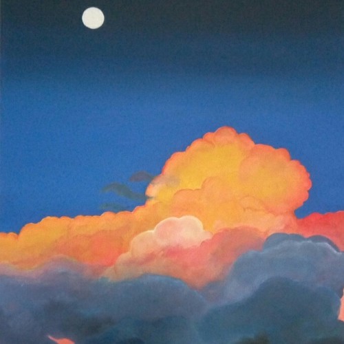
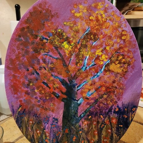
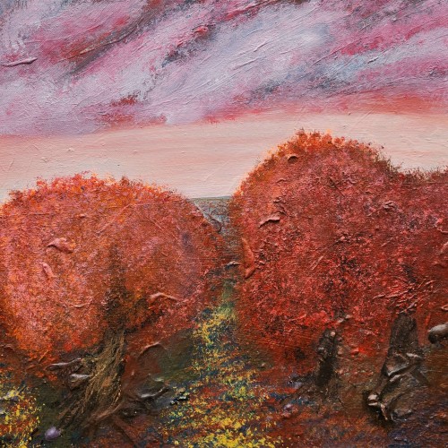
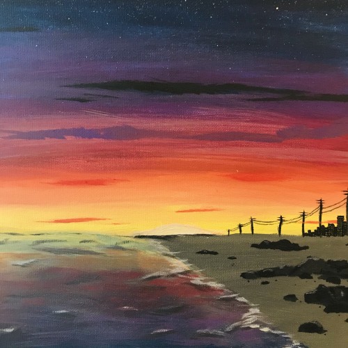
I feel like my landscapes have very traditional colors so i tried to make these look bright and exaggerated but still hold the same base color. Let me know what you think.
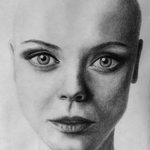
Lead pencils F,B-B7, kneatable- ,normal-, pencil eraser, paper stomps, tissue on A3 bamboo fibre rag paper. Choose to draw her bald, for no particular reason. Zoom in for full detail. Photographed in the sunlight with the canon 28 mm f/1.8 prime lens. Photoshop for greysteps contrast-boost and cropping. Like if you dare. Or else post some critique. Just some try to imagine Christina bald. Realistic? Still doodling? Her eyes are like dominating the whole draw... kind of unreal, isn´t it?
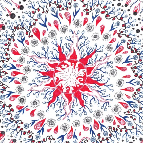
One of my abstract mandala-type designs. It is available as a print on products on Redbubble, Society6, Zazzle, and Threadless. This link will take you to all sites: https://linktr.ee/okhismakingart