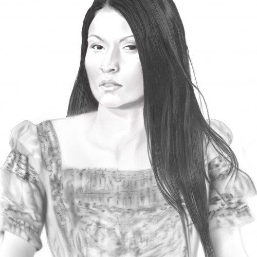
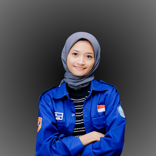
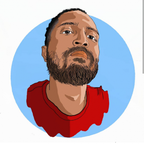
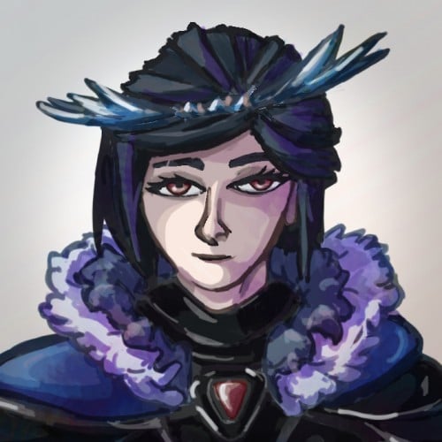
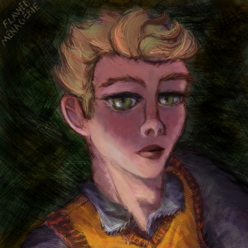
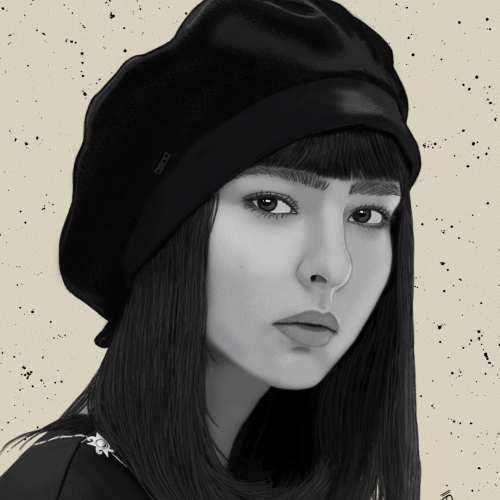
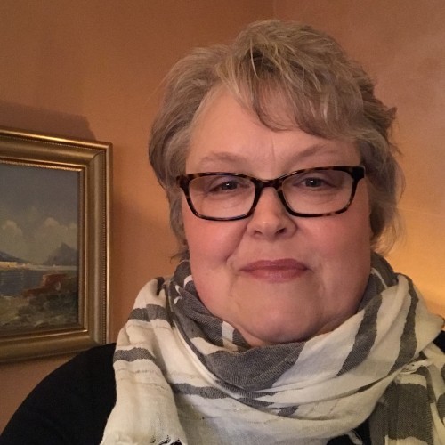
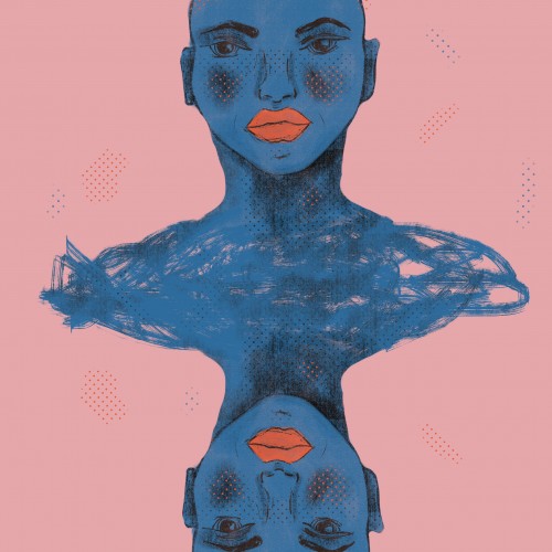
This was my first digital portrait for a book cover I did for my brother. you can see the book cover image here https://www.amazon.com/Gus-Graham-Arizona-Sheriff-Winkies-ebook/dp/B071H3S5NW/ref=sr_1_1?crid=2FT2WWGZ0IG1M&keywords=winkies+escape&qid=1641839447&s=digital-text&sprefix=winkies+escape%2Cdigital-text%2C65&sr=1-1
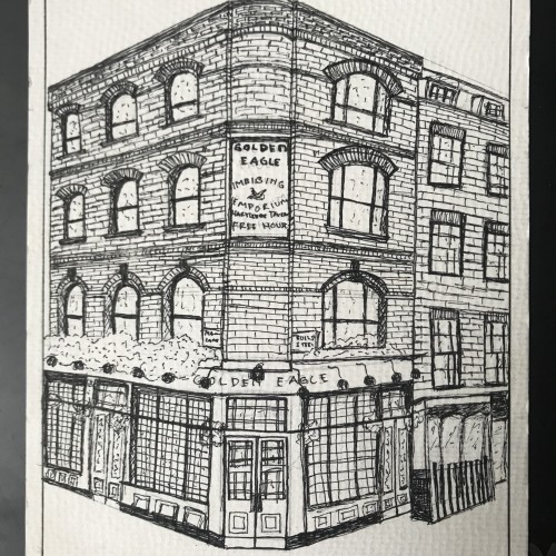
I drew a London Street Building, source from pinterest using the freehand sketch method. The story behind this sketch is that I drew it with a hesitation feeling, you can feel it when you see how my lines were drawn to create the brick texture.
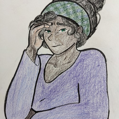
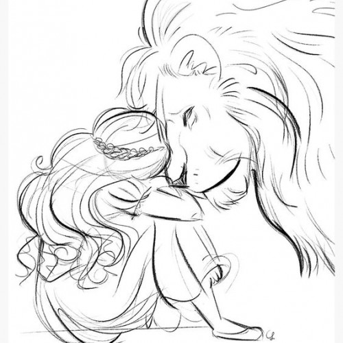
I absolutely love colored pencils. The smell, sound, and feel of them, their texture is amazing. Shading and depth control are so easy with them. :) Lucy looks pretty worried. Don't worry, Lucy. I'm sure it will turn out fine.
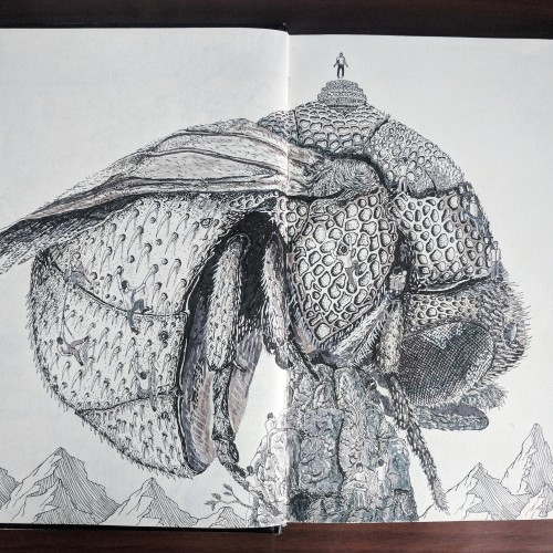
Every person chooses his/her own path. Somepeople help others. Some people quit. Some people settle for less. That's the theme. I always loved the textures of insects so chose it as main thing to look at. And then trekking is easiest way of seeing struggle. That's about it.
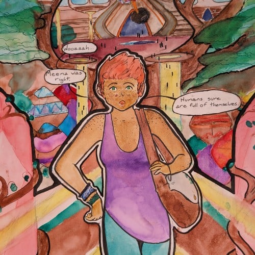
Spent some time last week trying to work through a new digital painting/colouring technique . It needs some more work and I haven't decided if I like It yet or not. One of the images turned out blander but the original skin tone was very orange I did like the brush textures a lot better on the orange skin but the lighting feels better on the purple-toned image.
The materials that Meir uses in her works are not of the refined and so she is called an “arte povere” artist. At times she describes her work as someone dealing in alchemy - work develops as in a trial laboratory with different techniques and materials. She says, “ at times the artistic work process is a sort of puzzle demanding the filling in of all the empty squares “.
Some of her work focuses on women, and they incorporate criticism and cultural protest.
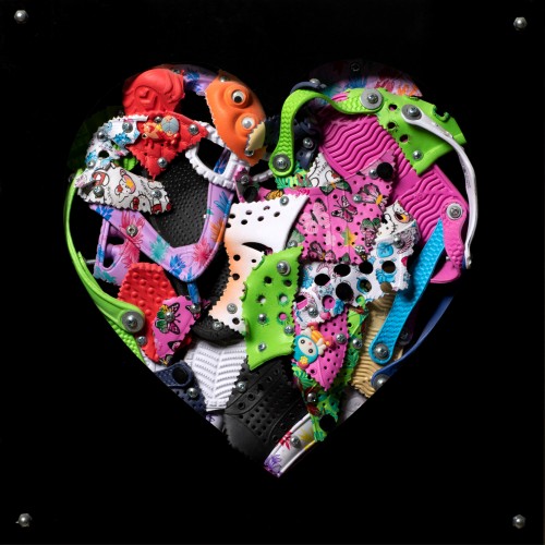
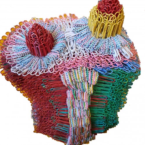
Meir has strong opinions about recycling and environmental protection that is represented in her works by use of materials and shapes. In her work she reacts to contemporary art that communicates with the eco system, waste, and she also searches for different worlds. Her works are made up of layers upon colorful layers that when we look at them it becomes clear that the mound of waste she chose is not coincidental. It actually becomes a colorful kaleidoscope of utopia.
Jaffa Meir is a multifaceted, autodidact artist working in painting, sculpture, photography, product design, carpets and furniture, painting on textile, and computer graphics.
The structural composition of some of the works is influenced also by her many years of working in the architects’ office.
Meir also worked in the developing of ideas within the field of ecosystems and recycling for factories such as Coca Cola, and during this process came up with ideas for designing parks and public game spaces using industrial waste products.
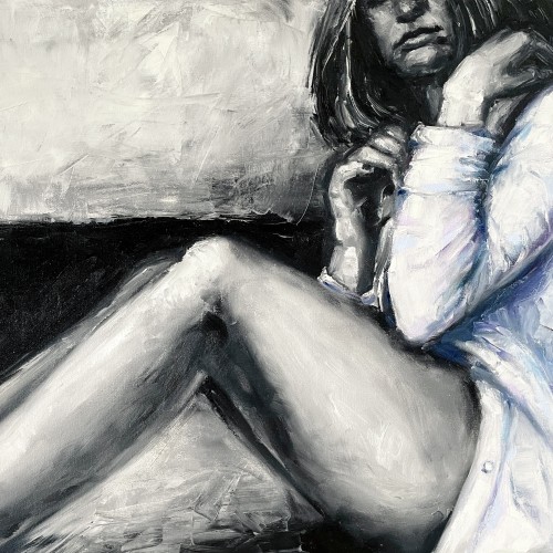
"The painting ""The Girl in a Shirt"" is one of the paintings series ""Her"".The artwork is painted in oil on canvas with wide textured strokes of a brush and a palette knife. In the work, we can see the opposition of a gentle female image and deliberately careless aggressive rough strokes of paint. The artist plays of black and white hard contrast against delicate pastel colors. The girl depicted in the painting feels
constrained by external conditions, which prevents this painting from having an erotic value. The girl nervously tries to unbutton her shirt in order to get more air and freedom. Her pose is not balanced, which shows even more uncertainty and indecision. That's why this artwork is considered rather dramatic."
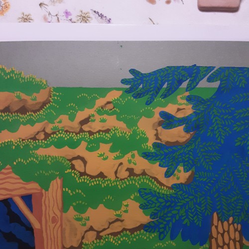
Backgrounds used to be my least favorite part of painting, but now im having fun trying out different textures and patterns. Having a strickt 12 color limit adds to the challenge and makes it feel like a puzzle.
The materials that Meir uses in her works are not of the refined and so she is called an “arte povere” artist. At times she describes her work as someone dealing in alchemy - work develops as in a trial laboratory with different techniques and materials. She says, “ at times the artistic work process is a sort of puzzle demanding the filling in of all the empty squares “.
Some of her work focuses on women, and they incorporate criticism and cultural protest.
Meir has strong opinions about recycling and environmental protection that is represented in her works by use of materials and shapes. In her work she reacts to contemporary art that communicates with the eco system, waste, and she also searches for different worlds. Her works are made up of layers upon colorful layers that when we look at them it becomes clear that the mound of waste she chose is not coincidental. It actually becomes a colorful kaleidoscope of utopia.
Jaffa Meir is a multifaceted, autodidact artist working in painting, sculpture, photography, product design, carpets and furniture, painting on textile, and computer graphics.
The structural composition of some of the works is influenced also by her many years of working in the architects’ office.
Meir also worked in the developing of ideas within the field of ecosystems and recycling for factories such as Coca Cola, and during this process came up with ideas for designing parks and public game spaces using industrial waste products.
From Sketch to Final Water Coloring Stages, this is a spread from Tide Day! A lot goes into making a good composition, taking into account the center of the image where the binding is, and how to play with size and negative space. One of my favorite things to do is explore contrasting expressions between characters and highlight their emotions through physical stances and expressions. This was a tough challenge with the lack of limbs and the watery context, but Pearl's stubbornness and attitude shines through!
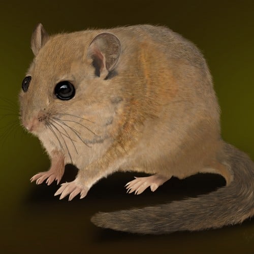
This delicate digital illustration captures the quiet charm of a hazel dormouse, portrayed with soft textures and warm, natural tones. Every fine hair and subtle contour has been carefully rendered, bringing a lifelike sense of warmth and vulnerability to this enchanting woodland mammal. The dormouse’s glossy, expressive eyes and gentle posture invite the viewer into its secretive world, hidden among hedgerows and ancient woodlands. Created using digital drawing apps, this piece blends realism with a tender, almost storybook quality — a celebration of one of Britain’s most beloved yet rarely seen native species.
The materials that Meir uses in her works are not of the refined and so she is called an “arte povere” artist. At times she describes her work as someone dealing in alchemy - work develops as in a trial laboratory with different techniques and materials. She says, “ at times the artistic work process is a sort of puzzle demanding the filling in of all the empty squares “.
Some of her work focuses on women, and they incorporate criticism and cultural protest.
Meir has strong opinions about recycling and environmental protection that is represented in her works by use of materials and shapes. In her work she reacts to contemporary art that communicates with the eco system, waste, and she also searches for different worlds. Her works are made up of layers upon colorful layers that when we look at them it becomes clear that the mound of waste she chose is not coincidental. It actually becomes a colorful kaleidoscope of utopia.
Jaffa Meir is a multifaceted, autodidact artist working in painting, sculpture, photography, product design, carpets and furniture, painting on textile, and computer graphics.
The structural composition of some of the works is influenced also by her many years of working in the architects’ office.
Meir also worked in the developing of ideas within the field of ecosystems and recycling for factories such as Coca Cola, and during this process came up with ideas for designing parks and public game spaces using industrial waste products.
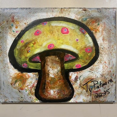
An exuberant, almost psychedelic take on a magical mushroom. The bright chartreuse cap is adorned with striking magenta spots that pop against a textured, almost chaotic background. The bold, black outline gives the subject a playful, cartoon-like presence, while the energetic brushwork suggests movement and a sense of wonder. Signed and dated by Ty Patmore, 2025.
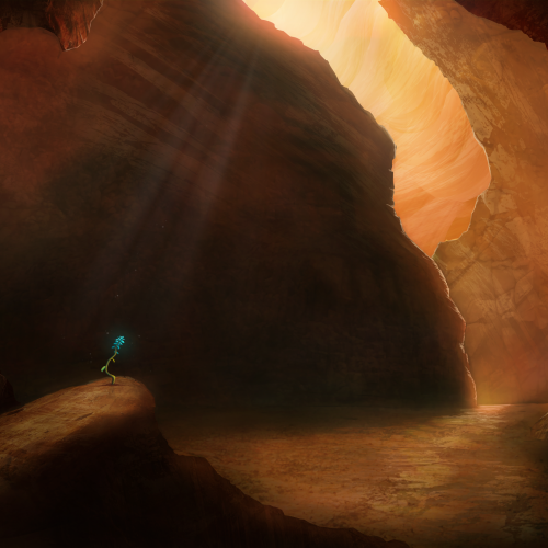
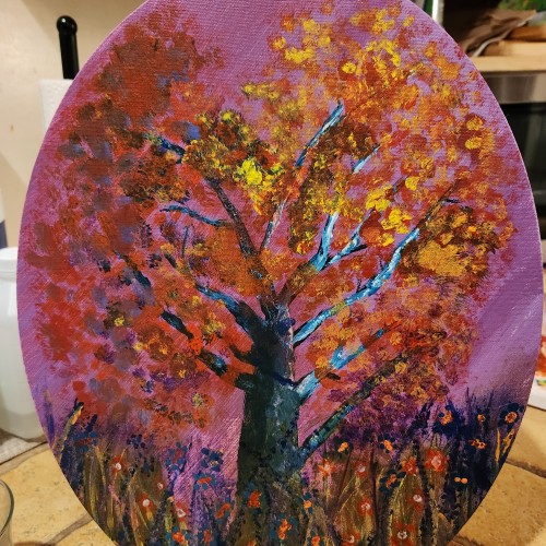
My project for a skillshare course I am taking. I am trying to work on developing more textures and drama to my paintings as well as improving on the composition. Any advice or tips that you can share would be appreciated. Thanks!
Painted as a project for Painting Environments class: skl.sh/32Khrti
Project parameters:
- Mysterious Cave
- Dark but with moody lighting
- Mostly warm colors but with single blue flower
- Flower is the focal point - use composition to lead eye to flower
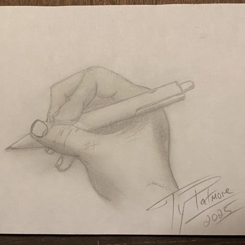
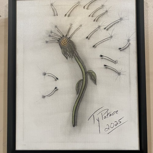
This captivating drawing by Ty Patmore (2025) beautifully illustrates the final stage of a dandelion's life cycle, transforming the common weed into a subject of elegant art. The central, spent head of the flower is rendered with intricate texture, while the detached seeds are given a light, airy quality as they float away. The subtle shading and focused color on the stem provide a grounding element to the otherwise ethereal composition, making it a perfect piece for anyone who cherishes the simple, magical moments in nature.
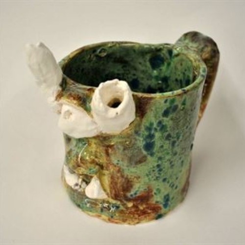
The first stage of clay is slip. Slip is watery clay; it is most often used to "slip and score", which I used to attach the features of the mug to the mug itself.
The second stage of clay is wet. Wet is moist, very plastic clay. Wet is the type of clay I love to use, just because it feels so fresh, and because it is moist enough that I don't have to soften it with water.
The third stage of clay is leather hard. Leather hard is the stage my mug was in after being left on the shelf for twenty-four hours or so. It is easier to cut but very difficult to sculpt.
The fourth stage of clay is greenware. Greenware is completely dry clay that is fragile and breakable. I would say that greenware is an overdose of leather hard for the clay. In other words, leaving clay out for a longer amount of time can turn leather hard clay into greenware.
The fifth stage of clay is bisque. This is the clay after its first firing. If it was grey clay, it is now white in this stage. It is now completely hard and no longer soft in any way. Bisque, luckily, is only one stage away from glaze...
The sixth stage of clay is glaze. This is the final firing and results in a smooth texture and a shiny look. I loved the way my glaze came out. While I was painting the mug, it was more of a ruddy red-brown but when it glazed, it turned out to be this beautiful spotted green.