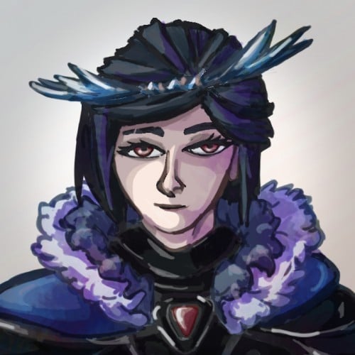
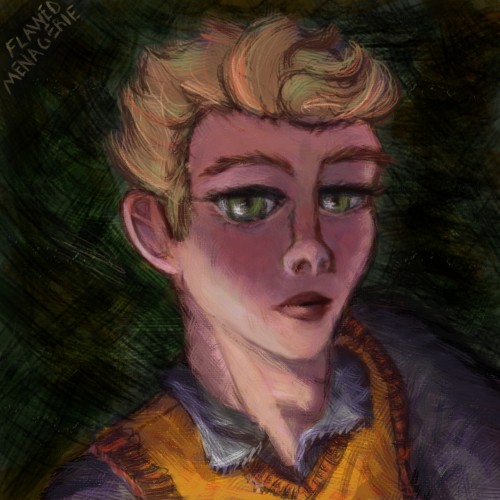
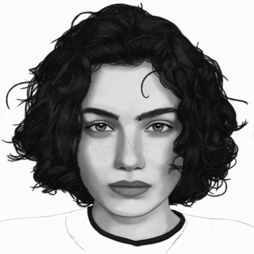
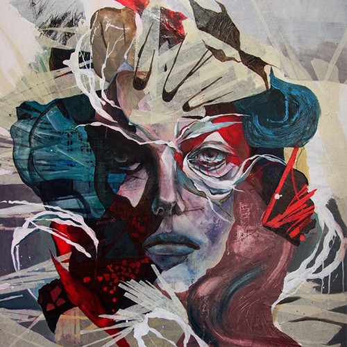
Spent some time last week trying to work through a new digital painting/colouring technique . It needs some more work and I haven't decided if I like It yet or not. One of the images turned out blander but the original skin tone was very orange I did like the brush textures a lot better on the orange skin but the lighting feels better on the purple-toned image.
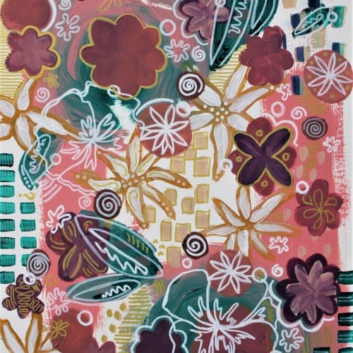
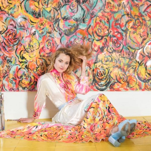
This is an acrylic painting on pre-stretched canvas. It features a pop art style of pink and teal and purple shapes in a sort of abstracted floral pattern, but wait, that's a flower there too. Huh that's pretty cool. Yeah so there's also gold and white flowers too. It's a pretty pretty painting and I should know, I'm the artist. Love, Brianna Eisman
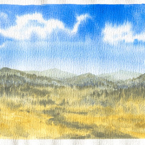
I got a pack of loose watercolour paper from eBay in 2018. The side this was painted on had a really strange pitted texture on it. I thought it might be interesting but I didn't like the way the paint gathered in the pits. I just use it for sketching and testing colours these days.
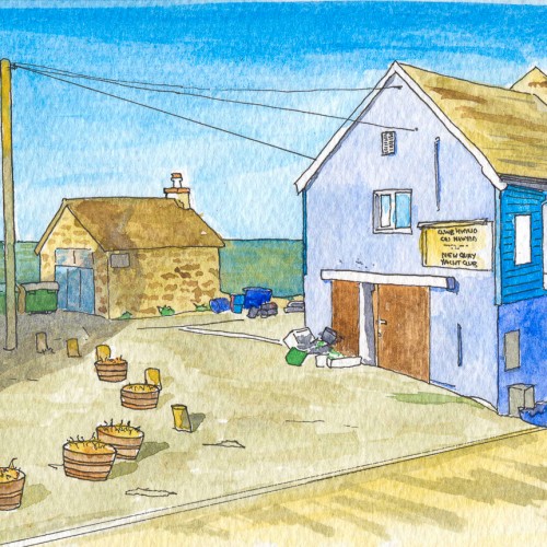
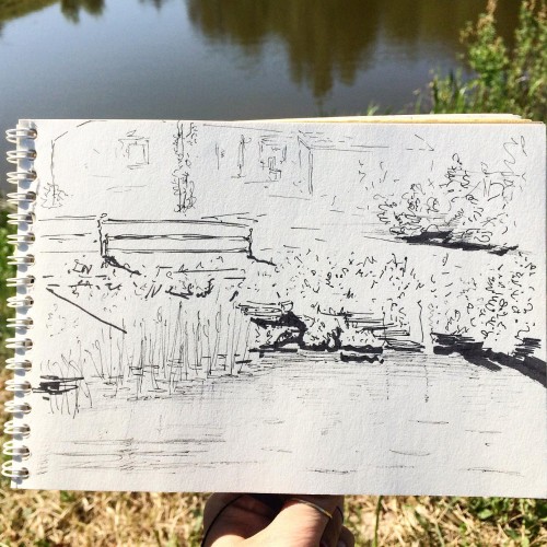
New Quay is a quaint little seaside town on the Ceredigion coast. This was my second attempt at pen and wash in 2018 and it totally bombed. I'm not sure there's anything I like about this - the colours, the linework, the lack of texture. Nah! Definitely worth trying again at some point.
Quick 1 hour sketch working with a limited palette for a moody, gritty atmosphere. I always like to think of the story behind a piece before I start, and this one was a reflection of where I see the world going - a dystopian world in which many parts of the city have been abandoned, taken over by urban foliage, and left to ruin as people flee.
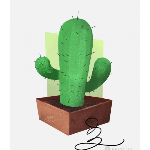
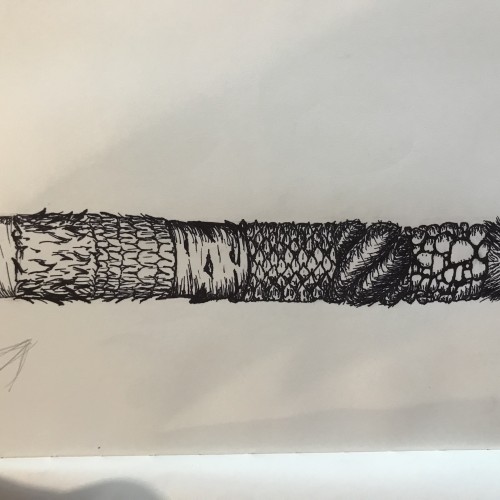
Part of Paintable's intro to digital painting course; quick exercise on layering, masking, color choice, and texture. Was provided line art of a cactus and brushes. Source: https://paintable.cc/
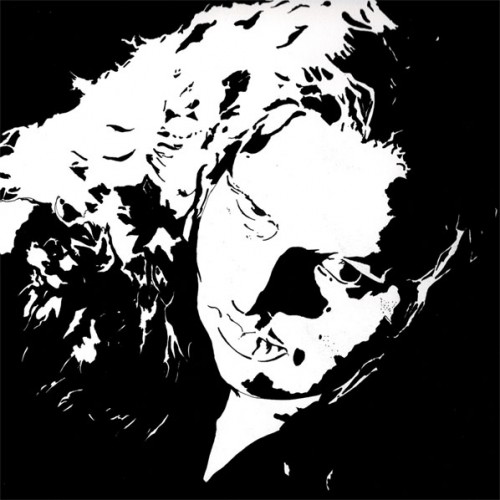
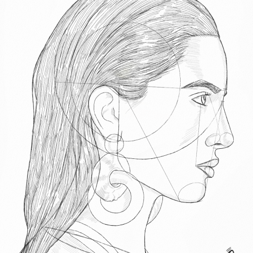
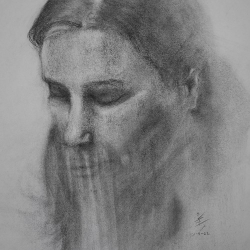
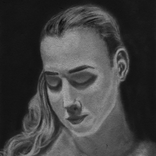
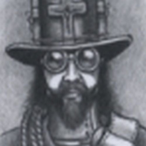
Model Portrait Art by Oz Galeano
Instagram:
https://www.instagram.com/arte_ozgaleano/
Comissions:
https://www.fiverr.com/s/6WzyVL
Donations:
https://www.paypal.com/paypalme/ozgaleano
Youtube:
https://www.youtube.com/@OzGaleano/videos
Patreon:
https://www.patreon.com/Ozgaleano
Shop:
https://www.inprnt.com/gallery/ozgaleano/
TIK TOK:
https://www.tiktok.com/@oz_galeano
Behance:
https://www.behance.net/ozgaleano
KO-FI:
https://ko-fi.com/ozgaleano/commissions
Artwork sketched traditionally with pencil then transferred to iPad to finish in Procreate. I'm trying to free myself from my own expectations. Stubborn is the word :/
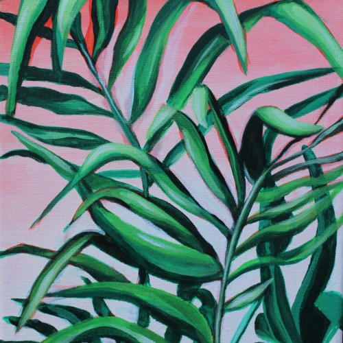
I love the versatility of acrylic paint. You can change the consistency by adding water or acrylic mediums. These additions enable artists to create transparent glazes or thick impasto textures. The fast-drying nature of acrylics makes it easier to correct mistakes or make alterations during the painting process. This painting is part of a three piece set featuring my favorite plants painted on a soft gradient background.
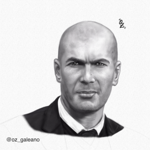
Zidane Portrait drawing by Oz Galeano
Instagram:
https://www.instagram.com/arte_ozgaleano/
Buy your custom Portrait:
https://www.fiverr.com/share/67BRlX
Donations:
https://www.paypal.com/paypalme/ozgaleano
I changed the composition, types of silhouettes, and background texture a few times.
I didn't have any expectations about the finished work. It was a creative flow with many changes. I think the creative process looks like this.
Don't be afraid to try.
If you make your art digitally, it's simple. You can:
- create a new layer,
- use shortcut Ctrl+Z.
In traditional art, it depends on the art supplies you use. Sometimes you can try more times. Sometimes you need to start again.
But any attempt is better than giving up.
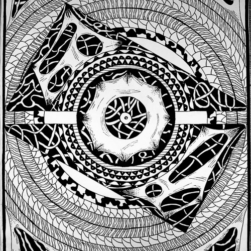
I initially wanted to draw a mandala but after outlining the big circles, I thought "why not add some texture?" and there you go. Experimenting with different shapes and shades always pays off.
This is a 19 in by 24 in oil painting on Bristol paper. I love this piece because of the textures and the bright but muted colors. I did this in 2019 in the spring at the Fashion Institute of Technology. The professor always pronounced "fruit" in a very bazaar way. It was a great class overall.
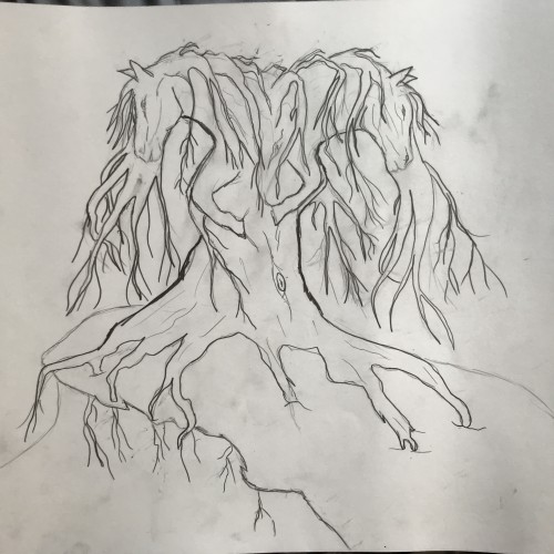
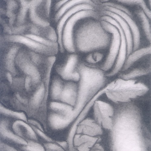
(HB pencil on 74mm x 106mm paper) A dreamscape (automatic drawing) image. A weird one showing a somewhat annoyed elf hiding amongst the trees and shrubs. The face itself was one of the first things to take form and I liked the way the dream construct became the texture of the tree branches.
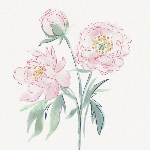
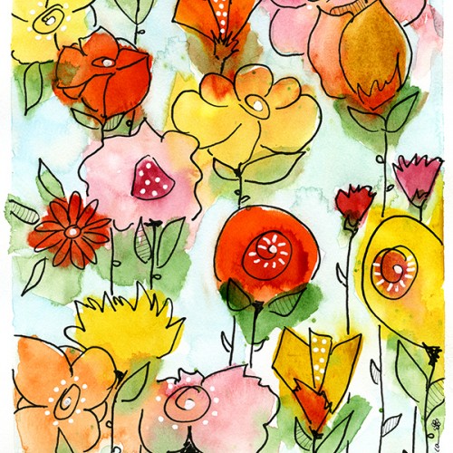
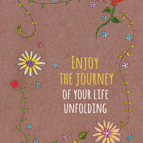
I created this card for someone to bring to a Law of Attraction event. I drew the flowers on textured paper, came up with the phrase, and then set the type. I am a professional Healer so this phrase is powerful advice I give to others in my practice.