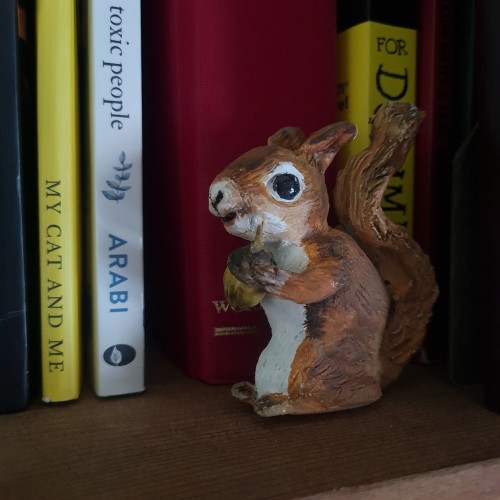
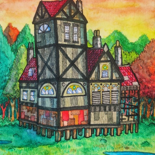
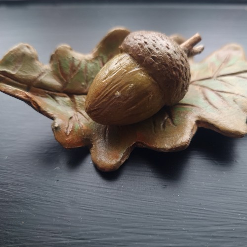
More air clay work. Water colour paint. I have a resident squirrel, who I have named Melanie. She left an acorn in my garden and now I have a little oak tree.
This painting was done with the Tuscan style in mind. The Tuscan style favors a rustic look. To me this never goes out of style because it’s as if the new and the old have found a common medium and have agreed to blend so well. There’s plenty of green, beautiful grass. The windows are complimented by the various colors of flowers that are perfectly placed below them. I love how there’s a table set outside of the building with a string of lights (even more beautiful at night) for people to enjoy the scenery as they eat some tasty, authentic Italian cuisines. There’s a group of people walking past the wall of yellow flowers and vines on the way to the inside of the building. In this scene, the ladies are wearing some long, beautiful dresses with gentlemen by their side to accompany them. This gives the impression that this group is out to have a good time. The white birds tops it off in this painting by giving it an inviting feel...”a moment to remember” feeling.
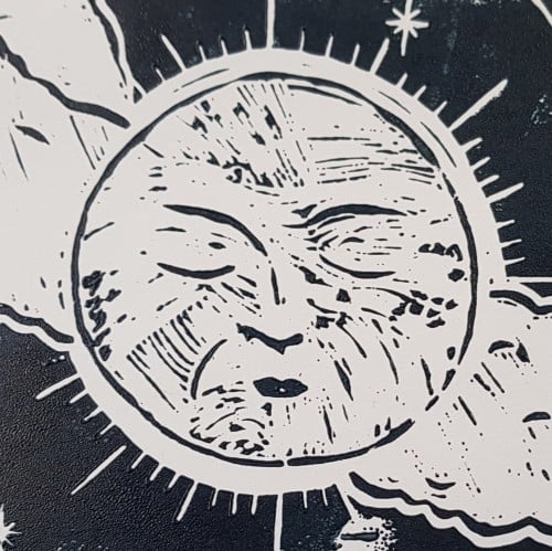
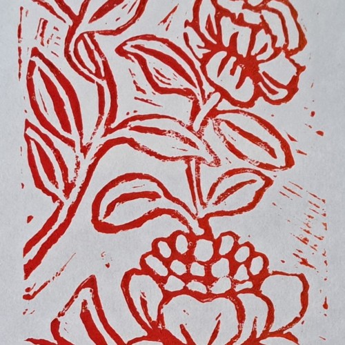
This is the second lino cut print I made using motifs from my surroundings here in Vienna, Austria. I enjoyed learning this when I was in Art College in Australia back in the day and my passion is now re emerging for it.
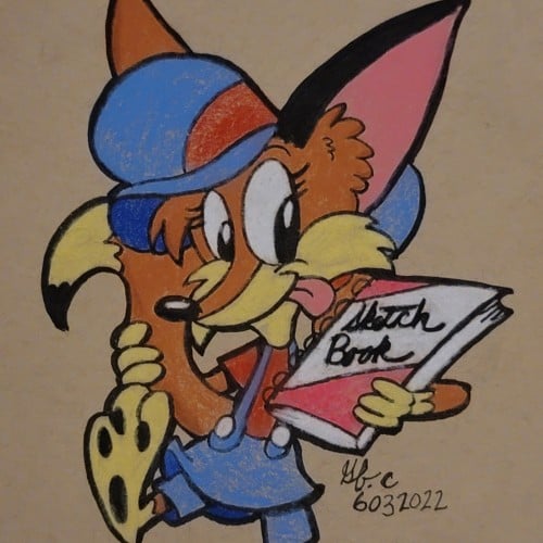
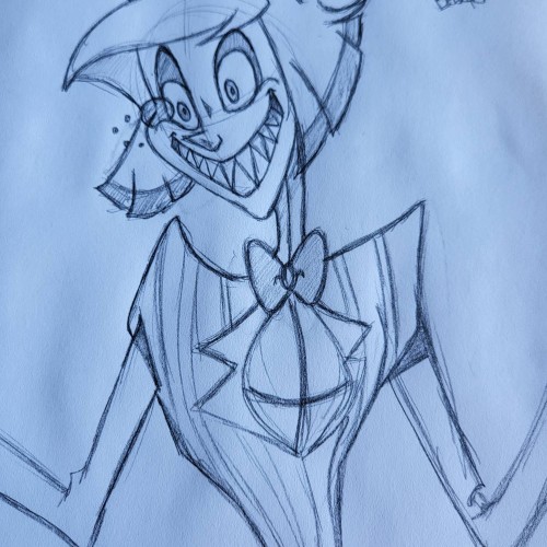
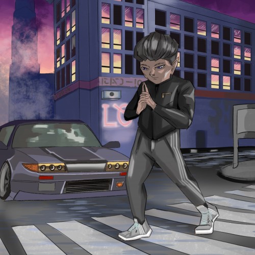
This was a sketch I did the other day. I'm currently working on the digital version. I always sketch all my images before I move to the digital versions. This is my favorite character from Hazbin Hotel.
We have an interesting thing with the sun here. It shines a different color every day. No one knows why this is, not even Charley. We grow the watermelons in different colors the best we can.
In the watermelon sugar
Richard Brautigan
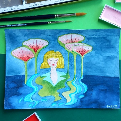
I got a little emotional when I heard the Lahaina banyan tree would make it through the Maui fire. I found a reference and painted a watercolor of the new growth. I come from a Navy family and was born in Hawaii. Let me know if I got the transparency and shading right or if it is aesthetically pleasing.
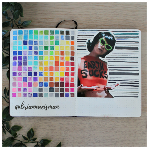
About once a year I set aside a page in my sketchbook, or bullet journal, to do a marker test. I go through every pen I own including Sharpies, highlighters, Bic Permanent Markers, Crayola markers, Stabilo pens, Expo dry erase markers and everything in between. I document the quality and determine whether to keep or toss the utensil. I find it’s easy to collect art materials, especially when you’re like me and switch mediums regularly. It’s important to know that when I reach for a certain pen or marker, it’s going to work the way I want it to. I do keep a page at the back of my sketchbook open for testing mediums, but it’s an important part of the process of creating art to go with the flow and just draw.
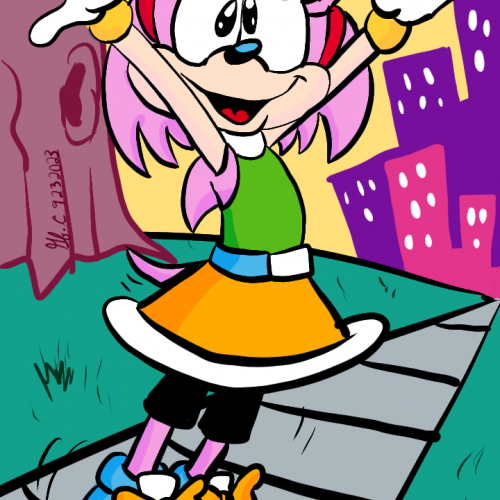
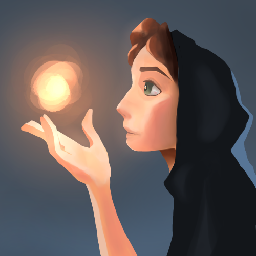
A painting I just finished to work on lighting, inspired by a painting done by SamDoesArts. This one was especially fun because I haven’t worked with layer effects for lighting in a little while and liked the way this turned out.
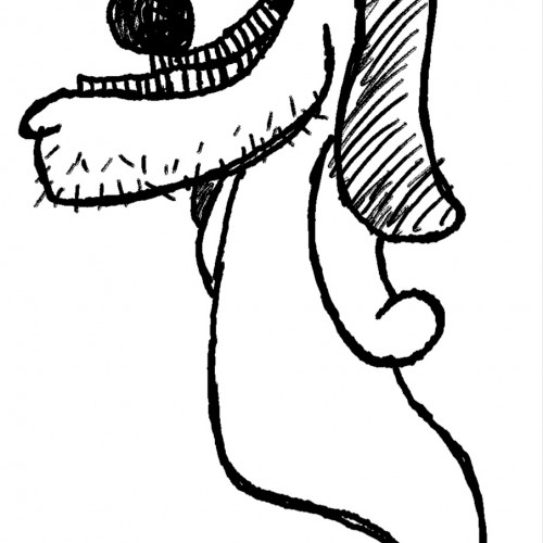
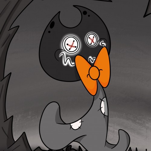
This is a new character I have created, his name is Creep Face.
Species: Spirit
Personality: Prankster
Home: Mausoleum
Likes: Wanders Cemeteries, Pumpkin, Hot Chocolate and scaring Scribble
Dislikes: The Sun (Its too optimistic & bright!)