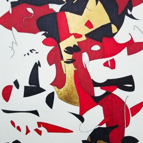
Some works were born to be prodigious. Once the preliminary lines were laid within the first minute, the quality of the shapes, the diagonal composition and the weight were balanced out.
With the black mass as the hood, a face, hidden underneath, is unveiled. With the addition of the black fingers and the white hand, the full figure surfaced naturally.
The black fingers are the minimal suggestions to add character. The title `Remorse’ came about because of the bowed head and the pose.
utube clip: https://youtu.be/mb48rCx-lYI
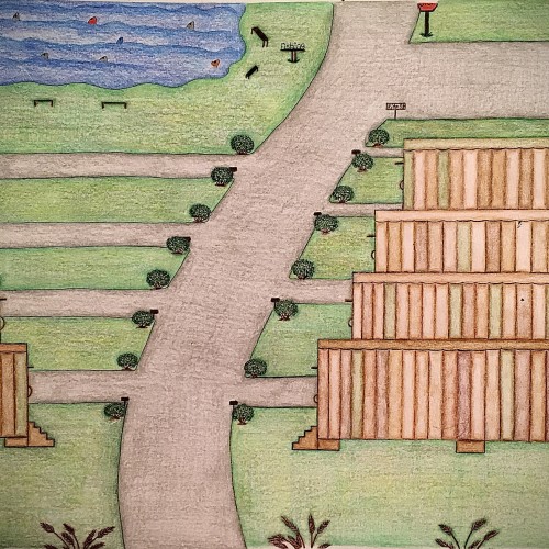
I designed these multicolored trailers using different shades of color only in a different pattern for each trailer. I felt like this color scheme would give the trailers a uniform look yet their own distinct look. The roads look freshly paved with small shrubbery on the corners of the entry ways of the driveways. There are some pretty brown steps that leads to a door on each trailers. Also, as you can see the trailers have been topped off with the same flat style roof only with a different solid color which is one of the colors used on the sides of the trailers. There’s a fishing area with plenty of fish in it as well as places to sit. There’s even a place to use the restroom close by the fishing area so you can continue to enjoy your day catching fish with minimal interruption. This trailer park has a fresh look to it. It has a warm, inviting feel to it and is perfect for living a more simple lifestyle.
OK, I'm not saying it's mind-blowingly good. Rather, I want to allude to how this picture came about: I painted it with a hammer! You can find the complete creation process on my blog at https://christiandrab.de.
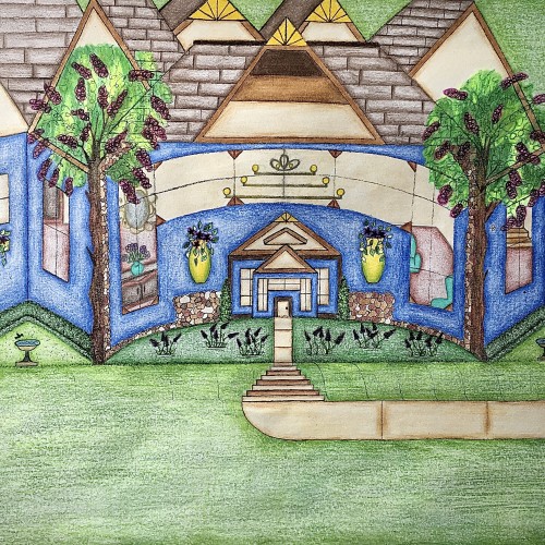
I designed this house. It has a really pretty blue exterior, and it has a slight curve to it that gives it a more warm and inviting feel. I like how the walkway kind of curves into the stairs and transitions back into the walkway before arriving at the front door. I like that there’s plenty of yard space with some really nice landscaping. The birds can even come and get a birdbath. I thought that was really cute. I used the multicolored stones to add detail for a more distinguished look. The hedges are neatly cut in a square and follows along side of the house. Looking through those gorgeous windows you can see the house is fully furnished. There are some really pretty chandeliers in there that adds character. There’s a stairway that leads to another level of the house as well. I love how there’s a touch of yellow that highlights the points on the rooftop. Furthermore, the swing in the backyard adds an inviting feel to the scenery. Also, it’s a nice place to sit and enjoy the view.
For a long time, I always misheard the lyrics in the song ‘Torn Green Velvet Eyes’ by The Magnetic Fields as ‘Tom Green Velvet Eyes’… told myself that one day I’d draw something inspired by this mishearing of things and well, here you go!
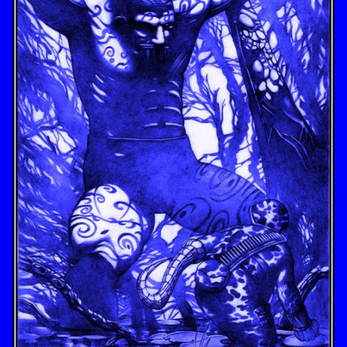
Done 2017 with lead pencil AND USED DIGITAL TO MAKE IT BLUE AND GAVE BORDERS on11 x17 bristol paper. If you are interested in purchasing this artwork for $80 and also I do private commissions. Leave a comment or contact me at jungmeister4@yahoo.com (Shipping fee to ship the original artwork will apply)
My art book is available to purchase. To purchase my art book hit the link.
https://www.artwanted.com/artist.cfm?ArtID=115637&Tab=Books&CPID=1133