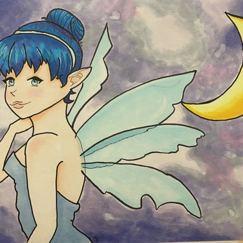
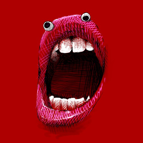
First. I need advice on blending in IbisPaint. Thanks! And second. This is my friend who is so awesome. Everyday they put a smile on my face. I attempted blending. It didn’t work very well but it’s okay. Please send advice.
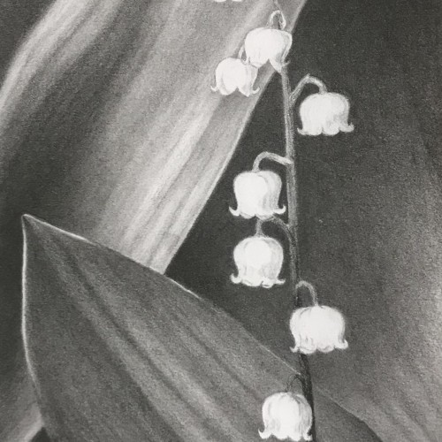
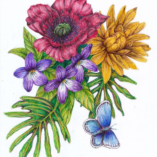
My first venture into artist grade colouring pencils - and I'm smitten! I never thought I could achieve such boldness and blendability with them! I'm still getting used to them and will think about choosing smoother paper with less tooth next time. The texture and weight was more for the water-based gouache along with alcohol inks (which are very unforgiving to even primed heavy paper!). Apologies for the unevenness of lighting between the 2 sides of paper; will correct that when I'm making proper image files.
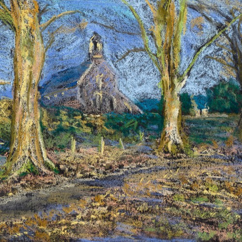
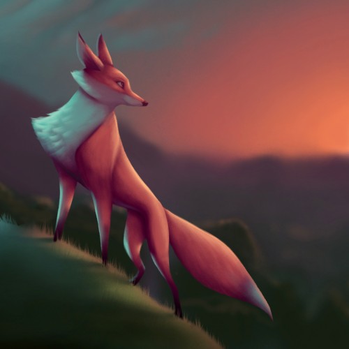
In late 2018, after some time not doing any artwork, I really wanted to get back into it. I fancied doing something different and invested in some soft pastels. This was my first go with them and it was a hell of a learning curve about how they adhere to the paper, and how they blend. I'm not really sure the pastels I was using were soft enough for the look I wanted, but I like how loose this one turned out.
Giving it a go with artist colored pencils for the first time. Finding it challenging to keep a point on the pencils and anyway to recover if what should have been a white area gets too much color? Do most colored pencil artists use solvents to blend?
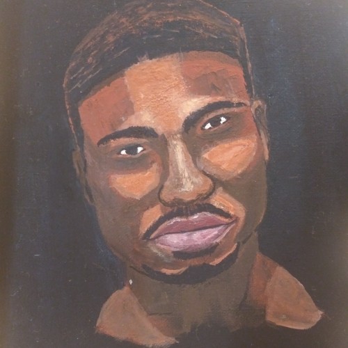
My amazing boyfriend. ^^ first time doing this kind of painting. Thought it came out pretty good ^^ blending became challenging particularly for the shines of the skin. But over all, Im pretty happy with it ^^ hope you like it ✌
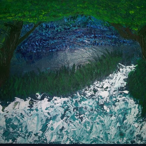
Its funny because this was my first painting and looked very different. Just a bunch of green and a little sky blue blended in that looked like nothing to me. I ultimately gave up on it but revisited it about 2-3 weeks later and turned it into a night sky with rushing water flowing through two trees into a forest. I used a palette knife for most of it which was new for me as well ^^ hope you like. Debating on touching it up a bit...
Pastels...I've never been a huge fan of working with them, mainly because I can never seem to get them to blend or move the way I want. I think this turned out okay; it's not the worst it could've been...not the best. It was fun to try, considering the fact that I rarely try new mediums, and it got my mind off everything I've been worrying about. Anyway, enjoy.
More ballpoint pen experiments. This was trying to "blend" colors, using ball point pens in a similar way to colored pencils. I found Layering evenly to be pretty difficult, esp with the pens blotching and very very limited burnishing. The interesting thing is that the paper doesn't seem to get "tired" the way it does with pencils. This is just cheap printer card stock.
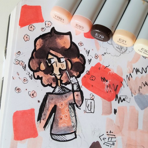
This is a drawing I did not too long ago, I think the pink and brown were blended nicely together in the piece. I use Copic markers, Microns, gel pens, and Ohuhu markers. I really enjoyed the theme of this character, (cherry blossoms) I think I was able to show the colors nicely together in the artwork.
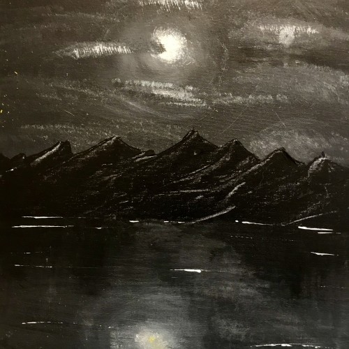
This was originally supposed to be a swamp landscape, but I got frustrated with the colors not blending, etc. I painted the whole canvas black and ended up with this
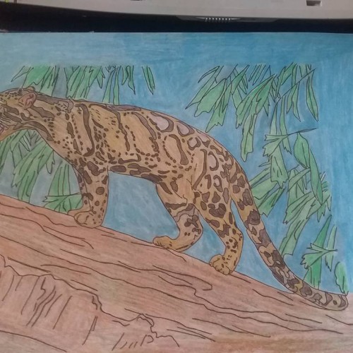
Cloud leopard i finish doing, it took me 5 hours to do, i used few different types of colouring pencils for this drawing, and baby oil for blending the colours,
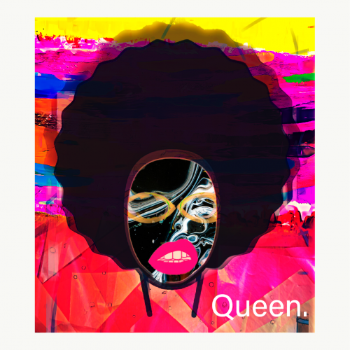
Colour and the absent of it. I blend to showcase the innocence of the child through colour attire. And the seriousness is felt in the child hat and the riffle with a strong black.
This art piece underlines the duality of eastern and western cultures. I love when they combine.
I’m a first generation Canadian with Indian descent.
My artistry shows that duality of co-existence
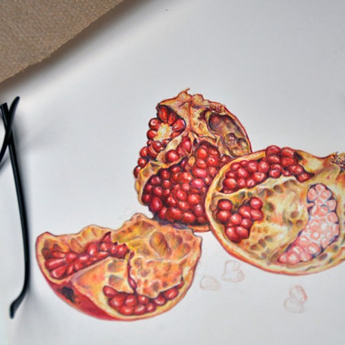
Colored pencil drawing of pomegranates "in progress." Prismacolor and Verithin pencils with some fine lines done with Tombow Irojiten pencils. I like the harder colored pencils for fine detail, but the blending of high wax and oil pencils can't be beat for blending.
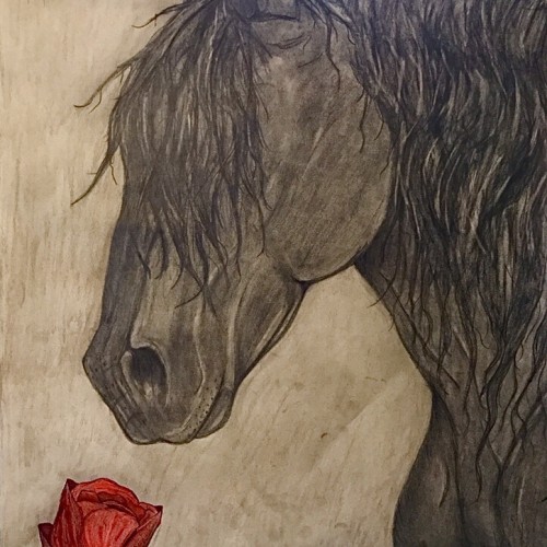
This is the finished drawing. It took me about 6 hours over the course of two days. I decided to just lightly shade the background so my finger prints didn’t show so much. I was afraid that going darker would make the horse blend in too much. I’m happy with how it turned out! Done in charcoal, marker, colored pencil, and pencils.
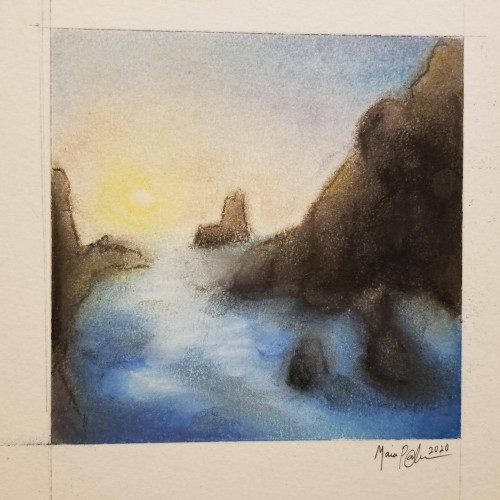
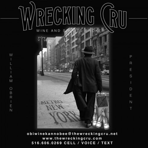
18x24 watercolor paper, technical pen and probably pastel pencil or just regular pencil blended with a q-tip. This was done for a friend who owned a wine and spirits shop, so I guess it's a vine. Or a tree. Whichever....
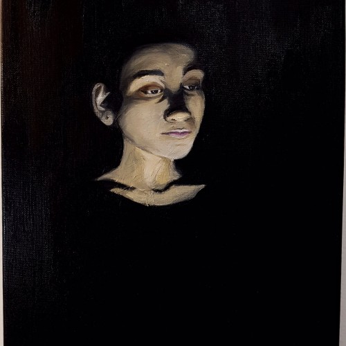
Inspired by the Neo-Classical period, I pushed myself as an artist to portray subjects in an idealistic fashion combining drama and artificial lighting. The subject is my sister who modelled as a reference, enabling me to control the shadowy effect over her face. The dim lighting and dark background resonated with the period style, focusing on the facial parts that are visible. The end result looks like she is emerging from the darkness. A somber atmosphere is illustrated through visual expression.
Adding the fast drying oil on the brushes improved the blending of the colours on the canvas which was especially useful when it came to applying strokes on the face smoothly. Visit https://www.martiaposts.com for more