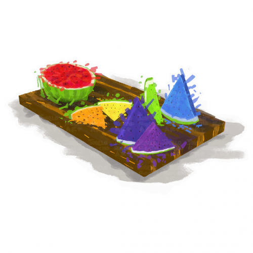
A vibrant assortment of rainbow watermelon slices is arranged on a wooden serving board, featuring colorful triangular and round shapes. The contrasting colors against the neutral background create a lively and appetizing display.
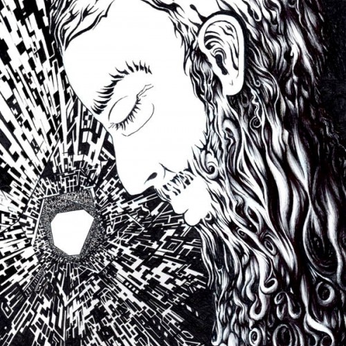
This black and white ink drawing portrays an aged man with a beard lost in deep contemplation within a futuristic spaceship setting. The subtle hints of sadness on his face are contrasted against the vastness of space, where the Milky Way is barely visible in the background. The artwork evokes feelings of isolation and reflection, inviting viewers to ponder the human experience amidst the cosmos.
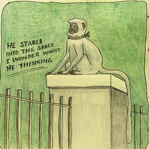
Found him sitting on a wall in the park where I go for a jog since pandemic started. Was so mesmerised by this magnificent beast. I couldn’t stop staring at him every morning. The contrast between the white fur and black skin. So shiny yet so peacefully he sat doing his job.
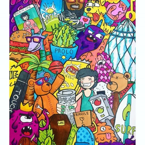
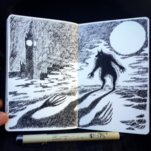
This doodle depicts a transitional phase in my college years. Illustrating one of my favourite rappers, drinks, snacks and one of the iconic buildings in London; this doodle is full of colours varying in throughout the page and popping out with contrast.
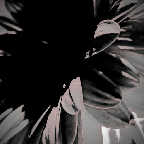
Capturing the spaces in between and amplifying them with a play on exposure and contrast to bring forth the beauty I see within the layers. This particular play is a flower I saved from a very special event I attended. I then dried the petals of this beauty. These special petals make their way to various projects, including oil and acrylic paintings and resin on canvas. More to come :)
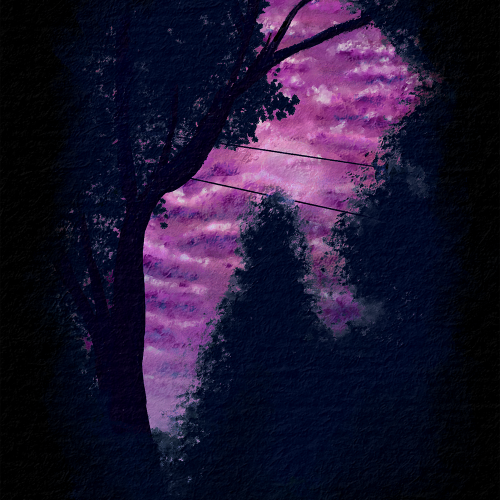
I was working on nighttime or dark themes and trying to get more contrast than the last piece I made. I wanted to also work on atmospheric perspective and depth with the clouds. Overall, I am pretty happy with the outcome. This is from a reference picture my husband took from our backyard. Painted with Rebelle 6 Pro.
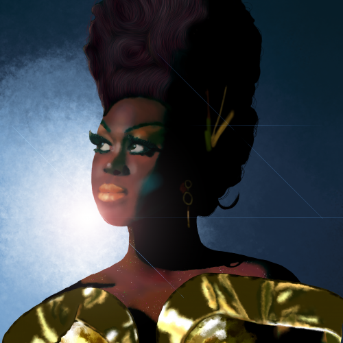
Bob the Drag Queen is a legendary performer and personality. She is one of my favorite people. I kept the composition simple to focus on shading and facial dimensions. I paid close attention to not lightening her skin tone and respecting her heritage but also contrasting the gold dress and blue background.
A little o' this, a little o' that. All on 8.5X11 heavy white card stock. Some colored pencil. Using photoshop only to render contrast, no other manipulation.
Who hasn't, at least once in their lifetime, fly towards something that seemed reachable?
“With the background, being unity, contrast. Like Venus in the morning”
~Golgaaryol, 2025
KO-FI https://ko-fi.com/tinebress
I honestly don't like using color tones like this. I actually really enjoy the black and white contrast. I have always loved black and white images, cartoons and movies. But I try.
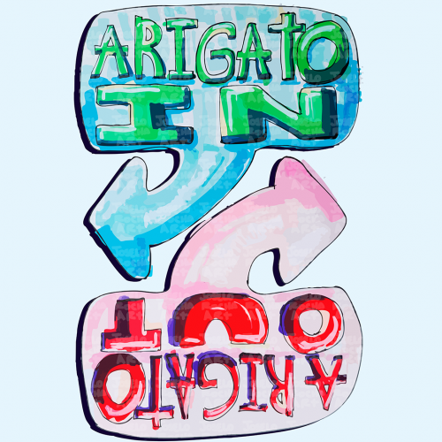
The image features colorful, hand-drawn text with arrows labeled 'Arigato In' and 'Arigato Out'. Inspired by Ken Honda and the philosophy of Happy Money.
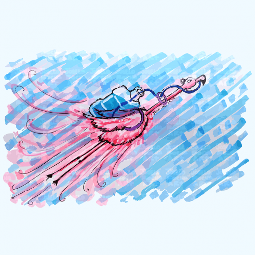
A vibrant pink flamingo bird is depicted soaring across a blue textured sky with a big water container in his back, its pink and blue hues create a striking contrast. The bold strokes and dynamic movement add a playful energy to the scene that reminds us to always stay hydrated.
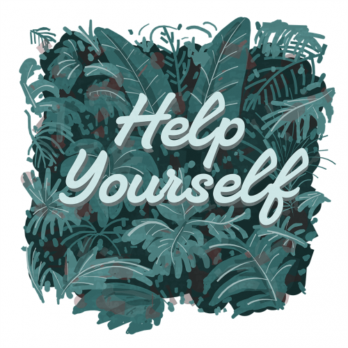
Lush green leaves form a vibrant background, setting a calming tone with the motivational phrase "Help Yourself" in the center. The contrast between the text and the foliage captures attention and invites reflection.
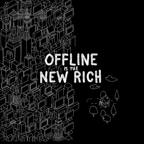
A dense cluster of geometric buildings sits beside the phrase "Offline is the New Rich" highlighting a contrast between urban and online life, and simplicity. To the right, a small house stands alone surrounded by trees and clouds.
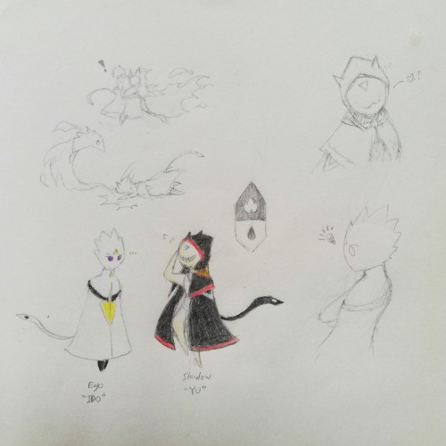
Been developing in a way to free myself from external reference-based OC concepts, which was where I started from in drawing. In a way, exploring how I view characters from my own eyes. Here, is an example of drawing myself in two contrasting counterparts. Personal preferences are actually pretty simplistic by appearance.
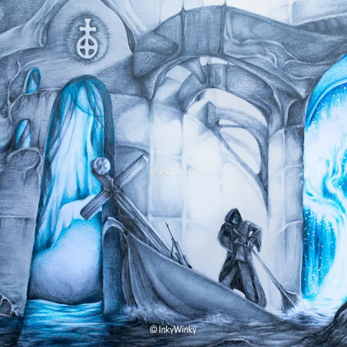
Journey presents a surrealist setting where a man is rowing his boat through a wondrous landscape, surrounded by buildings and stones with strange symbols and runes. A bright heavenly light illuminates the traveller's origin while a stark contrast is made with the vibrant blue light, from behind the walls, of this mysterious sunken building. This artwork is for sale on inkywinky.com.au
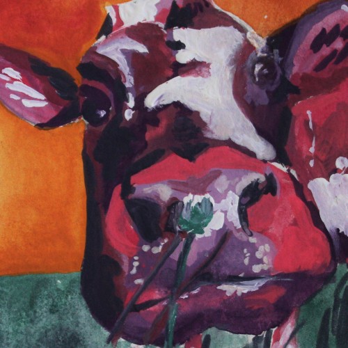
This colorful painting was created using gouache paint to give an illustrative design feel. The subject is a cow painted using non-local colors like pink and violet, contrasting the orange sky background. I love the small clover flower the cow appears to be smelling in the foreground of this piece. For more in my gallery, please visit ArtsyDrawings.com!
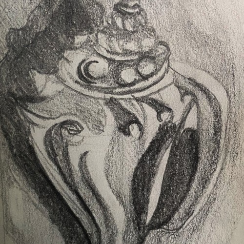
This is a graphite pencil drawing of a conch shell I found on the beach in Florida. I used this sketch as a base for a intaglio print I made. The sketch features the cool textures and forms of the shell in a harsh contrasting light.
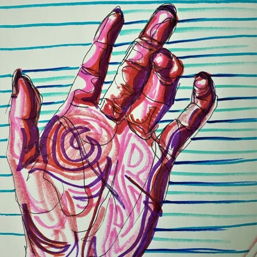
Pop art ink drawing in red, pink, and violet hues. The subject is the palm of a hand and curled fingers. The background has blue, green, and turquoise stripes contrasting the colors of the hand. This artistic drawing style uses non local color to create form in the palm hand drawing.
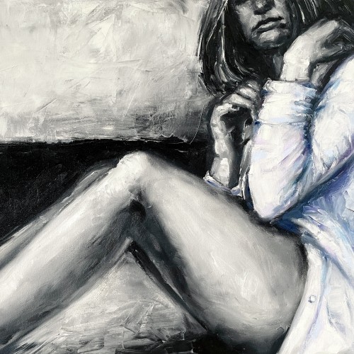
"The painting ""The Girl in a Shirt"" is one of the paintings series ""Her"".The artwork is painted in oil on canvas with wide textured strokes of a brush and a palette knife. In the work, we can see the opposition of a gentle female image and deliberately careless aggressive rough strokes of paint. The artist plays of black and white hard contrast against delicate pastel colors. The girl depicted in the painting feels
constrained by external conditions, which prevents this painting from having an erotic value. The girl nervously tries to unbutton her shirt in order to get more air and freedom. Her pose is not balanced, which shows even more uncertainty and indecision. That's why this artwork is considered rather dramatic."
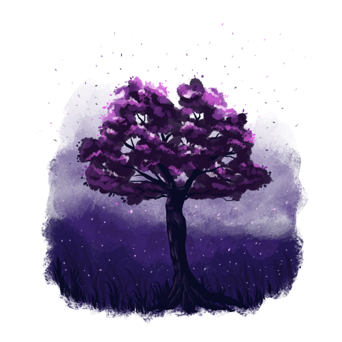
Somehow the tree trunk looks like a female figure to me.
I'm not sure if I really like this illustration, but my imagination plays here a lot.
I could draw a bit lighter background to make more contrast for the tree trunk. What do you think?
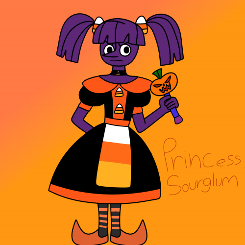
Like her name,she's sour but she's more angry than glum,I really don't like how her dress turned out but I really couldn't try anything else since I'm drawing with my finger again.. hopefully I'll redesign the dress soon and use less orange.Duchess RavenWaves is my inspiration for her.She is a purple licorice princess albeit evil (you know how a lot of people hate licorice?) Instead of having simple sweet candy decorations on her dress she has candy corn decorations (no one likes candy corn) she is really bitter,evil, selfish and ruthless often enslaving many candy people with her father who works as her advisor.her wand isn't alive like Sweetnette's wand it still has powerful magic like Sweetnette,she has to dance and sing to transform, there's a jester form and a military leader form.she is taller and thin,and has a circular face in contrast to Sweetnette's square face.she often uses demonic magic,which sometimes backfires.
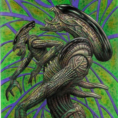
One day I was watching Aliens, Predator ,and AVP things and It just make me get so inspired. I love those franchise to start with ,but gosh getting exposed to those franchises again just pouring art juice on me to get me so inspired to create as you this art piece. I wanted to have minime alien coming out of adult aline chest instead of cliche baby alien coming to make it different than what people expect. I just wish I had Artist grade color pencils instead of student grade I used on my color pencil art pieces, but soon or later I want to get artists quality color pencils. I am dying to try Polychronos color pencils. It is oil based color pencils. I been using wax based,but polychronos are expensive even more so than Prismacolors. If i want to save money and i gotten this brand before . It is Staedler triangle coloe pencils. They sell this stadeler color pencils of 48 colors for $13 at walmart.com. I might get that one I dunno. I do wana get Polychronos if not prismacolor but anyways Here is the art work using shitty color pencils. It seems like this scan looks better than my originals cuz i scan it and bring it to Photo impression software that came with the scanner to boost a bit of contrast cuz if u did not know student grade color pencils have less pigementations and more white fillers so u cannot make dark really nice dark or hightlight really nice strong highlight like artist quality color pencils can bring. DONE 2022 WITH STUDENT GRADE COLOR PENCIL ON 11X17 BRISTOL ORIGINAL ART $160+S/H AND I AM OPEN FOR COMMISSION COLOR PENCIL OR LEAD PENCIL WORK. SIZE RANGE FROM 8.5X11, 9X12, 11X14, 11X17 COMMISSION RATE STARTS FROM $20 AND UP. LEAVE COMMENT OR JUNGMEISTER4@YAHOO.COM I AM SELLING MY ORIGINAL ART. I have my 2023 Wall calendar up for sale $19.95 with my artworks through Artwanted.com art community website. Click or copy&paste the link below and would be appreciated if you can support me on the calendar https://www.artwanted.com/artist.cfm?ArtID=115637&Tab=Calendar
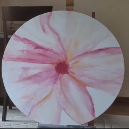
Textured acrylic painting on round canvas. This pink floral painting is perfect as a contrast decor piece for the blue walls of your living room. acrylic painting flowers on canvas. acrylic painting flowers aesthetic, acrylic art flowers, simple acrylic paintings, floral painting acrylic, pink flower painting, #paintingideasoncanvas #paintingideas #painting #flowerpainting
I printed my black and white zentangle drawing on marker paper and colored it with alcohol markers. At first it was a bit to garish with too much contrast, so I painted a warm grey over the whole piece. That gave me what I was looking for. Of course, THEN I completely undermined that with making a bunch of wild colored ones (two shown here) by playing with them in Photoshop. I shall be using this (along with my Zentangle koi posted la while back) for printing blank cards that we sell for charitable (mostly foodbanks) organizations.