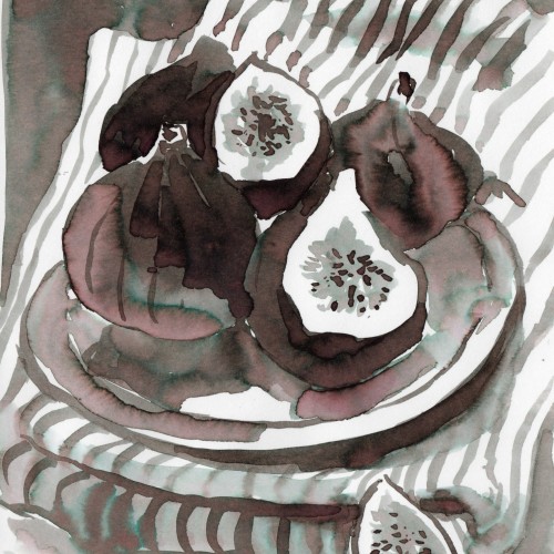
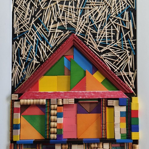
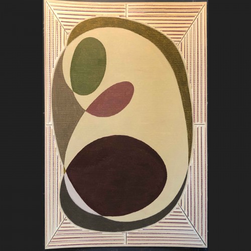
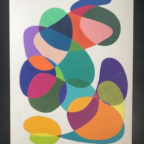
The materials that Meir uses in her works are not of the refined and so she is called an “arte povere” artist. At times she describes her work as someone dealing in alchemy - work develops as in a trial laboratory with different techniques and materials. She says, “ at times the artistic work process is a sort of puzzle demanding the filling in of all the empty squares “.
Some of her work focuses on women, and they incorporate criticism and cultural protest.
Meir has strong opinions about recycling and environmental protection that is represented in her works by use of materials and shapes. In her work she reacts to contemporary art that communicates with the eco system, waste, and she also searches for different worlds. Her works are made up of layers upon colorful layers that when we look at them it becomes clear that the mound of waste she chose is not coincidental. It actually becomes a colorful kaleidoscope of utopia.
Jaffa Meir is a multifaceted, autodidact artist working in painting, sculpture, photography, product design, carpets and furniture, painting on textile, and computer graphics.
The structural composition of some of the works is influenced also by her many years of working in the architects’ office.
Meir also worked in the developing of ideas within the field of ecosystems and recycling for factories such as Coca Cola, and during this process came up with ideas for designing parks and public game spaces using industrial waste products.
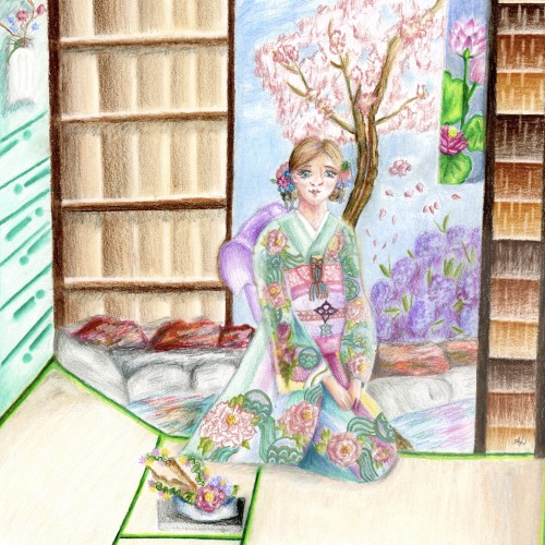
My latest illustration! I recreated my character Okimoto Manami (a computer graphics piece back in 2013) in a traditional Japanese setting. She is in a traditional house overlooking a garden that has a pond, a cherry blossom tree and a flower bush. She also has Ikebana (flower arrangement) peony piece near her. Theres also peony designs on her kimono.The kind of kimono she’s wearing is a furisode.I have advanced quite a bit in the past eight years and I prefer using traditional mediums these days! Colored pencils used: Caran d’ache luminance, Posca colored pencils, Faber Castell polychromos, etc..
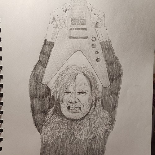
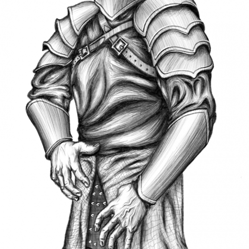
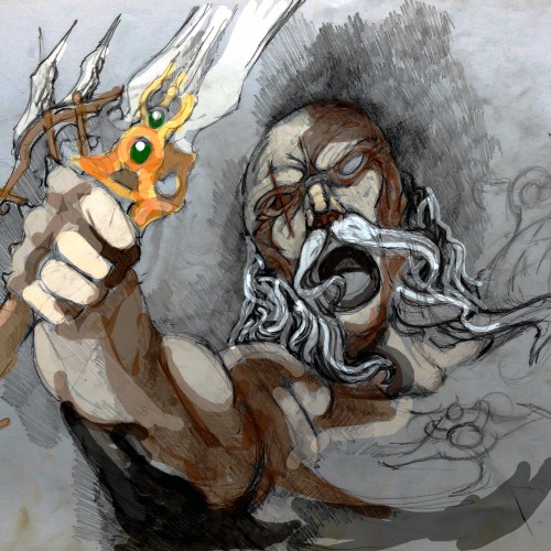
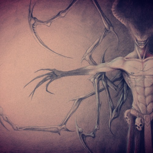
based in the METABARON series by Moebius n J.Jimenes, A.Jororowsky script,,,,,i didnt copy i did my own caracter but the style its very similar to taht graphic nobel,,,,,,well Hope you like!!!!
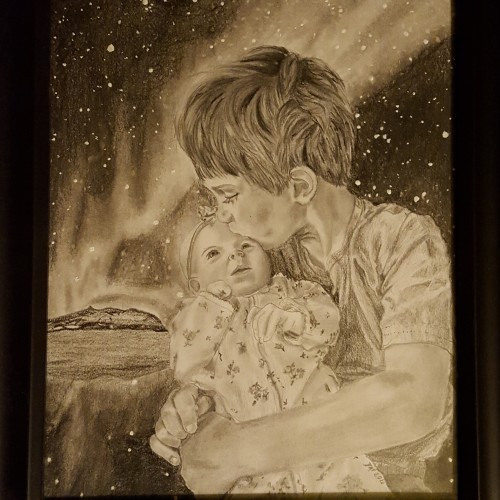
Graphite and charcoal with white acrylic paint for some of the stars. This year, my brother and sister in law got a telescope, so their family had a space themed Christmas. This was my contribution. Side note, I only just thought about how cruel I was to drop my nephew off in the arctic circle with only a tee shirt. We'll just say it's the north pole and the magic keeps them warm...
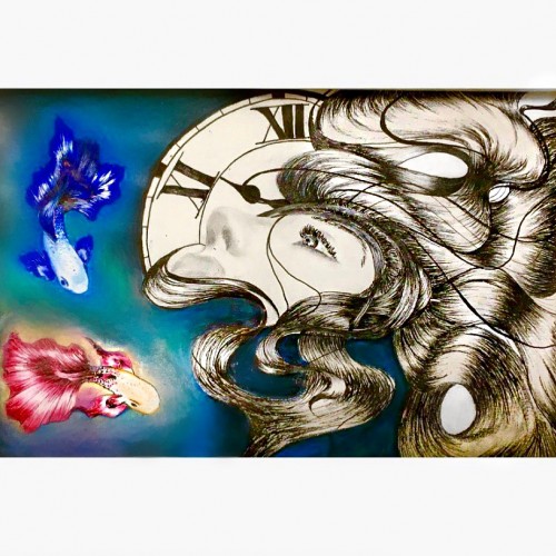
In this photo I drew two Betta fish, a clock and a female in a dark background. Drawing this picture was more of a self expression. The two betta fish expressed conflict; the clock expressed running out of time and the female I guess would represent myself. I was in a dark period while drawing this, but happy to say, I’ve managed to pull through my obstacles =)