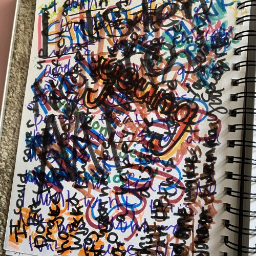
It's a mess, right? Not particularly beautiful or impressive. That is what self-hatred is like. Easy to achieve. Not great to look at. Very common. And very, very hard. To all of the people that struggle with self-hate, it's all in your head don't worry. You are the only one that sees you the way you see yourself.
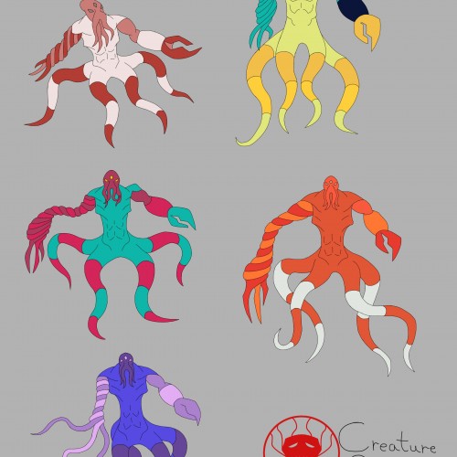
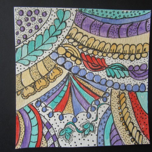
I decided to go with the mimic octopus color palette as the main one. The colors compliment each other nicely, and it doesn't look too busy as a result.
I was trying out different color palettes to see which one I preferred. The top palettes are based off the mimic octopus and the blue-ringed octopus, respectively. The rest aren't inspired by anything, I just thought the colors looked nice.
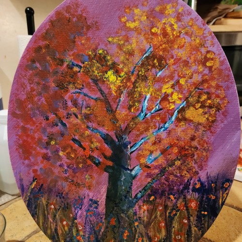
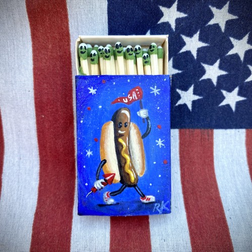
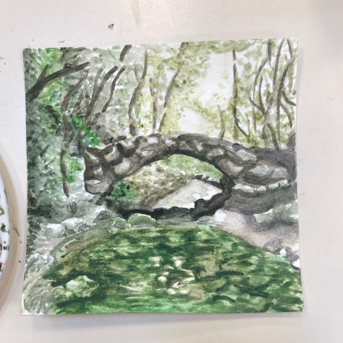
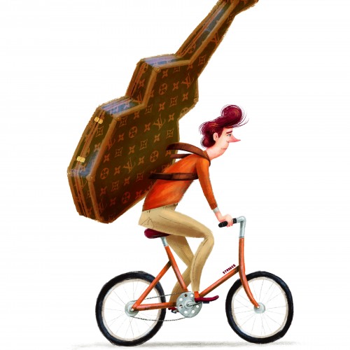
This painting has my mix of styles on display, I found painting this too be really enjoyable and meaningful check me out on instagram if your interested in my work! thank you for looking at it!
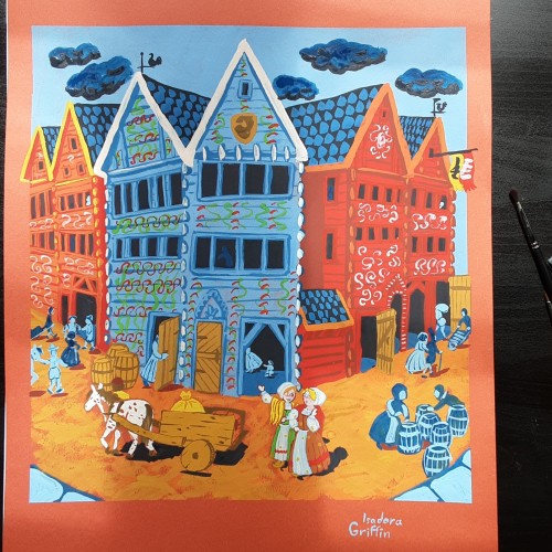
This looks simple, but i spent days researching to get the buildings and clothing right. There was also a lot more layers than i planned for. This buildings are still in use, there are different shops in them now. Sadly they no longer have those colorful decorations,
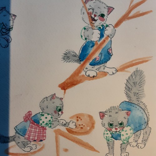
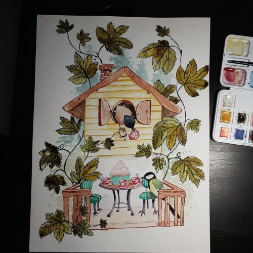
The painting im working on is taking a lot more time than i expected, so here is one i painted last winther. I love Beatrix Potters paintings where the animals look realistic, but they wear miniature clothing and behave humanlike.
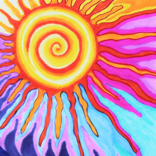
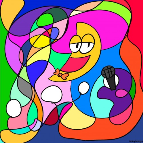
This doodle is a marker and ink drawing of a hyper stylized sun with a middle spiral and squiggles extruding from the center like a wild galactic heliocentric power hold. The sky is orange and hot Barbie pink and deep blue and very fun and colorful to look at. Check out more of my art at ArtsyDrawings.com
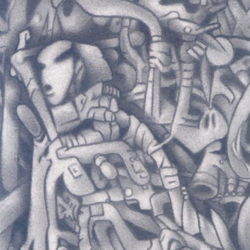
(HB pencil on 115mm x 80mm paper) A dreamscape (automatic drawing) piece which looks to depict a character dropping off to sleep, surrounded by his own dream construct.
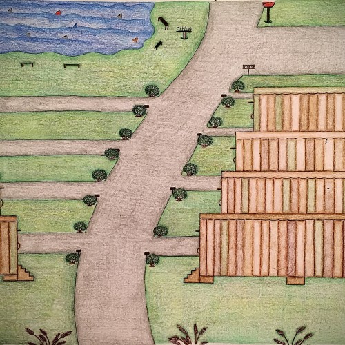
I designed these multicolored trailers using different shades of color only in a different pattern for each trailer. I felt like this color scheme would give the trailers a uniform look yet their own distinct look. The roads look freshly paved with small shrubbery on the corners of the entry ways of the driveways. There are some pretty brown steps that leads to a door on each trailers. Also, as you can see the trailers have been topped off with the same flat style roof only with a different solid color which is one of the colors used on the sides of the trailers. There’s a fishing area with plenty of fish in it as well as places to sit. There’s even a place to use the restroom close by the fishing area so you can continue to enjoy your day catching fish with minimal interruption. This trailer park has a fresh look to it. It has a warm, inviting feel to it and is perfect for living a more simple lifestyle.
Cross posted to Tumblr:Fun fact: before long,before all of my demon OC's,Ghost OC's, Object OC's etc.I made a scene girl oc since little ole me couldn't cope with the fact that I couldn't be scene at all (family and money reasons) tween me made one.Her appearance now is way different.Shes now afro Latina. I don't remember her original outfit so I made her a new one.Gave her pigtails because why not?I guess she still looks like a stickman because she was one back in the day! finally..she has a name!her name is Chrissy Temple! Wish I still had my old drawings of her I made in Ms paint and in paper lol.I don't know why I keep dreaming of obscure OC's of mine?
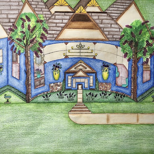
I designed this house. It has a really pretty blue exterior, and it has a slight curve to it that gives it a more warm and inviting feel. I like how the walkway kind of curves into the stairs and transitions back into the walkway before arriving at the front door. I like that there’s plenty of yard space with some really nice landscaping. The birds can even come and get a birdbath. I thought that was really cute. I used the multicolored stones to add detail for a more distinguished look. The hedges are neatly cut in a square and follows along side of the house. Looking through those gorgeous windows you can see the house is fully furnished. There are some really pretty chandeliers in there that adds character. There’s a stairway that leads to another level of the house as well. I love how there’s a touch of yellow that highlights the points on the rooftop. Furthermore, the swing in the backyard adds an inviting feel to the scenery. Also, it’s a nice place to sit and enjoy the view.
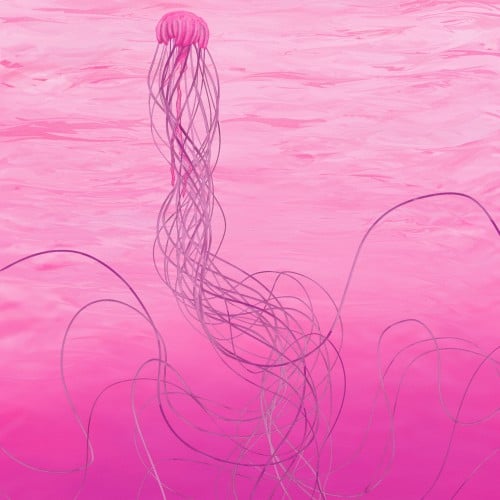
I aimed to have the water look believable while painting a jellyfish with long flowing tentacles. Drawn digitally in Rebelle 6 w/very minimal effects. This is not AI nor is any part of this AI.
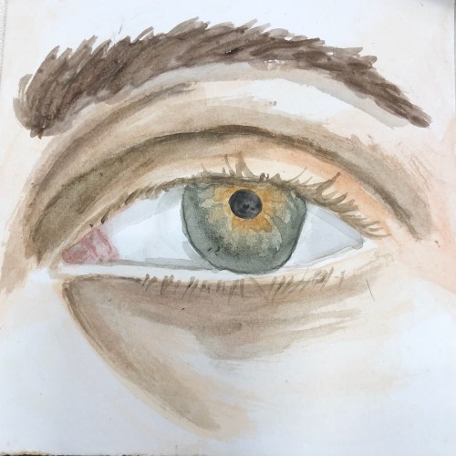
Another watercolor piece for practicing. This is actually a painting of my eye, which actually made it more difficult than doing someone else's. My iris has this weird mix of colors to it, but I always thought they looked really cool and I wanted to try to capture it. I think there are still some kinks that need to be worked out, and I think redoing it some other isn't a bad idea either.
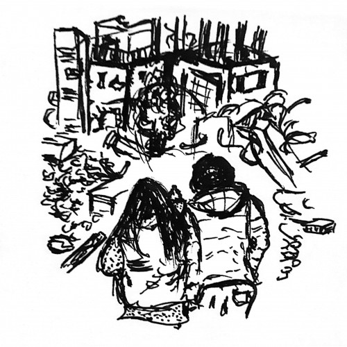
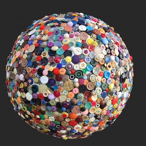
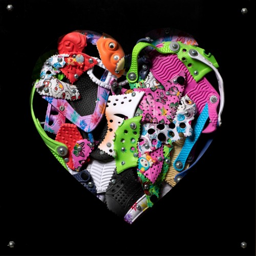
The materials that Meir uses in her works are not of the refined and so she is called an “arte povere” artist. At times she describes her work as someone dealing in alchemy - work develops as in a trial laboratory with different techniques and materials. She says, “ at times the artistic work process is a sort of puzzle demanding the filling in of all the empty squares “.
Some of her work focuses on women, and they incorporate criticism and cultural protest.
Meir has strong opinions about recycling and environmental protection that is represented in her works by use of materials and shapes. In her work she reacts to contemporary art that communicates with the eco system, waste, and she also searches for different worlds. Her works are made up of layers upon colorful layers that when we look at them it becomes clear that the mound of waste she chose is not coincidental. It actually becomes a colorful kaleidoscope of utopia.
Jaffa Meir is a multifaceted, autodidact artist working in painting, sculpture, photography, product design, carpets and furniture, painting on textile, and computer graphics.
The structural composition of some of the works is influenced also by her many years of working in the architects’ office.
Meir also worked in the developing of ideas within the field of ecosystems and recycling for factories such as Coca Cola, and during this process came up with ideas for designing parks and public game spaces using industrial waste products.