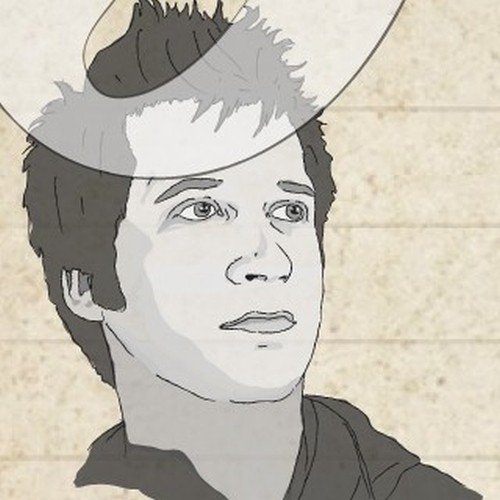
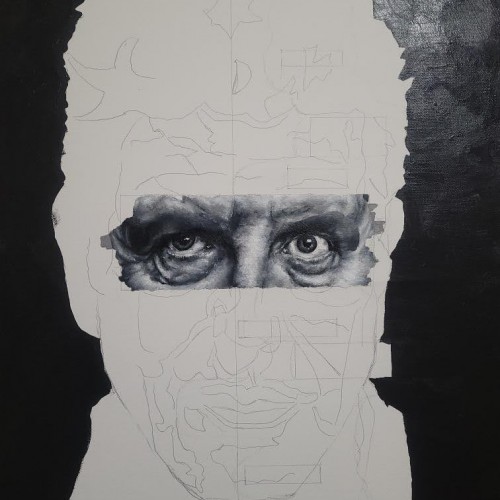
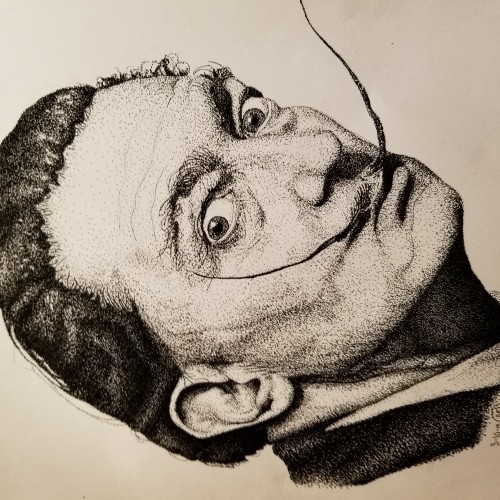
Over a year ago, I finished my Robin Williams portrait, and I decided I wanted to create a series of different black and white portraits. So far, this is the happiest I've been with a piece in a while. There's no expectation, there's no real pressure on this, it's me falling in love with painting again. I've only been working on this for a week, so there isn't a ton of progress. I suppose I'll reveal who the person is later once more progress is made but for now, enjoy.
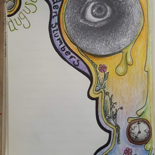
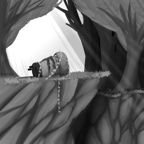
I know this is simpler and a quicker piece, but this is the drawing for my August journal. I started doing these back in March, with each month's drawing being based off a song. This month is "Golden Slumbers" by the Beatles, July was "Tower of Babel" by Elton John. (The pencil sketch eye I previously posted is indeed now in my journal.)
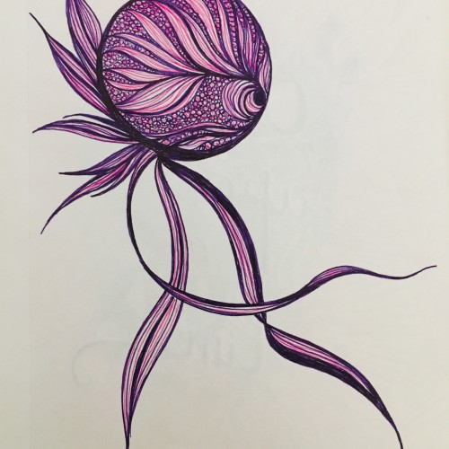
A drawing I made for a friend to go with a playlist they made me. Very cool. Almost considered a piece of vent artwork, but... eh. Drawn with FireAlpaca.
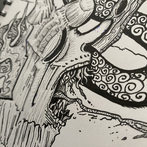
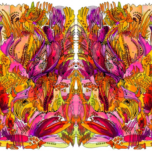
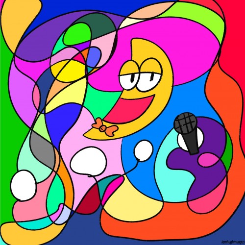
Sakura Pigma Micron pen and DR PH Martin Radiant Concentrated Watercolors. One side was painted, then embellished with ink, scanned into Photoshop, copied, flipped and pasted to make the two sides. (Fairly large image, so I included a couple of details.) Silly but fun to do. A little "acid" and a few hours of gazing is all you need for a profound experience. Ask me how I know.
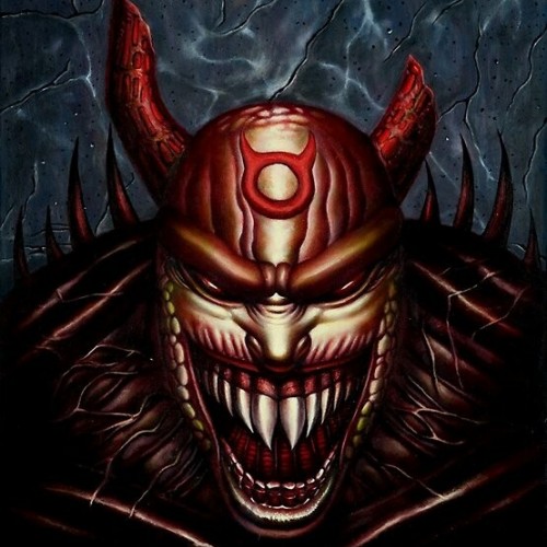
Done 2014 with pen and sharpie on `8.5x11 print paper. this drawing came about when i saw advertisement on back of the comicbook i just saw glimpse of it and drew whatever i remembered from my imagination . I think it is cool character. If you are interested in purchasing this original artwork for $20 and also I do private commissions. Leave a comment or contact me at jungmeister4@yahoo.com (Shipping fee will apply) Also I have my 2023 Wall calendar up for sale $19.95 with my artworks through Artwanted.com art community website. Click or copy / paste the link below and would be appreciated if you can support me on the calendar https://www.artwanted.com/artist.cfm?ArtID=115637&Tab=Calendar
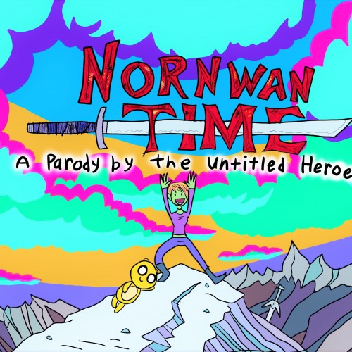
The Nornwan: World Of Wonder series has always had Adventure Time at its inspired heart. I just figured I'd finally make this and practice a little imitation of one of my favorite art styles, tell you the truth, I used to hate Adventure Time, I used to think it was too simple, and even dumb, but after a few years and a little convincing, I got into it. And I've had a happier life ever since. Thank you.
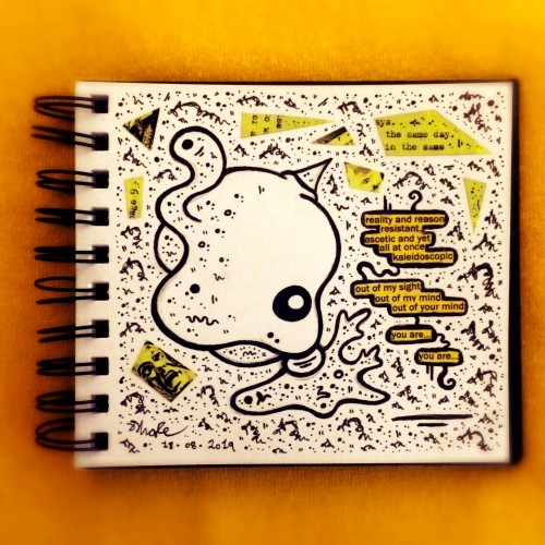
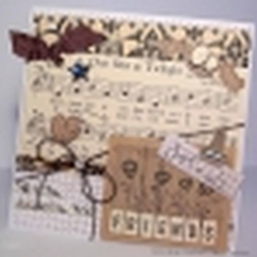
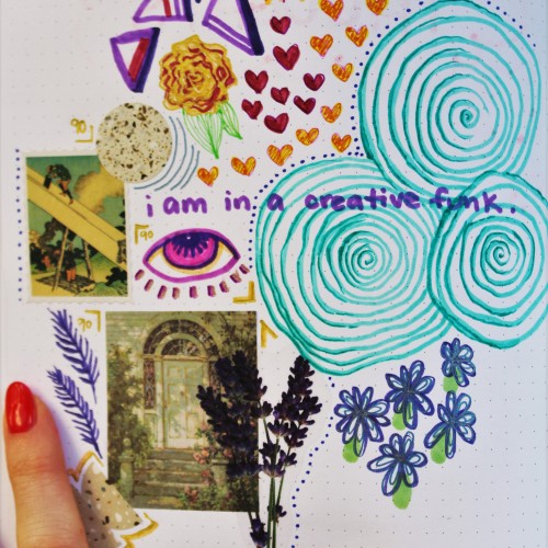
sometimes my head doesn't work right and art doesn't look like art. sometimes i like to simply draw and doodle and not have a plan nor a color scheme. this is an example of that type of in-the-moment artwork sketch in my sketchbook. it includes marker and ink drawings, stickers, and random pieces of scrapbooking materials
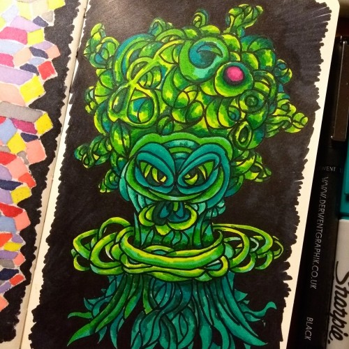
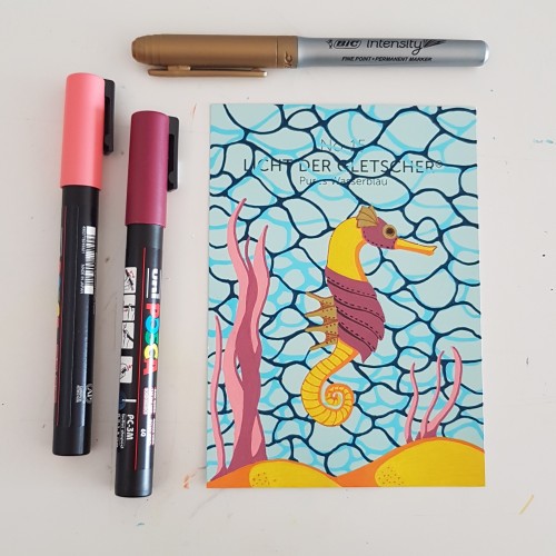
I did the water texture according to a tutorial by James Chapman, found on Instagram. The steampunk seahorse was an idea from a lady I am following on Instagram as well (look for @carrieisartsy) This piece is done on a paint chip card with poscapens, a gold marker and fineliners.
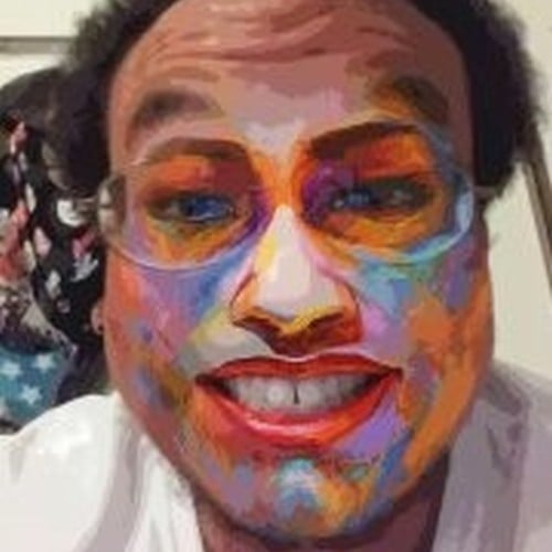
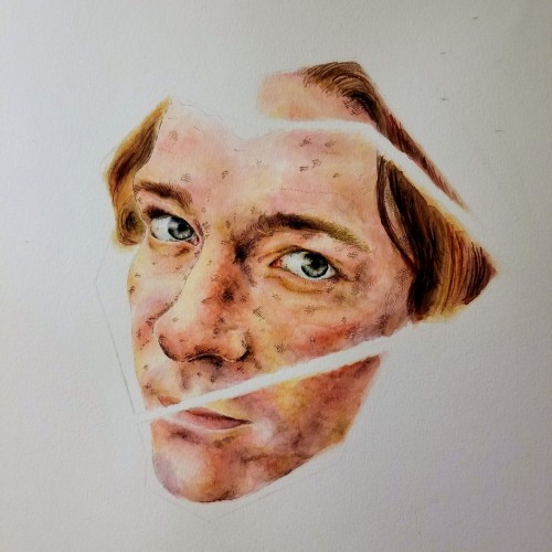
It's definitely been a bit since I've posted, sorry about that, things have gotten very chaotic very quickly. I'm officially less than a month out from graduation (the finish line is almost here!), which also means it's time for my teachers to cram in projects. Other than that, I'm happy to say I received two official art commissions! I'm hoping to get something set up to hopefully begin selling some pieces, but, for now, I'll have some pieces in a gallery soon. Things, things, things, and Tony's face. Part of a larger project, hopefully to be completed soon.
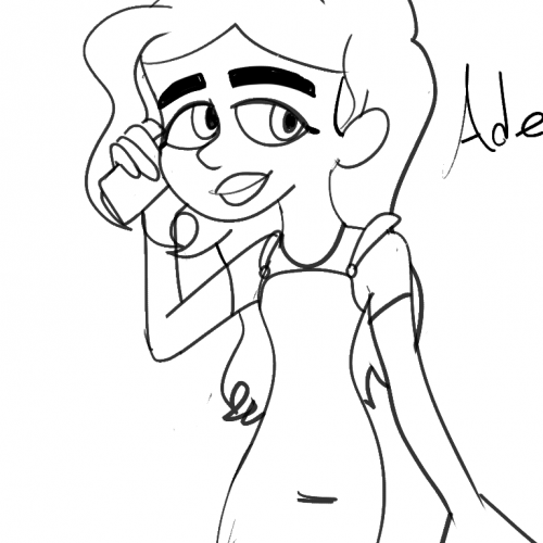
Ive been so occupied with myself that im so way behind with everything (including drawing)ive been practicing animating too.I don't stylize my OCS at all because I have no idea why.I was inspired by the bratz to draw adely like this (big head small body big eyes and big feet)might change her pose and draw nelsy (new name) next to her.
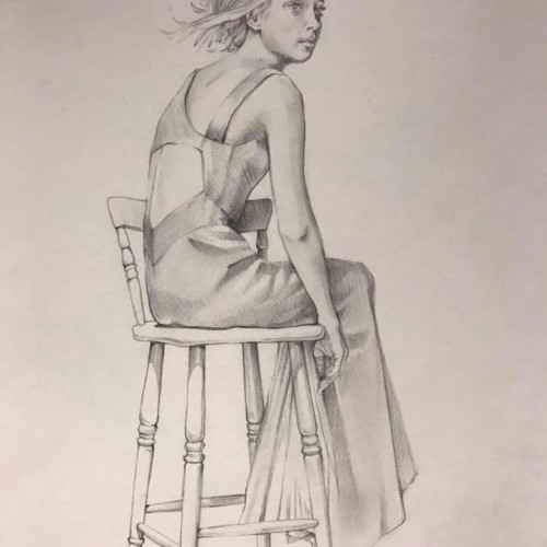
I have been wanting to explore the concept of creating a Vitruvian Women. Also felt like I struggled with the composition of the Reflect piece (which I am working on developing a series). Hence trying to learn from the best - in a scientific way:)
This piece was done with watercolour crayons, crayons, fineliner, acrylic paint and a touch of posca. I was showing that love can be blind and sometimes almost arrogant and selfish, the arrow has hit the spot on the second attempt but the scars are still to be seen. Although the person playing cupid aint always an outside force. I enjoy playing with the titles and am constantly changing and thinking of what it will be called when doing the piece, but i do like my wordplay. this one was a play on horticulture and felt it all tied in to the final design :))
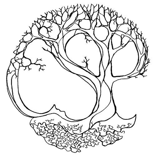
This is available as an a3 sized print.
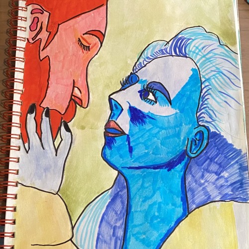
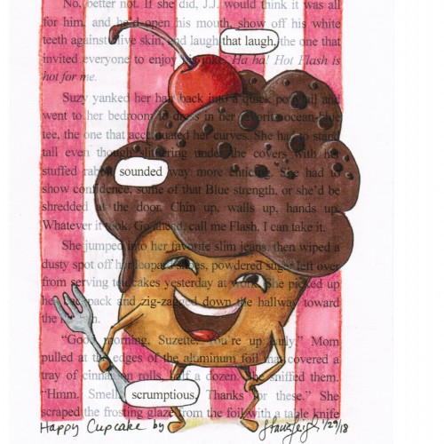
I was on the fence of whether or not I was going to make a piece for the prompt, but I'm glad I did. I tested out some watercolor pens I had recently gotten (I definitely have to practice with them a bit more). I didn't really have a plan for this, and it was a bit fun to do something so spontaneously.