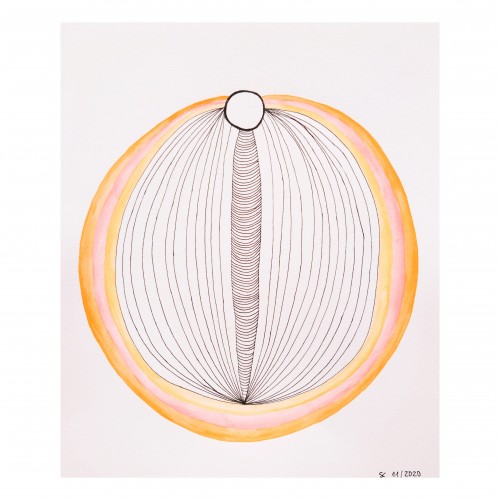
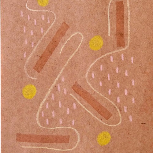
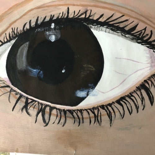
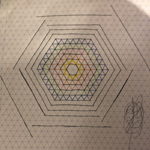
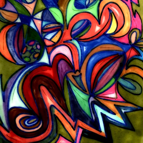
What happens when I keep trying to capture that spiritual image seen from the mind's eye? A shapeshifting abstract that is anchored merely by symbols. Sometimes I really just want to convey a consistent image that the world can see, which is really, really hard...
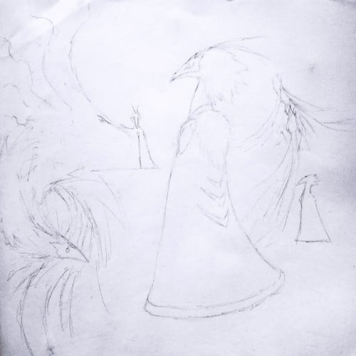
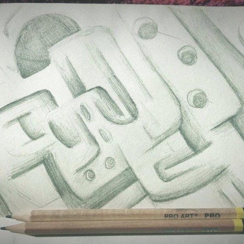
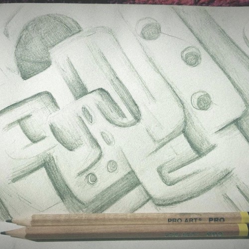
I mostly just started drawing shapes on this sketch, and then it turned into a kind of Earthy style. Feedback is always welcome on any of my artworks!!
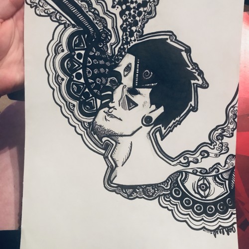
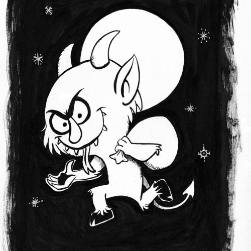
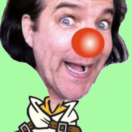
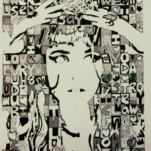
Brush with black ink and white acrylic paint on 9” X 12” acid free Strathmore Bristol smooth surface paper. The Image dimensions are about 5 1/2” X 8 ½. Signed and dated.
(The black ink was used for the character as well as for the background. The acrylic painting was used only for the small shapes in the background)
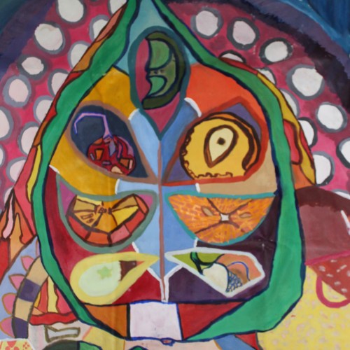
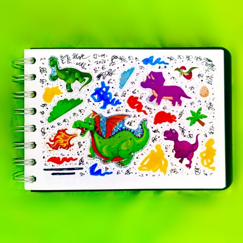
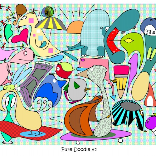
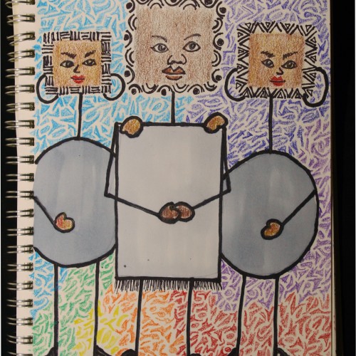
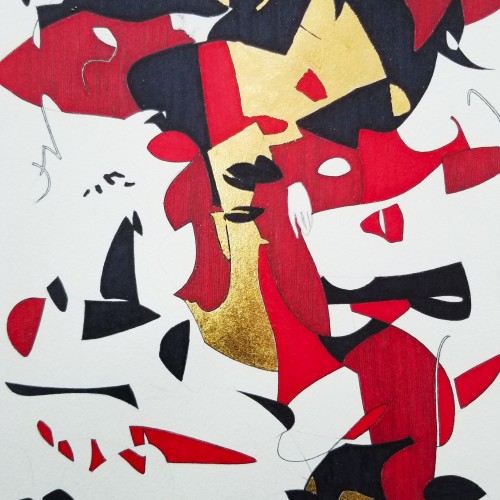
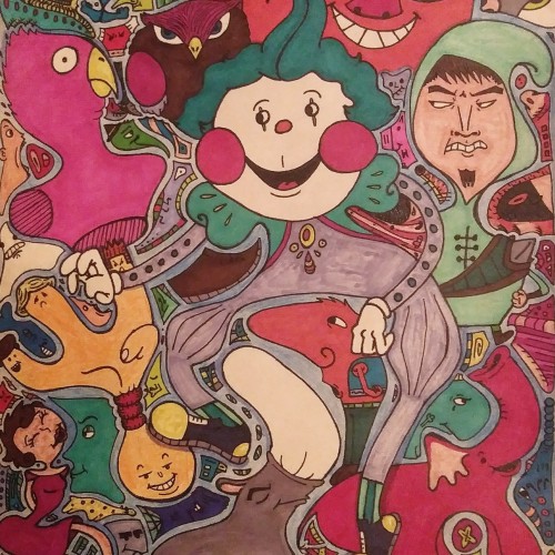
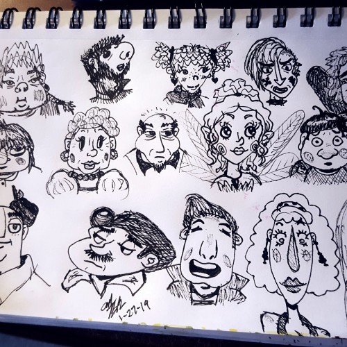
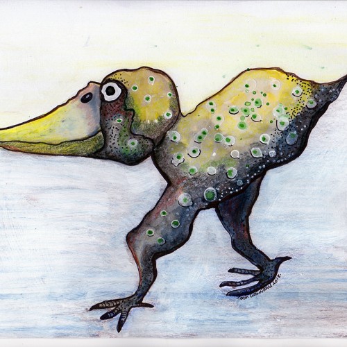
Normally i start w an idea or whim & doodle away trying to capture my thots. On this one i simply scribbled onto a page & then looked hard for shapes, animals, faces & any other unorthodox item. Then i simply added some color. I plan to do more of these mostly as a gr8 exercise for fresh runaway doodles hot off the press!
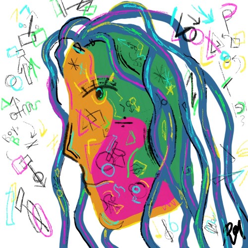
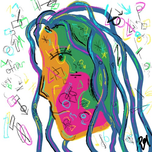
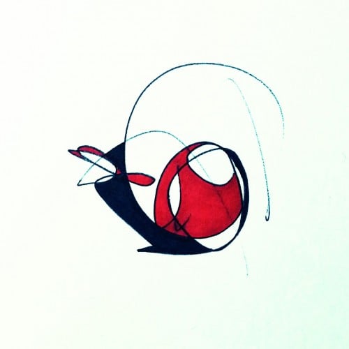
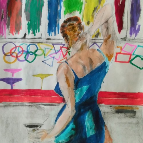
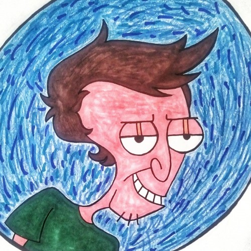
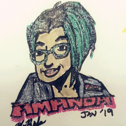
I drew this girl to keep my creative juices flowing, and I love how it turned out! Not a lot of technique involved, mostly just drawing shapes. I LOOOOVE colorful things.
Some works were born to be prodigious. Once the preliminary lines were laid within the first minute, the quality of the shapes, the diagonal composition and the weight were balanced out.
With the black mass as the hood, a face, hidden underneath, is unveiled. With the addition of the black fingers and the white hand, the full figure surfaced naturally.
The black fingers are the minimal suggestions to add character. The title `Remorse’ came about because of the bowed head and the pose.
utube clip: https://youtu.be/mb48rCx-lYI
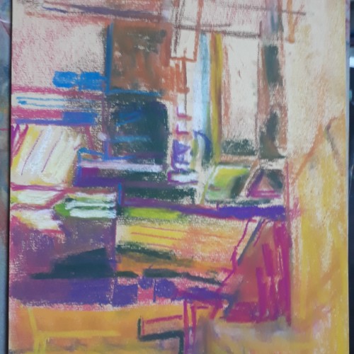
Soft Pastel. My studio is in a converted church with big GotHic windows. In the morning the sunlight streams in createing beautiful shapes on the studio furniture rolls of paper and general studio detritus.
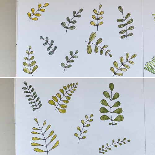
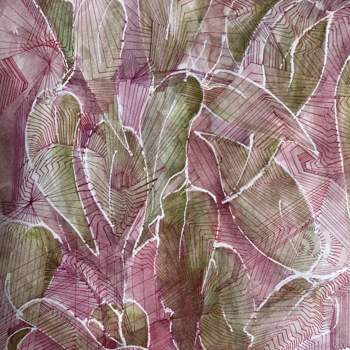
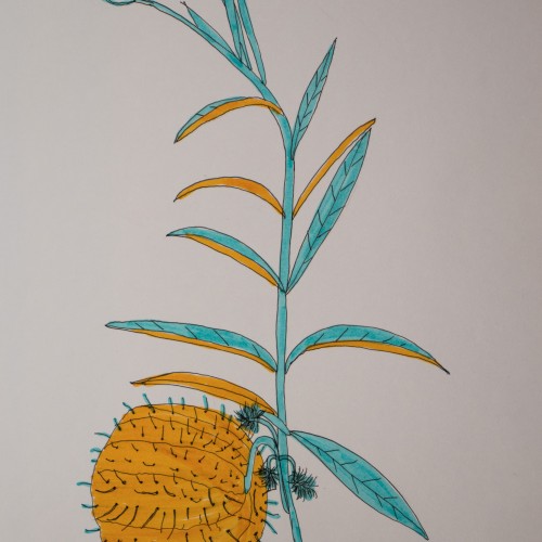
For some reason I tried some floral drawings, of different shapes, and I also used mixtures of different colors to produce hues of green. The first page - it’s a mix of the cobalt blue (PB 28) and cadmium yellow medium (PY 35). On the second one there is ultramarine (PB 29) for the blue color and the same yellow paint. To me, it seems the difference is very little but I’ve got the color closest to the ‘normal’ green using Cobalt rather than ultramarines. The latter gave either to yellowish to olive hues or too blueysh
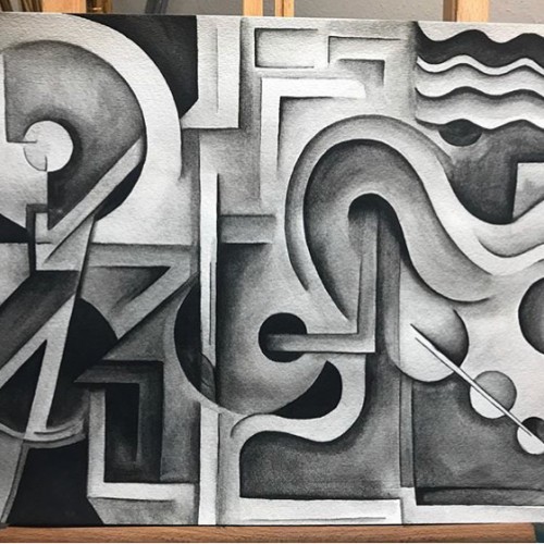
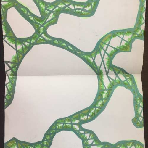
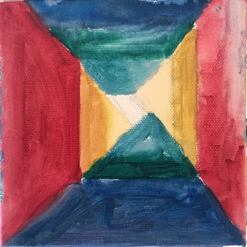
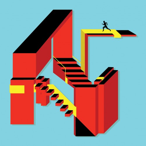
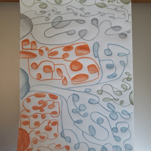
"Ups & Downs" explores the nature of basic shapes/colors and how they interact to tell a story. This piece focuses on an infinite recycled energy, meaning there is no end point to its structure. The aim was to keep it simple yet structurally complex to the eye.
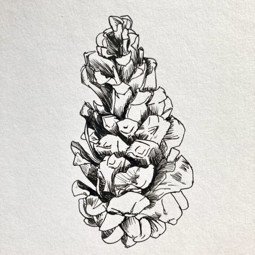
The nearby pine tree has dropped quite a few pine cones, all in different states of decay. I enjoy looking at the different shapes, sizes and colours of each cone, each with its unknown story.