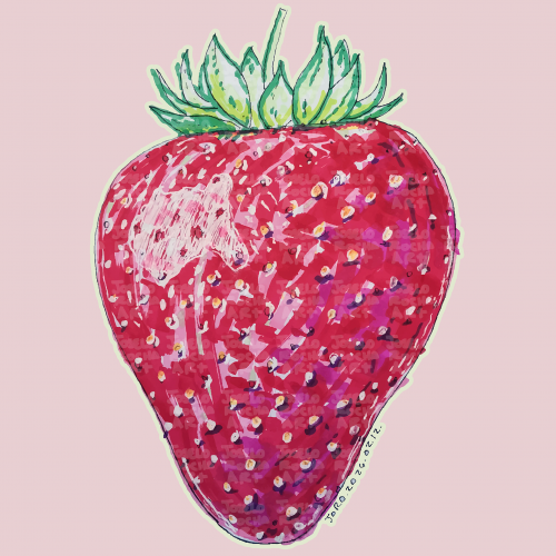
A vibrant, hand-rendered standing strawberry illustration featuring rich textures and expressive marker strokes. This piece captures the organic beauty of summer fruit through a modern, illustrative lens.
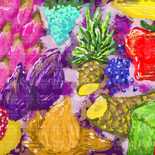
A colorful assortment of various fruits, including a dragon fruit, pineapple, and apple. The vibrant colors and unique textures create an eye-catching display.
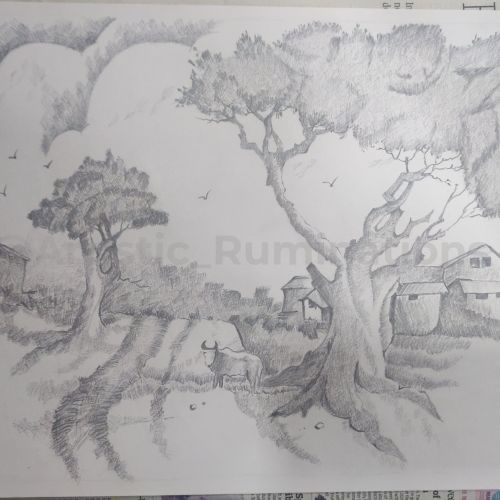
In this captivating cross-hatched pencil shading, a tranquil village scene comes to life. The intricate strokes create a harmonious blend of light and shadow, showcasing the serene beauty of rural life. Thatched roofs, winding pathways, and towering trees are meticulously detailed, inviting viewers to step into the peaceful simplicity of village existence. The gentle interplay of shades and textures evokes a sense of nostalgia and calm, capturing the essence of a timeless village story.
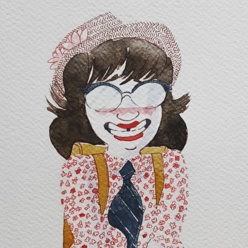
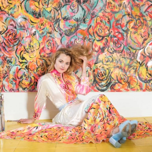
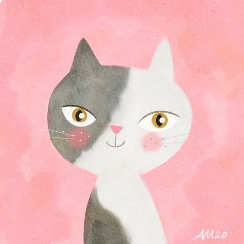
Backgrounds used to be my least favorite part of painting, but now im having fun trying out different textures and patterns. Having a strickt 12 color limit adds to the challenge and makes it feel like a puzzle.
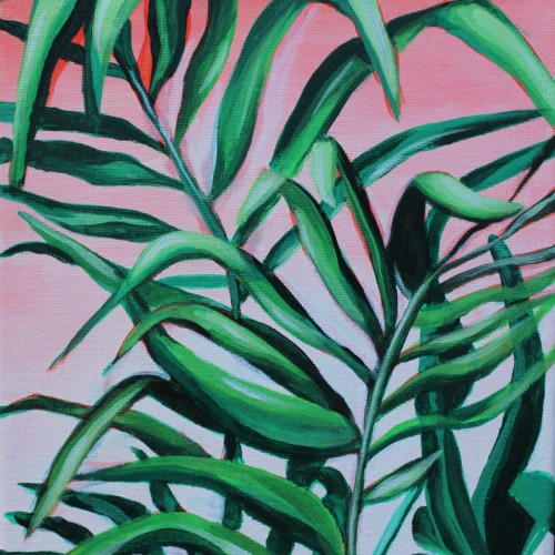
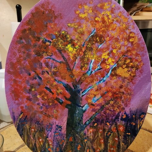
I love the versatility of acrylic paint. You can change the consistency by adding water or acrylic mediums. These additions enable artists to create transparent glazes or thick impasto textures. The fast-drying nature of acrylics makes it easier to correct mistakes or make alterations during the painting process. This painting is part of a three piece set featuring my favorite plants painted on a soft gradient background.
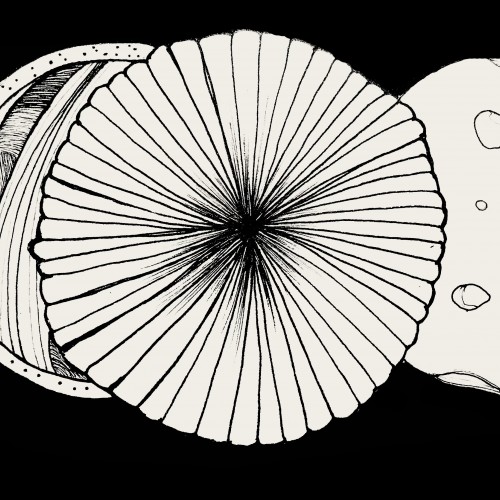
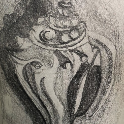
This is a graphite pencil drawing of a conch shell I found on the beach in Florida. I used this sketch as a base for a intaglio print I made. The sketch features the cool textures and forms of the shell in a harsh contrasting light.
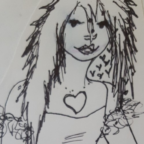
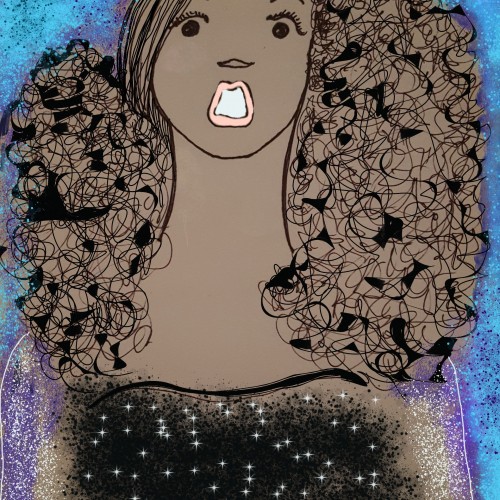
I rarely add colors to my drawings but am dabbling in unfamiliar territory with the Krita app. I am enjoying the ability to add textures as well. For me, it is similar to drawing left handed. This is the same drawing with a different technique.
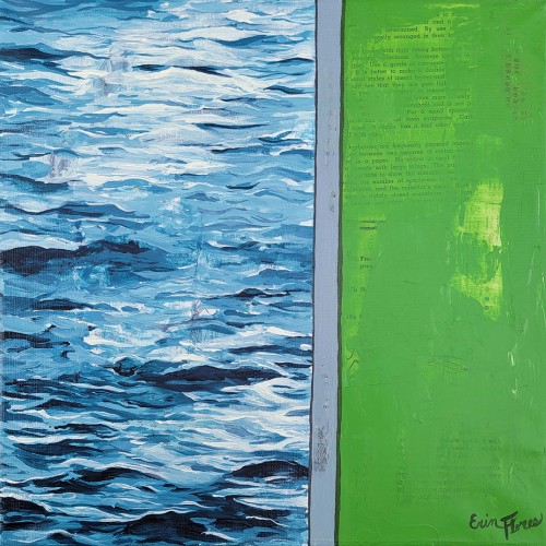
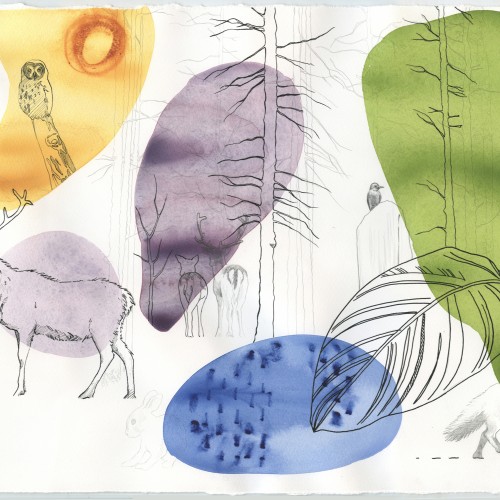
Inspired by a photo I took of a walled off area of a lake. It was grass on one side and water on the other. I love using textures from old book paper and the juxtaposition of realism and flat color.
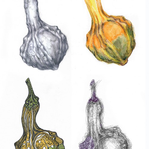
I modified the challenge a wee bit. I didn't use the same paper for the various drawings since I was using (top row, left to right) hard graphite pencils (3H to HB), watercolor pencils, (bottom row, left to right) brush pens and ballpoint pen. These media work best on very different paper textures and moisture absorbing qualities. The second picture shows the object of my study --- and the apparatus I use to hold botanical subjects. "Third hand" tools are very useful and cheap. This one was under $10 and serves my purposes well. Just FYI. (Each drawing/painting was scanned and composited in Photoshop.)
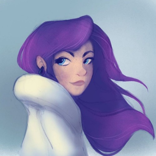
Spent some time last week trying to work through a new digital painting/colouring technique . It needs some more work and I haven't decided if I like It yet or not. One of the images turned out blander but the original skin tone was very orange I did like the brush textures a lot better on the orange skin but the lighting feels better on the purple-toned image.
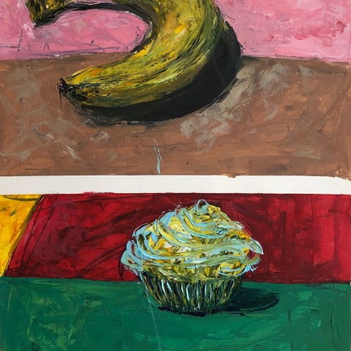
This is a 19 in by 24 in oil painting on Bristol paper. I love this piece because of the textures and the bright but muted colors. I did this in 2019 in the spring at the Fashion Institute of Technology. The professor always pronounced "fruit" in a very bazaar way. It was a great class overall.
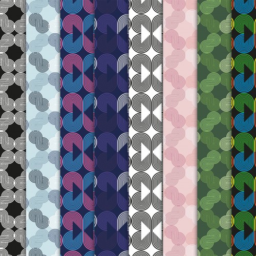
During this Quarantine I have had so much fun exploring what else I can create. Using this opportunity I am creating patterns & textures and trying to sell them on a few websites.
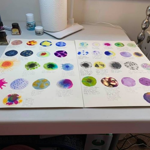
PLaying in the studio with watercolour paints and inks - created a planetarium of textural ideas - had great fun doing this and now plan to use some these effects in my next piece.
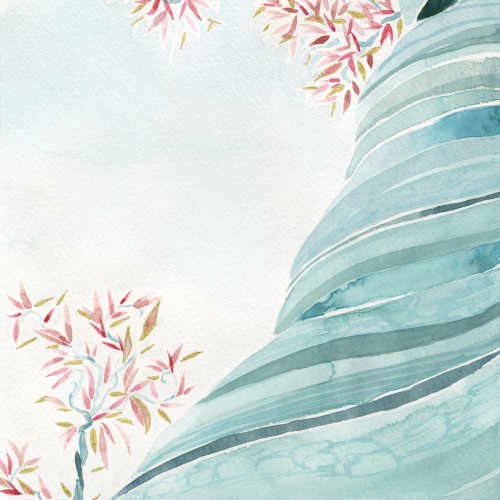
Here is a watercolor piece I made so I can relax, have fun with textures and my gold ink. It is meant to illustrate how those olive tree leaves shimer in the light of day.
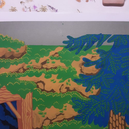
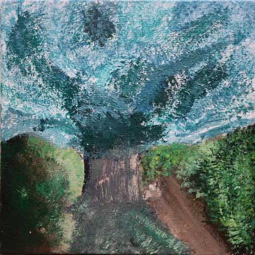
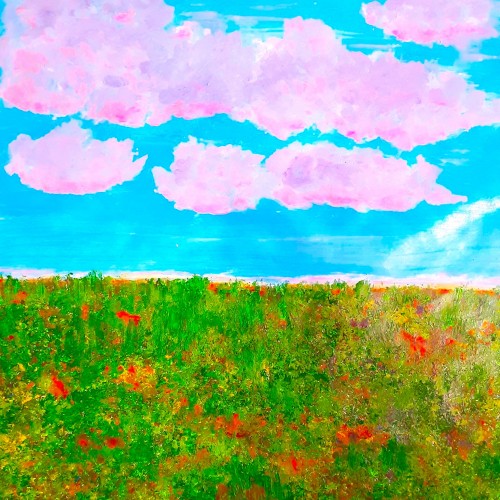
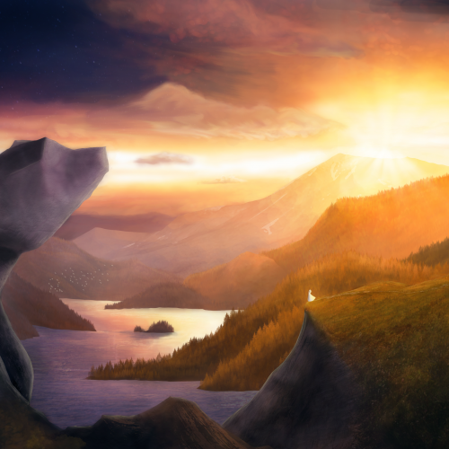
Painted as a project for My Painting Environments class: https://skl.sh/32Khrti
I am studying and working on my environment paintings, focusing on building textures and painting with light. This was submitted as my project for a Painting Environments course. If you have any advise, tips or comments on this painting I would love to hear from you. Thanks!
Epic Valley Project parameters:
- Hugh, expansive valley with mix of grassy and rocky terrain
- Haunting, dramatic sky with rays of light beaming
- Stone formations
My project for a skillshare course I am taking. I am trying to work on developing more textures and drama to my paintings as well as improving on the composition. Any advice or tips that you can share would be appreciated. Thanks!
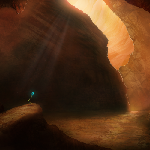
Painted as a project for Painting Environments class: skl.sh/32Khrti
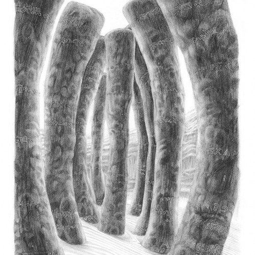
Project parameters:
- Mysterious Cave
- Dark but with moody lighting
- Mostly warm colors but with single blue flower
- Flower is the focal point - use composition to lead eye to flower