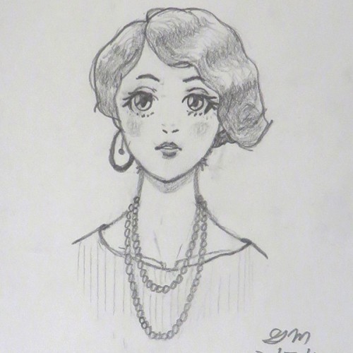
This was inspired by portraits from the 1920's. I've read that some girls who adopted the flapper style only wore one earring because their hair covered the other ear.
I wanted it to look like the chalkboard menus in quirky cafes. I drew the image with a Blackwing pencil, scanned it into Photoshop, inverted, then applied the colors.
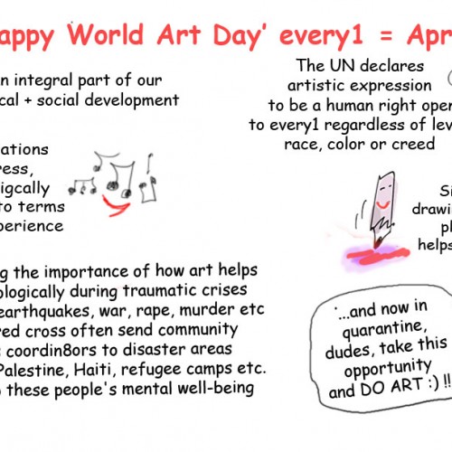
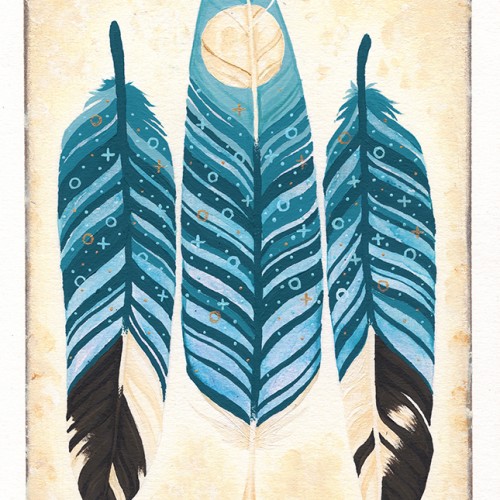
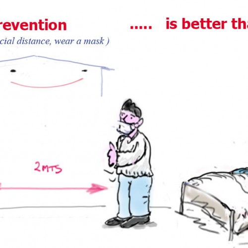
Happy World Art Day :) !! #artdavidmeehan /+ 00351969534520 / meehan99@gmail.com / https://www.facebook.com/artdavidmeehan/ + #FUCorona2020 = bringing 2getherness while we have to stay apart from each other at least physically... Peace, love, hugs - but only spiritual 1s 4 now!! #corona #jokes #covid19 #cartoon #cartoons #worldartday #art https://www.facebook.com/groups/fucorona2020/
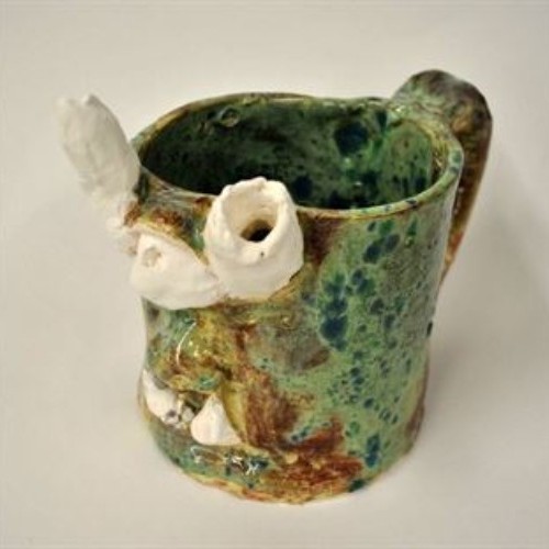
The first stage of clay is slip. Slip is watery clay; it is most often used to "slip and score", which I used to attach the features of the mug to the mug itself.
The second stage of clay is wet. Wet is moist, very plastic clay. Wet is the type of clay I love to use, just because it feels so fresh, and because it is moist enough that I don't have to soften it with water.
The third stage of clay is leather hard. Leather hard is the stage my mug was in after being left on the shelf for twenty-four hours or so. It is easier to cut but very difficult to sculpt.
The fourth stage of clay is greenware. Greenware is completely dry clay that is fragile and breakable. I would say that greenware is an overdose of leather hard for the clay. In other words, leaving clay out for a longer amount of time can turn leather hard clay into greenware.
The fifth stage of clay is bisque. This is the clay after its first firing. If it was grey clay, it is now white in this stage. It is now completely hard and no longer soft in any way. Bisque, luckily, is only one stage away from glaze...
The sixth stage of clay is glaze. This is the final firing and results in a smooth texture and a shiny look. I loved the way my glaze came out. While I was painting the mug, it was more of a ruddy red-brown but when it glazed, it turned out to be this beautiful spotted green.
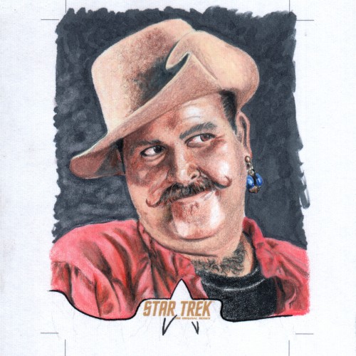
Here's a traditional art sketch card, produced on a 4 X 5 inch blank licensed card. The cut lines are set at 2.5 X 2.3 standard trading card size. Artwork is Copic marker and Prismacolor colored pencil. This card was created as a random insert for the 2018 Rittenhouse Archives Star Trek Captains collection Card series. This card features my favorite Star Trek bad guy Harcourt Fenton Mudd or Harry Mudd. See more at Sketchcardsandcovers.com
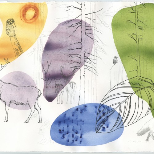
I love creating work that starts from a point in nature and develops into something more abstract, something that can be interpreted in many different ways. It’s interesting to hear what people see, what connection to their own life they bring when viewing a work.
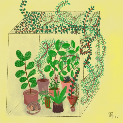
Final assemblage - manual drawing enriched with digital elements, A5 format
The punch line:
An external, independent force ruined the morning by shattering the cup.
Fate took its share.
The question is:
Does this same external interference have the power to destroy the rest of the day?
Does one rotten fruit have the chance to rob all the others of their flavor? The sun will shine no matter the situation.
Choice and acceptance don't have to be mutually exclusive!
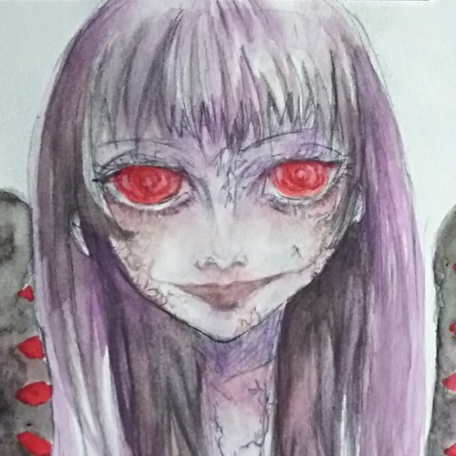
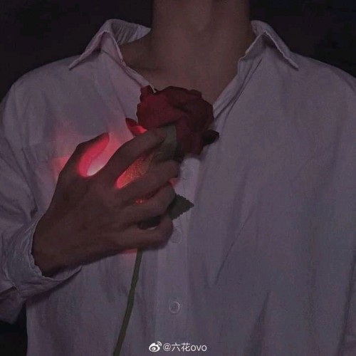
have you ever seen the part in a bug's life where he flies into the wall, shows a thumbs up and says "I'm okaaay". that's how I imagine saying the title of this image. I added some bruises and stuff so I didn't have to explain to my younger sisters that I was referring to an emotional state of mind
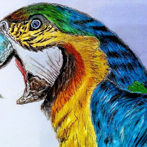
Oils on canvass. This is Charlie. He's the parrot owned by the supermarket where my husband used to work. The owner of the shop brought him in to keep him from getting bored and pulling his feathers out. He has a large cage at the entrance which he often escapes from, and can be found hopping from trolley to trolley on the handles, to amuse himself. He's usually found by a staff member who brings him back. A real character lol
I finished this drawing a day after I hiked to the top of the rocks, I did this during spring break this year in 2018. (Drawing is 6x4 inches in size. ) TIME: 1 hour 20 minutes
A solitary rowboat drifts across a muted, restless surface, unanchored and unattended. Rendered in charcoal, ink, and subtle white highlights, the vessel exists in a quiet state of motion—moving, yet going nowhere. The surrounding water is suggested through loose, rhythmic lines, emphasizing atmosphere and isolation over realism.
The boat is sharply defined against the hazy background, its dark contours and interior shadows contrasting with the soft, unsettled environment. Oars rest unevenly, implying recent human presence while reinforcing absence. The name Perditas—Latin for “lost”—is affixed to the hull, anchoring the emotional weight of the piece without explanation.
This work explores themes of solitude, uncertainty, and endurance. With no shoreline or destination in sight, Perditas becomes a reflection on drifting—physically, mentally, and emotionally—inviting the viewer to confront their own sense of direction within an undefined space.
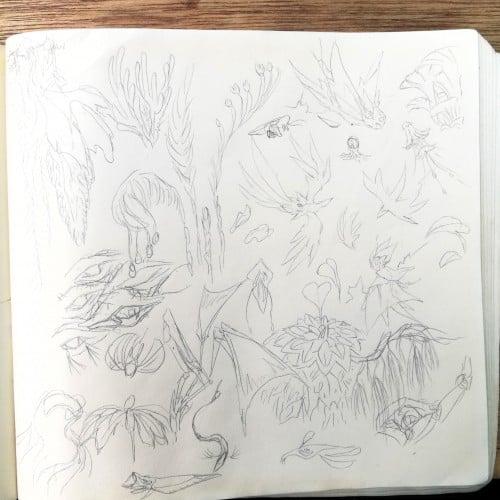
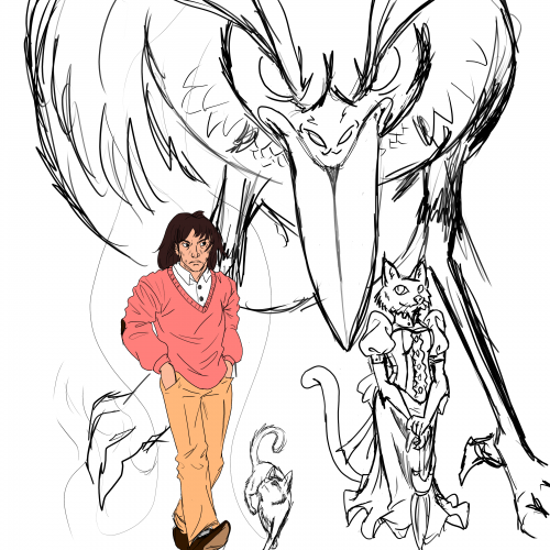
Had a thought to revisit one of my old worlds created during the creative streak over years ago. It was a world built from the primordial creative juices in my head, put from uncountable inspirations and knowledge bases learned from who knows forever.
Here is a perspective of how a world is built from the rise of some fundamental ideas. What happens if you consider a world suspended in nigh microgravity conditions, a supercharged atmospheric envelope orbiting a twin neutron star system, gravitational suspension, intense magnetic fields and radiation? A extreme and chaotic environment bordering an impossible miracle, in a constant state of freefall.
Not gonna lie, worldbuilding in detail is not easy. I don't have the mental and time resources these days, to expand a world in such intricate detail. Each of the scribbles above are mostly ideas of local flora and fauna that push the limits of my science knowledge base combined with accumulated general knowledge. Some of the concepts here are bordering magical fantasy, without even getting into the residing intelligent lifeforms.
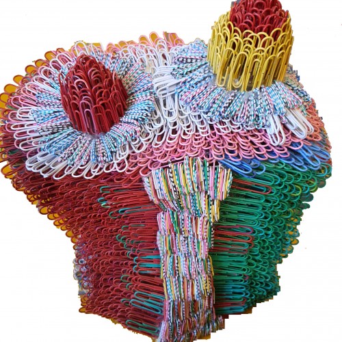
The materials that Meir uses in her works are not of the refined and so she is called an “arte povere” artist. At times she describes her work as someone dealing in alchemy - work develops as in a trial laboratory with different techniques and materials. She says, “ at times the artistic work process is a sort of puzzle demanding the filling in of all the empty squares “.
Some of her work focuses on women, and they incorporate criticism and cultural protest.
Meir has strong opinions about recycling and environmental protection that is represented in her works by use of materials and shapes. In her work she reacts to contemporary art that communicates with the eco system, waste, and she also searches for different worlds. Her works are made up of layers upon colorful layers that when we look at them it becomes clear that the mound of waste she chose is not coincidental. It actually becomes a colorful kaleidoscope of utopia.
Jaffa Meir is a multifaceted, autodidact artist working in painting, sculpture, photography, product design, carpets and furniture, painting on textile, and computer graphics.
The structural composition of some of the works is influenced also by her many years of working in the architects’ office.
Meir also worked in the developing of ideas within the field of ecosystems and recycling for factories such as Coca Cola, and during this process came up with ideas for designing parks and public game spaces using industrial waste products.